Software
Houzz Logo Print
glowgirlinto

Kitchen wall colour saga - help please!

7 years ago
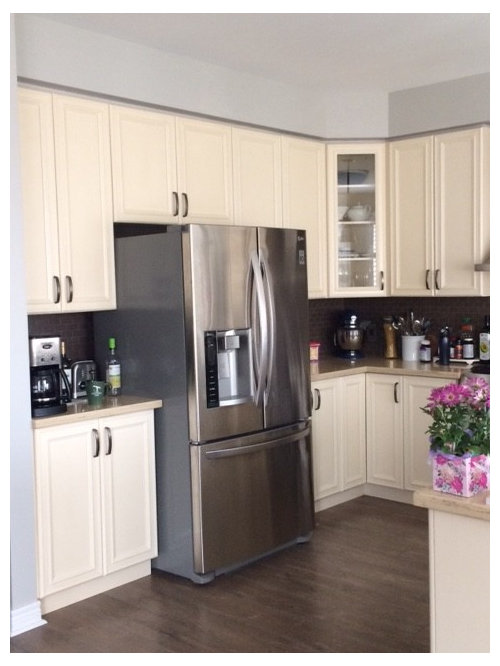
Calling all colour gurus! Here is my situation: we can’t afford a kitchen renovation so wall colour is the only change I can make. This is my second attempt to improve our kitchen and the last easy effort I can make before the crown goes in.

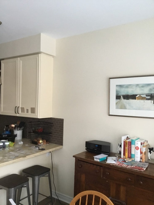
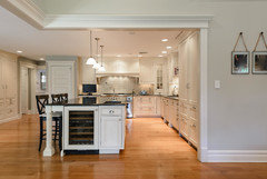
Cabinets are very creamy and lean yellow. Brown/grey backsplash and stone counter with yellow base and snips of orange and brown.

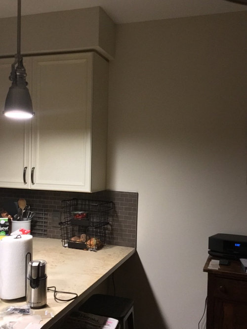
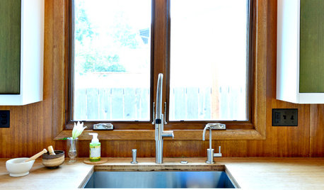
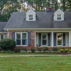
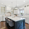
Walls were originally Stonington Grey which set off the yellow cabinets hugely (First picture). I then painted Indian White to neutralize everything and contemplate my next move (second picture).

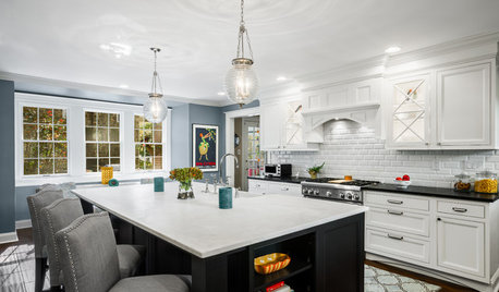
We have large windows that face north. Fixtures all have 3000/3500k led bulbs which do seem to be helping to “whiten” the look a little (third picture taken at night).

I will never love this kitchen but I think some contrast on the walls will at least make it more attractive.

I am looking at the tan/beige/neutrals. Which undertone of beige (green, yellow, pink?) will MOST neutralize the buttercream cabinets given the cool northern light?

I’ve got a bunch of chips including bleaker beige, stone hearth, warm sand, inukshuk, Baja dunes, shaker beige, and wicker basket from BM. Also have latte, nomadic desert, tony taupe, and balanced beige from SW.

All the trendy colours seem to have too much grey in them (Edgecomb, Revere, Agreeable Grey, etc).

Comments (19)

  • 7 years ago
    Thanks Patricia. Any particular colours you’d suggest?
  • PRO
    7 years ago

    Colors like Sea Salt from SW and BM has many grayed / greens . I would go get 3 sample cans of those shades and see which one works best in your space they all will have different undertones

  • 7 years ago
    The gray tones are not working, I agree. I’d also look at SW Accessible Beige.
  • 7 years ago

    Look at BM Balboa Mist...it is a soft warm gray; just painted my kitchen and get lots of compliments.

  • 7 years ago

    Go to Maria Killam's website and buy her ebook "White is Complicated." It will really help you learn how to choose colors that work in your space. You'll learn the four useful undertones of white: Blue-white, True white, Off-white, and Cream (yellow-white). The gray's not working because it works best with blue-whites, true whites, and off whites. You have creamy cabinets which work best with creams, beiges and browns.


    Seriously, buy the ebook, it's about $27. You'll be teaching yourself to fish.


    https://www.mariakillam.com/shop/#ebooks

  • 7 years ago
    last modified: 7 years ago

    I would make sure the LED bulbs are "daylight" and not warm white... I would go with a gray/green from PPG, something like Rain Cloud or Twilight Twist. I am not a fan of Benjamin Moore paint, it does not touch up well at all so I would steer clear, worst mistake i ever made was painting my last home will all BM.

  • 7 years ago

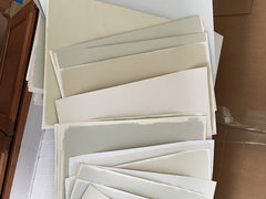
    Also, when you trying to decide on the color. Paint up samples on poster board. You can't really tell what the color is going to look like off a small chip. The poster board also allows you to move the sample around the room. Here's a picture of some of my paint "chip" library I've created over the years.


  • PRO
    7 years ago

    I love Sea Salt by SW - this will not fight or try to match any of the colors you have but it will complement very nice, But try Worldly Grey (for more of a neutral) from SW I think it will go great with all your selections.

  • 7 years ago
    Thanks to all.

    I tried three different brands of “daylight” bulbs that I had on hand. Absolute no-go. It looks like an airport or warehouse. 3500/4000 is the max that still looks good.

    Sadly husband has vetoed any green/aqua/blue-green combos. It took us four tries to paint our master last fall. The room also faces north and every single sample we painted turned robins egg blue.

    I think I really need to stick with a “beige” or a brown at this point to be on the safe side. I will be trying out actual samples painted on the wall I just want to avoid buying 10+ sample pots.

    If I can narrow it down to which type of beige undertone makes the most sense, at least that will minimize how many samples to start.
  • 7 years ago

    Just be extremely careful of the undertones with beige....you can end up with pink if not careful. I love the daylight bulbs, but I only use 65-75W in my recessed lights so it doesn't seem like an airport, lol


  • PRO
    7 years ago

    Have a look at Abalone from Benjamin Moore. Do buy test cans as well as the tester cards from the paint store. Look at a few different colors. Paint a couple of coats on the test cards and hold them up in different parts of your room. This is probably pretty obvious but, you need to look at them at different times of the day because colors change constantly. Good luck

  • 7 years ago
    last modified: 7 years ago

    Lighting is not your problem. But on that note . . .

    Regarding LED lighting. Don't purchase based on the marketing lingo of "Warm White", "Soft White", "Daylight" etc. Those are marketing terms with absolutely no industry standardization. Purchase based on what is known as temperature expressed in degrees Kelvin or "K" for short. You'll find that on the package. Also look for the Color Rendering Index (CRI) expressed in units from 0 to 100. You want a bulb that is 90 or greater. If it doesn't say it on the box, chances are it's a cheaper bulb and is around 80. The higher the number the better and the more accurate and truer the color will be.

    For comparison, the old incandescent bulbs have a temperature of about 2700K. Halogen bulbs have a temperature of about 3000K. The 4' florescent tube fixtures found in offices and often as the central light fixtures in 1970's kitchens have are about 3500-4000K.

    It's all a matter of personal preference but anything over about 3000K, to me, looks very cold and clinical - like I'm in a commercial office or doctor's office.

  • 7 years ago
    Missenigma - thanks for the led info. I’ve had a steep learning curve with them and tried a few 5000k bulbs this morning. I agree about the medical office look! I miss incandescent but I’ve found content with 2700-3500.

    Thank you for the colours suggested so far.


    Any darker/browner/tan/beige options out there?
  • 7 years ago


  • 7 years ago

    I had a somewhat similar situation at my old house - yellow/green off white cabinets - the actual color was “Misty Air”. I painted the walls SW Analytical Gray and it toned down the yellow a bit.


    missenigma - I hate lighting over 3000k!!! Everyone looks like a ghost and it’s so unflattering. All of our LEDs are dim-to-warm...3000k at full brightness and around 2700k when dimmed.

  • 7 years ago
    Thanks Heather. I picked up that chip and a ton of others today from SW.

    Any chance you have a picture of that kitchen?
  • 7 years ago

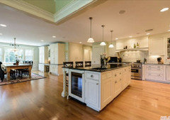
    Sure - the cabinetry and trim in all the pictures is "Misty Air". In some pictures (when we first bought the house) the walls were a sage green kind of color, you can see that in one photo just so you can get a sense of how a green might look. It was pretty, but didn't match the rest of our furniture. The pictures with the grayish walls have the Analytical Gray color. The cabinets still look kind of yellow, but some colors made them look REALLY yellow. Your cabinets are a slightly different tone than ours, but I had to go more purple-ish and darker than I had initially wanted to tone it down. In person, the walls read as gray with cream cabinets.


    With Green Walls


    Analytical gray on the far wall around the door and to the left by the two doorways. A different color is in the foreground, so ignore the trim and paint on the front wall and top of the photo.


    Analytical Gray walls with Misty Air trim


  • 7 years ago

    For reference, you can see how yellow/green the cabinet color actually is when you look at the Misty Air paint sample