Software
Houzz Logo Print
annvw

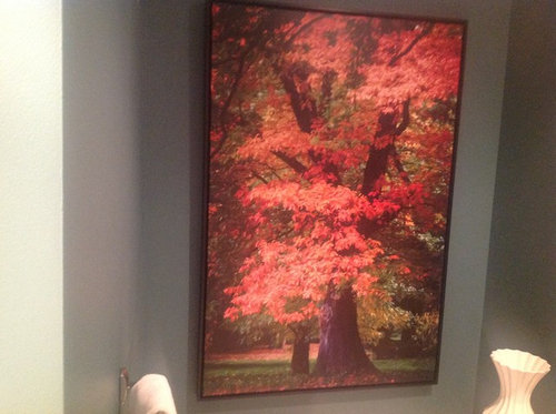
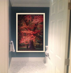
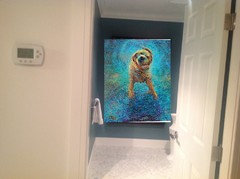
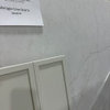
I know it looks wrong, but why? HELP..

7 years ago
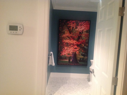
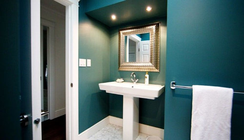
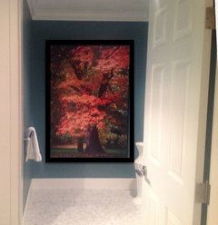
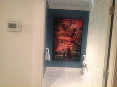
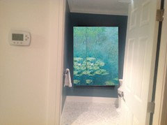
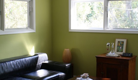
This is my powder room, paint color is BM Tropical Oasis C7P 710

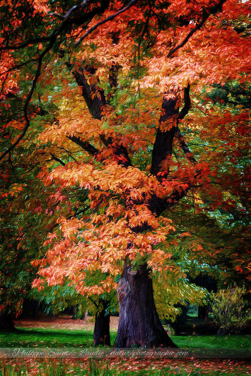
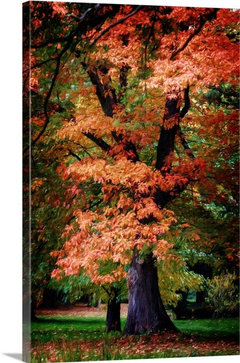
I just purchased print which we love, the size makes it look like we are looking out the window at a tree.

When we first put the print into the room we leaned it up against some prints with large black frames, it looked great. We removed the prints with the black frames, installed this one now it lookes flat.

Is it the paint color on the walls or does it maybe need black on the wall behind the print to make it pop?


Right now the paint looks grey in that corner, its because the photo I took is with the I-pad.

We what the Powder room to have drama, that's why the large print.


Comments (37)

  • 7 years ago

    I love the paint color, but I don't think the print's colors work with it. They're too warm. As much as you like it, I think I'd try something else. You could also use a nice rug in there.

    annvw thanked torreykm
  • 7 years ago


    annvw thanked Jennifer Hogan
  • 7 years ago

    I wouldn't normally use the colors in the print on a blue green wall, but wanting the feeling that you are looking out a window, I think it might just work, but you have to have a much larger frame to separate it from the wall color. I would probably go with a large frame painted the same color as your trim. Make it feel almost like window trim.


    annvw thanked Jennifer Hogan
  • 7 years ago
    I like the print amd wall color together, it just looks odd because the floor is cool toned.
    annvw thanked Nor
  • 7 years ago

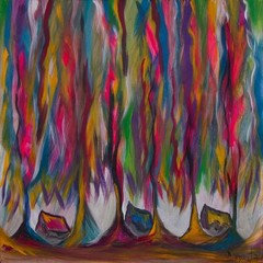
    Lovely art. I really like the paint color in the bathroom. It feels to me that the jewel tones of the bathroom are not jiving well with the earth tones of the art. Maybe there is another place you can put this nice piece and find different art for the bath. Art does not have to match but it should not clash either.


    annvw thanked Rawketgrl
  • 7 years ago

    that print doesn't go with that wall color

    annvw thanked dyliane
  • 7 years ago
    I think the print needs a gold frame. Get some spray paint.
    annvw thanked Hansen
  • 7 years ago

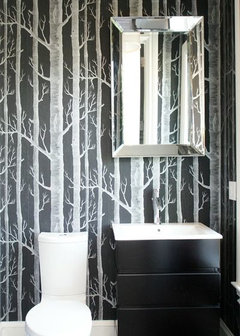
    You have a lovely print. When I use art, I pick my art first and then select the paint color. (There are so many paint colors that it is easier to select the paint color once the art colors are known.) I try to pull colors out of the art to tie the room together. From my perspective, I don't see the wall color or the floor color repeated in the art. I echo the thoughts of Rawketgrl and love her suggestions for the art. Do you see how she repeated the room and floor colors in the art? The beautiful jewel tone color of the bathroom does not go well with the autumn colors. The two don't relate to each other; there is no wall color or white trim color in the art. The art and the room colors are nice, but not in the same location. That's the reason behind why you feel that the look is off.

    annvw thanked Barbara
  • 7 years ago
    last modified: 7 years ago

    I agree^

    you have those cool blue walls, marble floors, crisp white sink, then you brink in the warm forest w/all of the opposite colors!

    Look at these next to each other. I substituted a cool art pic on the 2nd pic. look at the diff


    Sorry, but the print doesn't work.

    Either paint all of the walls in the room white, and that one wall black (so the autumn tress have neutral background) , or move the print to another location.

    annvw thanked Beth H. :
  • 7 years ago

    I agree with everyone's comments about the paint color, it should be changed. I like the idea of black it could be very dramatic. Would need to add something to bounce light around?

  • 7 years ago

    Don't blame the warm color. I don't like the frame and it is better with the wider white frame but to me it is not a good choice. I think it does not go with your otherwise "glam" powder room. It would be best seen from a distance. Using contrasting colors for drama is fine but in a room so small you have few options to repeat the coral color in the art. I also think the background to the main image is too dark to hang on that dark wall.

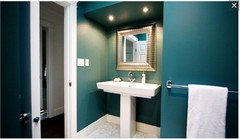
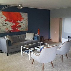
    Here is an image I saw on Etsy of a different room with some of your colors.

    I would use gold or mirrored accents in your room.

    annvw thanked emmarene9
  • PRO
    7 years ago
    last modified: 7 years ago

    This is a case of both TOO much and TOO little.

    If you want to fill the space, fill it. Meaning find a stick on mural of trees and COVER that entire wall.

    Otherwise, a series of smaller prints of tree........or a smaller and better proportioned artwork.

    Fill it, or go smaller. : ) Your proportion is off. As is the hot orange tone with your floor in this application. For a single artwork, the doorway is basically the frame. That's why it looks too wide ....off : ) Even though it fits.


    Interior Design Work · More Info


    annvw thanked JAN MOYER
  • 7 years ago

    Keep the wall color, it is beautiful, and your bathroom looks very nice. The print is also beautiful, but, not in your bathroom, with any color walls. Look at the colors on the prints in Beth's post above. Those look gorgeous on your walls. Try and find one in similar colors, that has something on it, that will look like you are viewing out a window. If you cant exchange the one you have, then see if you can find somewhere else to hang it, because, it just doesnt look good in your bathroom.

    annvw thanked cat_ky
  • PRO
    7 years ago
    last modified: 7 years ago

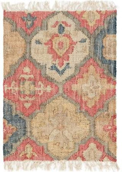
    Before you do anything, try a rug on the floor...this is Dash and Albert and any good rug store will carry samples. It might work if you bring down the colors of the wall and print onto the light floor.


    annvw thanked JudyG Designs
  • 7 years ago

    I dont have a suggestion, just stopped in to say , I love the window concept In an interior bathroom and I love the print. Can’t wait to see how this dilemma ends.

    annvw thanked auntthelma
  • PRO
    7 years ago
    last modified: 7 years ago

    Please the last place in a house for rugs left on the floor is a bathroom and that rug does nothing for that space.I do agree the wall color and the print do not work together at this stage probably easier to go find a different print . I happen to like the size so keep that just a different print.I also choose my paint colors to go with my art because we collect originals and those are the stars in my rooms.


    annvw thanked Patricia Colwell Consulting
  • 7 years ago
    The tree print is beautiful up close, but from a distance it looks hot...as though something is on fire.
    annvw thanked hummingalong2
  • 7 years ago
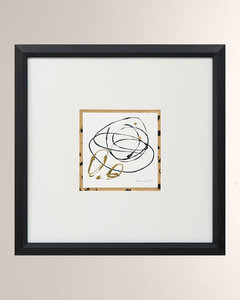
    last modified: 7 years ago
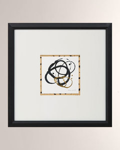
    Good grief with the rug comment above.

    Judy made an excellent and helpful suggestion and I would give a rug such as the one she posted a try. It may make all the difference.

    Finally a post showing large scale, impactful art! You can absolutely make this work.

    annvw thanked User
  • 7 years ago
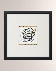
    Jan always has great advice on scale and proportion and knows the rules and knows how to make things work.


    She may be 100% correct and this picture may never work within your space.


    I am also a 60's rebel and don't always like to follow rules and sometimes have epic fails, but also have some wins that are unconventional and defy the rules.


    Since you said you love this picture and you really want it to work in this room I started thinking of ways you could make it work.


    I thought about the color combinations and the cool teal of the walls and the warm oranges in the print don't bother me. They are found together in nature and one of my favorite artists uses these colors together all the time.


    I started thinking about what makes this work together and went to the color wheel. I wanted the orange, teal and fresh green colors.


    Once I pulled this up I thought - Blue may be the missing element.


    How would you feel about painting the back wall a dark blue that works with both the teal and the green and orange in the picture. Adding a touch of the blue and orange elsewhere in the room. A small vase with a silk flower, A soap dish and bar of soap.


    It won't solve any issues with scale, but it seems that both mother nature and a great artist used blue to tie the teal, green and oranges together.

    annvw thanked Jennifer Hogan
  • 7 years ago
    I would frame your print in the same white as the rest of the trim, possibly building a frame from the actual trim wood. Paint the walls one of the calmest, most neutral shades of green from the print, and add a plain ( not patterned) rug from one of the red/orange tones in the print. Let the print be the star

    annvw thanked Connie Stackhouse
  • PRO
    7 years ago
    last modified: 7 years ago
    A white frame will destroy the picture. The best scenario is find another spot for the art, and start over on the bath wall. I hate to say I don't love the wall color with the floor, but I don't. Overpowering.

    A stacked related set of prints......... vertically hung. One over the other. You don't need the DRAMA of that much color : ) If you want bold color in the art, change the wall. Actually the light tone of the flooring would be good ,repeated in whatever framed thing hangs on the wall. Either way...... the print you planed is....a forced look.


    30 " x 46" below Softer........gold frame.........it need not shout.


  • 7 years ago
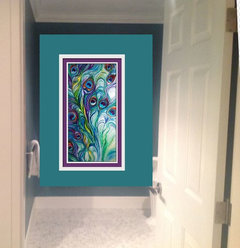
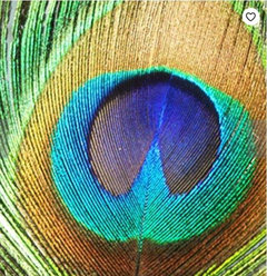
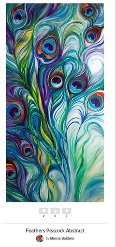
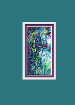
    1 - forgot to credit the artist - Marcia Baldwin.

    2 - Her peacock feathers print could add a lot of drama and I think would work perfectly in this space.


    annvw thanked Jennifer Hogan
  • 7 years ago
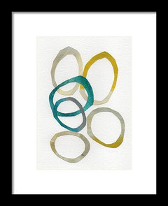
  • PRO
    7 years ago
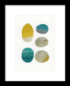
    Nice photo shop......... but the art and wall color kill the floor.

    annvw thanked JAN MOYER
  • PRO
    7 years ago
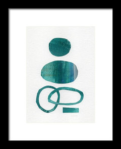


    https://fineartamerica.com/featured/sun-and-sky-abstract-art-linda-woods.html?product=framed-print


    Multiple sizes all...............more light and white in the art

    annvw thanked JAN MOYER
  • 7 years ago

    Thank you to everyone for your great ideas.

    I do agree with Jennifer Hogan, I also believe that rules need to be broken. I have seen articles in Architectural Digest where the over size art is on a small wall, which commands your attention.

    Regarding having a area rug in a Powder room, in the middle of the floor (NO).

    The paint on the wall shows hints of black more than blue in this room, what do you think of just painting that wall with the painting on it Black? Or black grasscloth?

    My husband likes the paint color, this is a small room as most powder rooms are, but this room has 8 walls. Small yes but it zigzag everywhere in this space.


  • 7 years ago

    Computers are terrible at rendering color. Do you have the actual brand and name of the color on your wall?


  • 7 years ago
    last modified: 7 years ago

    annvw - I love oversized art and think that in most cases people tend to go way too small. Too many small pieces have the tendency to look cluttered. Huge pieces make a statement. One thing I really like about your bathroom and something I would love in my next home, is that other than the tile floor and the towel rack, there is no immediate indication what type of room it is when you look through the door. All you see is the magnificant piece of artwork.

    annvw thanked ilikefriday
  • 7 years ago

    The reason I picked the blue is that it makes the grass green and the teal green relate, If you look at the color wheel it is 3 points equal distance apart + the complement color directly across from the center of the 3 points.


    Why our brains percieve color combinations based on Geometric shapes pleasing is a mystery, but it works.


    You can play with the color wheel just like I did

    Here is the link


    http://paletton.com


    annvw thanked Jennifer Hogan
  • 7 years ago

    You already own the print. There is no harm in trying to make it work by testing a couple of different paint colors. Worst case - you still don't like the print in the bathroom and repaint the wall in the original color and pick another piece for on the wall.


    The other thing to remember is that you do not live in the pages of a magazine. What works in Architecural Digest or in many of the homes featured on Houzz doesn't necessarily work in our modest, average home with our 2 income household lifestyles.


    annvw thanked Jennifer Hogan
  • 7 years ago
    I really love it on the black wall, but what else is in that bathroom? Will it even go with black?
    annvw thanked K R
  • 7 years ago

    To Ilikefriday, thank you for the comment on the room layout. With the door open all the time its great because you don't see the toile, thank goodnes.

    for Jennifer Hogan the color is--- Benjamin Moore Tropical Oasis C7P 710


    The rest of the house the walls are all BM Cloud White. I was going to do the wall in powder room in Cloud White where the print is to bring white into the room but when it was painted 4 years ago I figured 1 color for this space was enough.

  • annvw thanked ravencajun Zone 8b TX
  • 7 years ago

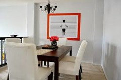
    Why not just try out a painted black background around the picture? Maybe by 3 or 4 inches...You could use black paper to see if you like the look. Just tape up construction paper in the correct size...like this but black


    annvw thanked User
  • 7 years ago
    last modified: 7 years ago

    Rawketgrl, could you provide a link for the green and blue/white trees art work you posted?

    (Why doesn't "search Google for image" work on here anymore?)

  • 7 years ago

    Since the floor is light and won't be changed I think you need to paint the walls a different color and then find a print. I do like the tree print but not with that wall color or floor.