

Issue with backsplash around window! Need advice!
7 years ago

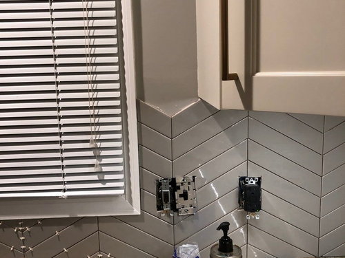
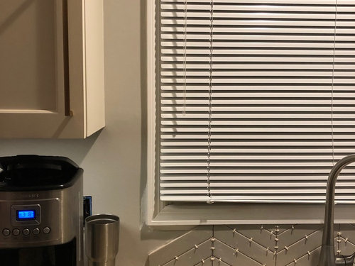
Featured Answer
Sort by:Oldest
Comments (16)
 7 years ago
 PRO7 years ago
Related Professionals
St. Louis General Contractors · Pittsfield General Contractors · Carson City General Contractors · North Platte General Contractors · Greenville Home Remodeling · Victorville Home Remodeling · Fort Smith Interior Designers & Decorators · Baltimore Interior Designers & Decorators · Mankato Interior Designers & Decorators · Clarksdale Interior Designers & Decorators · Elk City Interior Designers & Decorators · Missoula Kitchen & Bathroom Designers · Winston-Salem Kitchen Remodelers · San Antonio Kitchen Remodelers · Plymouth Custom Countertops 7 years agolast modified: 7 years ago
- PRO7 years ago
- 7 years ago
- 7 years ago
- PRO7 years agolast modified: 7 years ago
- 7 years ago
- 7 years ago
- PRO7 years ago
 7 years ago
 7 years ago
 7 years ago
 7 years ago
- 7 years ago

Related Stories
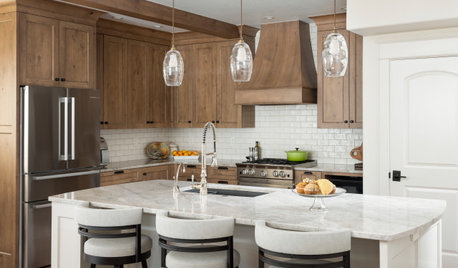
KITCHEN BACKSPLASHESWhere to Start and Stop Your Backsplash
Consider these designer tricks to work around cabinets, windows and other features for a finished look in your kitchen
Full Story
BATHROOM DESIGNDreaming of a Spa Tub at Home? Read This Pro Advice First
Before you float away on visions of jets and bubbles and the steamiest water around, consider these very real spa tub issues
Full Story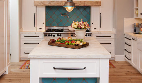
KITCHEN DESIGN10 Gorgeous Backsplash Alternatives to Subway Tile
Artistic installations, back-painted glass and pivoting windows prove there are backsplash possibilities beyond the platform
Full Story
You Said It: Hot-Button Issues Fired Up the Comments This Week
Dust, window coverings, contemporary designs and more are inspiring lively conversations on Houzz
Full Story
REMODELING GUIDESContractor Tips: Advice for Laundry Room Design
Thinking ahead when installing or moving a washer and dryer can prevent frustration and damage down the road
Full Story
MATERIALSKitchen Ideas: How to Choose the Perfect Backsplash
Backsplashes not only protect your walls, they also add color, pattern and texture. Find out which material is right for you
Full Story
HEALTHY HOMEHow to Childproof Your Home: Expert Advice
Safety strategies, Part 1: Get the lowdown from the pros on which areas of the home need locks, lids, gates and more
Full Story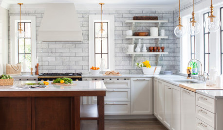
KITCHEN DESIGN7 Magnificent Oversize Backsplashes
They go up to the ceiling and don’t fall short on making a major impact. Are you ready to hop on the big-backsplash bandwagon?
Full Story
HOUSEKEEPINGThe Best Way to Get Your Windows Spotlessly Clean
Learn the pros’ tips and tricks for cleaning windows and getting them streak-free
Full Story
KITCHEN DESIGNBrilliant Idea: The Kitchen Window Pass-Through
A window that opens from cookspace to backyard is the next-best thing to an outdoor kitchen
Full Story
slk873Original Author