


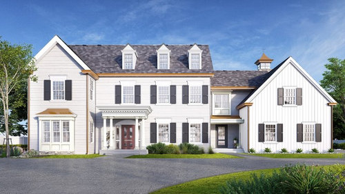
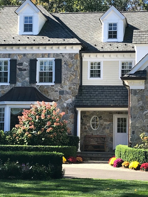
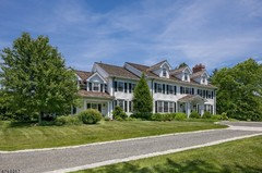
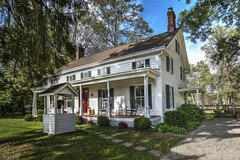
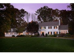
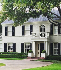
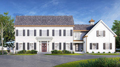
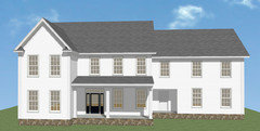
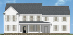
New Construction - Which 3D Rendering looks best
cae1840
5 years ago
last modified: 5 years ago


Featured Answer
Sort by:Oldest
Comments (31)
Related Professionals
Plainfield Architects & Building Designers · Yeadon Architects & Building Designers · Dallas Furniture & Accessories · Cottage Grove General Contractors · Eustis Flooring Contractors · Lawndale Flooring Contractors · Oak Park Flooring Contractors · Lincoln Siding & Exteriors · Bethany Siding & Exteriors · Millburn Siding & Exteriors · Chantilly Painters · Madison Painters · Buckhall Painters · San Marcos Painters · Wallington General Contractors
cae1840
5 years agolast modified: 5 years agocae1840
5 years agocae1840
5 years agohoussaon
5 years ago
AC LB
5 years ago
Laura Villar
5 years agoulisdone
5 years ago PRO
PROJAN MOYER
5 years agolast modified: 5 years agocathy hulbert
5 years agocae1840
5 years agokeith Dcil
5 years agoci_lantro
5 years agocae1840
5 years agocae1840
5 years ago PRO
PROPPF.
5 years ago
CLC
5 years ago- PRO
PPF.
5 years ago  PRO
PROJudyG Designs
5 years agolast modified: 5 years ago- PRO
PPF.
5 years ago - PRO
PPF.
5 years ago  PRO
PRONorwood Architects
5 years ago


Related Stories
WORKING WITH AN ARCHITECTWho Needs 3D Design? 5 Reasons You Do
Whether you're remodeling or building new, 3D renderings can help you save money and get exactly what you want on your home project
Full Story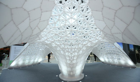
ARCHITECTUREWhat the Future Holds for 3D Printing in Architecture and Design
Designers worldwide are creating 3D-printed buildings, furnishings and materials. Will we be seeing this trend in our homes?
Full Story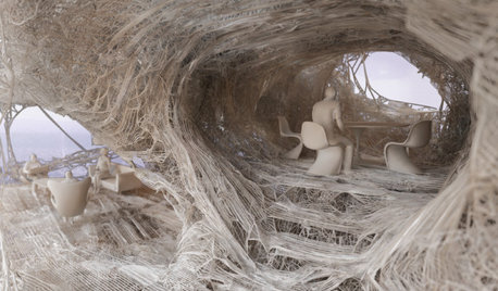
ARCHITECTUREDiscover the Intriguing Possibilities for 3D Printing for Architecture
Would you live in a home made of printed plastic? With 3D printing, the options push architecture's limits
Full Story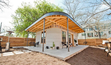
DESIGN FOR GOODCan 3D-Printed Homes Solve the Global Housing Crisis?
A San Francisco nonprofit and an Austin, Texas, tech firm aim to bring printed concrete homes to El Salvador next year
Full Story
FUN HOUZZHouzz Announces 3D Furniture Printing
This amazing new technology promises to revolutionize the home furnishings industry. Here's how it works
Full Story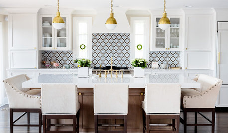
WHITE KITCHENSNew This Week: 3 White Kitchens, 3 Different Styles
A few key accents can make one all-white kitchen look and feel completely distinct from another
Full Story
KITCHEN DESIGNKitchen Remodel Costs: 3 Budgets, 3 Kitchens
What you can expect from a kitchen remodel with a budget from $20,000 to $100,000
Full Story
LANDSCAPE DESIGNGarden Overhaul: Which Plants Should Stay, Which Should Go?
Learning how to inventory your plants is the first step in dealing with an overgrown landscape
Full Story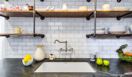
KITCHEN DESIGNNew This Week: 3 Modern Kitchens With Something Special
Looking to make your kitchen feel unique? Look to these spaces for inspiration for tile, style and more
Full Story
NEW THIS WEEK3 Warm Kitchens That Mix Blue, Green and Wood
Look to this color palette to add inviting personality to the room
Full Story


Side3