Software
Houzz Logo Print
marina_rotshteyn

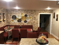
Kitchen Nook & Accent Wall

7 years ago
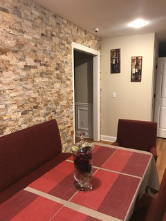
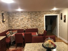
Finally seeing some light at the end of the tunnel with my kitchen nook project :)

Looking for decorating advice. Have 3 more of the decorative candle holders for the adjacent wall. How many should I hang and what may be the best way to display them? Thank you!

Comments (29)

  • 7 years ago

    Is anything else going on the wall? They dont seem to be the right scale if used alone on that wall.

  • 7 years ago
    That’s sort of the dilemma:) Does it seem out of place, would adding the others to adjacent wall help or should I consider other decor all together. Prefer not to add shelves...
  • 7 years ago

    You have a pretty traditional style I would stick with a traditional set up. Two sconces on long wall with art between. Art only on short wall.


    Get some fun art that you love, it will personalize and warm it up and make it look more home like and less like a restaurant.

  • 7 years ago
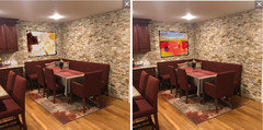
    Love love ❤️ the walls!!! Fabulous. Can you get a wide angle picture? All I see is red... what is on top of the table? I think you need to introduce some different colors to the space. Can you find a large art piece that catch’s your eye, and maybe use the candle sconces on either side, along the big wall? And maybe a fab light fixture over the table!
  • 7 years ago


  • 7 years ago
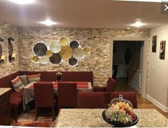
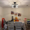
    Thank you for the recommendations! Here are two more pics of the space to help visualize...
  • 7 years ago
    I vote for the art that ilikefriday propose. Also think your nook looks too dark. The tablecloth is too brown and placemats are an overdose of red. Perhaps replacing all of these for something fresher and lighter?
  • 7 years ago
    And maybe introducing a third color in wall and floor, like light blue
  • 7 years ago

    Not the sconces, and when you find the right pieces they need to hang much lower. The two art pieces on the end wall should function as a group and be centered 5' above the floor. Anything on the "brick" wall should hang 5-8" above the banquette back. Nothing should hang above the door frame.

  • 7 years ago
    Thanks All! Much appreciated...
  • 7 years ago
    Wow what a beautiful brick wall. Your cabinets are gorgeous. I think you need to find a new color to introduce to the rest of the space to modernize and enhance your wall, there’s too much brown reddish. The scale of the candle holders are too small and wrong color IMO.
  • 7 years ago
    Thank you so much! So question... what colors would go with this red to break it up?
  • 7 years ago
    last modified: 7 years ago

    How about baby blue as was suggested above?

  • PRO
    7 years ago

    I lowered your small pics.


  • 7 years ago
    I would take out all accessories that have any red in them; your rug, pillows, table cloth and runner and anything else we can’t see. Your cabinets and buffet table and chairs are the only red items you should have. incorporate a light blue and taupe perhaps.
  • PRO
    7 years ago


    I would use placemats instead of tablecloth. I have never seen a splitface stone wall with wood trim at a doorway. Perhaps if you painted the trim so it didn't stand out that would be of benefit.


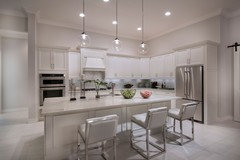
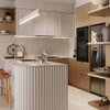
    Finally I don't understand why your ceiling lights are so glaring at the ceiling. I wonder if your light bulbs extend below the edge of the ceiling. See kitchen ceiling below.


  • 7 years ago
    about what other color - what colors have you liked in your home already?
  • PRO
    7 years ago
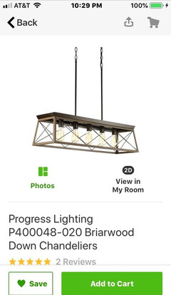
    Agree with Beverly and remove table cloth. That is a hazard with a banquet and sliding into seats. The stone is your “art”. I would think hard about hanging more stuff on it. The sconces aren’t the proper scale. Paint the door trim. Consider a nice chandelier over the table and that’s all you need.
  • PRO
    7 years ago
    Possible fixture
  • 7 years ago
    Marina, can u remove the tablecloth, placemats and pillows and take a pic? I agree that light blue would be a good color to introduce into the room.
  • 7 years ago

    I'm sorry that I don't have a suggestion for mounting the light fixtures, but ... where did you get that banquette seating? Is it the one at Crate and Barrel? I have been looking for something like this (graceful legs, comfortable and inviting look). Yours looks perfect.

  • 7 years ago

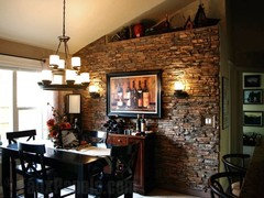
    I like how in this setup they played with light, making the wall pop:


    Also, I think clothes in warm white (very light beige) would open up the space a bit.


  • PRO
    7 years ago

    I agree about light table cloth


  • 7 years ago
    Quick update, so removed the scone, tablecloth and placements. Will have to work with electrician to see if we can replace the spotlight and place a chandelier. That thought has crossed my mind, but you guys solidified it. Will probably buy and try some wall art to see how it looks in this space. Really like idea of painting the white and lowering the side paintings, so that will be next step :) thank you All!
  • PRO
    7 years ago
    Marina-that already looks so much mote chic and calmer. In looking for art, find something you love but it needs to be fairly quiet in appearance to enhance the dining experience.
  • PRO
    7 years ago
    *more
  • 7 years ago

    Marina - that's already a great difference just taking the tablecloth off. You have a lot of fabric with the stools and banquette, which is usually the opposite of what I see. I feel like you need another "hard" texture (even though the wall provides a lot of texture already) and love the idea of a wrought iron or metal chandelier above the table. The fabric also provides so much softness that I kind of feel like the rug isn't necessary as well.

  • 7 years ago
    Thank you! Will
    Keep trying :)