Software
Houzz Logo Print
nicole_elizabeth13

8 Gallons later... Where do I go from here? Incorrect color match...

7 years ago
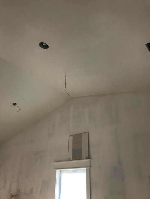
Help! Help! Help! Let me first say that I've learned so much from Houzz forums. But I officially need help!


After spending countless hours and many nights dreaming of paint samples, I finally decided to paint the interior (ceiling, trim and walls) of our raised (not so beach) bungalow Alabaster. It was down to the wire, Alabaster or Snowbound. But in some lighting, Snowbound lacked any luster...


My plan is to add coordinating color walls as we live in this home. At this point, this build has taken us almost 2 years bc we are doing everything ourselves, literally. We had plans to add beams and other fun stuff but having a baby along the way changes plans. So I am trying to paint keeping in mind that beams will happen eventually


So the dilemma... my lovely father-in-law so kindly decided that we should save $10/gallon to purchase PPG paints. He broke a corner off my sample sheetrock and came back with 10 gallons. Now, did I mention I have a baby. That means I wasn't there when they applied the first coat. I don't have anything against PPG. The 8 gallons of paint on my wall is not Alabaster.


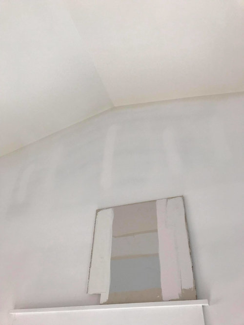
The color is more like SW Creamy. But it's flat and on the ceiling. Will it look totally different on the wall? I was going for a warmer minimalist beach vibe. My walls, trim and ceilings all painted the same color in different sheens. Pale Blue interior doors, Pure White Kitchen Cabinets(because we can only afford a Chinese factory painted cab-no custom) and Fantasy Brown countertops. Cherry bellawood floors throughout.


Maybe I just need some convincing?


This s

be too bad, but we might have to go down a grade in the countertops and have yet to explore those options.


What white to choose from here. What to do... what to do...


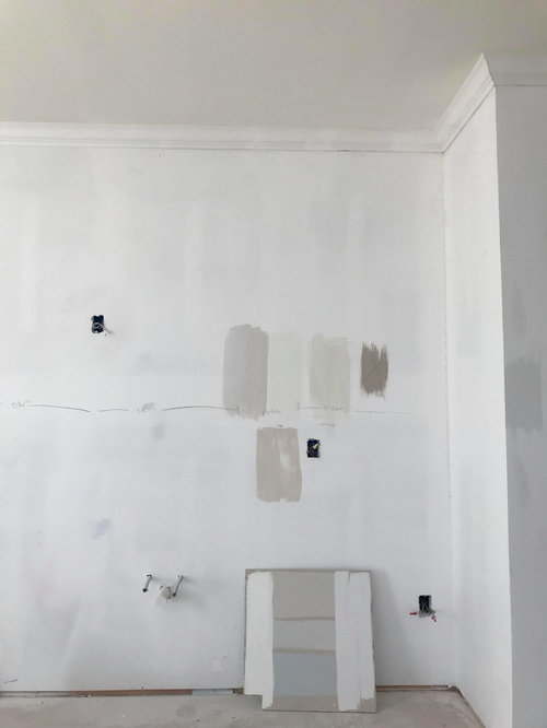
Here are my pics, the ceilings are painted the Alabaster Wanna BE, walls are primed, the sheet rock board shows SW Alabaster on the left, Snowbound on the right, modern gray in the middle, crushed ice and i think the blue is passive.


Modern Gray was my other option for the main living area and hall... But will it look ok with this ceiling paint?


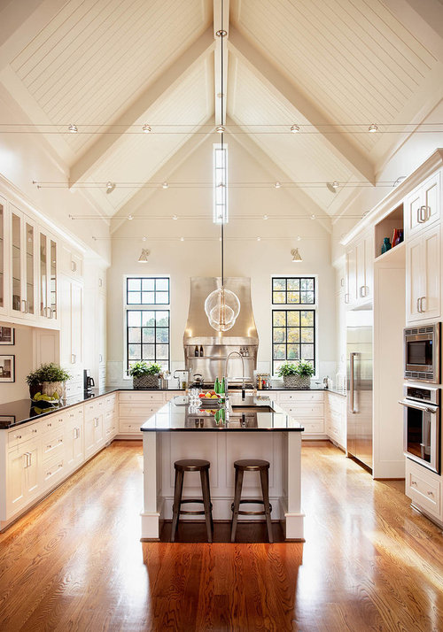
Here is an inspiration photo found on here. I don't know how to link it but the photo belongs to
Rufty Custom Built Homes and Remodeling.


Comments (33)

  • 7 years ago

    I don't have a ton of advice but do think that all of your swatches look nice together and I really feel for you and the disappointment. Can you consider the color you don't like as an extra coat of primer and just paint over it with what you do like?


    I really understand wanting warm white. I love your inspiration pic, but there may be a lot of differences in your light sources and flooring that would make it so you just won't achieve the same look as your inspiration.

  • PRO
    7 years ago

    First of all, with your current "non-lighting" situation it is darn near impossible to see any color with accuracy. I would take the paint you have, and use it as a "primer" and get a good coat of paint on the walls because they look like they need it to get any true color. You were on the right tract because SW Alabaster and SW Snowbound are good warm whites. Snowbound has less chroma so it will be brighter but still in the Yellow/Red Hue family. They are close in LRV so light reflective qualities is about the same. Either one should look, bright and white especially when you get your lighting installed. I would order sample of each of those from samplize.com because those are true color samples 12x12" squares and you can move them around and see what you think. That is less expensive method than your current methods! So sorry. Whites are hard enough without getting bad "matches". Good luck.

  • 7 years ago
    last modified: 7 years ago

    It may not be as bad as you think. Paint looks really really different on ceilings than walls.

    Do you have a gallon of true SW Alabaster? If so, paint a little on an easy to reach corner. It may not be as different as you think. Of course, if it is different then you need to paint it over with your PPG match.

    Also, even if it does match, you may still not like that color. But your ceiling is never going to look bright white with no lighting. Who knows, maybe your inspiration photo was photoshopped or color corrected or HDR. I’d move forward and paint the rest of the house and see if it still bugs you before you go painting all the ceilings again!

    Btw, the correct way to match paint between manufacturers is to just ask rather than have them try to match it by hand from a sample. Just ask PPG to make SW alabaster if thats what you want. They all have them all stored in their computer already matched.

  • PRO
    7 years ago
    last modified: 7 years ago

    Relax. You're looking at the Alabaster wanna-be next to primed walls. If it was color-matched to your sample board of the actual paint, it's probably fine.Primer has a very blue undertone, and distorts the way you are seeing the color.

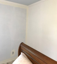
    Here's a good photo to illustrate how primer effects how a color is perceived. The paint is BM White Dove (very similar to SW Alabaster). The wall on the right has had one coat rolled on, the wall on the left is the initial cut-in on top of primed walls. It is the exact same paint, but the primer makes the paint on the left look almost butter yellow.

    Also, be aware that different sheens will also make the paint look slightly different, even when it's the exact same color.

  • 7 years ago

    I agree with above. Use the existing paint as a first coat. If you still don't like it, switch it out for the real Alabaster on the sly. From the numerous articles I have read, color matching between brands is not going to give you the exact color you want.

  • 7 years ago

    FWIW, I think that your sample board paint looks very, very close to the color in your inspiration photo. As others have said, you can't judge the color when it is propped up next to primed only walls.


    I had a BM color-matched in PPG paint and it was dead-on. BM Cloud White, IIRC.

  • 7 years ago

    I am no pro but I'm thinking it's the reflection. I am betting once it's all painted it will be a good match and beautiful!

  • 7 years ago

    Thank you everyone!


    We stopped all painting. My husband and Father in law hate the color. My FIL is stuck in 1980 and wants to paint the entire house beige.


    They are exchanging the rest of the paint at HD another color. We decided to choose a PPG color . The clerk was nice enough to give me a deck for Glidden/PPG. Unfortunately, the only colors I can find any designer info on the interwebz are not in the deck!


    So I found encycolorpedia.com. The colors I am looking for are not in the deck. SW Snowbound is an exact match to Behr 780A-1 Sweet Vanilla and close to Glidden Almond Roca (not in deck). Wedding White is close enough to SW Greek Villa. Which is a serious contended. The other option is Minimalist white and/or Raindrop white.--- WHOA totally different.


    I should state that the entire basis for this is that I am turned off by bright white trim. But I was reading that with Cherry floors a tinted blue-green white should be used.


    Any advise moving forward?


    I was thinking about just doing the ceilings in Pure White throughout the house and choose an off white for the larger room with vaulted ceilings. The ceilings are only 9-14ft.

  • 7 years ago

    You are making it far more difficult than it needs to be, pick a color and paint.

  • 7 years ago

    Did you find out what the paint color in the photo is? I would guess a creamy white would look better with Cherry floors than Snowbound.

  • 7 years ago

    You might want to take a look at BM White Heron.

  • PRO
    7 years ago

    I can look up those colors from Behr and see what true matches are. If you want your ceilings to feel and look higher, use same color on walls and ceiling. Cool white trim is fine. bbl with color news!

    Nicole Elizabeth thanked Flo Mangan
  • PRO
    7 years ago

    OMG I don't know where these colors are from but many aren't even in my website that has thousands of colors. They range from very dark, saturated colors like Sweet Vanilla, is a dark peach color??? Glidden/Behr Almond Roca - LRV of 32 - very dark and nonreflective. Glidden/Wedding White (match for BM White Dove) LRV 82 in the Yellow Hue family but in the cool segment. Will be slightly creamy especially against blue/white trim. SO-what color are you looking for and I can help. An off white? The safest off white in most light is BM OC 117 Simply White. Another off white that people liked is BM OC-65 Chantilly Lace. Remember, you CANNOT PERFECTLY MATCH PAINTS one brand to another for many reasons. Get the true brand. If you only have Behr to choose from, I can make some recommendations. Did you see these color chips? Maybe I don't have the right names?? But I wouldn't do any of those colors if you want an off white.

    Nicole Elizabeth thanked Flo Mangan
  • 7 years ago

    @Flo -


    What am I trying to achieve... To live in peace with my ornery FIL and opinion-lacking husband. He seems to chime in only when he doesn't like something. FIL is stuck in 1978... They painted the outside of my house Beach Flower. So I would like the calm, natural and airy. DH wants to feel inspired (whatever that means to him). I was hoping to achieve that with whites, but they end up looking yellow.


    HGTV Dream Home 2018 is Snowbound/Olympus white/Passive combo. I'd like to head in that direction. Cool coastal cottage feel. FIL is worried that Snowbound will be boring and dingy on ceilings and trim. He keeps reminding me that we do not have as many windows as HGTV 2018 DH. I've painted samples and he was agreeable but last minute my DH switched to Alabaster. I was originally doing Modern Gray on walls with Snowbound ceiling and trim.


    The house is north facing with the main living space facing west. In the main room there is only 1 window north and one window west(the window under the peak in the above photos). There are however windows and sliding glass doors along the southern wall. I'm beginning to realize that there is a drastic change in the


    One day we plan to put a beam straight down the center of the room but I do not ever want to paint the ceiling again! I'm going to check out Simply White and a blue undertoned white for the ceilings maybe Raindrop(Glidden).

  • 7 years ago

    Pick a color and dare FIL to say anything. Obviously you don't agree with his choices. Don't waffle. Tell him this is what you want. He's going to grumble. It's not his house. Stand your ground. Your problem isn't that you can't find the right color. Your problem is you won't tell DH and FIL what you want. Quit asking their advice. Tell them this is your decision. They will get over it.

    I learned from one of my painters to prime with whatever color I selected. On one house I wanted a creamy vanilla ice cream color. What I selected was butter. Thank goodness the painter tinted first. Otherwise, I would have been stuck with a stick of butter. Tinting the primer will save the day every time.

    Good advice to only buy paint from the source. If it's a BM color, go to the BM store. If it's a Behr color, go to Home Depot. I use Sherwin Williams, they are the closest store to my home. I use Creamy to achieve a warm white. For walls, I like Creamy in a egg shell. For trim, I like Creamy in a semi-gloss. When you select your color, don't paint the samples so close together. Spread them out a little and put them on more than one wall.

  • PRO
    7 years ago

    Painting samples on the wall is the worst way to test colors. Don't do that any more. You are not going to achieve the light, beachy color you want with your lighting and high ceilings, but you can get close by doing a good layered lighting plan once you get the walls painted. BM OC-117 Simply White has a LRV of 90, so it is going to be very light reflective. Don't confuse this color with other paints with similar names. Go by the BM OC-117 to be sure. Names get in the way when selecting colors. This is going to present itself in your space in a nice white with slightly warm look. You have to redo the ceiling in the same color to get the proper effect. Get a sample from samplize.com or from BM store. Most "sample" paints have a "satin" finish so they will look slightly different from a "flat" finish so keep that in mind. I wouldn't buy a ton more colors. You will just confuse yourself and I also would move forward with determination and stay strong with "the boys"! Most men are at least somewhat color blind, so they aren't good color arbitrators. lol

  • 7 years ago

    Not sure whether others have this experience; whenever I have painted ceilings the same color as the walls, the ceilings looked darker. Darker ceilings was not something I was used to, and definitely not the look I was going for. You may have to do ceilings a touch lighter than walls in order to get them to look the "same" color as the walls--if that is what you are going for. And, as others have wisely stated, lighting will be everything.

  • PRO
    7 years ago

    Hit and miss never works out well, especially for homeowners. At the very least, have a cabinet door, a piece of countertop (final choice only), flooring sample of final choice, trim paint color, any tile (final selections), appliances color sample, everything! Then start looking again at samples. Re-painting is expensive and time consuming. Do it right the first time. This prep makes paint color choice easy. Look at all this including paint samples painted (multi coats) on large drywall pieces. Look at all of these in morning, noon, late afternoon and night lighting, (sunlight ,(florescent if using), lamp light, daylight. This is not hard, but only way to see end result...in advance. P.S. My personal opinion is for everyone to just get over the all white trend. Just because a home is not a multi-million dollar estate, does not mean it cannot have "real" style. Open some magazines such as Arch. Digest, House Beautiful, Traditional Home, Veranda. Your home is just as special.

  • 7 years ago

    Sorry to cut-in (pun intended)...I’m about to paint the interior of my house and the company said 1-Coat is enough with Aura. We’re going with chantillís lace for trim (in satin) and pale oak ok walls in matte. The current wall colors aren’t very dark, but they’re not white. Thoughts on whether I should trust this recommendation? I’ve never used Aura before. Thanks!

  • 7 years ago

    I saw your post and immediately saw what had happened to me. I had painted the whole house Alabaster. Lovely color. Nice white with a hint of yellow in it that went with our golden hardwood floor. I was painting the office last. I thought it would look like the rest of the house, mostly south-facing. No it looked just like your photo you posted. That room is Noth facing which casts a blue gray color temperature. Your North facing rooms will need appropriate lighting to get the color you want. Just wanted to share.

  • 7 years ago

    Simply White has a high LRV and is a beautiful warm white. It looks white unless you put a pure white next to it.

  • PRO
    7 years ago
    Stephen in answer to your question, you can do it with one coat but if you want full color I always do two coats. I can do color analysis for you tomorrow but I am familiar with both colors and I think it is a good combo. I just want to verify that. Bbtomorrow
  • 7 years ago

    Thanks. What’s a color analysis?

  • 7 years ago
    last modified: 7 years ago

    I am never satisfied with only one coat of paint. IMO, it takes the second coat to add 'depth/ saturation' to the color. And I have tried to get by with one coat...one coat always ends up looking anemic. Kinda' like the difference in color between skim milk and whole milk IYKWIM??

  • PRO
    7 years ago

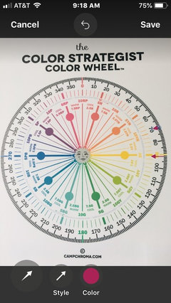
    @Stephen C - Here is my Paint Analysis of the two colors you are contemplating using and why they work. First just from this visual (and no color is accurate on a 2D form like the Internet, but gives you information) you can see that the two colors are far enough apart that provide enough difference to look good. Second, you can see that the LRV (Light Reflective Value) is substantially different, which is the difference in amount of light reflected by any color. CL has an LRV of 93 which on a scale of 0-100 shows it reflects a good amount of light. PO has an LRV of 70 so you can see it reflects substantially less by 25%. The next factor to analyze is the Hue Angle. The Hue Angle is the position on the Color Strategist Color Wheel that gives us information on what main color is this particular paint color. In this case, CL is 109.1 which is in the Yellow Hue family on it's way to Green/Yellow and in the "cool" segment of the Hue Angle. this means that this off white will appear to the eye as pretty cool. The PO Hue Angle is 91.6 so it is solidly in the Center of the Yellow Hue Family but just into the Cool segment. When colors are in the same Hue Family they generally work fine together. Much depends on your natural and artificial light in your space, but overall these should work well.


  • PRO
    7 years ago

    Here is Color Strategist Color Wheel with red arrows pointing to the Hue Angle on the color wheel of each of these colors.


  • PRO
    7 years ago

    In addition, if that wasn't enough! You can see the C in the notation on the color analysis shows the Chroma amounts. We like at least .20 difference in two colors so one doesn't make the other look muddy or weird in any way. In this case, there is a lot of Chroma difference so there will be contrast evident to the eye's perception. And last, the L which means the "Lightness" perceived by the eye. You can see the 97.5 for CL is much lighter than the PO at 87.1. So this is a "Color Analysis". Paint chips by themselves and even paint sample boards only scratch the surface of what a color is all about. Thanks for the question!

  • 7 years ago

    Thank you too all for the advise! An update, we painted the ceilings SW Pure White flat and my husband has taken it upon himself to paint the trim SW Pure White semi. I have alot of Southern Exposure light. I'd love to paint the entire room SW Pure White and be done. But we did not lighten the ceiling paint. Would I still be able to so the walls in Pure white also? I'm totally non committal to whites since the Alabaster incident.


    Flo- Chantilly Lace looked too stark in my space. It might also be that the Alabaster imposter was still on the ceiling. Simply White was just stunning, but I only painted a small sample board and have not been in the rooms since the ceiling was repainted. Sight unseen should I just bite the bullet and go for Simply white?


    It feels like the easy thing to do here is to either choose one SW Crushed Ice but thats not the white look I was hoping for. The countertops my husband is so dad set on is Fantasy Brown and we found a Blue Fantasy slab we still swooning over. Going cool with Cherry floors??


  • 7 years ago

    Absolutely to the SW Pure White on the walls, too. If you used flat on the ceilings and semi-gloss on the trim, use eggshell on the walls. The change in gloss will change how the light hits the surface. It's a very subtle, but sophisticated way of decorating. If you have uneven trim, like a historic home typically does, this is a great way to hide the imperfections. It will be a neutral palate.


  • 7 years ago

    OMG!

    Re:Painting samples on the wall is the worst way to test colors.


    Whats a better way...holding up those swatches? My experience is we try a sample and if we like it we go with it. Does it always come out the way we envisioned. Hell no but usually we are happy with it. If not we try again--that only happened once!

  • 7 years ago
    last modified: 7 years ago

    A better way is to paint samples on primed sheet rock project boards or at least white poster board or get those extra large swatches. Of course I am guilty of liking a color, painting it on a wall and being horrified at the results. I've done this several times with paint I have used in another room with a different exposure.