

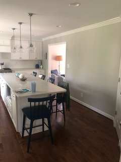
Art too small for wall?
7 years ago
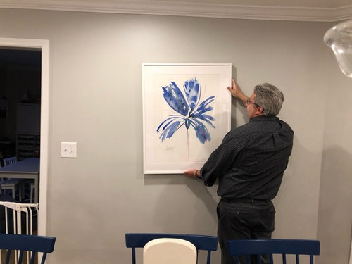
Yes, too small, find a different wall
Not too small, it works
Featured Answer
Sort by:Oldest
Comments (17)
 7 years ago
 7 years ago
Related Professionals
Dalton Interior Designers & Decorators · Fall River Kitchen & Bathroom Designers · Winona Kitchen & Bathroom Designers · Bakersfield Kitchen & Bathroom Designers · Yuba City Kitchen & Bathroom Designers · Amarillo Kitchen & Bathroom Designers · Galveston Kitchen Remodelers · Brooklyn Kitchen Remodelers · Dayton Custom Countertops · Potsdam Interior Designers & Decorators · Daytona Beach Kitchen & Bathroom Designers · Elk City Kitchen & Bathroom Designers · Toms River Furniture & Accessories · Farmington Furniture & Accessories · Bozeman Furniture & Accessories- 7 years ago
 7 years ago
 7 years ago
 7 years ago
 7 years ago
- 7 years agolast modified: 7 years ago
- 7 years agolast modified: 7 years ago
- 7 years ago
- 7 years agolast modified: 7 years ago
- PRO7 years agolast modified: 7 years ago
 7 years ago
 PRO7 years ago
- 7 years ago
- 7 years agolast modified: 7 years ago
Related Stories

SMALL HOMESMy Houzz: Walls of Art and Glass in a Brooklyn Loft
Eclectic collections, vintage furniture and favorite artworks personalize this 1,000-square-foot open-plan loft
Full Story
LANDSCAPE DESIGNThe Art of the Espalier
Go ahead, let limited garden space drive you up the walls. With these 6 ways to train plants vertically, it can be a beautiful thing
Full Story
DECORATING GUIDESCasual Wall Art Arrangements Show Deliberate Style
No time or desire to carefully plot a wall-art arrangement? Grab a hammer and throw tradition to the wind
Full Story
HOUZZ TOURSMy Houzz: Street Finds and Art in Amsterdam
Salvaged furniture and ever-changing contemporary art take a Netherlands rental from bleak to neat
Full Story
BEFORE AND AFTERSHouzz TV: See Recycled Walls and Cool Cassette Art in a Woodsy DIY Home
Walnut countertops join hardwood floors and pieces made from leftover framing in a bright Spanish colonial
Full Story
WALL TREATMENTSThe Best Chalkboard Wall Art on Houzz
Who knew Houzzers could be so artistic with a little chalk? We did
Full Story
ACCESSORIES3D Wall Art for Your Home
Add interesting dimension and texture to your walls with collected artwork
Full Story
ARCHITECTUREArchitecture and the Art of the Wall
See how common building materials can become uncommonly beautiful displays of color, pattern, texture and light
Full Story
ROOTS OF STYLEArt Deco, Art Nouveau, Arts and Crafts: What’s the Difference?
If the zigzag and swirly designs of the past leave your head spinning, these descriptions will straighten you right out
Full Story

Olychick