Software
Houzz Logo Print
acierno1

Orange, keep or something else.

7 years ago
last modified: 7 years ago
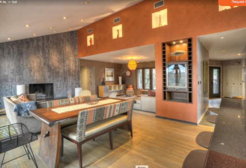
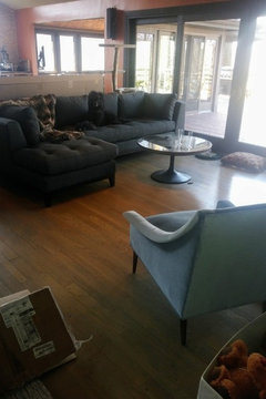
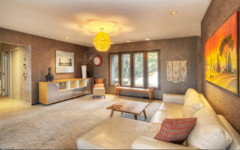
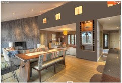
We just purchased this house from an artist. I have a love/hate relationship with the orange. I dislike it all day until the sun starts to set and then the room comes alive. Same issue with the dining room with a funny grey and brown textured wall paper. (they used the dining room as a sitting room) I do love the grey fireplace paint and plan on keeping it. If this was your house, what paint colors would you choose or would you keep the orange? The photo with the blue chair are the furniture pieces I chose light blue chairs, grey sofa.


Comments (33)

  • 7 years ago
    Your photo with a blue chair didn’t upload. The two photos I see show modern furniture selected specifically for this house and these colors. You may change paint colors and bring your preferred furniture, but a house like this almost demands to be in charge. It has a very strong personality. I love orange, but I like my home to please me during the morning, afternoon and evening.
    If you don’t like the daytime tone of this orange, you either need to get past that or change the color.
    acierno1 thanked felizlady
  • PRO
    7 years ago

    I had that exact color in a 1976 apartment and loved it : ) If You don't? Change it. It's lovely as the owner used it with complementary accents. Do as you LIKE . For you. ......and your furnishings.

    acierno1 thanked JAN MOYER
  • 7 years ago

    Prime the orange walls with two or more coats of white primer. Then you'll have a clean slate. The orange will reflect onto any new paint samples.

    If your new color palette has gray and blue, you can look for a fabric that incorporates those colors to use as a guide for paint. The accent colors could be vivid red, deep pink, yellow, or green. Many choices.

    acierno1 thanked apple_pie_order
  • 7 years ago


    There are the furniture pieces the Interior Designer picked out.

  • 7 years ago

    I can't see the wallpaper. Is that on the wall opposite the fireplace? (Or do you mean that room further back? Maybe post a pic so we can see it more clearly) Is this your furniture or theirs? If it's theirs, can you post a pic as it is now, even even if empty?


    I personally love the views out the windows and would emphasize that by repainting that wall to match the ceiling, so the orange doesn't compete with the views. How long have you lived in the house? I wonder if it makes sense to live with it a little and see how it grabs you. (can you hold off making furniture purchase for awhile?) If you've already lived with it for a while and don't love-love it, I'd say repaint it. (again, I'd probably repaint to match the ceiling. It's already getting a lot of attention). If it were me, I'd probably always think of that wall as "that's the orange the artist picked out." The could be a pro or con, depending on how you feel about the orange.

    acierno1 thanked girl_wonder
  • 7 years ago

    Personally not a fan, sorry.

    Myself?

    I'd paint a sage green.

    acierno1 thanked Janie Gibbs-BRING SOPHIE BACK
  • 7 years ago
    I am not a fan of orange... however, I think it really suits this space! It’s got a cool, retro vibe. I would see if it grows on you. You will know with each passing day if it’s a colour you can live with or not.
  • 7 years ago

    Have you picked out a rug?

  • PRO
    7 years ago
    last modified: 7 years ago
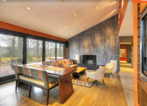
    Where IS your designer on the topic of the room as a WHOLE. Her "job" is to do more than advise sofa , chairs and a cocktail table. It is to unify your room/home to include wall color, rugs, furnishings, accessories, art........new and old...... and blend them seamlessly into a pre - arranged look and feel that suits YOU and your resources. A designer is all about you, and not about an online community , in the best scenario. It is not just a shopping expedition either. ...one of filling walls and space.

    In a perfect world? You're not asking US, at all.. : )

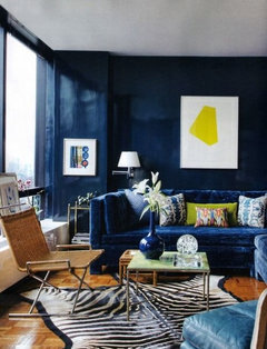
    Thus far, you've charcoal and a mid blue. Try an inky navy on the walls! Or try a fabulous rug that brings the orange tone in! You have a benign beginning........Indigo is a widely accepting color.


    Tudor glam redux · More Info


  • 7 years ago

    I don't think the orange suits you. Good idea to prime it with white for a clean slate. Pick paint after you get your rug. Paint should be one of the last decisions.

  • 7 years ago
    last modified: 7 years ago

    Thank you @girl_wonder. You really seem to see what I am seeing too. I went to SW to speak with a color consultant (who is coming out on Monday) and she said it will be too much white. That the white will stop the eye at the wall and will not blend the outdoors with the indoors.. She likes the orange, as do two of the ID's at Arhaus. They say it highlights all the green moss and trees. That it blends the outdoors with the indoors. But as I add more color details like opaque green blue glass on the coffee table and put down an antique rug I kind of like it more and more. The rug has every color imaginable except purple and orange. :) This is the dining room. I am now wondering if that is the problem... the wall paper. Maybe that is what needs to change. There is so much going on in this open space. We have light silver paint int he hallways, wall paper, orange walls and a blue grey wall. To me, there is no flow. But to others in the design world there is continuity.


  • 7 years ago
    last modified: 7 years ago

    Jan Moyer, the ID was a consultant from the furniture store. All advice given to me is not by contract. I am a white walls kind of person ,so just like trying new cuisine or listening to new music or hearing a divergent view, it is nice to explore new things to learn something new.. Hence, the question here on a forum entitled "design dilemma" Thank you. Your designs are beautiful.

  • 7 years ago

    Not sure I have much advice. Just wanted to say that fireplace wall is gorgeous. It'll give you a lot of flexibility should you wish to change the orange. Gorgeous home with gorgeous views. Enjoy!

    acierno1 thanked tartanmeup
  • 7 years ago

    Orange is one of my fav colors, but for some reason don’t love it here.. it’s a bit too much for me maybe... I read above that you were adviced against white and perhaps they’re right, especially if they’ve seen the space.. but there are many beautiful velvety off-whites that I think might work here as a neutral. Then add your favorite colors in art and accessories. Oh and I do love that gray fireplace wall! Post pictures when your done!! Best of luck!

    acierno1 thanked Jennifer Svensson
  • 7 years ago

    Actually, yes, after seeing the case goods you've chosen, I do have a suggestion for your orange walls. Have you thought of gold? Could be an interesting counterpoint to the gray and would look fabulous with blue upholstery. Good move on your part to get a colour consultant on site. She'll have a much better feel for the space than we ever could looking at our screens. Good luck and keep us posted. :)

    acierno1 thanked tartanmeup
  • PRO
    7 years ago
    last modified: 7 years ago

    Okay, the "designer" is a furniture consultant!! Try to avoid the "I got everything at Arhaus" result, because that is her purpose on behalf of the store. She works for THEM, and far less for you. So. Let a color consultant help you sort out what you may love. Be willing to strip wallpaper.

    But I stand as I said earlier. Too many ideas can be confusing. There is nothing wrong with a white envelope either, but a very worthwhile read below

    https://www.houzz.com/magazine/what-to-know-before-you-paint-your-walls-white-stsetivw-vs~42332464

    acierno1 thanked JAN MOYER
  • 7 years ago

    I also like orange, but not in your room with your furniture. I would paint the orange so the warmth comes from the floors and other wood in your furniture. Since your furniture is grey and blue, stick to tones of gray, blue, or white for your other walls so the house has continuity. I could see a deep navy or greyed white to replace the orange, which would give you very different looks. Then you can add pops of color in the rooms with accessories and artwork. I don't like the wallpaper in the dining room with the textured floors - it is too similar.

    Trust your own judgement on what you like. Different designers will have varying degrees of expertise, and also different opinions. Sometimes there is not a right or wrong - just personal taste.

    acierno1 thanked calidesign
  • 7 years ago
    last modified: 7 years ago

    tartanmeup, Interesting that you mentioned the gold. A neighbor told me that the previous owner had gold walls and it looked great. The food network did the interior design as a cooking show was taped here... so I assume their design team knew a thing or two. I will pass that by the color consultant. The house also has beautiful grey and blue stone flooring that is original from the 60's. I imagine a warmer white or gold will really make those pop. I will post a follow up with the recommendation from the color consultant and a picture when transformed. thank you everyone for your help - you helped greatly. Now I am armed with some questions for her.

  • 7 years ago

    On my screen this comes across as a very strong pumpkin orange.

    For me, the pumpkin orange with the black window trim looking at the beautiful and serene nature, it's quite jarring.

    acierno1 thanked Janie Gibbs-BRING SOPHIE BACK
  • 7 years ago

    I love it! Beautiful house ....

  • 7 years ago
    last modified: 7 years ago


    Hello everyone. Met with SW color consultant and this is what she chose.

    Gold makes an appearance, thank you for those who suggested it, and it will go in the hallway leading to the kitchen. The rest, the main area, the orange will be replaced with "only natural" and cubby holes in the living room will have saucy gold back panels or the seal color. The seal color is going to be the baseboard color the hallway. The dining room will be software.. which should be really nice as the gold will be seen from the second entrance way from the hallway. Software is a mid tone taken from the fireplace. For some reason my camera makes software look blue and saucy gold look orange. The blue is a grey with blue tones and saucy gold, gold. I will post updates when complete. The color consultant is coming over too - she is very excited to see everything complete.


  • 7 years ago

    This looks really good on my monitor! Glad you were able to find a palette that pleases you in your new space. I'm sure it will come together beautifully and look forward to "done" pictures. Good luck!

    acierno1 thanked tartanmeup
  • 7 years ago

    Can't wait to see the after pictures!

  • PRO
    7 years ago
    last modified: 7 years ago

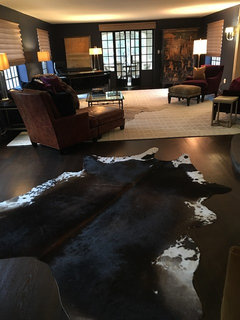
    Will this work?

    I like either the orange or a gray. Not crazy about your dark furniture or the blue.

  • PRO
    7 years ago

    Great Job. Move me in.: )

  • 7 years ago

    I love orange, but I don’t have any orange furniture. If your existing furniture will be used in this house, does it work with the orange? If not, paint out the orange with a color which actually goes well with your furniture.

  • 7 years ago

    Bev, that is a bit too dark with the color you chose.. The sherwin williams color consultant chose the colors, if you scroll up you will see them. The colors chosen work to blend the outdoors in through the floor to ceiling windows.

  • 7 years ago

    Janie, neither can I. We have been working on some critical projects on the outside of the house but the painters will be working on the inside of the house next. Furniture arrives in 3 weeks so it will be done before then. I promise to post. :)

  • 7 years ago
    last modified: 7 years ago


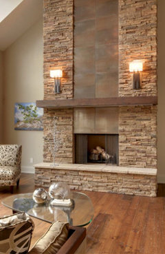
    Guys, there has been a change of plans. :). An interior designer (who I should have spoken to in the first place!) said the colors in the pallet were "horrid". :). So... I am swapping out my furniture that no one here like anyway. LOL. Going lighter. Going more organic, which I wanted to start anyway. Not sure how I ended down this road. We are revamping the fireplace and choosing this very nice, sooooothing paint color. Ahhhh. And the harsh sectional will be swapped out with a sofa and blue chairs swapped out as well. Keeping the mirrored table though as I love it and it flows with other pieces I have in dining area. Doing grasscloth wall paper in the dining area though. I think it will add more warmth. Finished results maybe in two months. Thank you everyone for your feedback. Even though I did not always like hearing some of the harsh criticism, those ended up being the most helpful. :)

  • 7 years ago

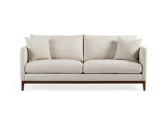
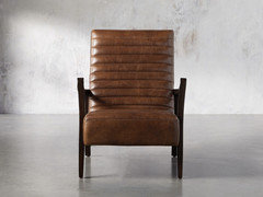
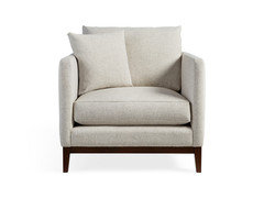
    New furniture for those that hated what was picked out for me. (I ended up not liking it either even though I gave it a go).


  • 7 years ago

    following