Software
Houzz Logo Print
jlipiec

help with window proportions?

7 years ago
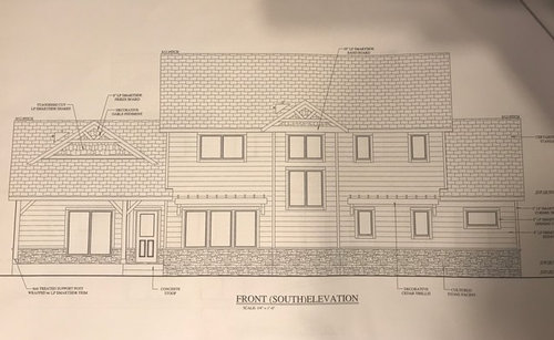
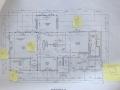
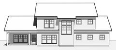
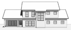
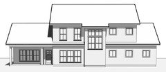
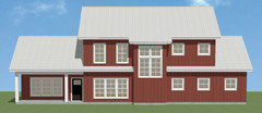
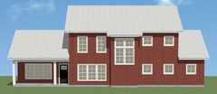
I feel like the window proportions are off on the plans we received back on our custom home build. The house should be based off a classic New England colonial farmhouse. The center is a stairwell, the room with the porch on the left is a vaulted family room (and the dormer should have a window.)

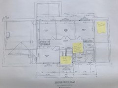
The 3 windows on the first floor left side is the dining room and size 3x5 each. The windows on the right are only 2x3.5. Should all the windows be 3x5? Problem may be the right side is the laundry room with a counter. I think the upstairs left should be two windows as well (it’s a bedroom).

The size of the 2 story section is 14 ft each side of the 9 ft wide stairwell

Thank you for any advice!!

Comments (37)

  • 7 years ago

    I'm guessing you worked with a draftsman to create this plan?

    I'm sorry but the whole front facade is not cohesive and I don't think it's only the windows.

    The brick is too high up on the wall. Brick should only go to the height of the first floor.

    What is with the craftsman type of gables when nothing else on the house says craftsman.

    The windows look like windows for a contemporary house and not a classic NE farmhouse. Not at all.

    The molding around the windows is also all wrong.

    Honestly, I hope your interior is better than this exterior but I fear it may not be considering this is your south elevation and the windows don't reflect that in terms of letting light in and

  • 7 years ago

    Cpartist we haven’t discussed exterior finishes yet, these drawings are not what we are planning. I was asking about the window proportions. We plan on making the windows larger just not sure what sizes

  • PRO
    7 years ago

    we haven’t discussed exterior finishes yet, these drawings are not what we are planning.


    Show what you are planning -- exterior finishes, window styles, floor plans so we see what windows correspond with which rooms, the other 3 elevations etc.


  • PRO
    7 years ago
    last modified: 7 years ago
    It appears the windows are a product of spatial relationships of the rooms inside the structure. Window placement should have been taken into account when the spaces were laid out. Since windows appear in the inside as well as the outside of a house, it is advised to know the interior and exterior when revising window sizes and locations and number.

  • 7 years ago

    These all look to be different sizes; will they all be the same type (eg casement)?

  • 7 years ago

    Is that the front elevation? I am very confused bc when someone says “colonial” my mind goes to “5 over 4 and a door” classic facades with typically a great deal of symmetry and window sizes that have a lot of historical precedent and are thus easy for me to chime in my opinion. I’m not sure what your architect has got going on there but it doesn’t look colonial. Maybe shingle style? Do you have any inspiration pics of what you want it to look like?

  • 7 years ago

    I guess I should not have said colonial as that is confusing everyone. The inspiration I gave our designer was the simplicity of a New England rustic farmhouse or barn style home, the interior layout lent itself to the symmetry of a colonial.

    The exterior finishes will be double hung windows with lites. Probably board and batten or other vertical siding. No stone facade. Definitely barn red, maybe cedar trim. So no, not colonial :)

    I am very happy with the interior layout. I think it now is a matter of curb appeal. I am thinking the single windows need to be larger and closer together, and repeated on the upstairs left. Not sure about the stair well windows.

    The house will be built on a wooded lot facing southeast (road is south) with a beautiful 20 acre view to the north (which is why the laundry/bath are on the south facing side and the great room has windows on 3 sides. Garage is detached.

  • 7 years ago

    I think you need to see your elevations done as you plan to finish the house. That is to say, with double hung windows with lites, vertical siding, no stone, etc. I understand you are just asking about window sizes (I'll say fenestrations), but I think to the eye, these other things will make the windows seem rather different than they do now.

  • 7 years ago

    A couple things also about the windows as drawn. On the group of 3 for the dining room, I think they'd look better if the bottom matched the height of the great room windows.

    Also, the mulled units for BR2 seem to have no space between them (as do all the other shown units) while the dining room windows appear to be slightly separate allowing for siding between the units. Just another discordance you need to sort out.

    Good luck!!

  • PRO
    7 years ago
    last modified: 7 years ago
    The laundry room windows can not be 3x5 due to the counter height. You can't do 5' and raise them above the counter because then the windows will be out of line with the tops of the dining room windows, which would look even worse. You could possibly enlarge the width of the laundry room windows to a 3' width. However, it looks like it will then alter the alignment of the windows to the sink and washer/dryer. If you do enlarge them to 3', I would make sure to add the extra width towards the center of the room, making sure to redesign the arrangement of the interior washer/dryer and sink. Keep in mind you will then need to have the upstairs bathroom windows mirror the sizing of the laundry room windows/placement, which will then muddle their wall placement on the interior.

    Just remember that when you change something on the exterior it alters the interiors. Everything relates to each other and should be accounted for.

    One thing I would do is center the Great Room window on the 15' front elevation.

    Hope that all makes sense! Good luck!

  • PRO
    7 years ago
    last modified: 7 years ago
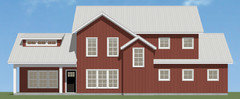
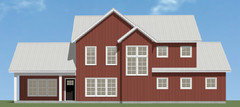
    I'd suggest the plan needs some refinement, but here is an idea with several roof changes and using windows that are either 36x66 or 36x36.


  • 7 years ago
    last modified: 7 years ago
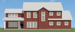
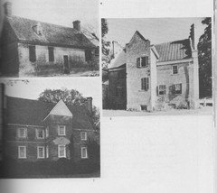
    What you might be able to use for inspiration is the Post Medieval English style brought over from England to the colonies in the mid 17th century. Unfortunately, only the manor examples have survived so it not well known. There's a nice configuration in A Field Guide to American Houses. You may need to make the roof taller. The lower left (7) is the front and the upper right (*) is the back.

    A better known example of the style is the House of Seven Gables in Salem MA. It greatly influenced the Shingle Style which is another possibilty.


  • 7 years ago

    One thing I notice is that the windows in the original image get smaller and smaller as the house grows, from left to right. And there is not rhythm. PPF's sketch the windows do get smaller, too, but they shrink only once, and there is a nice rhythm to them. They are balanced, though not symmetrical.

  • PRO
    7 years ago

    Yep double hung windows instead of the casements where possible.


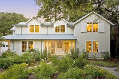
    Or windows that take on better proportions then your casements like these below.


  • 7 years ago

    Cpartist we haven’t discussed exterior finishes yet, these drawings are not what we are planning. I was asking about the window proportions. We plan on making the windows larger just not sure what sizes

    You can't design a house in bits and pieces. Inside, outside and elevations all have to be designed together. Good design doesn't take a piece here, slap it on, and then decide whether or not to add another piece or change a size. It all has to work together as a cohesive whole.

    Additionally, I think your kitchen as designed is a bit dysfunctional. You have no real room to prep. Your kitchen work area is about the same size as your pantry. Do you really need a pantry larger than the kitchen work zone? I think not.

    When we cook, we normally remove food from the fridge and pantry, bring it to the sink to wash, prep next to a nice sized space (a bare minimum of 30" wide) next to the sink and then bring the food to the cooktop/stove to cook it. (I see you have indicated you want an 8' island. That would definitely alleviate the problem of not having prep space on the island.)

    And with the 4 season room, the kitchen will be dark.

    Additionally, every time you come into the mudroom, it means then walking through your laundry room? Is that really how you want to be greeted when YOU enter the house or wouldn't you also want a more enjoyable way to be greeted?

    Coming from the hallway, you walk down the hallway to get to the laundry/mudroom area and what is in front of you? A blank wall.

    Speaking of walking. That's quite a hike from the mudroom and through the kitchen work zone to get to the pantry/fridge to put away groceries.

    Do you really want the powder room door opening across from the dining room and the first thing you see as you come down the stairs? From the dining room anytime the door is open, what your guests will have a view of is the...toilet.

    Also if anyone stays up late downstairs and uses the powder room while one of you is trying to sleep in the master bedroom, you will hear the toilet flushing. Trust me on that one.

    Your foyer is barely large enough for one person to stand in.

    If you're in the NE area, where is the coat closet near the front of the house for guests?

    No linen closet on the first floor? Where will you store your linens and things like toilet items?

    9' is actually pretty narrow for a dining room. Consider 9' is equal to 108". A standard table is 42" wide which brings you down to 66". You need a minimum of 36" on the wall side and that's only if you have a maximum of 2 guests sitting on that long side. Assume when you entertain, your guests closer to the kitchen will be into the hall.

    Any reason the master bedroom wasn't put on the corner so you could get windows and cross breezes on two walls instead of the bathroom having the coveted spot?

    Upstairs you have bedrooms on either side of the media room but nothing to block sound. Normally in good design, something like a closet is used to block sound transmission between bedrooms or bedrooms and other rooms.

    One sink with more storage in kids bathrooms usually works better than 2 sinks with less storage.

    What's the thinking for the door between the sinks and the tub/toilet?

    And do you really want the kids touching a door handle after they've done their business but before they washed their hands?

    I hope where you wrote flip stairs it's because you realized the draftsman drew it wrong because as drawn right now, it's impossible to get up the stairs.

    Again, upstairs the end of the halls have blank walls?

  • PRO
    7 years ago
    last modified: 7 years ago
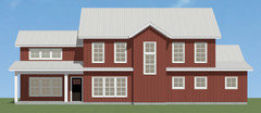
  • 7 years ago

    PPF definitely an improvement.

  • 7 years ago

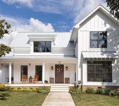
    Thank you PPF for your renderings. The triple window in the porch does look better, I think he was trying to center it under the dormer which isn’t working. I am not a fan of the flat roof though. We want a dormer window in the great room to let in the southern exposure, similar to the white farmhouse posted above. The balance still looks heavy to the left side to me as the windows get smaller to the right, am I wrong?

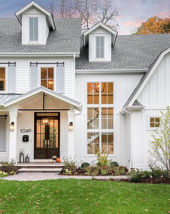
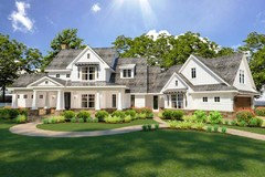
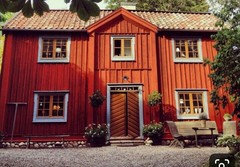
    The following is actually my inspiration house, and what we were planning for the roof line of the 2 story.

  • 7 years ago

    Your house looks NOTHING like your inspiration. And with the way it's designed internally, there is no way to do so.

    If you add a dormer on the left, it will look even more unbalanced. Unfortunately the house does look unbalanced even now, unlike your inspiration which does look like a wonderful updated "colonial".

  • 7 years ago
    <?xml version="1.0" encoding="UTF-8"?><md>Cpartist thank you for your very thorough yet unsolicited advice on my floor plan, which I had stated earlier that I was happy with. I assure you it is very well thought out, was not planned in bits and pieces, and suits my family’s needs perfectly. I am sorry you wasted so much of your time criticizing when you know nothing of my family, our tastes, the land, or budget.

    I apologize for the apparent disgust my post has caused you, but since you don’t have to live here or probably ever see my house, you fortunately don’t have to worry about it.

    And yes, I do need a pantry that size.

    It’s amusing how much criticism comes from people who aren’t footing the bill!!
  • PRO
    7 years ago

    Your inspiration house and your house are rather different in form -- the inspiration house has a pleasing shape.

    You have taken an element of its design and tried to force it upon your plan.

    The standout issue with your house, to me, is the front door. It looks like an afterthought, as if the designer completed their work, then realized there was no entry.


  • 7 years ago

    I know my house can’t look like the inspiration house. That’s why it’s an inspiration not a copy, lol.

  • PRO
    7 years ago

    The balance still looks heavy to the left side to me as the windows get smaller to the right, am I wrong?


    The windows are a reflection of the interior. You have chosen to place utility spaces there (nothing wrong with that) and the windows shown work with those rooms.

  • PRO
    7 years ago
    last modified: 7 years ago
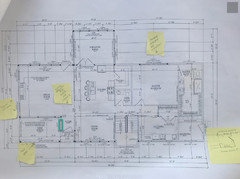
    Swapping bed/bath upstairs.

  • 7 years ago
    last modified: 7 years ago
    I think PPF's last two renderings do the best to help with the window balance, mainly because the window in the stairwell isn't so large.

  • 7 years ago

    Also, any opinion on moving the entry door to the adjacent wall (marked in green)? I realize it's not typical for the entry to not face the front, but it could help with balance.

  • 7 years ago

    PPF's last renderings nail it for your interior. I will admit that my eye is immediately drawn to the "tower" instead of the front door. I think the negative space below the tall narrow window makes it seem like a door or window should be there but isn't. What would really make the exterior fabulous is some stone on the "tower" and some about 1/3-1/2 way up on the porch area.

  • 7 years ago

    I think using PPFs last rendering and thoughtful landscaping at the base of the "tower" and below the laundry/mudroom windows will help tremendously with the curb appeal. It would give it a sense of balance.


    I wouldn't change the position of the front door. Your entrance should be welcoming to guests, not tucked away like you're trying to hide it from visitors.

  • 7 years ago

    Live and learn. Or, build and learn.

  • PRO
    7 years ago

    It appears the windows are a product of spatial relationships of the rooms inside the structure. Window placement should have been taken into account when the spaces were laid out. Since windows appear in the inside as well as the outside of a house, it is advised to know the interior and exterior when revising window sizes and locations and number. Is the extra space between kitchen and the dining for guest's coats to be piled?? There is a lot of room for improvement in the layout design of the house, and it effects the window layout. Fix the layout and it will improve the window composition. The design if a home should be like a poem or a symphony, not a drum set falling down the stairs like this design.

  • 7 years ago

    I agree that PPF's last studies are most successful so far. One last study I might suggest is taking the last options an add back in the gable over bedroom #2. This is a case where the nested gables, though it runs contrary to the internal functions and forms of the house might help recenter the house closer to the front door and help balance out the stair tower.


    Internally, per cpartist's previous note, I would strongly recommend you take another pass at your kitchen layout. There is so much space in that kitchen that could be more efficiently used. That kitchen is 50% bigger than ours, but has nearly half the counter space, not counting the pantry. Having at least an unbroken 4' length of counter for prep work is invaluable if you do a lot of cooking, and I would do your best to get at least that somewhere. I certainly would never give up the 7' of uninterrupted counter space that we have on one side of our kitchen for prepping meals.

  • 7 years ago
    last modified: 7 years ago

    Unfortunately what happens to so many of us is we get design fatigue where we've looked at the plans for so long we are unwilling to make anymore changes. I know that feeling myself. Just ask architectrunnerguy when he made a suggestion to me near the end of my design phase.

    After lots of grumbling on my part, I did listen to his advice. While I didn't use exactly what he had suggested to me, it did spark me to redesign my bathroom/closet layout for a much more efficient and better designed space.

    And of course the more we look at the plan, the more we fall in love with it or become used to it.

    The problem is there is good enough, or it's better than I have now, and not what should be, which is it's the best it can be. Now that doesn't mean perfect and it certainly doesn't mean mistakes won't be made. After all, we're all human. But, it's a heck of a lot cheaper to make changes at this phase of the build than once you start building.

    While not all comments were in relation to the windows, indirectly they are all in relation to how one feels as one enters the house, and how one lives in the house.

    As mentioned over and over, whatever is done on the interior does affect the exterior as you're unfortunately seeing now. It's always your decision whether or not to take the advice but as mentioned over and over, you can't just change a window without it affecting other parts of the house.

  • 7 years ago
    last modified: 7 years ago

    Jenny.....if you can just try to get past some of the gruffness here, many of these suggestions can really help you. I fully understand the blood, sweat, and tears that goes into designing a custom home (been through it myself). Many times after much of the mental and emotional energy has been expended, we become firmly married to the design. It then gets extremely difficult to hear negative comments about our choices (especially ones that are not couched in what we would consider a gracious manner). Try to look past all of that. Read through the comments here and do your best to objectively consider what’s being said.

    I wish I had been here on Houzz when we were in the design phase....I would have definitely made some different choices (although I will admit that I can almost guarantee my initial reaction to the negativity would have been to dig my heels in and fight the suggestions....would have been very difficult to swallow it all and be inundated with a barrage of negative comments...definitely rough). But really, it’s to your benefit to look beyond all that and try to be open to suggestions.

  • PRO
    7 years ago

    Position the kitchen so someone carrying the paper towels from Costco does not have to walk from the garage to the house through the mud room through the laundry room past the master bedroom past the stairs to the basement past the stairs to the second floor past the powder room past the dining room through the kitchen to the pantry where they can be placed on a shelf.

  • 7 years ago

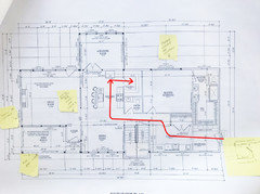
    Here is the path both Mark and I mentioned about bringing groceries in.

  • 7 years ago
    last modified: 7 years ago

    That is a very nice inspiration picture and your eye goes straight to the gable area and the front door. However in your plan your stairs are what the eye is drawn to and not the front door. What makes it hard to make it harmonious is that the stair section is forced due to the design to have an empty space below the windows which throws off the look further. So the first thing you notice when looking at your house is the stair portion. Is that where you want everyone's focus to be?

    Most want the front door to be the focus and not a gable forced to be there due to the stair location which further makes the elevation hard to make harmonious due to a large blank space needed at the bottom.

    I wonder if you'd benefit from making the plan a little larger to bring out the wall in dining, laundry and mudroom even with the stairs and no gable and then do something to improve on drawing the eye to the entry instead. The blank space that is needed where the stairs are could then be camouflaged with tall landscaping where the windows are missing and it would be less noticeable as there is nothing to draw the attention to the area such as a gable or roofline.