

caesarstone color samples for “marble” looks
7 years ago

Sort by:Oldest
Comments (4)
Related Stories
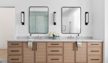
HOUSEKEEPINGHow to Clean Marble Countertops and Tile
Acidic solutions can damage your marble surfaces. Here’s how to keep marble looking clean and amazing
Full Story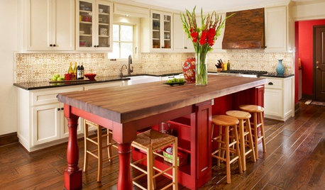
KITCHEN DESIGNSample Bright Color in the Kitchen
Spice up your kitchen with just a dash of bold hues, then you'll know if you're ready for the whole enchilada
Full Story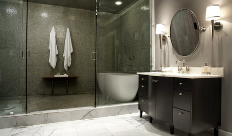
KITCHEN DESIGNUsing White Marble: Hot Debate Over a Classic Beauty
Do you love perfection or patina? Here's how to see if marble's right for you
Full Story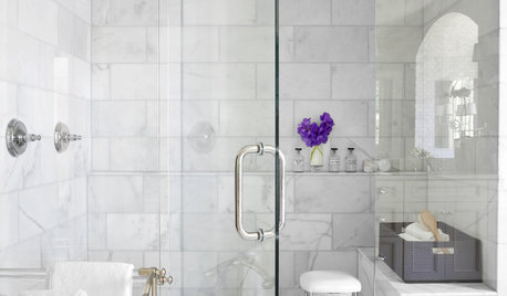
REMODELING GUIDESWhy Marble Might Be Wrong for Your Bathroom
You love its beauty and instant high-quality appeal, but bathroom marble has its drawbacks. Here's what to know before you buy
Full Story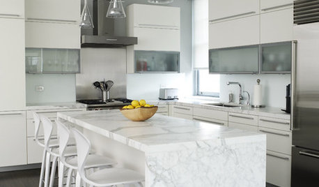
REMODELING GUIDESCarrara vs. Calacatta Marble: What Is the Difference?
The answer is in the color and veining of these popular Italian marbles
Full Story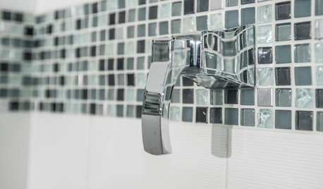
TILE3 Key Steps for Grouting That Looks Its Best
Get your grout right to keep your tile beautiful and for an installation that will last
Full Story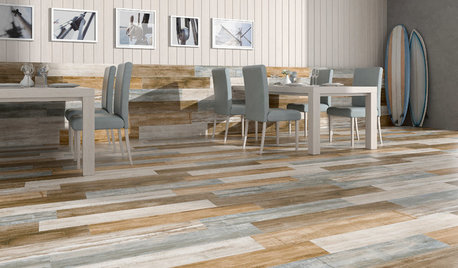
TILETop Tile Trends From the Coverings 2013 Show — the Wood Look
Get the beauty of wood while waving off potential splinters, rotting and long searches, thanks to eye-fooling ceramic and porcelain tiles
Full Story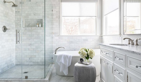
BATHROOM MAKEOVERSMarble Tile Brings Spa-Like Luxury to a Master Bath
A designer liberally uses the stone to deliver bright, refreshing style to a once-dark California bathroom
Full Story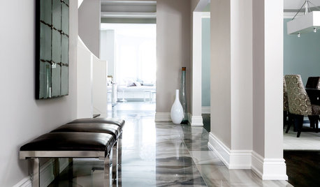
TILEWhen Bigger Is Better: The Dramatic Look of Large-Format Tiles
With fewer grout lines, this versatile material brings a smooth appearance to walls and floors
Full Story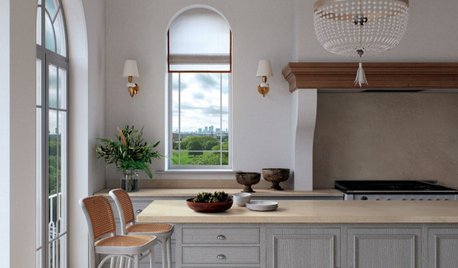
MATERIALSNew Looks for Engineered Countertops and Other Surfaces
See the top colors and styles for new engineered surfaces introduced at the 2021 KBIS trade show
Full Story
mvcanada
KimOriginal Author
Related Professionals
Aberdeen Architects & Building Designers · Gary Architects & Building Designers · Binghamton Architects & Building Designers · Springfield Design-Build Firms · Branson Design-Build Firms · Las Vegas Design-Build Firms · Hannibal Home Builders · Harrisonburg Home Builders · Ocala Interior Designers & Decorators · Dover Kitchen & Bathroom Designers · Jamestown Kitchen & Bathroom Designers · Danville Kitchen Remodelers · Bend Kitchen Remodelers · Palm Bay Custom Countertops · Saginaw Custom Countertopsmvcanada
BeverlyFLADeziner