Software
Houzz Logo Print
michelle41

Which rooms do you like better

7 years ago

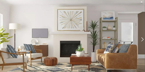
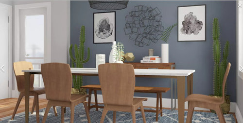
Hi, I have two designs of mine for the living room and the dining room of my house. Can I ask which designs you like better of 1 or 2?


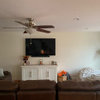
Designs 1


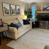
Designs 2


Or neither and if neither can I ask what needs improvement or if it is just not your style.

Comments (19)

  • 7 years ago

    I like the warmth of #2

    michelle41 thanked Sammie J
  • 7 years ago

    Both are very interesting and stylish, but seem quite different in "style"--if that's the word. The top one seems quite cosmopolitan and the bottom one feels more casual, less "luxe". Both are very creative. Good luck!

    michelle41 thanked Margaret Bannerman
  • 7 years ago

    Thanks Sammie! Margaret, I can see you have the eye! First one is my go to style, but I was wanting to mix it up and try the relax mid century look. My neighborhood is all mid century homes and they are selling within two days, that is, when they go for sale. They are small houses though. I was thinking of paying tribute to it, but a little scared to change it up and that is why I came here for opinions.

  • 7 years ago

    They are both nice, but LR2 seems somehow unbalanced to me. Can you swap the sofa with the chairs (paralleling the arrangement in LR1)?


    I generally prefer 1 but am not entirely sure why. The balance/layout issue may be a part of it. I prefer the artwork over the fireplace in 2 to the mirror in 1.

  • PRO
    7 years ago

    #2

  • 7 years ago

    I like both but design two is more warm and inviting. The darker colors in design one are less appealing visual but overall both are really beautiful

    michelle41 thanked Eryn Roberts
  • 7 years ago

    2

    michelle41 thanked st5330
  • 7 years ago
    last modified: 7 years ago

    Prefer the warmth of 2 HOWEVER, not a fan of fixed windows. I'd want them to open. Or, if there are three, then you could have the center one fixed and the two on each side able to open.


    Do rethink your window design.

  • 7 years ago

    Like 2, but the art over F/P is too big. Don't like mirror in 1 or D/R in 1.

    michelle41 thanked ashtonchic
  • 7 years ago

    Thanks again everyone. cawaps I can change the layout. I will play with it. hu1967910 When it comes to decorating, I tend to stick with a theme. However, a good decorator knows how to make many themes work together at once. I am however, not a professional decorator. suezbell , the living room windows open, but the dining room I have a enclosed patio that the dining room window leads out to the patio. Since there is not much ventilation I prefer the unobscured glass. I have a love hate relationship with my patio. It is heated and air conditioned so it gives me extra space, but it takes light away. If I was building a home I would never add it again.

  • PRO
    7 years ago
    last modified: 7 years ago

    It's a good start but don''t you think you might need a TV that is easier to view? I have switched the position of your chairs and sofa. Also I think the chairs should be more blue and less teal. Just a suggestion.

    Get the coffee table directly under the chandelier.

    michelle41 thanked BeverlyFLADeziner
  • 7 years ago

    If staging for sale, LR #2. Doesn't read warmer to me, just suggests more space. Airier because of the leggier chairs and circulation around window. The dining space in both options looks cramped., without room for a console. Maybe it is just the rendering?

  • 7 years ago

    Living room #2 is best. In LR#1, the tv is not functional, since it can't be seen from the far sofa, and the table lamp blocks the view from the closer sofa. But I think the gold shelves in #1 are better proportions for the wall than the heavier shelves in #2. Dining room #1 is the hands down winner over #2. No one likes to sit on a bench seat, and the larger artwork in #1 is less fussy than the metal sculpture which fights with the metal light in #2.

  • 7 years ago

    #2

  • 7 years ago

    Thanks Bev, I do like the arrangement that way also. Yes, my space is small, but the console would fit. Should I take it away? I love the table in the dining room 2. You cannot see in the pic, but it is marble and the legs are brushed brass. The other table is actually my table from Pottery Barn. It is reclaimed wood with chrome legs.

  • 7 years ago

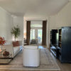
    I have one more room that is part of the open concept. I just finished and was wondering do you like any of these two?


  • 7 years ago

    Aesthetically, I wouldn't say no to either nook design. In the 2nd one, the rug is too small (the back legs of the chairs are almost on top of the edge of the rug even pushed in). Also, the 2nd table looks too small for 2 people to comfortably dine, much less the three you have chairs for.

    I can't really see the light in the 2nd design. The Sputnik in the 1st seems like a bit too much for the space.

  • 7 years ago

    I like the second one....but if you go with the first, please do not hang mirror over the fireplace.

    Use a great piece of original art with lots of color.