Software
Houzz Logo Print
kelseypj1

Kitchen Backsplash Dilemna - Please Help

7 years ago

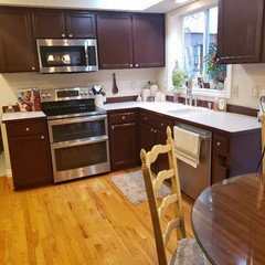
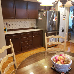
Okay so I am finally ready to refresh my kitchen, on the cheap end as this is not a long term house. I have picked out my kitchen cabinet color, which will be Benjamin Moore, Seapearl in Advance Satin (please excuse the soon to be gone espresso). For the counters I am down to either Silestone Pietra, or Spectrum Tranquility. Looking at backsplashes, I am down to a few different ones that I think go with either counter. However, I fell in love with Crystal Ice Mosaic Tile from Home Depot. It is a silvery glittery tile with SS accents. I know it would not be a good fit for all of the spaces so here is my question. Would it look silly to put that just behind the stove? Another option would also be to put it on the back counter as well as behind the stove (see pictures, and please forgive the soon to be gone cow wallpaper that my daughter is very attached to...lol), if that would help tie it in. For the other backsplashes, I am down to a few. Please look at the pictures and let me know what you think of using the Crystal Ice with one of the others. I would love onions on the other options for the rest of the space as well. I think I am leaning towards the natural stone, but I do also love the other option. Note: the floor will be refinished in the future to a warmer color as well. And I would love to see photos if anyone has installed the Tranquility or Pietra counters. I want sparkle!


Comments (18)

  • 7 years ago


  • 7 years ago


  • 7 years ago


  • 7 years ago
    last modified: 7 years ago

    No to the glittery one, and no to all the skinny-pencil tile ones. Pencil-tile backsplash is a look that is 5 years dated already, maybe more.

    I agree with Beth H. Wait, and rein in your eagerness on the backsplash. Things look completely different after counter and cabinets are done. Don’t choose a backsplash until then.

    kelseypj1 thanked Shannon_WI
  • 7 years ago

    The blue Beth posted looks good when you think about your floors....sparkle backsplash and your wood floors is a mismatch.

  • 7 years ago

    Thank you Beth and Shannon. I did plan on waiting until the cabinets and counter were done for the final decision, but trying to tie it all together to help make a decision on the counter. I do know that I do not like subway tile, especially with how small my space is. Also, want to keep blues out as much as possible and focus on greys with some accenting warm ones as my family room is adjacent and has more warm tones to it, so it does need to tie to that as well. I will repost for your ideas once counter and cabinets are complete :)

  • 7 years ago

    When you say pencil tile, are you talking both about the natural stone and the tile that had varying shapes? I thought the stone was a little newer design? I have been to every store in the area, and these were the best options so far. I was looking for a herringbone, but could not find one :(

  • 7 years ago

    I am currently looking for someone to refinish the floors. I already strongly dislike my kitchen with the the size and functionality, and than to add insult you add the god awful golden floors. My husband will not be happy, but if I am going to do the counters, the floors are going to go now too. Can't wait to be able to get a new house in a few years with something more up to date :) But with that said, the floors will not be done before I will want to get the backsplash done. Once the cabinets and counter is all done, I will post a video that shows how the kitchen is basically on top of the family room, which has earthtones (why I'm trying to pull in greys :))


  • 7 years ago

    I love the tranquility, but do think I am leaning towards the pietro just because that is what the rest of the family loves. That and I don't want too much white


  • 7 years ago
    last modified: 7 years ago

    kelsey, so you don't want any blues or subways.

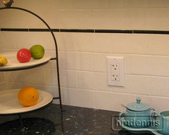
    here are a few options w/the Silestone. since it is a rather busy pattern, you should try to stick to something without a lot of diff colors.

    all of these options come in diff colors, except the marble one w/the micro in the upper left. I put that in there because you seem to like a little bling.


    the subway in the middle is a beautiful glass tile from Oceanside. Casa Calif. the colors (and they have many) would look beautiful w/your slab


    you could also do a ogee type of tile. Pratt and Larson, but many others carry it as an elongated hex tile


    solid herringbone


    and even though you don't like these, this particular tile goes very well

    Newport 2x10 white, ivy hill from home depot

    kelseypj1 thanked Beth H. :
  • 7 years ago

    wow, thank you!! I do like that one narrower subway that you showed in the middle above. And if I found a herringbone that went well, that would be great as well. I have one from home depot, but it is a fairly big. It is a struggle because I want something that brings out both greys and creams, but not brown or tans, if makes sense. A couple of those you showed would do that.

    You have me motivated and the cabinets are now 1/3 painted :) I will be ordering the counter tomorrow along with the sink. I had originally wanted to use my kohler heartland, as I love it, but if I go with the Pietra going to order the Kohler Staccato SS.

    Do you think the Pietra is out of date, or still current and relevant?

    Jumping ahead, but what color wood floor do you think would go well? I also have the same hardwood throughout my entry and front hallway.

  • 7 years ago

    Have you tested BM Seapearl in your kitchen? Don't pick the color from a small paint chip. I have Seapearl in my master bath and at certain times of day it looks yellow. Yellow will not look good with your counters.

    kelseypj1 thanked chispa
  • 7 years ago

    Good to know! I have it painted on some of the cabinets. My trim work is actually Mascrapone which does have a cream tint didn't so the Seapearl is definitely more white with a grey undertone, which I hope the counter brings out more of, and at the same time, hoping the white of the cabinets brings out more white in the counter. Praying this works out..... Would be an awful expensive mistake. The good news is anything would look better than what it does now!!!!

  • 7 years ago
    last modified: 7 years ago

    “When you say pencil tile, are you talking both about the natural stone and the tile that had varying shapes?”

    Pencil tile means they are thin and long, like pencils. Each tile is 1/4” or 1/2” high, and range from 6“ to 12” long. Originally, and for a hundred years, they were used just to edge regular-size tile, or create borders for regular size tile, or to have a narrow decorative line in a contrasting color across the backsplash a few inches from the bottom or top of the backsplash (of regular-size tile).


    Then, for some reason, around 2008 or so, a fad came in that used pencil tile for the entire backsplash. The fad lasted 5-7 years the way fads do. It is a very busy, heavily-patterned look, with a zillion grout lines. The type of tile in this look does not matter. The pencil tile backsplash is all about the long thin shape and heavy pattern. You will not be happy with a backsplash covered in pencil tile.

    kelseypj1 thanked Shannon_WI
  • 7 years ago

    Pietro is out. Now it is Tranquility, Wilsonart Kolams or Pental Terrano

  • 7 years ago

    Thank you Shannon. I would tend to agree with most pencil tile, as I have stayed away from it. However, the natural stone that has no grout lines I do like. I like the texture not being all smooth and uniform, which for me is odd because I am a clean freak who loves everything looking perfect. Now that I have taken Pietro out, the one herringbone pattern may work if I go with the Terrano.


  • 7 years ago

    The final selection is Cambria Berwyn. It is beatuifu, goes with the house while also pulling out the greys. I do like the original "pencil" tile with as the colors blend beautifully and all of the tiles are different sizes with a variations in the same tones as the counter. That is not to say it is my final choice, but I will definitely consider it while looking at a more monotone tile in a different pattern.

Sponsored
Bella Casa LLC
Average rating: 5 out of 5 stars17 Reviews
The Leading Interior Design Studio in Franklin County