Software
Houzz Logo Print
hzdeleted_20021230

Layered...Eclectic - or both?

6 years ago
last modified: 6 years ago


Comments (40)

  • 6 years ago

    I don't know what to call it but I love it, except for the huge picture of the horse and its rider, that seems overbearing.

  • 6 years ago

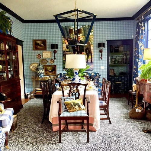
    Layered, mostly, and definitely with an English bent. I don't quite get the lamp on the dining table, and the ginormous lantern hanging overhead doesn't look right to my eye, but I do rather like the big guy and his big horse. Fits the mood, IMO.

  • 6 years ago

    Very nice.


    I'd like to see a frame around the portrait -- something to isolate the image from the checkered wallpaper. Although the dimensions of the painting are already very large -- too large? -- as it is.

  • 6 years ago

    Layered ... but a bit too much. I think this style of layered is VERY hard to do. Yes, it feels English.

    Specific thoughts:

    - The checkerboard pattern on the wall and the spotty print on the rug are "too alike" in size.

    - I like the shade of blue on the sofa and the curtains.

    - I like the big guy and horse -- without them, all the patterns would be "too alike". I agree with the above poster that the horseman requires a frame -- this isn't a minimalist room. And I greatly dislike that the lantern pendant blocks the view of this big picture.

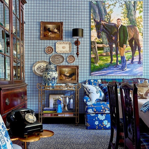
    - I find your second picture much more pleasing, and I think it's because that lantern pendant isn't in it.

    - I agree that the lamp seems odd on the table.

    - Just curious: Is that rotary style phone actually still in use? It's old enough to be cool again.

  • 6 years ago

    Although I love seeing the phone, it strikes me odd since it probably doesn't function. I guess it is purely decorative? To me looks nostalgic, and the rest of the room is more "collectables" stuff rather than old stuff that used to have a specific use but is now being used as a decoration. I'm not crazy about doing that, but that's just me. Not that there is anything wrong with it . . . My parlor is set up as a reading room, and yet we hardly ever, ever go in there to read. But I like passing it by and knowing that I could use it that way. I might feel the same way about the phone . . .

  • 6 years ago

    I'm with Mrs Pete on the lantern fixture, which I just find to be a distracting eyesore. The random table lamp blocks sightlines equally much, though it isn't innately ugly like the lantern. But I think even with them gone, I wouldn't like the room. I don't like the curtain and upholstery fabric with the wallpaper, and I don't like the rug with the wallpaper (all are fine by themselves, just not in combination).

  • 6 years ago

    At a first overall look, I like it a lot. Picking it apart there are things I’d modify if living there starting with fixing the direction of the dining chair! I’d also edit down a little.

  • 6 years ago
    last modified: 6 years ago
    All I can see is clutter. If these were pictures of a house for sale, we'd be telling the owner to declutter!

  • 6 years ago

    I'm guessing that the lamp on the dining table and the dining chair with its back to the table are staging for the photograph and not in their normal positions. I still enjoy looking at and visiting rooms like the one pictured, but I don't want to replicate the look in my home any longer.

  • 6 years ago

    Layering is a talent that I don't have but that's ok. The room seems to be well done except for the chandelier and the pink layered table cloths on the table. Those just seem to jar the scene before me.

  • 6 years ago

    It looks like a booth at an upscale congisnment shop. Especially with the host chair turned and with pillows on it.

  • 6 years ago

    Turn the chair around, take the lamp off the table, definitely get rid of the wallpaper (more neutral wall), then I could live with it. Full disclosure - I have a black rotary wall phone in my kitchen, and oversize art in my very traditional living room.

  • 6 years ago

    I love it. Makes me nostalgic for an Old New England cottage. Something you’d find in a seaside town.

  • 6 years ago
    last modified: 6 years ago

    While there are individual pieces that I like, the overall look is one I just find ugly.

  • 6 years ago

    Wow, I didn’t like rotary dial phones back when they were the only choice. Especially once our area code changed from the short and snappy 312 (and we didn’t even have to dial it) to the torturous 708...my brother lived in the city where it was still 312 but calling home to 708, and our phone number that had 3 9s in it, and other family members who had 8s and 9s, well, by the time you finished dialing your news was already birdcage liner.

  • 6 years ago

    I like most of it -- though I'm not crazy about the black crown moulding or the flooring. It seems like someone took that advice, that every room should have a bit of black in it, and went crazy.

    And somehow it seems very staged, more like a catalogue shoot than a house where someone lives.

    I still miss rotary dial phones, esp because for most of my life we didn't need to dial the area code. Heck, in college in small-town New England, we only had to dial the last four numbers.

  • 6 years ago
    last modified: 6 years ago

    I’m trying to figure out why I find it all unsettling when I like much of the layered mix. To me there is a drop off at the floor which is making the walls seem heavy and the overly large eclectic dining light seem very heavy. Maybe the goal was to have a place for the eye to rest somewhere, don’t know. I think I would feel better if there were some deep tones somewhere in a rug to balance and ground the space. It would be so much more by doing that.

  • 6 years ago
    last modified: 6 years ago

    I'd edit it a fair bit but I like the floor,the walls, and the sofa. LIke Becky, I think the use of black is heavy and overall the room strikes me as too staged,too un-lived-in (& unlivable) to qualify as a 'full English".

  • 6 years ago
    last modified: 6 years ago

    Jim - Do you have any info on this room that you can share with us? (Like where it's located?)

  • 6 years ago

    bpath zeroed in on it, as far as I'm concerned. I looked for price tags at first glance. It would make me very uneasy to be in this room.

  • 6 years ago

    IdaClaire

    Jim - Do you have any info on this room that you can share with us? (Like where it's located?)

    ^^^^^^^^^^^^^^^^^^^^^^^^^^^^^^^^^^^^^^^^^^^^^

    None - not even after a google image search


  • 6 years ago

    Ida, I thought this was Scot Meacham Wood, but then looked through images and couldn't find it. It came across my IG recently ...

  • 6 years ago

    It is reminiscent of SMW's work, which I usually really like.

  • 6 years ago

    In the first picture the wallpaper looks like gingham, and I like that look. The second picture reveals that the wallpaper is tattersall. Too many lines; hard on the eyes.

  • 6 years ago

    Oh, yes indeed! But darn it, now that I no longer do Instagram, I can only view a couple of the pictures. Still got to see a bit of the process though. Thanks for solving the mystery of where this came from.

  • 6 years ago

    Estate sale or child’s I Spy book?

  • 6 years ago

    Haha - if I liked royal blue, I might appreciate it more.

    I can take it in small doses, but that is just too much!

  • 6 years ago

    This was done in 2019, wow. Lacking an eye for clues from fabric or whatever, it looked to me like the glossy pix I used to fantasize over long ago while watching my toddlers. I've never been big on browns, but I love blue and really like the way the brown ceramic wall grouping, as well as some of the fine woods, keep the blue enjoyable by not letting it be too much. Like a cup of coffee does for a too-sweet dessert.

  • 6 years ago


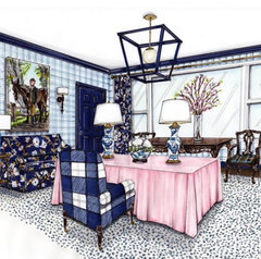
    The artist’s rendering of the room from SMW’s IG account. Looks a little different than the photo. Do you suppose the lamps on the dining table are just for show or can you actually turn them on and get light? I remember eons ago seeing a lamp in the middle of a dining table. The owners had drilled a hole in the table and run the lamp cord to a floor outlet under the table.

  • 6 years ago

    Since the artist isn't the designer, I wonder if SMW sent her a picture as he was starting to put the room together, before it was finished as it was photographed.

    I can't tell from the photo above if the lamps are on or not, but esp in a show house it'd be easy to make a hole in the table and run a cord under the table, or even under the carpeting to the nearest outlet. You can rejigger an electric lamp to make it work on batteries, but I don't know that I'd bother for a show house.

    This is the lamp -- very pretty,

    https://www.port68.com/scripts/prodView.asp?idproduct=1886

  • PRO
    6 years ago

    The wallpaper and trim throw me a bit. I don't dislike the layered look but maybe a calmer solid color background would anchor everything better.

  • 6 years ago

    I still hate that enormous lantern hovering ominously over it all. I mean, really, really HATE it. I expect better from SMW. ;-)

  • 6 years ago

    To me looks nostalgic, and the rest of the room is more "collectables"
    stuff

    And I don't "do" collectables.

    I still hate that enormous lantern hovering ominously over it all.

    I know that lantern lights are a trend right now, but I don't like them. Lanterns are not an "in the house" thing.

  • 6 years ago

    I think the horse and rider painting would work much better on the wallpaper with a frame rather than frameless.

    And I'm not sure if the scale or pattern of the carpeting isn't working with the rest.

    It would be interesting to see how this works in person.

  • 6 years ago

    Aren’t rooms in show houses supposed to be over the top, almost a parody?

  • 6 years ago

    bbstx

    Aren’t rooms in show houses supposed to be over the top, almost a parody?

    ^^^^^^^^^^^^^^^^^^^^^^^^^^^^^^^^^^^^^^^^^^^^^^^^^^66

    From my experience, yes and no.

    The ASID Showhouses I've visited locally tend to be a showcase of the individual designer's vision but don't necessarily 'flow' with other rooms in the house.

    The Infant Welfare Showhouses look more like one designer could have worked on the entire house over time - they also tend to be more trad.


  • 6 years ago

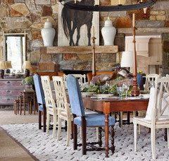
    When I think of OTT show houses, I think of the one in Cashiers, NC, that I visited several years ago. James Farmer, whose designs I like, used a stuffed beaver and a stuffed duck (taxidermied, not cooked) as the DR centerpiece. It was great show house “theater” but not a look I’d want to replicate on my own dining table.


  • 6 years ago

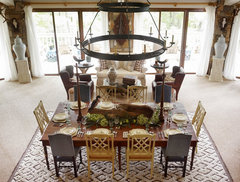
    additional picture from a different angle


  • 6 years ago

    I dont know what it is, but I like it, especially the dog under the desk. it would be a treat, to be invited to dinner.