

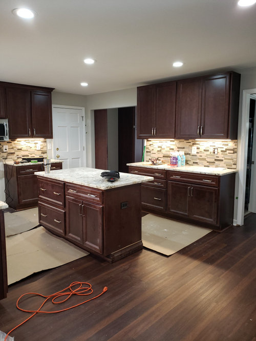
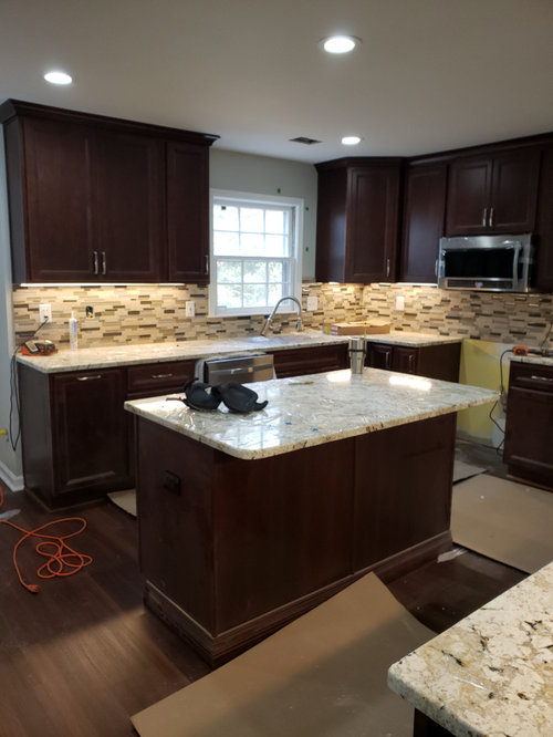
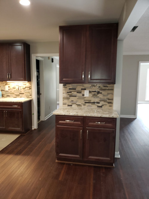
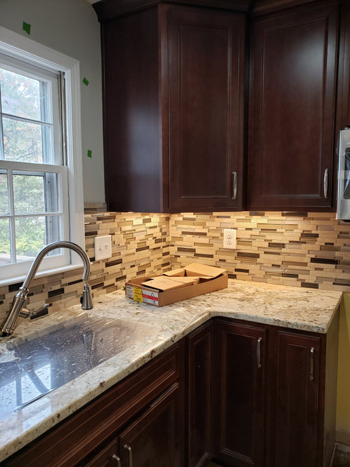
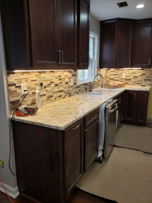
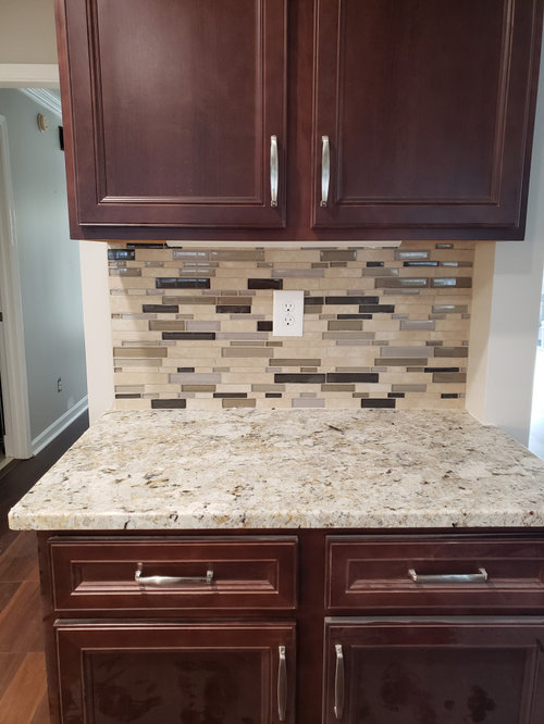
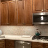
Backsplash opinions!
6 years ago
Featured Answer
Sort by:Oldest
Comments (22)
 6 years agolast modified: 6 years ago
- 6 years ago
Related Professionals
Valdosta Kitchen & Bathroom Designers · Madison Kitchen Remodelers · Aiken Kitchen Remodelers · Petersburg Kitchen Remodelers · Utica Kitchen Remodelers · Tampa Custom Countertops · Worcester Interior Designers & Decorators · Alexandria Interior Designers & Decorators · Palm Bay Architects & Building Designers · Somerset Architects & Building Designers · Olean Architects & Building Designers · San Bernardino Kitchen & Bathroom Designers · Mesquite Kitchen & Bathroom Designers · Cheyenne Kitchen & Bathroom Designers · Chatham Kitchen & Bathroom Designers 6 years ago
- 6 years ago
- 6 years agolast modified: 6 years ago
- 6 years ago
- 6 years ago
- 6 years ago
- 6 years ago
 6 years ago
 6 years agolast modified: 6 years ago
- 6 years agolast modified: 6 years ago
 6 years ago
- 6 years ago
 6 years ago
- 6 years ago
 6 years ago
 6 years ago
- 6 years ago
 6 years ago
- 6 years ago

Related Stories
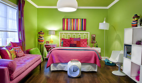
DECORATING GUIDESNo Neutral Ground? Why the Color Camps Are So Opinionated
Can't we all just get along when it comes to color versus neutrals?
Full Story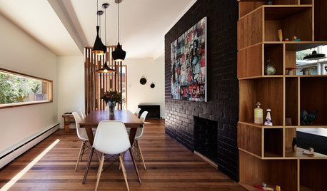
WALL TREATMENTSExpert Opinion: What’s Next for the Feature Wall?
Designers look beyond painted accent walls to wallpaper, layered artwork, paneling and more
Full Story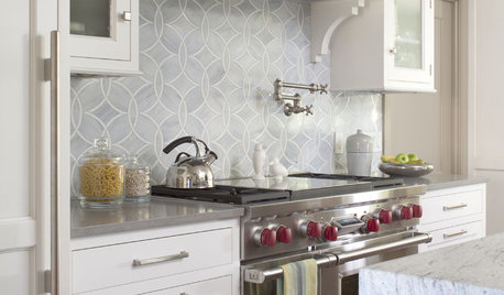
KITCHEN DESIGN8 Top Tile Types for Your Kitchen Backsplash
Backsplash designs don't have to be set in stone; glass, mirror and mosaic tiles can create kitchen beauty in a range of styles
Full Story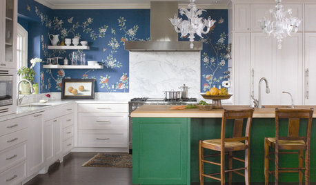
KITCHEN DESIGNTry a Shorter Kitchen Backsplash for Budget-Friendly Style
Shave costs on a kitchen remodel with a pared-down backsplash in one of these great materials
Full Story
MATERIALSKitchen Ideas: How to Choose the Perfect Backsplash
Backsplashes not only protect your walls, they also add color, pattern and texture. Find out which material is right for you
Full Story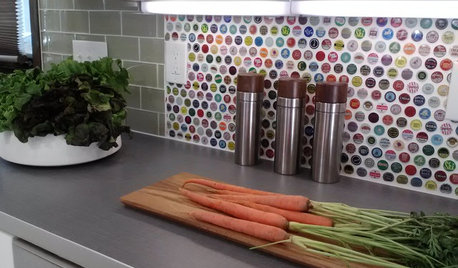
KITCHEN BACKSPLASHES15 Creative Kitchen Backsplashes for the Adventurous
Consider using snow skis, mirrors, bottle caps and other unusual materials for your next kitchen backsplash
Full Story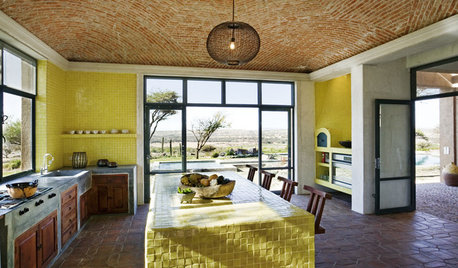
KITCHEN DESIGNKitchen Color: 7 Sensational Yellow Backsplashes
Warm up a white kitchen or add some zing to wood tones with a backsplash that glows
Full Story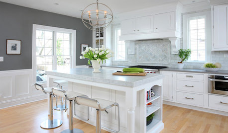
KITCHEN DESIGNHow to Add a Kitchen Backsplash
Great project: Install glass, tile or another decorative material for a gorgeous and protective backsplash
Full Story
KITCHEN DESIGN10 Gorgeous Backsplash Alternatives to Subway Tile
Artistic installations, back-painted glass and pivoting windows prove there are backsplash possibilities beyond the platform
Full Story
KITCHEN DESIGNCountertop and Backsplash: Making the Perfect Match
Zero in on a kitchen combo you'll love with these strategies and great countertop-backsplash mixes for inspiration
Full StorySponsored

Leading Interior Designers in Columbus, Ohio & Ponte Vedra, Florida

mark_rachel