

Backsplash regret, seems to exacerbate poorly chosen color scheme
I’ve gotten a late start in choosing colors for my home. I’m new to design, and also new to my open concept which was done in this remodel. My many mistakes have caused a domino effect. Although I’ve chosen nice items, something seems off. I think it’s the backsplash exacerbating a poorly thought out color scheme.
We started by paining The living room in SW 7571 Casa Blanca. (Warm antique white). Then we painted the kitchen and dining room SW 6896 sole. A warm yellow. We have true white kitchen cabinets and didn’t want the dining room to be white also. All trim in house is true white.
I made a big mistake in not viewing Countertop properly. It looks like a blue-gray and was fighting with the yellow walls. Not a good look.
We then chose a backsplash with a blue glass, black white and stainless. We thought it’d pull the kitchen together. (White cabinets, stainless/black appliances, blue gray countertop) We then had an in home consultation with Sherwin Williams to choose a blue for the walls that’d work with countertop and backsplash. They recommended painting kitchen & dining room walls SW 6219 Rain.
We loved the Rain wall color. We couldn’t wait to finally install our glass backsplash. (Crystal Cove from Home Depot).
Well, although I feel the Sherwin Williams rep was correct in coordination of the countertop, kitchen paint with this backsplash, I guess I hadn’t considered the magnitude of having SO MUCH BLING. I find the backsplash too loud compared to my overall home design. I feel it emphasizes my poorly thought out color scheme. It’s become a focal point, and not in a good way.
I hate the thought of redoing it. I guess I’m looking for someone with a trained eye to tell me if I’m making too big of a deal about this. I know design rules can be broken. But I’ve never seen the rule broken having completely different color schemes in an open floor plan. But of course I’m new to design. Please tell me if I am making too big of a deal or if I’m correct and this should be replaced. We are on a tight budget but redoing the backsplash won’t kill us. It isn’t grouted yet if that helps.
Comments (109)
 6 years ago
The soffit needs to be whatever wall color you choose. Don't try to match the cabinets. It will look disjointed.
Jessica thanked calidesignJessica
Original Author6 years agoHere is a better picture of our granite. The name is Herdwick. There are a lot of uniqueness. If you Google Herdwick granite the photos don’t look like mine. It is difficult to describe the color. I’m stuck with it i realize. I think it would be wasteful to discard. It has beauty and a nice feel to it. Functional. There’s some badly placed asymmetrical veining but thats how Mother Narture formed it. Fortunately my cutting board completely covers the oddly places vein and i use the cutting board so it’s functional and there it stays.
That said, the color of this granite countertop was kind of a surprise and is throwing off my design. Just before countertop installation, we painted the kitchen and dining room yellow. Then the countertop was installed and the countertop looked like gray with faded denim undertones. Maybe! i don’t trust our eyes anymore. I’d say it’s gray/black/white.
What if we darkened the granite with an enhancer? It’s a honed finish and water spots are driving me crazy already. it has been sealed but i cooka lot and it seems to need to be resealed so i was considerMing the enhancer. A benefit to thr enhancer is this: it would “blacken“ thr granite giving it a wet look. Maybe that would eliminate the blue undertones and allow me to pursue a plan of a whole house wall color?
too many decisions. I better hurry hubs wants to get this defused and put up Subway tile. We much prefer the glossy (L) over the matte (R)
whet should we do I’m even more confused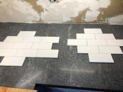
now.
Related Professionals
Manhattan Interior Designers & Decorators · Oxford Interior Designers & Decorators · Morgantown Interior Designers & Decorators · Rock Hill Architects & Building Designers · Hempstead Architects & Building Designers · Mountain Home Kitchen & Bathroom Designers · Dalton Kitchen & Bathroom Designers · Marietta Kitchen & Bathroom Designers · Texarkana Kitchen & Bathroom Designers · Elizabethtown Kitchen & Bathroom Designers · Victoria Kitchen & Bathroom Designers · Sioux City Kitchen & Bathroom Designers · Casper Kitchen & Bathroom Designers · Worcester Custom Countertops · Ithaca Custom Countertops 6 years ago
Your granite is beautiful. Never heard of enhancing, but we had polished. I did have honed marble for a backsplash. I would do the white subway on the left with dark grout! It was just too busy. Looks beautiful with the white subway
Jessica thanked Kathy FurtJessica
Original Author6 years agoHere a pic of granite countertop with the yellow paint SW (sole) it didn’t look right So we painted SW Rain which is the blue we still have
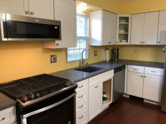
BEFORE: early in remodel (yellow walls before repainting blue)
- 6 years ago
I like a whole house color. We used Agreeable grey in our new build with greys and blues, then we have accessible beige in this one. Canvas tan is also pretty and lighter
- 6 years ago
And don’t worry about covering up the veining!! That’s what makes it look so good
 6 years agolast modified: 6 years ago
jessica,,,if you drop a bead of water on the countertop, does it sit or get absorbed?
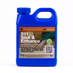
if it absorbs, it will take a sealer. And enhancing sealer is just that. It will deepen and darken natural stone. Once you apply it, it can't be undone. so if you have any spare stone or a spot that doesn't stand out as much, try a little bit of it there to see if you like the look. Basically it that type of sealer will look the same as it does when you wet the stone. does applying water to the countertop make the color deeper? (If it's properly sealed, it won't do it) But that's what the enhancer will do.
try 511 or aqua mix.
 Jessica thanked Beth H. :
Jessica
Original Author6 years agoThank you Dormelles for the excellent summary and advice. Yes that’s pretty much where we are. Although whole house color is necessary in full open floor plans, you are correct that we have semi-open so we can use a different color beyond the archway where Living room ends and dining room begins.
But although I don’t have full open concept, I can see how following the whole house color scheme would improve thr look of my design and have many benefits. But unfortunately, given my Gray granite countertop, a whole house color scheme might be taking me further from finishing the house. We’d have to buy new living room furniture or reupholster and paint everything grayish, something we dont want to do as we love our family heirloom furnishings. We like the ivory leather sofa and recliners they are soooo comfy and they were my Mom’s and I don’t want to replace
The Sherwin Willians rep thought the transition was ok. Do you think we could plan to always keep a color in the blue areas? Like keep options open by matching subway tiles to cabinetry We don’t paint soffit white as Bri suggested. (Although that is a good suggestion, just not going to work in this particular instance.) And someday we will hopefully remove the soffitt. I wish we would’ve done that b4 hanging upper cabinets That is what makes me so disappointed with myself. If we had a design pro from the beginning, they undoubtedly would have pushed to remove soffit and go with tall cabinets almost to ceiling. We ended up over budget on cabinets (Menards) because we had several returns of special order items that were not Menards fault exactly but once we viewed them we decided to return and pay 25% restocking fee so we weren’t living with less than functional cabinet areas.
Sorry back to the color. Hubs wants to keep the blue and dining subway tile. I’m understanding I’ll probably need to give up my fkeeting hope of whole-house color. But if understand you correctly, we could someday repaint the blue a different color. (But not 7571 Casa Blanca since it’s too warm for cabinets.
thank you again Dormelles. I will also update on countertop enhancing before making final tile choice.Jessica
Original Author6 years agolast modified: 6 years agoBeth H thank you I am calling countertop shop to inquire about enhancer. I think It would help hide spots. Mine was sealed before install with a clear sealer. . I’m hoping it’s not too late to put in enhancer. Although mines been sealed, water spots still take days to disappear
 6 years agolast modified: 6 years ago
@Jessica Your husband is a lot like mine wanting to get things finished up quickly! I showed my husband the photos in this thread last night and told him how eager your husband is to get the new backsplash up, and he said, "I understand." For our ongoing renovation, my husband has had to exercise patience with my decision-making process, as it takes time for me to consider the options and dwell on them long enough to be confident going forward, so in that respect, I understand your position, too. Here's addressing the various new issues you've brought up, point-by-point:
- Granite - First, the granite; it's beautiful. I looked up Herdwick and see that it typically comes in a honed finish, so you probably didn't have a choice on the finish type when you selected this color. The honing lightened the appearance from what it may have looked like polished and may have also opened up more pores in the stone so that water soaks in more readily, thus the temporary water stains you are seeing. A penetrating sealant would be a good idea. An enhancing sealer may actually bring out more of the color, so don't count on any sealant darkening the granite to the point of making it a dark neutral. Were this granite to be polished, you'd see a darker finish but also more of the color variation. That would be out of budget to change the finish at this point and usually involves having countertop removed and sent back the shop which is risky for damage to the countertop and cabinetry. Sealer, regularly maintained, should improve your water spotting issue and allow you many years of enjoyment of this honed countertop material.
- Original Yellow Kitchen Walls - Thanks for the photo of the cabinetry with your original SW 6896 Sole wall paint. I'm wondering if you might have felt less that "something was off" in the color combinations if the yellow had been a bit more of a pastel. When looking at paint chips, the paint always seems more intense when placed over the entire spread of a wall compared to the samples, so it's sometimes hard to land on the tone you may have intended. In this Sole color, I think we're seeing that sunny warmth you are still craving for your kitchen area, explained in the next point.
- Current Blue Walls - So, it sounds like discussion is ongoing in your household around your final two dilemmas which are both re-dos, the wall color and the backsplash. If only my own renovation were down to the last 2 items it would seem so much farther along, so I hope you're relieved to know that these last issues are a relatively small percentage of all the work and expense you've put in thus far. So, if I'm hearing you right, you like the Rain blue as a color by itself, but it is not feeling like a warm enough color for what you had intended for your kitchen. This Rain blue was selected by someone else, and it's draining the warmth out of the area, leaving you unsatisfied. Your husband is afraid that the color changes will go on and on if he allows another re-paint, but honestly, I think if you offer to do the painting yourself and give him the reasoning, perhaps you can have another go at the wall color.
- Whole House Wall Color - You're hoping to get a whole house color, and I think you can if that's truly important to you. To do that, we are stuck with some unchangeable parameters thus far: white kitchen cabinets, white whole-house trim, gray/blue kitchen countertop, ivory living room furniture upholstery. For purposes of this list, I'm abandoning the idea of two colors between your kitchen/dining and living room, because even though it would probably work (your existing Rain/Casa Blanca, for example), two colors isn't the crowning finish of what you'd intended by an extensive remodel to get an open concept. There are two options I think are your greatest possibilities, 1) white walls, 2) non-white pastel color. More on that as follows.
- Option #1 White Walls - White walls would work with all your parameters, but you may be left feeling like your house is colorless unless you really worked to pull in warmth and color with wall hangings and other decor, which is possible. You'd also need to repeat the ivory color in other ways throughout the decor so that it isn't limited to just the furniture. White/ivory combination pillows on the ivory couches, ivory floral arrangements in the kitchen and ivory wall hangings in the dining room are examples. You can Google "combining whites" for more information about how this has been successfully done.
- Option #2 Non-White Pastel Color - A second option would be to lean in some non-white color direction for the entire area. My aunt has her enormous open-concept first floor painted SW 6204 Sea Salt, which is one example, a light green, which works fine with her white kitchen cabinetry, cream/black granite and colorful living room furniture. I'd recommend something a little more pastel than that, though. This is going to be tricky getting a color you like, but it can be done, and it can work for the whole house.
- Backsplash - Even though your efficient husband can get a backsplash installed this week and is pressing to do so, the choice shouldn't be made until you've settled on a wall color. If you're unhappy with the coldness of the blue, a white backsplash is only going to commit you further to a cool color scheme in the kitchen. You said you much prefer the shiny white to the matte white tile, but I think that is because white is so boring. You're wanting more liveliness in the area especially because the countertop has a quiet pattern to it. Your countertop is honed, so shiny is going to compete with that. I think something with moderate color variation might work for you on the backsplash to provide more of the feel you're craving, but you need to firm up the wall color first and hopefully even change the wall color if you're going to do that before settling on the backsplash. Sheetrock repair can be done for now where the previous backsplash was torn out. Take a very close look at some white/ivory/off-white blended backsplash materials if you want to bring in some off-white paint as a whole-house color. Also take a look at backsplashes that have some small contrasting pieces of gray in them to provide interest without having to go high gloss and accentuate the honed counter. I'll be traveling for the next 24 hours and won't have access to posting, but I'll be wishing you all the best with these difficult choices and will check back soon.
[Edit: This post originally had a suggested option as off-white walls. Looking at paint samples later, I realized the Sherwin Williams off-whites lean gray which isn't what is needed in this situation. Light cream would be a better suggestion such as in the example of the Kraftmaid Dove White kitchen cabinetry posted above. The backsplash seems to be a blend of cream and white tones. This option would involve re-painting everything including the current Casa Blanca walls to a lighter cream tint. The more pronounced ivory of the Casa Blanca color is going to be a tough sell next to the expanse of white kitchen cabinetry. You can get away with light cream walls next to white cabinets if, once again, you repeat and blend the whites together throughout the decor.]Jessica thanked AglitterJessica
Original Author6 years agoThank you so much Dormelles! You have been amazing understand my dilemma. i will research all these options you’ve presented. That should keep me busy for 24 hours. Safe travels to your destination and Happy Thanksgiving!
- 6 years agolast modified: 6 years ago
@Jessica, here are a few links with examples of different whites combined in open spaces, all from color expert Maria Killam who has written extensively on this topic on her blog. Take note especially of the photos she provides in these posts:
- https://www.mariakillam.com/combiningwhites-2/
- https://www.mariakillam.com/whiteandcream/
- https://www.mariakillam.com/3-ways-white-walls-work-earthy-finishes/
- https://www.mariakillam.com/jilsoniamcdonald/
And here are a few examples of wall color plus variegated backsplash color for your consideration. Click on each photo to view a larger version with better clarity. All these photos supposedly feature Kraftmaid Dove White cabinetry: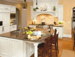
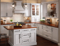
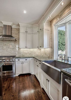
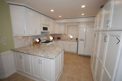
See more photos from this final project featuring a backsplash with dark dots at the Houzz project page here: https://www.houzz.com/hznb/photos/dovewhite-praa-sands-traditional-kitchen-phvw-vp~3244794Happy Thanksgiving to you and your family, too!
- 6 years agolast modified: 6 years ago
@Jessica Any more thoughts on your paint and backsplash colors? I'd like you to know that I stopped by a Sherwin Williams' store after my last post and looked at a SW 7571 Casa Blanca swatch and suddenly realized when seeing the color in person that you probably chose this because it was a perfect match to your ivory living room furniture. I'd hate to mess that up. Thinking forward, could you keep the living room color as is for now if it is a match to that furniture and then think toward repainting at a later time if the upholstery ever fails and you want to re-cover? You've mentioned this is family heirloom furniture, so it has some wear on it, but it could last a long time, too, so maybe think about whether you would be content with a 2-color scheme in your open concept space for a number of more years.
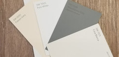
When looking at off-white swatches such as SW 7004 Snowbound, they tend to lean toward a gray tone, which isn't what you need. I'm also not seeing any creams that appear to work well to pull together the area, primarily because of that prominent gray color in the counters. I'm wondering if a lighter pastel yellow might work since you liked yellow for the area originally, but again, no yellow is looking great up against the gray.
While I'm not seeing this Casa Blanca color up against the white kitchen cabinetry as a pure tone, I do have a few wild ideas. It's not as common these days, but in years past we saw many two-tone walls painted with faux effects. I'm wondering if you could use a base white that matches your cabinetry and do some type of faux effect with the Casa Blanca paint on top or vice versa so that there is a mixture of colors. You'd have to like this look, but it could be a way to blend from white to ivory. Doing a sample board and holding it up to the cabinetry first would be essential.
To sum things up, a safe color for the walls would be a white to match your cabinetry. KraftMaid/Cardell is using the term "Dove White" to describe this paint which is also a Benjamin Moore color that has some cream to it. It's hard for us to see via computer what direction the cabinets lean color-wise. Sherwin Williams 7005 Pure White would be a place to start in looking for a perfect match to the cabinetry.
Even if you do white walls, I still think some interest to the backsplash other than plain white subway would lend more of the interest you seem to be wanting to the kitchen area. The other option of course, which your husband is wanting at this time, is to keep all the wall paint as is and finish out the backsplash. Wall paint can be changed fairly easily at any time, so as long as you know what direction you'd want to go color-wise with the paint if you ever did repaint, then you will be fine proceeding to finish the backsplash. I'm interested to hear where you are in the thought process.
Jessica
Original Author6 years agoWow! Dormelles thank you so much! You are so sweet to think of me and my dilemma this busy week. I love how you understand the situation how we’ve made irreversible decisions as far the countertop and cabinets. We need a way choose a color scheme and re-paint ourselves out of this predicament!
Am update on my end: i finally stopped at Countertop Shop and picked up a sample size slab of my granite. (Lol too bad thr countertop was installed over a month ago.). But better late than never. Now I have a slab to shop with. It was too late to obtain a scrap from my actual tops, but it’s better then nothing. At least I have slab in hand to shop. It looks identical to me and is much better than a cell phone pic.
I stopped at a different Sherwin Williams that was near the Countertop Shop. The representative at this store gave me an 8x11 paint sheet ofSea Salt. She thought Sea Salt be a prefect whole house color or just for kitchen. She said the granite slab does not have blue undertones. I’m not sure I see blue in my actual countertop anymore so hopefully this issue good news. .
But due to our lack of confidence in our ability to hammer out a color t mid-project, we decided to pay for an Interior design professional. We are having too many doubts about our ability to create a cohesive color scheme to get us out of this conflicting colors situation. Although we did have an SW in-home consultation who chose the blue rain, at that point we weren’t seeing the benefits of a cohesive whole house color scheme and unfortunately our question for the In-home paint pro were limited to the kitchen. ( I guess it wasn’t her place to talk us out of our bad choice of mosaic high contrast backsplash) In any event, I wish the paint pro had advised us that the result would look disjointed without serious additions of blue furnishings and pillows in thr living room, which I don’t think I’d like because everything is a neutral ivory/brown/taupe neutrals in the living room. I realize she was there as a paint pro not a whole house designer.
Dormelles I can’t wait to update you and everyone on this thread with good news and pics. Your handle on my dilemma is spot on given the fact all I’ve supplied is cell phone pics. i am planning to share your leg work and all the tips from the Houzz community to try to finalize a color palette.
I feel better doing this since we do feel over our heads with bad decisions thus far. I’m hoping I don’t need a lot of the designers time as we are do it yourselfers. But we do need help color-wise and to get us back on track do we can shop with confidence that our accessories we purchase will be harmonious.
Dormelles thank you again. I will update Friday. Also if you think of anything I’ve forgotten please feel free to comment i will check back.- 6 years ago
I used sea salt in both our bathrooms with a new build and had carrerra marble on countertops, showers, white cabinets. It went well. Can’t wait to see what your designer says!! The white backsplash will look so much better, and since all your rooms flow together, I think one color would be better.
- 6 years ago
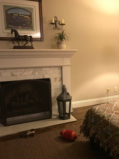
This was from our house we sold in 2/18. So kitchen was gutted in 2001 and then to update for sale we had cabinets painted in Dove white along with all doors, mouldings, trims etc. and then refinished the hardwoods. Sold in 6 days for $1.6M cash.....
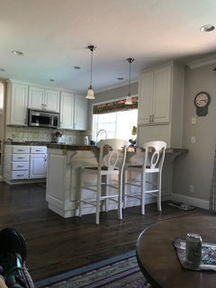
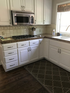
- 6 years ago
Walls are accessible beige the entire down stairs. We actually did all that a year before we sold, but it helped to have it updated
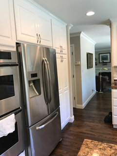
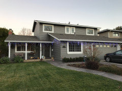
 PRO6 years ago
Jessica, that's great news that you hired a design professional. It would be a good idea to run all your ideas by her/him, and not second guess your choices from this point forward. You're paying good money for the advice, and once you and your designer make a choice, you probably should go with it.
Good luck--I'm sure you'll be able to find colors and products that work to give you the home you have always wanted!
Jessica thanked Diana Bier Interiors, LLCJessica
Original Author6 years agolast modified: 6 years agothank you Kath. I wonder how accessible beige would look with our granite. That was one of the colors I recall looking at in-store for the living room. That was back in August, so i have forgotten all
about accessible beige. I wonder if Accessible Beige would work with my true white cabinets and gray/black/white granite. I am hoping my countertop does not have a blue undertone. That assumption could be wrong on my part.
- 6 years ago
Agreeable grey is nice too! Just listen to your designer!! She narrows it down and you pick!
- 6 years ago
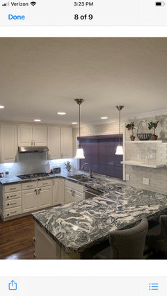
Check this out!! What our buyers did with the kitchen! A little busy for me, but love the update
- 6 years ago
Jessica, You may want to put up white poster board over your backsplash and see what it does to your counter color. At least it might give you a better read of the countertop color and also if a white of some type tile should be a consideration.
Jessica
Original Author6 years agolast modified: 6 years agoHello Houzz pals. I want to thank each and every one of your who commented. I needed to hear this!!! as i mentioned last week, we are working with a local interior designer. She’s already been here and sees our strengths and weaknesses. She gets our style and personality and is helping nudge us into an elegant but practical solution that will tie everything together. Your comments were helpful as it prepared us for the consultation which I’m sure saved precious time and money. And now she is off and running and giving us plenty to do. I won’t yet reveal the rooms we already painted per the designer’s smart recommendation, or the overall creative solutions she came up with by seeing the space in person. But I do hope all of you will check back. I will post results here and also in before and after. Again, thank you for the emergency design support education when I needed it. There is hope that these conflicting colors and styles can be blended into something we will love. Special thank you to Dormelles, Beth H, Calidesign, Kath Furt and eam44. Sorry, I won’t reveal our plan in process but we’ve already started I am looking forward to showing after pics!!! Hopefully we will be done January 2020.
- PRO6 years ago
What a nice comment, Jessica! Good luck on your project--looking forward to seeing your reveal!
Jessica thanked Diana Bier Interiors, LLC - 6 years ago<?xml version="1.0" encoding="UTF-8"?><md>Have fun Jessica and can’t wait to see the final!! It will still be you only better!!Jessica thanked Kathy Furt
 6 years ago
I agree that the backsplash should be switched out for something less dramatic. I'm also getting the impression from your pictures that the lighting in your kitchen is too harsh, especially compared to the warmer lighting in the adjacent dining room. Changing out those bulbs for a warmer/softer light might make a huge difference. Good luck!
Jessica thanked T BJessica
Original Author6 years agoHello Houzz friends who helped me with great advice regarding our poorly chosen kitchen backsplash. i am especially hoping Grateful4Advice, Beth H, caliedesign, Kath Futh, Bri Bosh and eam44 will see this mid-point follow up:)
I am not ready to post pics because we still have about 6 weeks of work remaining. But we’ve come a long way! We are very happy we made the decision to hire a designer. Although it certainly would’ve been better to start with a designer first, she has done an excellent job in this emergency situatio. She has been very valuable in correcting our mistakes with fantastic ideas that have made the most of the items we’ve already installed. Right before thanksgiving we removed the poorly chosen backspace (blingy glass mosaic). We had it up like 1 week and tore it down. Great news we do have the perfect backsplash up and it’s a. style we hadn’t really considered but it solved so many problems and took the look of the cabinets to a higher level. Other work has been completed that also helped us turn the corner. I no longer am looking at mistakes. it looks really great but I want to wait 6 weeks before posting pics. Please check back around March 7 I will hopefully be ready for the final reveal. You won’t want to miss this!!!
thank you again to all who’ve helped! I know I missed some names please believe you’ve all been such great help!- 6 years ago
Jessica! So good to hear from you!! Can’t wait and I get an email notification when someone posts so hopefully all those other people did too. So glad the designer helped you!! They’re always worth the money i think!! We’re doing our kitchen soonish so I’ll be posting too. Take care and enjoy the process !
 6 years ago
I’m so happy for you. You’re putting the work in, won’t it be fantastic to love the final look?!? Bravo in advance.
- 6 years ago
Jessica,,so happy you found something that worked. but don't leave us hanging! give us a little snippet of what you picked!
 6 years ago
It's sooo hard waiting for it all to be done! Been there, done that... can't wait to see the final product!
Jessica
Original Author6 years agooh yes thank you for the reminder. We are probably “done enough” to post pics now but I was waiting on a few more finishing touches. i am in the middle of a deadline for work at present so I can’t do it this weekend. Hopefully in 2 weeks. Thank you for the comment i cant wait to share!
- 5 years ago
See the +Follow button at the top where the OP entered there dilemma. I use it all the time, so you don't have to say 'following'.
- 2 years ago
I have always wondered how this project turned out and would love either a description of the colors chosen or photos.









calidesign