Software
Houzz Logo Print
bowmankat

Looking for backsplash advice

6 years ago
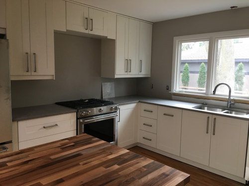
Hi all,

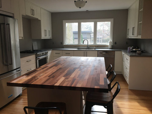
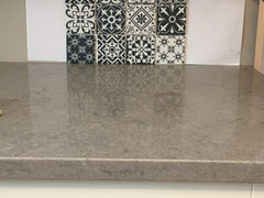
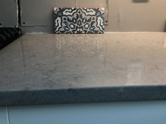
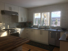
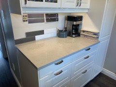
I'm not thrilled with how my new counters (symphony gray ceasarstone) are looking, so I want to make sure I choose a great backsplash. I'm not sure what is clashing here, but need something to tie it together. Cabinets are Ikea grimslov (off-white). Thanks in advance for the help.


Comments (128)

  • 6 years ago

    My problem is that I haven’t found any that seem like a home run. This is tough!

  • 6 years ago

    Brighten the wall colour. Put a backsplash behind only the stove.

  • PRO
    6 years ago

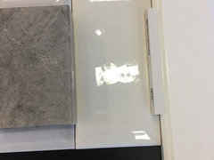
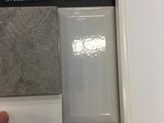
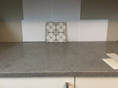
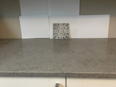
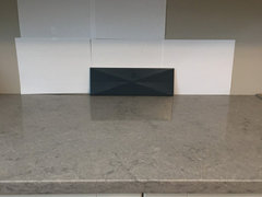
    IMO The bar samples are not great either - Going from left to right, the marble is not right at all - it's too gray and makes the counters look fake (most marbles do this when paired with quartz). The second appears too white - The third harlequin I just dislike - it's too busy and will be very difficult to clean. The large square encaustic tile is a good match, but I'd get tired of that pretty quickly and I'm not a fan of the green. The last subway tile looks like a good match with your cabinet color (at least on my monitor), and I think that's what I'd do. You can add color and interest with your accessories. IMO, you can never go wrong with subway tile. It's timeless, classic and budget friendly.

    Katherine thanked Design Girl
  • 6 years ago
    last modified: 6 years ago

    Agree tomorrow is better when you have the undercabinet lighting. Makes a big difference. Love your kitchen

    Katherine thanked lmuhrich
  • 6 years ago

    Marble backsplash

  • 6 years ago

    Backsplash

    Katherine thanked jlmjpmsam
  • 6 years ago

    Katherine, hang in there. If none of them are doing it for you, then just put them all away and start looking again.


    I started reading this old Houzz thread but don't have the time to read it all right now. But thought if you hadn't seen it before you might be able to glean some info from it that will useful in your search.

    Looks like you aren't the only one having a hard time trying to come up with a backsplash for this quartz.


    https://www.houzz.com/discussions/3701603/does-anyone-have-symphony-grey-quartz-ceasarstone-in-kitchen


    Katherine thanked tedbixby1981
  • 6 years ago

    Thanks for the pics, beautiful!


    Thank you, Ted. I have seen that thread, but forgot about it. I’m gathering more ideas from it.

  • 6 years ago

    I


  • 6 years ago
    last modified: 6 years ago

    Personally I think you may have to find something with variegation rather than a solid. It seems like anything solid is "off."

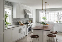
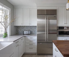
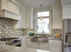
    I've been trying to locate photos of Symphony in kitchens but not to many out there. I did come across this one which is going in a different direction than what you've been looking at. But at least you can see how not having one specific color in the backsplash still pulls everything together.


    symphony gray caesarstone backsplash - Google Search · More Info


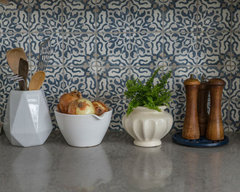
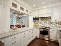
    A bit better close-up

    symphony gray caesarstone backsplash - Google Search · More Info


  • 6 years ago
    last modified: 6 years ago

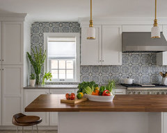
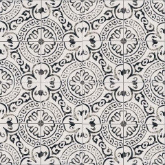
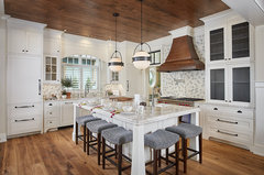
    This might be that tile. Countertop: Caesarstone 5133 Symphony Grey; Fatima hand-painted field tile in Mezzanotte finish from Walker Zanger’s Duquesa collection (found on another site)


    6 Trending Kitchens That Show How to Work In a Bold Backsplash · More Info

    Oh yep, it is. I should read the WHOLE article before posting!


    6 Trending Kitchens That Show How to Work In a Bold Backsplash · More Info


    Katherine thanked tedbixby1981
  • 6 years ago
    last modified: 6 years ago

    i like the cement one w/the green. if you don't like green, then look for one w/blue. or black/white,, or whatever color you like.

    As for getting tired of something, I'd get tired of a plain old white (or gray) subway. If you like something, you like it. I think the space needs a little color or pattern, but that's me.

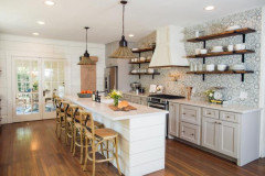
    Look at the pic T. Bixby posted. I think that kitchen is stunning. go w/a pattern and color like that if you like.


    I don't like simple and blah. some do and that's fine. Figure out what it is you want first.

    Katherine thanked Beth H. :
  • 6 years ago

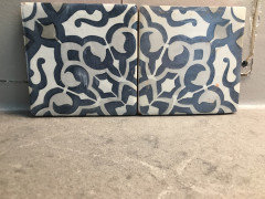
    Ted! Thank you for finding the name of that beautiful tile! I have a sample coming. It’s very expensive though. Maybe can do behind the range. Beth, I hear you, I agree a pattern would lift the space. Do u know the brand of the black and white you posted? Love it.

  • 6 years ago
    last modified: 6 years ago

    yes, that WZ tile is pricey. you can find similar looks for cheaper, you just have to look.
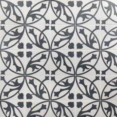
    that black and white one I posted is MSI Kenzzi paloma, 8x8 in porcelain.
    Tilebar has a similar one


    if there is a large tile store near you, you should be able to find similar copy cats. for instance, in my tile place, there is an entire wall of cement AND porcelain tiles that look like the cement


    marble


    Calacatta linear bar (Tilebar) Tuscany.


  • 6 years ago

    I am perhaps the biggest fan of blue BUT I think the patterned tile with the greenish/black will work beautifully in your space. The green and the wood work nicely together.

  • 6 years ago

    I always say, if you love it you'll never tire of it and it won't matter if it is in trend or not. I think if you decide to do a cement tile only in the hood area, you are going to have a hard time still coming up with a tile that then has to go with BOTH the counter and the cement tile..


  • 6 years ago


  • 6 years ago


  • 6 years ago

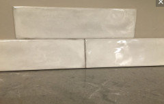
    Picked these up at Lowe’s. The first looks nicest to me so far. I also ordered a few samples from wayfair.

  • 6 years ago

    I like the 1st one of all of them, too. Not only does the coloring appear to work with your counter and cabinets it has a bit of a more modern flair like your kitchen. Once you get the other samples and if this one is still #1 to you, I'd purchase a bunch of this one so you aren't making your decision on one tiny tile.

  • 6 years ago

    Thank you! I’ll do that

  • 6 years ago

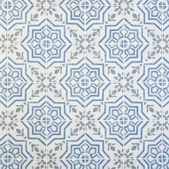
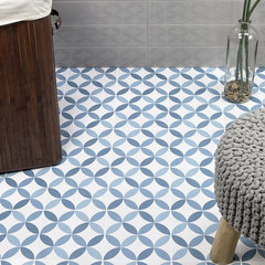
    Stratford Decorative Porcelain Tile - from Floor and Decor


    Stratford Decorative Porcelain Tile - 8 x 8 - 100506054 | Floor and Decor · More Info


    Norwalk Floor Deco Blue 8x8 Matte Porcelain Tile (Tile Bar)


    Norwalk Floor Deco Blue 8x8 Matte Porcelain Tile | Tilebar.com · More Info


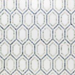
    Budget Breaker?

    Infinity Thassos & Ming Green Hexagon Marble Tile (Tile Bar) $39.41/sq ft


    Infinity Thassos & Ming Green Hexagon Marble Tile · More Info


    Katherine thanked A T@Home
  • 6 years ago
    last modified: 6 years ago

    Not sure what this one is but maybe someone else knows...


    iridescent tile backsplash - Google Search · More Info


    Katherine thanked A T@Home
  • 6 years ago

    Shades of white with grout to match counters?

    Cloe 2.5" x 8" Wall Tile in White

    Katherine thanked A T@Home
  • 6 years ago

    The Cloe might bring in the off white of your cabinets. Not sure...I've never seen it IRL.

    Good Luck!

    Katherine thanked A T@Home
  • 6 years ago
    last modified: 6 years ago

    I really like the first one from this batch you just posted too. Ted is so right when he tells you to buy more to try, though. Actually, I remember from ages ago that a poster made color copies of her patterned tile and taped those up to her wall! I stole that idea before installing my square herringbone backsplash pattern.

    I liked the larger patterned cement with the green, as well. I didn't read all the comments or look at all your possibilities, so don't know if that one got tossed.

    Hang in there. I know it gets maddening!

    Katherine thanked barncatz
  • 6 years ago
    last modified: 6 years ago

    Of the newbies, I like the first one you posted with the subdued grays, I still like the one with some green, and I think that multi white one has potential as well.

    Katherine thanked salonva
  • PRO
    6 years ago

    Katherine, of the newbies, I too like the first one as the colors seem to work well. However, I think that pattern could get very busy and hard on the eyes, almost making one dizzy. Of course, I am not a fan of the encaustic and cement tiles. It just seems trendy and very HGTV "Flip or Flop" to me. IMO, your kitchen seems like a lovely, well designed, transitional space with the shaker cabinets and warm wood. I'd want to keep it that way. The Cloe that A T@Home posted above seems like it could be a great choice and I'd give it a try.

    Katherine thanked Design Girl
  • PRO
    6 years ago

    Simple gray tile with white grout would tie all together very well. Also, Carrara White marble tile seems ideal as it consists of whites and light grays. If you want more pattern, you can choose more interesting shapes like hexagon or splitface interlocking.

    Katherine thanked Home Art Tile Kitchen & Bath
  • 6 years ago
    last modified: 6 years ago

    Hi @Katherine, beautiful choices thus far in your kitchen!!

    • I'll differ on the encaustics or strong patterned backsplash - while nice, I really don't think they are right for your space. I think it will look uncurated with your particular butcher block. Too busy, too many colors. Nice by themselves with the counter/cabinets, but then with the variated butcher block, no.

    • It's a nice size kitchen, but with encaustics and your butcher block, it's too much pattern and color crammed into the space shown. The island is really a large feature.

    • Your butcher block - so cool - makes a strong statement which is different than the inspiration photos with the encaustic tiles - those show butcher blocks with little variation of the wood.

    • While wood is universally neutral, such as your flooring, your island block variations create a different consideration. It's a pattern; reads like stripes. A busy, colorful encaustic will not play nicely IMO.

    • To get that special finish, I'd recommend a tile that brightens everything up and also carries the line of the cabinet color.

    • I like the beautiful creamy white, textured tiles you posted. Those would be gorgeous if you run them all the way up the wall and up to the ceiling on the window wall.

    • A solid light color will enlarge the space visually as the eye won't stop on a busy backsplash. It will see the island and unobstructively flow out the window.

    • Accessorize with the colors and design brought in by the busy encaustics (if you really love them) and I think you'll be glad you didn't see them everywhere. I just saw a kitchen and encaustics were used on a feature wall off to the side where they use it for a bar. They coordinated the rest of the kitchen backsplash with one of the colors pulled from the encaustic. While to me the encaustics are already dated, it was the way to do it.

    • Best of luck.


    Katherine thanked jillybean103
  • 6 years ago

    I second what frostyfootball said. Kitchens usually look plenty busy without a busy (trendy - even if you do love it) tile.

    Katherine thanked Emily Gray
  • PRO
    6 years ago

    Agree with frostyfootball

    Katherine thanked Design Girl
  • 6 years ago

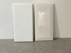
    Thank you all! You’ve given me a lot to think about. Frostfootball, really appreciate your insights. I have some encaustics arriving today, but I have to say I’m leaning towards simple.


    I’m not crazy about the first, looks maybe too white. I really like the texture and shine level of the last. It is not an exact match though, slightly gray.


    people seem to think it best to tile all around window. That’s what I’ll do unless anyone thinks that’s a mistake. My GC said it would look too industrial..

  • 6 years ago

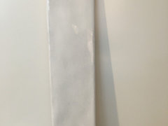
    This is the last tile in a whiter shade.


  • 6 years ago


  • 6 years ago

    You really need to post photos including the cabinets if you want us to take that into consideration, too.


    And if you find you love the encaustic, don't be afraid that it is going out of" trend". They have been around for centuries.


    No matter what tile, style and color you put up, anything will be out of trend at some point. Put up what you love and you won't care what is trending at the moment.

    Katherine thanked tedbixby1981
  • 6 years ago
    last modified: 6 years ago

    Tiling all the way around the window is a great look. Silly they said that's industrial. Yes industrial looks also do that, but so do many other styles.

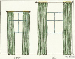
    As an analogy, I think not tiling all the way up the wall will become very old fashioned just like the old and new tips on hanging curtains like in the picture here. I can't see us ever going back to the old curtain hanging methods. That's what I think of when I see low backsplashes. Go to the ceiling and all the way up between the cabinets.


    Katherine thanked jillybean103
  • 6 years ago

    Thanks, Ted. That is the cabinet the tile is propped up against.

  • 6 years ago


    I can’t afford these, but fun to see what the walker zanger duquesqua looks like! More samples coming Monday...

  • 6 years ago

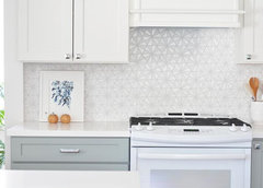
    I wonder if this tile would work Daltile - Gris Et Blanc - Baroque DA19


    Transitional North Shore Kitchen · More Info


    Another view


    Transitional North Shore Kitchen · More Info


    I think this may be the same tile but in a different kitchen


    The Gables · More Info


    Katherine thanked tedbixby1981
  • 6 years ago

    I like that, Ted! Thank you. I’ll get a sample ordered. I think this decision is going to take me a while. Luckily, not in a hurry.

  • 6 years ago

    It helps when you don't put yourself on a clock to get this done as you can take your time looking at all the possibilities and when you come across "THE" one , you'll have no second guessing as you'll know.

    Katherine thanked tedbixby1981
  • PRO
    6 years ago

    I love the kitchen example tedbixby posted. I would have suggested something similar as I think a solid backsplash is too boring and won't tie it together well enough for you.

  • 6 years ago


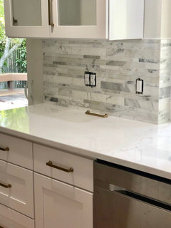
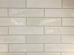
    Thanks for all the help! We ended up with “shadebrick light” and are very happy.


  • 6 years ago

    Wonderful that you found something that you are very happy with. Thanks for updating us and enjoy your kitchen.

  • 6 years ago

    Thanks for update. Looks very nice, enjoy

  • 6 years ago

    Looks great! Glad you found something that works - and I think you made an excellent choice.

  • 5 years ago

    Katherine, I am also debating g Shadebrick. Can you tell me what grout colour you used? I just posted a poll about my choices.

  • 5 years ago

    @Katherine gorgeous!!!!

    Katherine thanked jillybean103
  • 5 years ago

    Hello! Sorry I missed this earlier. We went with Lacicrete "light pewter." I like it, but actually wish we would have gone a little darker. I liked how pronounced the lines were when the grout was wet. It looked nice with the gray counters. Good luck and enjoy your new kitchen!