Software
Houzz Logo Print
webuser_915531663

overwhelmingly blue/grey

last month
last modified: 26 days ago

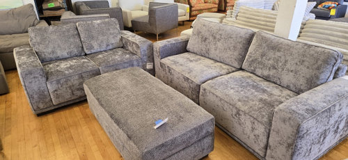
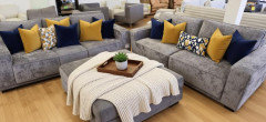
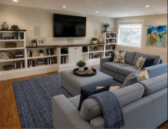
So my husband bought these 3 pieces for the media room downstairs. While comfortable, it’s an almost overwhelming amount of blue-grey velvet.

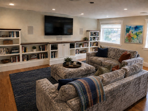
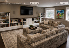
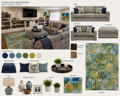
The room has white walls and a fair amount of space. I’m trying to break the look up a bit and was thinking a navy shag rug, accent pillows, a wood or other tray to break up the expanse of ottoman, and a throw might help. The art is an abstract my grandmother painted and I thought I could bring in some other colors. I could really use some community advice. Thanks in advance!

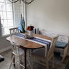
Top photo: actual furniture

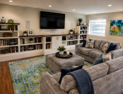
Bottom photo: styled with AI (which did something ugly to the couch fabric in this rendering)


Comments (43)

  • last month

    P.S. The first photo shows the set he bought. The second is my AI rendering to explore what we might do. Looking forward to seeing other suggestions.

  • last month

    I think you will find your new furniture will be less overwhelming if it can be placed in a room with dark-chocolate surfaces like floors and furniture. The warmth of dark chocolate like Jacobean stained wood will balance the cool grey. Accenting with navy and/or plumb will look lovely. Your AI image isn't bad! You don't have to be stuck with your wall color unless you are renting. Your walls could be dark charcoal navy, aubergine black, making your grey seating a focal point.

  • last month

    The AI rendering is lovely. In a basement a rug a bit less solid DARK may be wise. You don't want it to be a cave. The room could also use a bit of pattern. The rendering offered one item with a stripe. How about a rug with dk blue swirls, some pattern and movement. Also it would show dirt less. A solid navy rug will show every piece of lint and what not that comes it's way.

  • last month

    Recently I've observed the power of uplighting shown onto a light blue grey ceiling for making a dark-walled space feel open and airy. Torchieres are my new bestie.

  • PRO
    last month
    last modified: last month

    The set is far worse in the AI. Post a picture in your real space: ) Please?


  • PRO
    last month

    I would do a much lighter rug for sure . One of the reasons hubbies should not choose furniture but at least it does not recline. If you must have pillows also much lighter and maybe colors from the art .

  • last month

    Thanks, everyone for your ideas and feedback.
    We are renting and need to keep the wall color. I selected the upstairs furniture so we have a light and airy feeling in the living and dining room. My husband spends much more time on the couch than I do, so this downstairs room will function more as his cave, and I’m fine with that.

    We haven’t moved into the space yet, but the AI image is using their wall color and media console. There are hardwood floors that I’d like to leave partially exposed.

  • PRO
    last month

    IMO a teal rug would be more visually exciting to view. Painting the feature wall would help tone down the pattern on the seating.


  • last month

    I think your idea for navy could be nice. I would bring in navy plus brown/tan and or gold. Blues, by themselves, will not warm up the space. And imo, adding significant blue in rug, accent wall, etc. will only enhance the “overwhelming blue/grey.”


    I would definitely not use so many pillows; this is just to show the general idea.


  • PRO
    last month

    You could bring in Brown gray to tone it down with mustard

  • last month

    Colors can be so deceptive viewed online. Take one of the sofa cushions (or an arm cover if the sofa came with them) to a carpet store and see what really goes with the upholstery. There is likely to be some undertone in the velvet that may not be apparent until you put it next to other colors. The floor and wall colors are neutral, so it doesn't look like you'll need to be constrained by them. In a good carpet store you will find ready-made area rugs, and remnants that you can have cut to size and the edges bound to finish them. Don't be afraid of pattern. Something that isn't one color may make it easier for you to find a good fit.


    If you can, look at your choices in natural light next to each other before you buy. When DH and I were looking for new carpet the last time, we would take things outside to get a view in natural light. The lighting in a showroom is unlikely to be the same as what you have at home.

  • last month

    Thanks, yes. I can do that— I ran into a similar challenge years ago, choosing the right color green for a kitchen.

  • last month

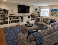
    Neutral option

  • last month

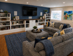
    Here’s a look with the tv wall painted.

  • last month

    taupe seems to tie it all together

  • last month

    Your furniture appears more brown in your second picture, particularly - at least it appears that way on my screen. If it’s a strong blue-grey, as you say, then in real life- it would likely look less brown than it appears in this mockup that is posted above.


    Would your furniture actually look more like this?


    If it does, and if you want to break up that kind of grey, you need


    brown, tan, gold . And perhaps consider not doing navy in the rug.

  • last month

    Such an interesting variety of suggestions! Thank you!

  • 29 days ago
    last modified: 29 days ago

    Is that the pattern or does the nap need to be vacuumed? We vacuum our velvet and suede furniture with the attachment and it makes a big difference...like a freshly vacuumed wall-to-wall carpet. Otherwise try a brush on it.

  • 29 days ago

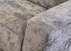
    To answer the true color questions, this photo shows what happens when light hits the velvet.

    The nap catches my eye and contributes to a feeling of being in a story sea. The showroom owner suggested buying a Bissell Little green machine, which I will do because there’s going to be eating and feet up that constantly disturb the nap,

    I’m instead shifting my view to take this as an opportunity to not be responsible for a pristine appearance —especially hard for those of us who lean toward perfectionism. 🙂

  • 28 days ago

    This is probably a closer color to your furniture. I also added a rug from Wayfair that goes well with your painting.

  • 28 days ago

    Wow! Thanks so much for sharing these ideas. Very different moods. Thanks also for the decor suggestions.

  • 27 days ago

    I like your AI mockup. Good luck!

  • PRO
    27 days ago

    How long ago was the furniture purchased? Can you return it? The fabric looks mottled and very unattractive, and if you are going to have to vacuum it frequently it sounds like a nightmare.

  • 26 days ago

    @Diana Bier Interiors, LLC - It hasn't been delivered yet, but no, it can't be returned. The picture is a bit deceiving. It's not mottled --it's velvet so the nap is just going in different directions. Not the configuration I would have chosen, but it is comfortable (I'm 5'4" and he 6'2" so that is a feat in itself). My husband will be in charge of maintaining it (or not). My practice will adjusting with good humor and just letting it be.


    I'll design around it, playing around with some ideas on this thread. Once it's delivered I'll be able to bring a cushion into a showroom to make a carpet decision. I have been enjoying the crowdsourced suggestions. At the end of the day, the relationship matters much more than any furniture.

  • 26 days ago
    last modified: 26 days ago

    I say: kick him to the curb. with the furniture. :)


    Of course, I am not serious. Totally on point what you said about a relationship mattering more. And if this space is - as you say - essentially his man cave- then even more reason to let him have the furniture he likes in there. If you are spending some time in there as well, I understand you want to be comfortable.


    Your AI rendering is not depicting the furniture accurately at all. So the rendering is essentially useless... for trying to get a sense of what colors, etc. will tone down, what you say is, “overwhelming blue/grey.” All I can tell you is basically what I have already said above: bringing in a substantial amount of blue and or grey with it, is only going to up the blue/grey.


  • 26 days ago

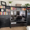
    Thanks, @freedomplace1. The photo at the very top of this thread is the actual color, and the white walls with the shelves are what's in the room currently.


    The actual furniture won't be delivered and in place until mid-late next month so there isn't much to do until then. It is useful to have a few different design directions to test out once I can see the furniture in the space, along with the light.

  • 26 days ago
    last modified: 25 days ago

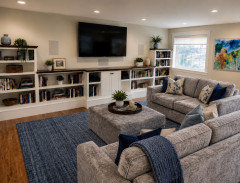
    Yes, I understand. I did a couple of AI renderings based upon the actual furniture picture. I posted them in previous comments. The first one is the actual furniture (showroom?) picture. The second one is a rendering where I attempted to import the furniture into another room/setup.


    Here they are, again:


    So I have an idea of what the furniture looks like and it looks nothing like it does in your AI rendering.


    ETA: And as I mentioned upthread... I would definitely not use so many pillows - such as what is shown above in the first image with the navy and mustard gold pillows. AI went wild with the pillows. You can of course use less pillows, and or (alternatively) just a throw or two. Using simply one lumbar pillow on a sofa can oftentimes be enough. It really depends on style and preference. These images were mainly to show the idea of using throw(s) on the ottoman, and some of the possible color ideas for breaking up/warming up blue/grey.

  • 26 days ago

    It is a challenge to determine colors, etc., based upon pictures. Cameras vary, lighting varies, viewing devices vary, etc. Plus, individual human perception can vary. But it is clear that your AI rendering is in no way an accurate depiction of the furniture color nor the texture. That is why, I did not waste my time trying to do any mock-ups with it.


  • 26 days ago

    I don’t know if this is your actual furniture color - but this is your actual furniture picture. I included a navy rug.


  • 26 days ago

    @Erin L will you be adding end tables for beverages and snacks? If so, those will help with all the grey. Will hubby be putting his feet up on the ottoman? If so, a tray there will just be in the way. What is hubby's preference regarding size and shape of pillows for the activity proposed for this furniture. A lot of decorative pillows may just be annoying.

  • 25 days ago

    imo a navy rug just adds further to dullness and lacklustre of room. I would purchase a multicoloured rug as in Emilys pic. add a few cushions with. colors drawn from those in rug. add a coupla plants and well
    placed lighting. This will liven up the sofa which btw does not look like a dull grey as the material has some sheen and movement in the fabric. i really like the sofa

  • 25 days ago

    @marhop I agree. I already stated on this thread that I would not advise a navy rug- or really any blues in a rug, for that matter.


    OP wants a navy rug, and others here have told her that the navy will work, including Emily. I used a navy rug, in that latest mockup I did, to try to show the effect of a navy rug with the OP’s actual furniture. The multi-colored rug that was used in a mock-up by Emily, that sort of mimics the OP’s art, is not one that I would suggest, either. I think it distracts from OP’s art - but the main issue is that It is mostly cool tones. And keep in mind that the mockup with that rug is not showing the accurate color of the furniture.


    Here is the multi- colored rug mockup that you are referring to, @marhop.

    Above is the latest one I did, using the OP’s actual furniture picture.


    I like the furniture, too. I don’t have a problem with the grey velvet; although I would want to balance it, because it would be too much grey for me, personally. I think it’s too much grey for OP, too. She said that it is “overwhelmingly blue-grey” - and that is literally stated in her post title... and would seem to be the whole point of her dilemma. She thinks the answer is bringing in lots of navy. I like the idea of some navy in pillows. But loading up the place with navy or any blues and or grey and or green is not the answer, imo. At least it’s not the answer if OP wants to break up all the grey. But if OP likes the look- then it is the answer.


  • 25 days ago

    Thanks for this commentary.
    I reached the overwhelm point when the ottoman of the same color was added. I would have preferred a leather one. This one could definitely benefit some breaking up with a throw and a tray, and yes, it will be used mostly for feet. :)

    I’m not stuck on adding navy, and I’m appreciating the explorations of other colors; I do want to keep the rug from competing with the art. We have some additional bold art we’ve collected from our travels so there will be other pops of similar colors on the other walls.

  • 25 days ago

    And yes, AI loves pillows much more than my husband.

  • 25 days ago

    Three pieces in the same fabric is too much . Sell the ottoman and get a cocktail table .

  • 25 days ago

    We might be sending OP to divorce court, George. ;)

    I think the ottoman idea is good- especially since it will be a foot rest. I agree that leather (or in my case, vegan leather :) would have been a nice choice. But this is easy enough to remedy, by placing a throw or two on the ottoman.

  • 25 days ago

    There are also ottoman slip covers. So down the road, that might be another option. That’s one of the nice things about ottomans; it’s relatively easy to change up the look.

  • 25 days ago
    last modified: 25 days ago

    Maybe use the large matching ottoman as a bench elsewhere in the room, and substitute a different-color ottoman (or multiples, maybe round) for use with the sofas? That would help break up the sea of blue-gray velvet. Then there are any number of options for another color in the room. Here are a few, shown by different rugs, in different styles as well as colors. (This is not your actual room, obviously.)


    I like some of these better than others, but what matters is what you like.

  • PRO
    21 days ago

    I’d be careful with the dark navy rug, simply because you already have so much blue-grey in the upholstery. I think the room needs contrast more than another variation of the same color.

    I’d pull one of the warmer colors from your grandmother’s painting instead and repeat it very selectively — perhaps in a few pillows or a throw — and bring in some warm wood and aged brass or bronze. That would make the blue-grey furniture feel much more intentional.

    I’d also consider lighting as part of the solution. A beautiful glass fixture with warm amber or golden tones could be especially effective here because it would introduce warmth above the furniture without adding more visual clutter to the room. Something Murano-inspired could be really striking against the otherwise restrained palette.

    I recently included a Murano-style glass chandelier in a video about five timeless luxury pieces, and it shows exactly the kind of warm glass and light I mean. It might give you some inspiration for breaking up all that blue-grey:
    https://youtu.be/PoZYuVMbVXQ

  • 20 days ago

    I’m also a fan of warming things up with maybe the yellow or rusty orange family of colors. Art can be art and be whatever colors but the rug should be carefully chosen to take the edge off the lounge pieces. I agree with others that suggested a slip cover for the ottoman. If you buy a rug online I’d suggest buying the smallest size available just to use as a test and then it’s easier to return. It’s a huge drag to buy a large rug that should be returned when you see the colors aren’t quite what you were expecting.

  • 20 days ago

    Late to the replies. If the furniture isn’t in your home yet wait till it is. Buy a bunch of different coloured pillows and throws and see what works in reality vs AI.

  • 16 days ago

    Thanks, everyone. I will wait for the couch before selecting throws and pillows. I did find some ottoman covers which is a good idea, also potentially putting the ottoman somewhere else and getting a circular leather one.

    I’m starting to explore more natural rugs with flecks of blue or natural wool with high/low pile. I like the idea of bringing the browns and rusts into pillows and a throw, and do have a bronze floor lamp to try. I do plan to find a couple of good SF-based stores to hunt for some remnants, as we now need at least 3 more area rugs. If anyone has rug store recs for places to go in SF, I’m all ears.