

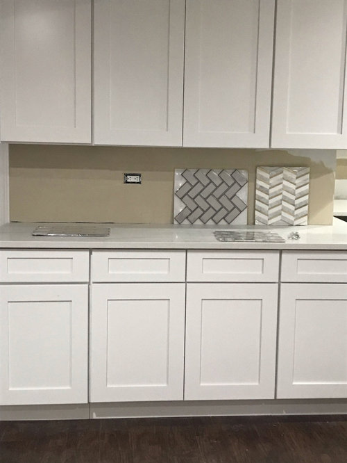
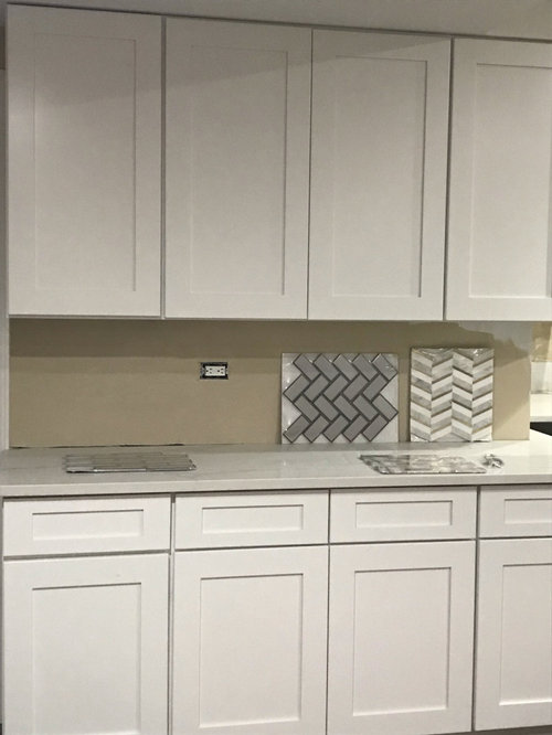
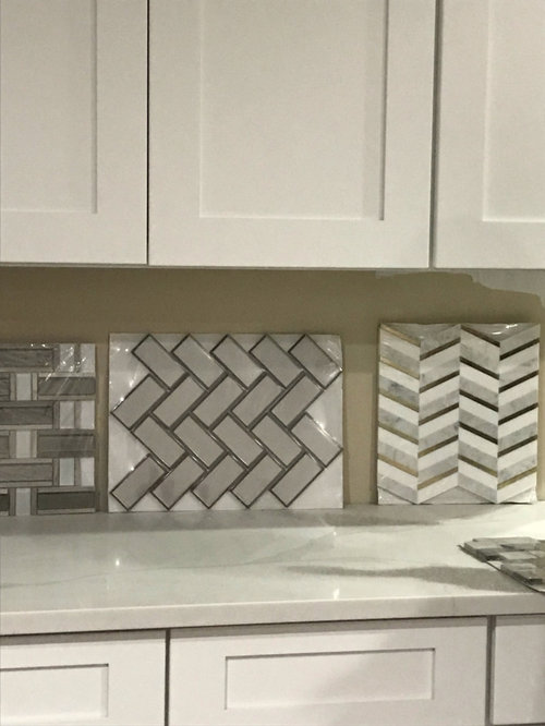
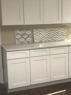
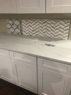
please recommend which backsplash?
6 years ago
Featured Answer
Sort by:Oldest
Comments (22)
 6 years ago
 6 years ago
Related Professionals
Indianapolis Interior Designers & Decorators · Dallas Interior Designers & Decorators · Champaign Interior Designers & Decorators · Trenton Interior Designers & Decorators · Sterling Interior Designers & Decorators · Hattiesburg Architects & Building Designers · Corpus Christi Architects & Building Designers · Amherst Architects & Building Designers · Santa Rosa Architects & Building Designers · Manhattan Kitchen & Bathroom Designers · Columbia Kitchen & Bathroom Designers · Dallas Kitchen & Bathroom Designers · Alpena Kitchen & Bathroom Designers · Mesquite Kitchen & Bathroom Designers · Lewiston Kitchen & Bathroom Designers- 6 years ago
- 6 years ago
- 6 years ago
 PRO6 years agolast modified: 6 years ago
 6 years ago
- 6 years ago
- 6 years ago
- 6 years ago
 PRO6 years ago
- PRO6 years ago
 6 years ago
- 6 years ago
- 6 years ago
 6 years ago
- 6 years ago
- 6 years ago
- 6 years ago
 6 years agolast modified: 6 years ago
- PRO6 years ago
Related Stories

KITCHEN DESIGNHouzz Quiz: Which Kitchen Backsplash Material Is Right for You?
With so many options available, see if we can help you narrow down the selection
Full Story
DECLUTTERINGWhen Simplifying, Which Papers to Keep and Which to Toss?
Find out which records you can get rid of when you are decluttering or moving to a smaller home
Full Story
MATERIALSKitchen Ideas: How to Choose the Perfect Backsplash
Backsplashes not only protect your walls, they also add color, pattern and texture. Find out which material is right for you
Full Story
KITCHEN ISLANDSKitchen With Double Islands Pleases a Baker and a Smoothie Maker
With multiple refrigerators and ovens, this space easily accommodates a couple of cooks and their guests
Full Story
HOUSEPLANTSMother-in-Law's Tongue: Surprisingly Easy to Please
This low-maintenance, high-impact houseplant, also known as snake plant, fits in with any design
Full Story
KITCHEN DESIGNCountertop and Backsplash: Making the Perfect Match
Zero in on a kitchen combo you'll love with these strategies and great countertop-backsplash mixes for inspiration
Full Story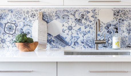
KITCHEN DESIGNBehold These Bold Kitchen Backsplashes
See how these 62 backsplashes bring beauty, personality and style to their kitchens
Full Story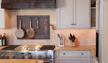
KITCHEN BACKSPLASHESKitchen Confidential: 8 Options for Your Range Backsplash
Find the perfect style and material for your backsplash focal point
Full Story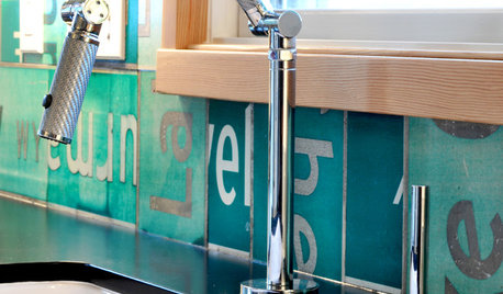
KITCHEN DESIGNSuper Backsplashes to Pair With Recycled-Paper Counters
Aesthetics and personal ethics come together for most folks who opt for this eco-friendly material
Full Story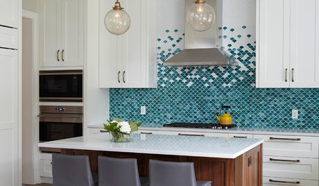
KITCHEN BACKSPLASHESTrending Now: Color and Pattern Make These Backsplashes Stand Out
Jazz up a white kitchen or enhance a dark wood one with a bold backsplash. These 10 trending kitchen photos offer ideas
Full Story

Design Girl