Software
Houzz Logo Print
twang817

Need help with colors!

6 years ago
last modified: 6 years ago
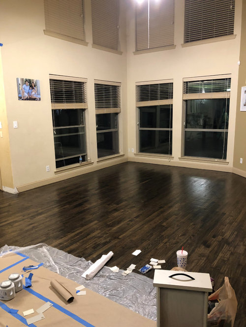
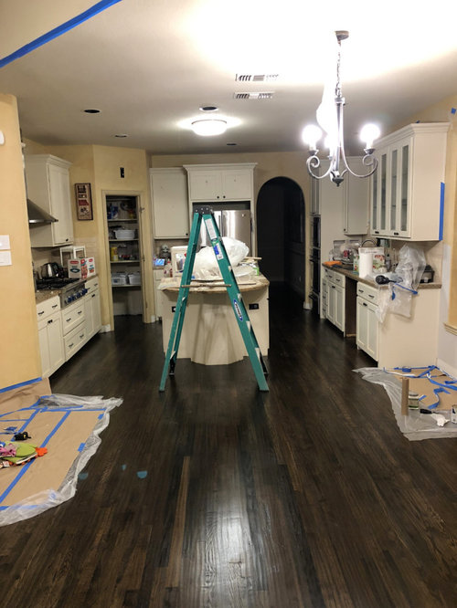
We had some water damage and needed to refinish the hardwood floors on our house. We decided to make lemonade out of lemons and took the opportunity to finish the wood floors with an ebony stain with a light scrape with the grain.


Now, while we're out of the house, we're looking to repaint.


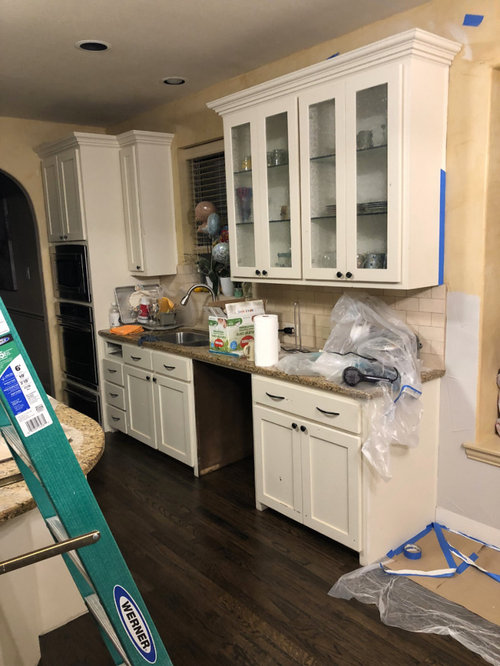
Some pictures:


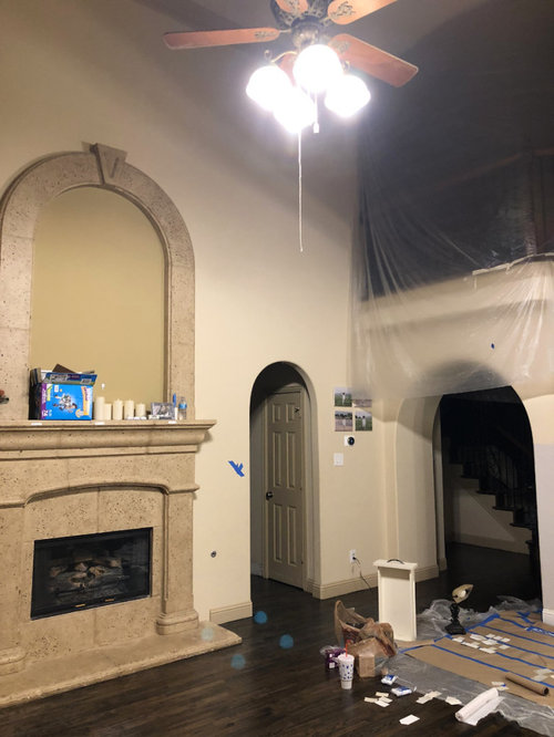
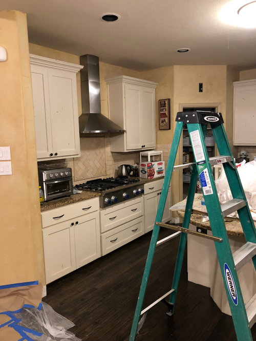
We really want to get rid of the yellow/orange and go with a more modern warm gray/white look. We're already committed to replacing the counter tops with something like a quartz. We also plan on changing the backsplash. If we must, we can repaint our cabinets, which are currently SW softer tan. We also plan on white-washing the cast stone fireplace and possibly removing the arch.


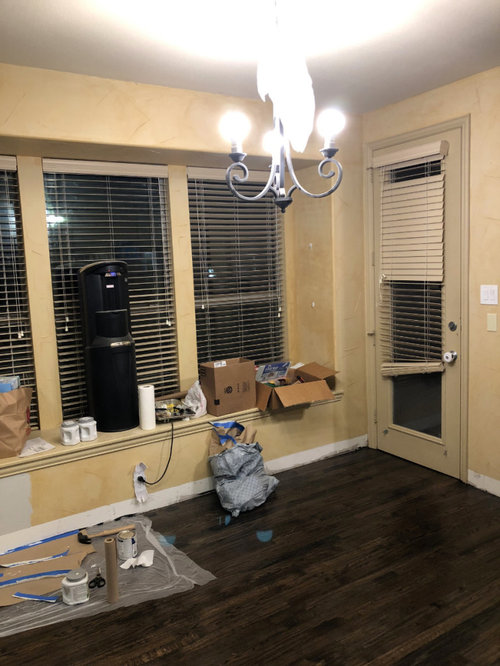
The windows along the back wall are north-facing, and the windows along the breakfast bench and the side of the living room are west facing. We are a corner lot, so we get plenty of light from the west. From the north, we currently have plenty of light as well -- but there will eventually be a backyard patio project that will probably reduce the light from the lower windows.


You can see in the 2nd picture that we've painted some samples on the wall. From left to right, they are SW agreeable gray, worldly gray, and accessible beige. The trim in that same image is alabaster white.


The beige, I think, is going to be too yellow. While its pleasant and safe, it doesn't seem like it will be that modern bright look that we're going for.


I really like the photos of agreeable gray that I see online, but for whatever reason, it looks so cool/blue in our space. We thought worldly gray may be a step warmer than agreeable gray, so we put that in a larger space around the cabinets (in the last picture) -- but it gives a slight purple/pink cast.


At this point, I'm not sure if its just the fact that I have so much yellow that's making it difficult to see what the agreeable gray will look like in the end -- or if for whatever reason agreeable doesn't work in our space.


Can someone color-gifted help us out in some color ideas?

Comments (4)

  • 6 years ago

    Why are you committed to replacing the counter tops? That is more serious than wall color.

    I agree that the current beige leans toward orange but that can be fixed after you make other changes. Wall color is the last choice you should make.

  • 6 years ago

    I dont mind the color on the cabinets (existing wall color looks bad with it), however, I like cabinets and trim all to match, and I really wouldnt like trim the color of your cabinets. I dont like the gray white with your cabinets either.

  • 6 years ago

    Sorry for the delayed response.


    When I say that we're committed to changing the countertops, I simply mean to say that we don't like what we have and plan to change them anyway. We're fairly sure we're going to go with a fairly white quartz with minimal movement -- though we haven't exactly settled on it yet. We are addressing the walls first -- because we've already moved out of the house and would like to get painting taken care of before we attempt to move back into the house.


    We're starting to realize the cabinets are really limiting the selection of colors, and we're not opposed to repainting them. They have significant amount of scratches and chipping -- plus the original wood underneath was a knotty wood that had a lot of imperfections. Even if we don't fully repaint them, we're going to have to putty the holes in touch up anyway (and hope that it matches!). I have a feeling that I'd be happier if we simply changed the color altogether.


    Given that, we hope to be starting with a clean slate in terms of color. There isn't anything that we're particularly tied to -- except the recently refinished wood floors (in ebony).


    Initially, we thought we wanted the warm gray look. Something along the lines of the oh-so-popular agreeable gray on the walls. We were shocked it looks so blue when painted up, but I wonder if that's simply because there's still so much orange and yellow in the room. The more we look at the grays, however, the more I started to wonder if they are simply too dark. So, in the past couple of days, we've started looking at warm off-whites.


    As far as what we're looking for -- it seems so effortless to find so many fantastic pictures on Houzz and Pinterest. We'd really be quite happy in most of the pictures we find -- anything that isn't too cool or stark white. And anything that doesn't border on ultra-modern / minimalist. But, it seems to me that most professionally taken photos online are 2-3 stops overexposed, which make the walls (and the room) seem quite a bit brighter than they actually are.


    In any case, we've currently established that we think Accessible Beige is too boring -- and a tad too beige/yellow. On the other hand, Repose Gray is probably too cool. Both Agreeable Gray and Worldly Gray look very blue. I just grabbed samples of Benjamin Moore's Revere Pewter and Edgecomb Gray -- and I might go pick up Balboa Mist as well. If these don't work out, we might look more seriously at the whites (SW Egret White, Shoji White, Dover White etc). Farrow & Ball's Cornforth White has also caught my eye.


    Our trims will likely fall somewhere from Pure White, Alabaster, or perhaps up to Creamy -- depending on how warm we ultimately end up on the walls.


    If it helps, we were recently asked what our favorite furniture store is -- and we're more of a Crate & Barrel type family, as opposed to a Pottery Barn. The adjectives my wife uses when describing what she'd like are clean and fresh.

  • 5 years ago

    Curious what you went with? 😊

Sponsored
Wannemacher Interiors
Average rating: 5 out of 5 stars26 Reviews
Customized Award-Winning Interior Design Solutions in Franklin Cnty OH