Software
Houzz Logo Print
jojoboston

HELP!!! I picked the wrong grey paint!!!

6 years ago
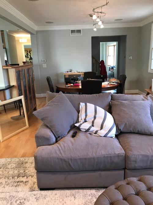
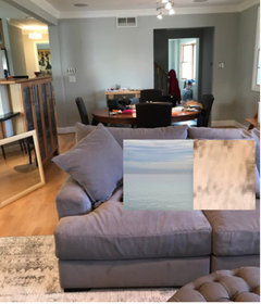
I hired a color consultant. I put up huge foam boards of 10 colors. I left them there for weeks. I obsessed and finally chose Benjamin Moore Grey Owl. I just had it done, and it looks GREEN. My couch is grey with a purpley undertone. I wanted monochromatic grey and now I feel like I have a clashing circus of odd greys.

What do I DO?! We could hardly afford this job, we can’t afford a do-over. Will decor and curtains help??

FWIW we also painted our master and hallways the same color and I like it there. Different light maybe.

Comments (25)

  • 6 years ago

    Thanks! I think I like the wall color too, it’s the contrast to the couch and the fact that the green is coming through so much. What about a huge mirror on the wall? Pillows in what color? Any/all decor advice welcome!

  • 6 years ago

    Could be the temperature of the lighting. Maybe experiment with that first.

  • 6 years ago

    Don’t panic- it’s a nice color. I agree about throw pillows or artwork maybe for that wall beyond the dining table that could bring in more colors. We need some experts with photoshop skills to chime in...

  • 6 years ago

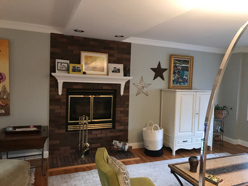
    What space is the room with the white chest? I’m seeing a lot more color there. The room with the gray sofa seems to have a lot of gray, black and white and no color. On the white chest you have pretty artwork with colors I could see incorporated more where the sectional is.

  • 6 years ago

    I think you need to add other colours that will help soften the green tone. We have grey owl through our entire house and it looks quite different in each room.

  • 6 years ago

    Thanks everyone! So we have a center hall colonial with a living room on one side (with the color) and a family room/kitchen/dining room on the other side (with the black marble fireplace). Can someone tell me what colors neutralize green? I’m not a huge color person. I really like neutrals. But I’m open to ideas. I’m thinking of putting a huge mirror on the dining room wall in back of the couch in the top photo, maybe hang white sheer curtains on thin black rods over the windows. Would that help?

    I’m driving myself a bit crazy. I really don’t like blue/green. The painter said he’d repaint those two rooms for $500. Not bad, but we don’t really have an extra $500. And, I don’t know what color I would chose instead.

    It’s true that Grey Owl looks very different in different rooms and during different times of day!

  • 6 years ago

    Try different colors of light bulbs.

  • 6 years ago
    last modified: 6 years ago

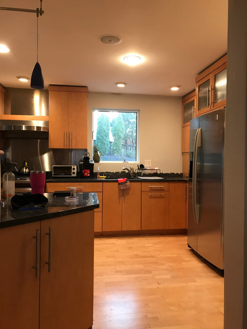
    Hi. To me it's good that you have contemporary smooth in kitchen, and ceiling light - easier possibly in a color blocking way to bring the lavendered light and greened light together. As tertiary colors, they have an affinity with each other.

    Don't use stark white, or mirror to help. Let's try other things like color.... ?

  • 6 years ago

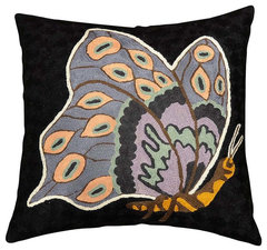
    Posting what I find... this might have the muted neutrals of sofa and paint -

    Butterfly Blossom Black Decorative Pillow Cover Hand Embroidered Wool 18x18" · More Info

    https://www.houzz.com/products/butterfly-blossom-black-decorative-pillow-cover-hand-embroidered-wool-18x18-prvw-vr~24170416

  • 6 years ago
    last modified: 6 years ago

    Another aspect of it is the different styles there - the white unit and mantel might be fine, but to me aren't good with dark brick. I don't think that's helping with new paint color.... but what in person is it like? There are houzzers who've made a medium neutral of their fireplace.

  • 6 years ago

    I wouldn't focus at all on white even - of the pillow or the rug - they don't seem a great help with sofa color....? are the dark chairs ok?

  • 6 years ago
    last modified: 6 years ago

    Green, purple and orange form a triangle on the color wheel. This is a triadic color scheme. everdebz 's butterfly pillow above is an example of it.

    It doesn't need to look like 1960's op art. In soft muted colors, it's a beautiful color scheme. So my suggestion is to add the third color, orange, in a very muted way i.e. a pale peach or pale caramel color. You already have it in your rug. You could look for cushions or throws with the 3 soft colors.

    Your white pillows could have covers in these muted pastels to tie things together. The 2 "pillows" I show are just ideas for color. The peachy/caramel one is a snip of your own carpet color, enlarged.

  • 6 years ago

    The rug is actually a cream so that’s a good idea

  • 6 years ago

    I love the wall color.

  • 6 years ago

    I think the problem is it doesn’t go with my couch and decor.

  • 6 years ago

    Totally understand your frustration... color of each are great but so don’t compliment each other. Can you repaint just the one room? Or couch swap?

  • 6 years ago

    Easy to fix by adding decor that compliments both.

  • 6 years ago
    last modified: 6 years ago

    There might be a sofa cover that'd be ok. I think you'd be more pleased, but I wish we could see the room in person.


    https://www.houzz.com/products/mist-decorative-accent-throw-pillow-prvw-vr~105864593

  • 6 years ago

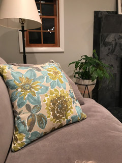
    So I put this pillow from another room on the couch. It does seem to neutralize the green and pull things together; although I don’t like this pillow in the family room. Any other decor suggestions; pillows, something to put on the back wall?

  • 6 years ago

    If you are looking for a reproduction, Claude Monet has beautiful mixtures of pastels. I think this one has the colors you need. I have a soft spot for this one since I have seen the beautiful original. It is part of a series, this one is called Houses of Parliament, London.


  • 6 years ago
    last modified: 6 years ago

    All I know is I think those walls are gorgeous!! Yes, I see the green, but it's a "nice" green not a "blah" green if that makes sense. I'd hate to see you spend to cover it.

    I understand well how hard it is to pick the "right" gray. It took me 2 months and 25 samples to pick my color, and I just ended up with Agreeable Gray. But then the real headache started, picking an exterior gray. It took even longer and even more (about 40) paint samples. I thought I was going crazy. My husband almost divorced me. And still... sometimes I see purple in our exterior color. Gray is just such a hard color to pin down.

    Anyway,I was just commiserating. Like others are saying, accessories (a throw blanket to cover some of the couch color?) can pull them together more, but I'd live with the color for awhile before you go the repainting route, because it really is beautiful.

  • 6 years ago

    Ok, so I just did the same thing. Spent months mulling things over, making big sample boards and I still got it wrong! I’m repainting my bath, bc it would bother me to no end. Sometimes you need to see the finished product to see if it worlds. I’m only out of a gallon of very expensive $90 paint. So there’s that.

  • 6 years ago

    If I was you, I would just repaint one room, like someone else suggested.

  • 6 years ago


    i like the pillow you added. I’m thinking you need some colorful artwork And pillows. From your previous comments, I got the sense you were wanting a sort of neutral room with gray tones. If sticking with your new wall color, i would say you’ve introduced a color now and you have to embrace that. I like the idea of florals or abstract. Your kitchen cabinets seem a little more contemporary so maybe an abstract.