

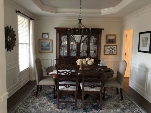
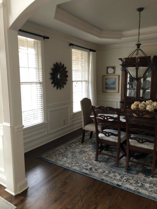
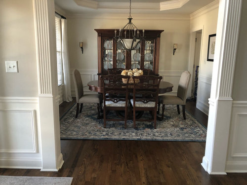
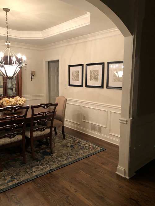
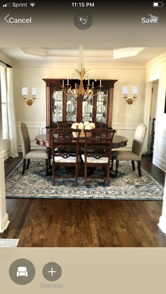
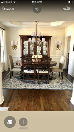
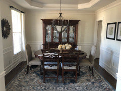
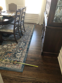
Which looks better?
6 years ago
Featured Answer
Sort by:Oldest
Comments (28)
 6 years ago
Related Professionals
Mobile Interior Designers & Decorators · Tuscaloosa Interior Designers & Decorators · Fort Smith Interior Designers & Decorators · Alexandria Interior Designers & Decorators · Albuquerque Interior Designers & Decorators · Billings Interior Designers & Decorators · Branson Architects & Building Designers · Greensboro Architects & Building Designers · Sioux City Architects & Building Designers · Alexandria Architects & Building Designers · Pittsburgh Architects & Building Designers · Newport Architects & Building Designers · Grand Rapids Kitchen & Bathroom Designers · Bakersfield Kitchen & Bathroom Designers · Cheyenne Kitchen & Bathroom Designers- 6 years ago
 6 years ago
 6 years ago
 6 years ago
- 6 years ago
- 6 years ago
 6 years ago
- 6 years ago
- 6 years ago
- 6 years ago
- 6 years ago
- 6 years ago
 6 years ago
- 6 years ago
- 6 years ago
 PRO6 years ago
 6 years ago
 PRO6 years ago
 6 years ago
 PRO6 years ago
- 6 years ago
- PRO6 years ago
- 6 years ago
- 6 years ago
- PRO6 years ago


Related Stories

LANDSCAPE DESIGNGarden Overhaul: Which Plants Should Stay, Which Should Go?
Learning how to inventory your plants is the first step in dealing with an overgrown landscape
Full Story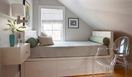
BEDROOMS7 Ways to Make a Small Bedroom Look Bigger and Work Better
Max out on comfort and function in a mini space with built-ins, wall mounts and decorating tricks that fool the eye
Full Story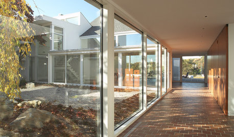
GREAT HOME PROJECTSUpdate Your Windows for Good Looks, Efficiency and a Better View
Great home project: Replace your windows for enhanced style and function. Learn the types, materials and relative costs here
Full Story
FURNITURE6 Decades-Old Designs That Look Better Than Ever
After getting a few nips and tucks, some favorites from the ’60s and ’70s have made a stylish comeback
Full Story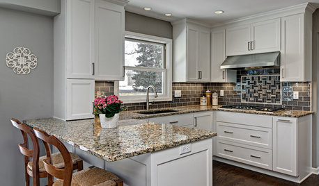
BEFORE AND AFTERSSmall Kitchen Gets a Fresher Look and Better Function
A Minnesota family’s kitchen goes from dark and cramped to bright and warm, with good flow and lots of storage
Full Story
FUN HOUZZHouzz Quiz: Which Midcentury Modern Chair Are You?
Have a seat for a little fun. Better yet, have a seat that has you written all over it
Full Story
REMODELING GUIDESWhich Window for Your World?
The view and fresh air from your windows make a huge impact on the experience of being in your house
Full Story
You Said It: ‘Which Color Truly Reflects You?’ and Other Quotables
Design advice, inspiration and observations that struck a chord this week
Full Story
KITCHEN DESIGN12 Great Kitchen Styles — Which One’s for You?
Sometimes you can be surprised by the kitchen style that really calls to you. The proof is in the pictures
Full Story



jck910