Software
Houzz Logo Print
linda_buckles_ortega

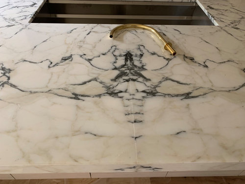
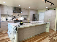
Bookmatched marble off-center

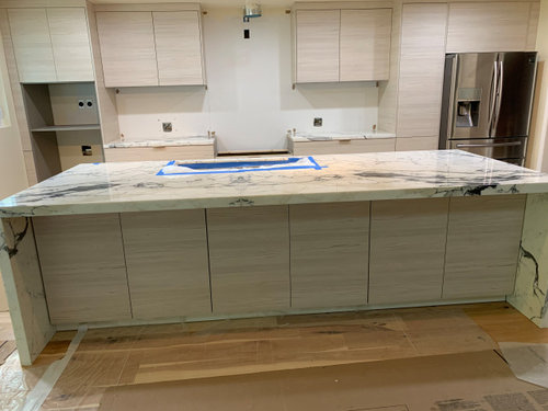
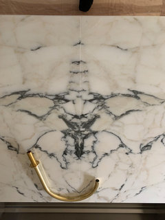
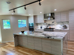
The marble is Statuario Venato. We had to add a seam to our 10’ island. We thought the seam would be done as inconspicuously as possible; but was surprised to see this book matched seam, which seems inappropriate since the seam is not centered on the island. What are you thoughts/advice?


Comments (88)

  • 6 years ago

    Wow..beautiful Looks like a dragonfly.

  • 6 years ago

    That book matching is stunning.


    I see lots of veining, so I don't think he would have been able to find a "mostly white area". If he hadn't bookmarked, it would have looked like a vein suddenly ended and it would have still been obvious. So, given the seam would be visible, why not use it to make it look luxurious and artistic?


    Good book matching is hard. That's amazing. Visitors are going to be wowed by it. It looks intentional with a high degree of difficulty in planning.

    Linda Buckles-Ortega thanked Laura Mouse
  • 6 years ago

    From what I’ve read here, behind the sink is ideal because it means a shorter seam and an eye distracted by the sink/faucet

  • PRO
    6 years ago
    last modified: 6 years ago

    I have to ask. Are you in Florida? Near or in Palm Beach Gardens?

    " I had too much faith in the fabricator"

    What does that even MEAN? You saw a layout. Did you ASK how the veining would look? Make a trip to the shop before a cut and polish? What is the guy supposed to do, when he knows darn well ,most folks would scream without a veining line up, and nearly imperceptible seaming?

    Seams on islands are a peril. You either select a different stone/slab, or you shorten the island to accommodate your slab. Bottom line is in ANY language, ............nobody can read your mind. You could have reversed the slab, but how would he know that?

    That said, I see nothing wrong with the seam, with the location, or the book match.

    You "didn't ask for a book match". .........where were you for the template? If in any doubt, you see it taped off at the shop.

    At the sink is the most desirable place for a seam on an island. Taking advantage of Mother Nature and a book match is s.o.p. as well. It looks fine and I will go so far as to say you would have hated anything else with that slab. Maybe write the guy a thank you note and move on to enjoy the stone and the kitchen.

    But. I am dying to know your location, : )

  • PRO
    6 years ago
    last modified: 6 years ago

    Will add:

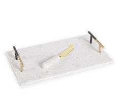
    Eighty five percent through a kitchen install is that. Get the rest done and stand back - your perspective will change. Probably to include Mom Nature as well. If not? Ask ( now ) for the cut out from the sink to be cut and polished. Screw in some bar pull cabinet handles, to each end on top. , Ten inches or so. Set it in front of that sink and faucet. Declare yourself a genius for the beautiful "cheese tray". Put some bumper feet on it .Gandalf banished .


    Linda Buckles-Ortega thanked JAN MOYER
  • 6 years ago

    I love it! I think it would look weird if it wasn’t centered on the sink.

    Linda Buckles-Ortega thanked CC
  • 6 years ago

    I think it’s a terrific match. And that stone is fabulous. I’m sure they did the best match they could with the pieces of stone you had. It’s quite perfect as a book match. No one will notice except you. Everyone will be taken with the beauty of the stone. Yup, you’re over-thinking.

  • 6 years ago
    last modified: 6 years ago

    @JAN MOYER obviously there was a lapse in communication. Had no idea he planned to book match the seam. The objective was to make that seam inconspicuous. He suggested to place the seam centered on the off-centered sink. The sink is 44” so if the seam was centered on the island, it still would have run into the sink and not the full depth of the island. We did go look at the templates in person. The tape hid the edges and because of my inexperience, I thought we were on the same page during our discussion, of having the veins continue flowing in one direction. I like the book match very much, but would have preferred it to be centered on the island. It was a surprise. A book match seam is a striking detail and should have been discussed with an opportunity for us to see the formation before the slab was put in. We didn’t try to imagine it under the tape edges of the template, as book matching was not discussed!!

  • 6 years ago

    @JAN MOYER we are in Southern, CA

  • 6 years ago

    I think it is done right and is lovely.

    Linda Buckles-Ortega thanked Susan Murin
  • 6 years ago
    last modified: 6 years ago

    With that stone you were never going to get an inconspicuous seam. There is too much veining. The book matching was the best way to go. If you can't make the seam inconspicuous then make it into a feature and that's what was done. If it was book matched and put somewhere else on the island it would not look good at all. If you didn't book match you would have veins dead ending into the seam and that would look horrible.

    Linda Buckles-Ortega thanked vinmarks
  • PRO
    6 years ago
    last modified: 6 years ago

    I must be confused. Your words:

    "I didn't ask for book match"

    .............. there was a language barrier........ ( my interpretation of your words"........you thought he understood.

    You said you wanted "inconspicuous"

    Well Believe this: An off the sink seam, with some "random " vein match , or even a logical close match? Would be a helluva lot more conspicuous than what you now have, even perfectly executed.

    Thus? If you do NOT have a skilled communicator/designer working on your behalf ? You are the self appointed communicator with all who shall be involved in your project. With that? there is no verbal anything. If you have a vision? You draw it.You pair the drawing with text. You had a vision. At template view a simple " does it look like this under that tape?" ( you sketch) NO??? Draw this for me, please? One pencil, one piece of paper. No problem. The picture worth several thousand dollars that cost .........five minutes.

    Unfair? Sorry. That's the "rule" Or as the saying goes:

    Don' t ass- ume lest you make an ass- of u - /me.

    It's like saying "I want red walls!" . ........you don't let the painter decide the red. You give him the color. Unless you favor a stop sign in your dining room. : )

    Linda Buckles-Ortega thanked JAN MOYER
  • 6 years ago

    "I like the book match very much, but would have preferred it to be centered on the island."


    I understand the desire for symmetry, but with the off-centre sink, you have to carry it through. I'm no design expert, but I know I like things that are balanced. If I knew how to photoshop, I'd move that seam to the centre and I think you would see that it would look out of kilter.


    In the version you have, the ethereal wings of the moth balance the sink with the wing tips beautifully framing the sink. The darkish large veins on the right and left lower section of the island countertop counter-balance the sink. If you shift the seam over, all that beautiful balance is off kilter.


    I know that you probably pictured this island looking like one continuous flowing slab with an invisible seam. It's hard to let go of a vision. I think if you wanted something like that, you would have had to pick something less dramatic with small light veins. What you have is an amazingly dramatic stone and I think if you can let go of your vision, you can embrace your stunning island. I think that seam beautifully pulls out the artistry of that stone and elevates the entire kitchen.

    Linda Buckles-Ortega thanked Laura Mouse
  • 6 years ago

    What Laura said: Workmanship is very nice quality and aligning the book match took a good bit of care. Centering on cutout is standard practice and would have looked off any other way given the sink form the visual center of the island.


    Time to let go and enjoy your wonderful island.

    Linda Buckles-Ortega thanked pc6103
  • 6 years ago
    last modified: 6 years ago

    Looking at the veins today, they seem to animate—like they’re running and pouring into the sink. That’s pretty neat... I think all will be ok. Funny how veins can begin to take on a life of their own.


  • PRO
    6 years ago
    last modified: 6 years ago

    As I always say: 85/90 % of the way through a kitchen re do is just that. Panic has its own life. : )

    Linda Buckles-Ortega thanked JAN MOYER
  • 6 years ago

    I think the bookmatch is beautiful and looks great where it is. So jealous!

    Linda Buckles-Ortega thanked robinhall120
  • 6 years ago

    Your fabricator may not be a communicator but he/she is an artist and perhaps you should just bow in respect. Those mitered seams on the edge are incredible and the end result is stunning. I like the off center. LIke someone said above it looks like things are moving towards the sink.

    Linda Buckles-Ortega thanked scrappy25
  • PRO
    6 years ago

    Oh my that bookmatching is beautiful. It sets the offset of the sink perfectly. It will be inconspicuous by looking like it's supposed to be like that, particularly once the rest of the stuff is in place. Good job to the fabricator!


    And I'm not fond of stone in the kitchen in general... but I rather like your island, and had to cheer along with others. Your counters make me like stone used in this way.


    If you can keep your sink cutout as scrap- do it. Willing to bet it might be in two pieces, also bookmarked.

    Linda Buckles-Ortega thanked beesneeds
  • 6 years ago

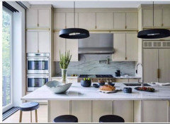
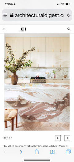
    This was one of my inspiration pictures for sink and appliance placement. Appliances to be installed today—will post updated pictures!


  • 6 years ago
    last modified: 6 years ago

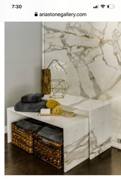
    Found this pic of a use for scrap marble—nesting tables. pretty neat!


  • 6 years ago
    last modified: 6 years ago


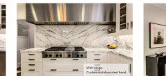
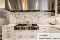
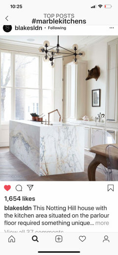
    Found this pic today and it’s interesting: An off-center book match—showcasing the range...somewhat similar in concept to our book match, showcasing our off-centered sink. What are your thoughts? Thank you.

  • 6 years ago

    I think it looks very nice, and I wouldn't have noticed it being off-center right away. However, there's an evil ant awaiting its chance to take over the kitchen.

  • 6 years ago

    Using a bookbookmark & having it centered over the stove really highlights the stove & is more interesting than a traditional backsplash .

  • 6 years ago

    Rhyme and reason are more important than symmetry. Symmetry is just a starting point. Love that backsplash.

    Linda Buckles-Ortega thanked Zalco/bring back Sophie!
  • 6 years ago


  • 6 years ago

    This is our backsplash right now 👆

  • 6 years ago

    Linda...your kitchen is great. I have done two kitchens with granite and had a great fabricator, the same one, both times. I gave him measurements of a small cart and the little table under the wall phone and a couple of other places I could use the off-cuts and larger scraps, and he made granite pieces for each one. Those small platform ideas shown by ariastonegallery.com are fabulous. I’ll use that idea next time.

  • 6 years ago

    Next time if there is one, I’m definitely going to hire a designer/coordinator.

  • 6 years ago

    I'm glad you are seeing how gorgeous your island is. As Jan said, panic can take over your ability to see that this fabricator is very, very talented. Your island and backsplash are definitely unique. Not perfect - unique. Embracing that should help you start enjoying your new space.

    Linda Buckles-Ortega thanked RedRyder
  • PRO
    6 years ago

    I think it's beautiful. And I think your fabricator is smart to have thought this through. It's easy to stress about every little thing in a renovation—it's so much money and you want to get it right. But take a step back and view it through a stranger's eyes. It's actually very beautiful.

    Linda Buckles-Ortega thanked Renov8or
  • 6 years ago
    last modified: 6 years ago

    Funny I was thinking if the fabricator discreetly signed his initials or name near his book match design—I’d probably appreciate it more—being that anything an Artist does is never wrong.

  • PRO
    6 years ago

    You really just need to write a thank you to Mother Nature. :: ) No disrespect to the fabricator. ...,,,,

    Linda Buckles-Ortega thanked JAN MOYER
  • 6 years ago


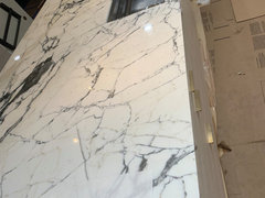
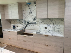
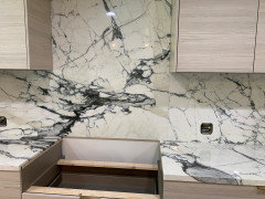
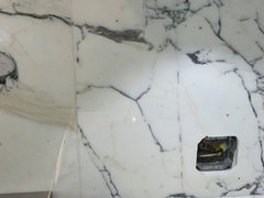
    Another seam because our 4th slab wasn’t quite wide enough for the backsplash; but what is kind of neat is that the seam line mimicks the vertical vein that’s to the right of the seam—especially from a distance. #idontliveinaperfectworld. Lol

  • 6 years ago

    I think it all looks awesome! I like the seam centered on the sink. Stunning

    Linda Buckles-Ortega thanked Mary Nigro
  • 6 years ago

    Love it! It’s artistic and showcases the sink beautifully!

    Linda Buckles-Ortega thanked brendapbennett
  • 6 years ago

    Your kitchen wizard looks stern but I think he approves :)

    Linda Buckles-Ortega thanked thinkdesignlive
  • 6 years ago


  • 6 years ago

    I too think it's just beautiful.

    Linda Buckles-Ortega thanked kathiebartel
  • 6 years ago

    Your fabricator did one of the best jobs I have ever seen. You should thank your lucky stars you found him to do your job. It's stunning.

    Linda Buckles-Ortega thanked cpartist
  • 6 years ago

    I think if you were standing at the sink and the bookmark seam was off to the left it would look really odd. The fact that you can stand at the sink and have that stunning seam right in front of you is great.

    That seam is stunning and the bookmark is gorgeous. Your guy is an artist.

    Linda Buckles-Ortega thanked blfenton
  • 6 years ago
    last modified: 6 years ago

    I like that the veins all seem to be funneling towards the sink. Yes, the seam looks like a human pelvis from the seating end; and from the sink side it looks like a little gremlin there with a big cape 😄


  • 6 years ago

    This is what I was picturing in my mind originally... but in this pic I imagine it was huge slabs to begin with.


  • 6 years ago

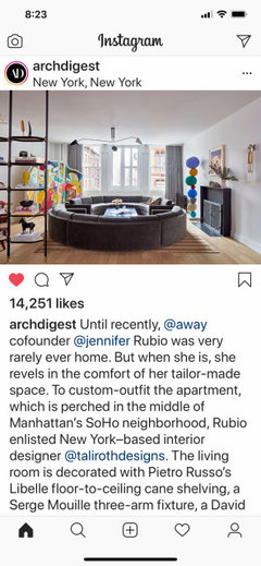
    Here is another inspiring image! A reason I put sink off center 🙂. Wish I knew about seams, and how bookmatching is a beautiful solution to the peril!


  • 6 years ago
    last modified: 6 years ago

    @RedRyder thank you for your comment. I thought of you when I saw this chandelier in this pic; I can see now how imperfection has its quality too.❤️ The imperfection here lends an appreciation for it—that it is no less beautiful, and actually is peace invoking, because we do not live in a perfect world.


  • 5 years ago

    I just want to thank everyone again for your encouragement and support. @Shasta, you were right, after getting the fixtures in, it would look great. 😁🙏🏼

  • 5 years ago

    Your marble is gorgeous. I especially love your dramatic backsplash. Could we see photos of the completed kitchen?

    Linda Buckles-Ortega thanked Carolae
  • 5 years ago


  • 5 years ago

    Wow, just gorgeous! Thanks for sharing the after pics. I concur with the previous posters, your installer did a fantastic job.

Sponsored
Wannemacher Interiors
Average rating: 5 out of 5 stars26 Reviews
Customized Award-Winning Interior Design Solutions in Franklin Cnty OH