Software
Houzz Logo Print
mar_77

Tile samples are here - please help with selection

6 years ago
last modified: 6 years ago
Counters are installed. Cabinets may stay the same golden oak (for now). May paint them off-white in the future.

Of the samples that came in - here are the choices in order of preference. Please give me your opinion. Thanks!

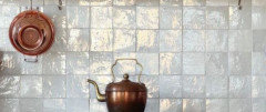
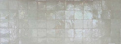
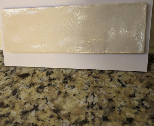
1) A Zellige look ceramic cream tile (with a shine when it catches light) 2 by 8

May also consider the 4 by 4


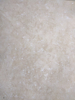
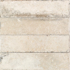
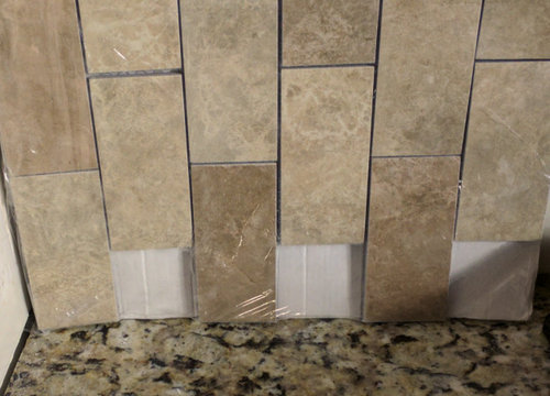
2) A Travertine look porcelain tile 2 by 4


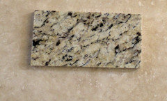
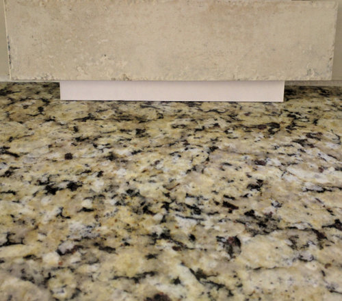
3) A stone look porcelain tile 2 by 12


Comments (34)

  • 6 years ago

    I don’t like #1 for a variety of reasons. The unevenness, the extra shine it seems to emit.

    #2 is travertine albeit porcelains, no and no. It’s too busy, it’s a dated look. But if you love it ......

    That leaves #3. The color at least on my monitor is spot on. I would prefer it in a ceramic finish. Sometimes matching is very hard. The bottom line comes to what you are comfortable with.


    mar 77 thanked eld6161
  • 6 years ago
    last modified: 6 years ago
    @eld6161, thanks for replying

    I was afraid the travertine look is dated. That tile is my husband's favorite. Although the colors seem to blend well with the granite. It's porcelain and easy to clean. Would also provide contrast with off-white cabinets in the future.

    I really like the Zellige look tile. The shine makes it not a boring subway. The uneveness gives it a hand made finish. It mimics the very expensive Moroccan tiles. Husband does not like the shine. But is ok with whatever I choose. Shine makes me happy- lol

    The last tile #3 color does blend with the granite. The surface has some pits which could be a trap for cooking oils and sauces in a heavily used kitchen. It's also seems a bit too big?

    Will I be making a mistake going with #1? Will it look too modern with wood cabinets and the warm granite? Floors are light cream-taupe travertine look 18 by 18- porcelain.@@

  • 6 years ago

    I just think it's too yellow. might make a cream hard to pick.

    you can seal #3 so that pits and stone surface don't have to be a problem, but if you scrub your backsplash a lot, you might have to reseal occasionally.

    mar 77 thanked acm
  • 6 years ago
    last modified: 6 years ago
    Thanks, @acm. Granite does look yellowish in the picture, but it's more cream, white, beige, buff and taupe (It's not Venetian Gold or Santa Cecelia). The tile matches the lighest cream in the granite.

    Would a similar tile in white go better than cream? Maybe the 4 by 4? Will have this look. What if I mix cream, white and gray tiles? Or keep it one color? Help!


    Good idea on sealing #3. Not sure if the 2 by 12 is a bit big for my kitchen. Will have to see if I can find #3 in a 3 by 6. It has a rustic stone look with uneven and pitted edges.

  • PRO
    6 years ago
    last modified: 6 years ago
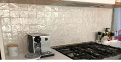
    What is the FLOORING? I see nothing wrong with the third Use a soft ivory white grout., no yellow in it.


    mar 77 thanked JAN MOYER
  • 6 years ago
    last modified: 6 years ago
    @JAN MOYER Flooring is a cream-taupe-white travertine look porcelain 18 by 18 tile- picture below.

    (#2 Travertine look backsplash tile above is darker shades of the floor tile. It also matches all the colors in the granite.

    #1 Zellige look tile has a more modern but handmade feel and I was thinking it would not make the kitchen look too traditional with all the warm colors and wood. But would the styles clash?

    #3 is very similar to the floor tile - but lighter and muted).


  • 6 years ago

    Don't listen to @acm on the sealing. Tile is porcelain.


    Where are these tiles being used? Backspash? We need to see all the colors and surfaces together.

    mar 77 thanked strategery
  • 6 years ago

    I like 1-go with your gut, the reasons you have given for it seem spot on to me!

    mar 77 thanked rnonwheels
  • 6 years ago

    @strategery - tiles are for the kitchen backsplash. I will try and post a picture of the space, but kitchen is still a mess as lighting is going in. Maybe I'll post a part of the kitchen.


    @rnonwheels - thanks. I probably need to get some of the white and cream in 4 by 4 to see how that looks too.

  • PRO
    6 years ago
    last modified: 6 years ago
    Your flloor looks to be in quite a conflict with your counter tops. Post a well lit photo of the entire kitchen. Back splashes and tile are niot the cure for Polio or any other "disease".

    Show the kitchen. Lights on, daylight and several angles.

    mar 77 thanked JAN MOYER
  • 6 years ago
    last modified: 6 years ago

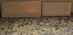
    @JAN MOYER - here is a sample of the counter and floor

    Under current lights the counter does look yellow, but it is cream, taupe, white, black, gray and rust/dark brown. The floor has cream, taupe and white (taupe in floor not showing well in pic).


    Will post a larger space when we have the correct lights.

    But narrowing choices to pictures below. Do you have any suggestion. Anyone else vote on the tile choices below?

    Grout will be matching the tile in all 3 choices below. Cabinets will be painted off white (maybe an expresso glaze) in the future. For now they are oak.

    #1 in a brick pattern and not stacked like below


    #2 in cream and not the color below. Could not find a picture of cream with that shine.


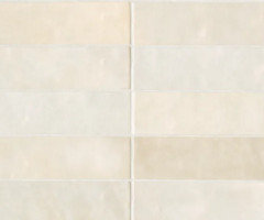
    #3 a 3 by 6 gloss bevel subway in cream.


  • 6 years ago

    The only one that looks okay to me is #3 in your first trio of pix (stone look porcelain). I would pick something close to the lightest shade in the counters (cream) for a simple backsplash with no pattern.

    mar 77 thanked chloebud
  • 6 years ago
    last modified: 6 years ago

    @chloebud- thanks for replying. This is what #3 looks like.


    Any from choice #4, #5 and #6 in my most recent post?

  • 6 years ago

    @chloebud, I think I am slowly leaning simple too. The solid cream subway bevel is growing on me. Just has an elegant, classic look with the light bouncing off the bevel. With off white cabinets (in the future) the kitchen will look updated. For now the wood may work with it too.


    So difficult to select backsplash. Thanks so much for replying.

  • PRO
    6 years ago

    No bevel. Just a simple soft white subway as the eventually painted cabinets you'd like..........with no glaze. It just looks dirty. Always. It largely went away.in cabinet finishes, for just that reason.

    mar 77 thanked JAN MOYER
  • 6 years ago

    @JAN MOYER - is there a reason you say no bevel? Is it outdated? Or some other reason? My husband does not like a regular subway tile- says it looks like a bathroom. I looked at other subway tiles that looked handmade - uneven edges - but that was a no from him too.


    I just got a sample of the bevel tile. It's a light cream. I can find edge tile to match it- so cutting the bevel where needed won't be an issue. I will post the sample tomorrow. My favorite is still the Zellige look tile-it will have some contrast with the future painted cabinets. But still not 100% sure.


    Thanks for letting me know about the glaze.

  • PRO
    6 years ago
    last modified: 6 years ago

    I said no bevel, because it too, has an effect of "quadrupling" the lines..........even though grouted as field. It too is a bit dated, just like the glazed cabinet. You ONLY need a simple ivory subway tile in an updated SIZE. Longer and narrower. The granite is plenty busy.

    Why don't you see if a local tile shop can get you a sample of:

    Alyse Edwards Tongue in Chic collection in TWO colors: "I think I'll Bisque it" and "Don't be a shell out"

    It has a nice hand cut look , a bit wavy, and is 2.5 x 10 in size. You can get pencil liner that matches. Both colors.......see which looks better. The shades are inaccurate online. You need the in person.

    PS.............. Tell hubby that a kitchen is the sum of ALL parts... : )

    http://www.alysedwards.com/collections/31/tongue-in-chic

    mar 77 thanked JAN MOYER
  • 6 years ago
    last modified: 6 years ago

    Listen to Jan. And I wouldn’t let your husband randomly veto every choice. Subway tile is classic, has been used for decades and for good reason. My mother’s 1920/1930’s bathrooms (original) have subway tiles (she’s in NYC).

    That granite is too busy for anything but a SIMPLE tile and no contrasting grout.

    mar 77 thanked Anna (6B/7A in MD)
  • 6 years ago

    Any of them will look nice. Many answers on here are biased by current trends. It is ok to pick what you love since you will look at it every day. I actually like the first tile or the third tile better of those 3 first ones you showed. But any of your options will look good. And I think your floor looks great with your counter. In full disclosure, I couldn't make a decision re backsplash so mine is a 5 inch granite piece with paint above. Plain white subway tile is boring to me and not as interesting as your options :) Yes it has been around for years. But it doesn't mean you should use it too :) lafdr

    mar 77 thanked lafdr
  • 6 years ago

    The "Shell Out" and "Bisque It" from Jan look like possibilities to check in person. Wish I had a photo of our daughter's kitchen. The granite is very similar to yours with a cream subway splash. Looks so nice.

    For the record, I'm not influenced in the least by trends. Just what appeals to my eye. There are umpteen kitchens with pattern in both counters and backsplash. You might consider that a trend, too. The requested opinions here are simply meant to be helpful.

    mar 77 thanked chloebud
  • 6 years ago
    last modified: 6 years ago

    @JAN MOYER - Thanks for the link. I like the "Shell Out" color and the tile shape/wave. A tile shop an hour away carries that line. It is 3X the price of my other selections, but I will check if any other shop closer to me can special order it or a sample.

    @Anna (6B/7A in MD) - My husband is ok with any tile I finally select. But he "reacted" most to the plain subway- lol.

    @chloebud - If you can get the name of the cream tile, I will look it up. The suggestions here have definitely been helpful.

    @lafdr - You are right about "current trends". What's "in" today is "out" tomorrow. So just going with what one likes makes sense as one has to live with it. I just don't want to make too big of a design mistake.

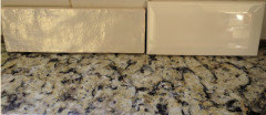
    Here is the first tile you mentioned - the 2 by 8 in cream. Next to it is the new bevel sample 3 by 6 in cream. The 2 by 8 has a handmade look and also resembles the more expensive Zellige tile (which is more common in a 4 by 4). It is 9mm vs 8mm and can have a tight grout line. It also has a mix of 2 finishes a matte and gloss. They sent me the gloss. I think a backsplash in this tile will have a subtle contrast to the eventually painted off white cabinets.

    If I went with the first tile in a 2 by 8 then it would be in a brick pattern. If the first tile in a 4 by 4 then in a stacked pattern. Can you tell I am leaning towards this tile? Sigh... hard decision. If I had a less busy granite I would have used it on the backsplash!


  • PRO
    6 years ago

    Get both colors! You do not select tile online. Ever!

    mar 77 thanked JAN MOYER
  • 6 years ago

    My first impression was that #3 is the best fit, but I don’t think the photos of #1 are that good. Why is there white paper between the tile and the granite? And both pictures have shadows in them. Can you get another picture of the tile you like best next to the granite, without any shadows? I would love to love it too!!

    mar 77 thanked ShadyWillowFarm
  • 6 years ago
    last modified: 6 years ago

    @JAN MOYER - guess I need to get both colors. The salesperson said the "Bisque It" was lighter than the "Shell Out" which is a pretty and popular color- more bone. I did request photos of both. She said a sample would cost $25 just to ship a tile or 2! Also they had a 30% restocking fee and one only had 24 hours to call in for broken tiles. So more restrictive than other places.

    @ShadyWillowFarm #3 colors do blend nicely with the granite. But when you see many tiles together the edges have a lot of color variation/pits and it has a rustic/stone look with a dull matte finish next to the granite. I am looking for a transitional look with subtle color and contrast (but not tuscan - stonetravertien/marble backsplash and not ultra modern - white on white on white).

    I will post another picture tomorrow morning with better light and without the paper (the tile sample came that way from tilebar). It's sand dune from the Montauk collection.

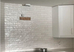
    Pictures below are in white- but I would go with the cream tile.

    2 styles of the same tile below. (I really appreciate all the suggestions as it's forcing me to think about this patiently).


    Style #1


    Style #2


  • 6 years ago
    last modified: 6 years ago

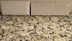
    @ShadyWillowFarm - Here are other pictures of that tile without the paper (tried to capture shine and no shine) I don't get a lot of light in the kitchen.

    The bevel is available in a plain subway too.


    What do you'll think?


  • 6 years ago

    I would go with the plainer tile (no iridescence). The shine pattern is too busy next to the granite.

    mar 77 thanked ShadyWillowFarm
  • 6 years ago
    last modified: 6 years ago

    @ShadyWillowFarm thanks for replying. The shine only shows when the tile catches light. Otherwise it just has a regular look (second pic above). Also, they only sent me the tile with the shine, but the box has a mix of matte and shine tiles. So all tiles won't have that shine.

    Color wise do both go with the granite?

  • 6 years ago

    On my monitor, yes.

    mar 77 thanked ShadyWillowFarm
  • PRO
    6 years ago

    You're worrying about the price of getting two smples? Seriously? Twenty five dollars to test in person what might get glued to a whole wall. ......

    i said... "You need both colors in person. You can't tell anything online"

    That is true of any tile or fabric or finish ....... .

    mar 77 thanked JAN MOYER
  • 6 years ago

    @JAN MOYER - price relatively speaking - compared to tilebar $5 for $5 and free shipping.


    The retailer in my area was also more restrictive in their policy on broken tile replacement and return of unused tile- compared to other places. So, I will check with retailers further away as they will be shipping the tile anyway. I don't know if all suppliers of that tile have a similar price. But in that range I could also consider tile from fireclay.


    I wish I had done a solid color counter and then I would have had a choice of so many beautiful tiles out there. I did not know any better at the time. Guess some consolation is that the granite I have is high quality from a good shop- well sealed and so far hides all stains.

  • PRO
    6 years ago

    You don't return unused tile. Not unless an in stock from a local. You order 10% more than you need no matter what, to account for possible breakage. You don't horse around for a box of tiles, when the thing you are putting on the wall is going to be there for nearly.....forever.

    In other words? You don't make a simple thing hard, when you want to like your result for a long time. Be a Pro : )

    mar 77 thanked JAN MOYER
  • 6 years ago
    last modified: 6 years ago

    @JAN MOYER - I see your point. The problem I have is that one contractor measured around 30 sq feet. He got busy on another job so another one came in and measured 47 sq feet. I measured to check and got 33 sq feet - so who's right - lol. That's why I wanted to be able to order 20% more and then if the 47sq feet was incorrect I wanted to have the option of returning the tile without a 30% restocking fee.

    I really appreciate all the helpful comments from everyone. I initially would have made a mistake going with a light gray tile (well gray was in- but was definitely not "in" for my counter color - I could not see it at the time). From there I went through all kinds of options. I think selecting backsplash is not easy. My husband finally said just go with what you like and we can change it later if you end up hating it - it's not that expensive.

    I like the longer flat subway tile you showed - so that's an option. The bevel subway is out of stock with no more in transit- so that one is out. I also love the Zellige look. But with all the comments on texture against my granite I see how the 2 by 8 in a brick pattern would be too choppy in texture and finish. However the 4 by 4 stacked layout is still a contender. Handmade look, texture for interest, shine when it catches the light (in my lower light kitchen), neat stacked look against the granite, tile size proportionate to space and great reviews on multiple sites. It's a well made 9mm Spanish tile that will provide subtle contrast against off white cabinets in the future.

  • mar 77 thanked new-beginning