Software
Houzz Logo Print
andigo02

Is the backsplash grout too light thereby creating too much pattern?

6 years ago

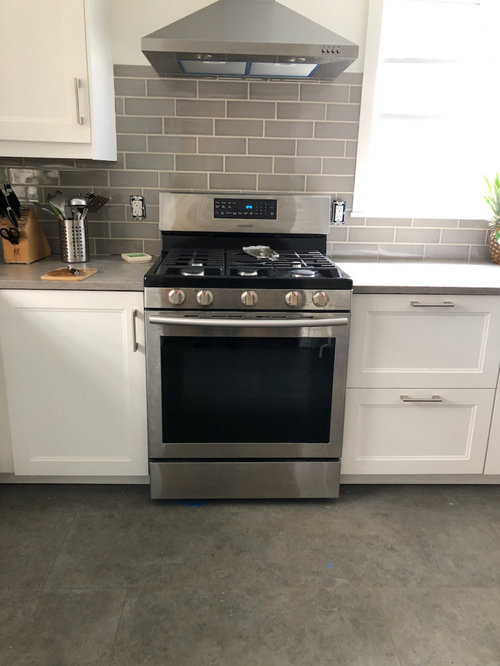
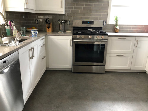
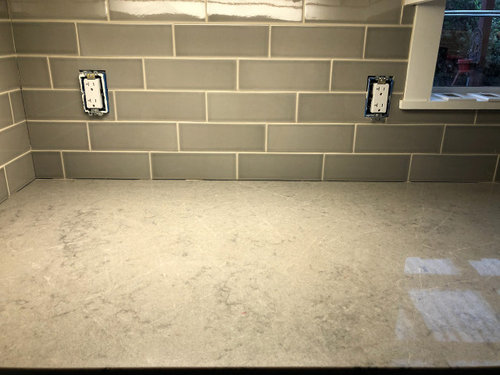
I think I chose too light a grout color (bone from Custom Building Prism line) for the Sonoma Tile crackle tile Stellar Rainstorm behind Ceasarstone Symphony Gray countertop. Here are some photos. I'm afraid the very graphic grout lines detract from the more subtle countertop, floor, and crackle tile. What do you think? I am contemplating staining the grout to a gray slightly lighter than the tile, but there is a risk the stain could go into the crackle. The tile and grout have not yet been sealed. Of course this will require great patience and a steady hand. We are going to try some experiments.


Thanks!


Comments (33)

  • 6 years ago

    I like it and wouldn't mess with it.

    andigo02 thanked vpierce
  • 6 years ago

    Leave it! The backsplash brings the cabinets and counters together.

    andigo02 thanked mmwhalen1999
  • 6 years ago

    another vote for leaving it. You'll get used to the contrast and it won't bother you. It's just that it's new.

    andigo02 thanked User
  • 6 years ago

    Looks great!

    andigo02 thanked smokeyfl
  • 6 years ago

    Looks fine. Just leave it.

    andigo02 thanked Tina
  • 6 years ago

    Nope, it looks great. Patterns compete when they are the same size. Your door panels are a much larger size, and the countertops are small, or uniform enough that they do compete with the backsplash. Very pretty!!

    andigo02 thanked ShadyWillowFarm
  • 6 years ago

    Is the row below the hood laid wrong?

    It looks like all tile are at 1/3 offset, except for the row below the hood?

    andigo02 thanked chispa
  • 6 years ago

    Chispa. They are all correct, even the very thin cuts where the tile meets the bottom of the hood. I have a great tile setter. Thanks for checking.

  • 6 years ago

    Looks great! I like the contrast too!

    andigo02 thanked K R
  • PRO
    6 years ago

    It is just fine .

    andigo02 thanked Patricia Colwell Consulting
  • 6 years ago

    Thanks everybody! I am getting used to it as Lisa mentioned. Also thanks ShadyWillowFarm for a more detailed comment. I'm guessing you mean the countertop does NOT compete with the backsplash. It seems to be a consensus and will certainly make my life easier!

  • 6 years ago

    Like it

    andigo02 thanked toni1947
  • 6 years ago

    Everyone agrees which rarely happens, you nailed it. Very nice.

    andigo02 thanked wacokid
  • 6 years ago

    It looks fantastic. Don't change a thing! Well done.

    andigo02 thanked mvcanada
  • 6 years ago

    looks great!

    andigo02 thanked Kathleen
  • 6 years ago

    I love it as-is!

    andigo02 thanked hemina
  • 6 years ago

    I love it as it stands and think that you need the definition since the floor and counter have so little. Great job!

    andigo02 thanked jemimabean
  • 6 years ago

    Looks awesome and it will soften quickly. Have you thought of going to the ceiling behind your vent?

    andigo02 thanked Lidia
  • PRO
    6 years ago

    Very nice tile job, and the grout is perfect with the tile color! Enjoy your new kitchen.

    andigo02 thanked Diana Bier Interiors, LLC
  • 6 years ago

    Looks really good now relax :)

    andigo02 thanked User
  • 6 years ago

    It looks awesome, don"t change the grout! AWESOME JOB!! LOVE IT!

    andigo02 thanked mjkjrobinson
  • 6 years ago

    i think the grout looks great, but the way some tiles are offset at 1/3 and the others are centered looks strange to me

    andigo02 thanked sunshine_31
  • 6 years ago

    Your current grout looks great, as does the rest of your lovely kitchen.

    I see what chispa is talking about. That would bug me, a lot. There are two rows where the offset is not consistent with the others. The first one is just above the bottoms of the upper cabinets (above the range), and the second one is the top row of full tiles below the hood.

    If you don't know what we're talking about, then never mind and enjoy your kitchen! (Some people are more OCD about layout/spacing than others, and I am far to the OCD end of the spectrum. Regardless of what we notice, your backsplash is gorgeous.)

    andigo02 thanked salex
  • 6 years ago

    Live as is as it looks good. I do think you need to address the tile meeting the counter. Needs some caulk. Also look at the corner in which the two sides meet. It is missing the grout.

    andigo02 thanked Toni Hamlett
  • 6 years ago

    It’s beautiful! Leave it be. Enjoy your wonderful space. Best wishes.

    andigo02 thanked lilacblumen
  • 6 years ago

    The view further back really helps - keep the lighter grout. It works better with the floor than if the grout matched the backsplash tile. It gives the backsplash life.

    andigo02 thanked Michelle misses Sophie
  • 6 years ago

    Agreed, it looks great! You’ve probably been staring at it too long and doubting your decision. We tend to do that when something’s our own because we’ve invested time, energy and money into it. Step back, soak it in and enjoy :)

    andigo02 thanked Renata Palfy
  • 6 years ago

    bikertoni. Yes, the sealing and caulking will happen in a few days. Corners get caulk. Thanks

  • 6 years ago
    last modified: 6 years ago

    salex and sunshine_31, I saw what you are saying just before I read this, but let's just call them bigger steps. Thanks

  • 6 years ago

    It looks wonderful. Don’t change a thing!

    andigo02 thanked Gloria H.
  • 6 years ago

    Renata, you are right about that!