Software
Houzz Logo Print
webuser_969139140

Backsplash Layout

6 years ago
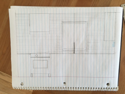
Hello,


I have a few questions about our backsplash layout.


Tile - 2-1/16" X 8.5" matte white subway

Spacing - 3/32"

Grout - 90% chance we will do white, 10% chance of gray or black

Arrangement- running bond (staggered by half)

Photo - Vertical blue lines would be half of a tile. Horizontal lines are the courses. You'll have to imagine the stagger.


Should I center the tile on the range / hood, the window, or the wall?


My thought was center on the range. This results in being ~3/4" off center on the window.


Centering on the wall will make it slightly off center with the stove and window.


The right end of the tile will continue around a corner, and the right end is not a critical part visually.


All three options are pretty close in layout, the difference between the three is moving the tile over an inch or so one way or the other.


Comments (15)

  • 6 years ago

    Need to see the actual wall to know if tile should go to the ceiling. Post a picture of the space

  • 6 years ago

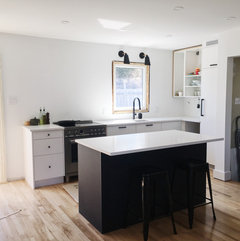
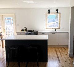
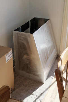
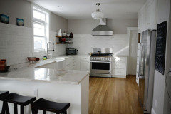
    Here' some pics of the space so far, and the hood which will be sprayed white.

    Doorway on right leads to a walk-in pantry. We will probably have some kind of black metal shelving beside the hood. Uppers on right wall will have doors.


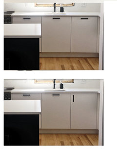
    Handle question:


    The door on the right is hinged on the right side. Should I install the handle vertically on the left, or horizontally in the center?


  • 6 years ago

    Not the most popular post in the world, haha. I will center with window and go with the horizontal handle.


    I am wondering about having a strip near the top. If I start with a full tile as my first course, I will wind up with about 1/2" of tile at the top. The ceiling also slants 1/4" over 7' to the right of my range hood (1940's house), so this will grow from 1/2" to 3/4".


    Alternatively I could take some off my first course to wind up with more thickness at the top (which is what is shown in my hand drawing). This would be about 1-3/8" (of the 2-1/16" tile) at the bottom, and about the same at the top.


    Generally, looking at photos, it seems like a strip is left at the top (see photo).


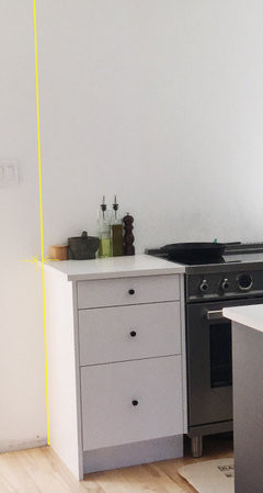
    For starting my tile on the left cabinet beside the stove, I know it would be okay to start at the edge of the counter. Would it also be okay to start in 1" or so to align with the edge of the bottom cabinet itself?


  • 6 years ago

    Last try, lol. Making these final layout decisions today, so any feedback would be appreciated.

  • 6 years ago

    Thanks @houssaon. To center on range, I'd probably want to start in from the end of the counter a bit, as shown in the photo below (not sure if this is generally considered acceptable). This is aligned with the cabinet base underneath, and would avoid slivers on the end. If I go right to the end of the counter, I'd have 1" of tile at the end.


    If I center on the window, I won't have this issue, which is why I'm leaning in that direction at this point.


  • PRO
    6 years ago

    Emily: You might want to loosen up and remember this is not a formal space. I would center tile on window and have it extend 18" above counter (and higher at range to bottom of vent ) and take a leap of faith and add some personality color / walls / window treatment to add personality ,the floor adds a little warth ( match the stain to the floor for open shelves, but still pretty cold for a kitchen

    Emily thanked Adrian J. Naquin Interior Design L.L.C.
  • 6 years ago

    @Adrian J. Naquin Interior Design L.L.C. Color, what's that? Haha - the window trim will be white oak, and the uppers on the right will be white oak. Shelving would likely be black metal framing with white oak bases. Pretty sure I'm taking tile to ceiling though, what's the reasoning for not (to add a wall color?).


    The whole open main level is only about 450 sq.ft (dining, living, kitchen), and there is lots of wood and we will add decorative elements for color. The dining room light fixture is one of those huge Serge Mouille style ones with three arms, which makes the whole space feel different.

  • 6 years ago

    I would center with the window, as I think it is a more visible (or eye-catching) area and any asymmetry around the window will be more noticeable.

  • PRO
    6 years ago

    tile wainscot - not having things all line up adds interest and in this case will serve to decompress the relatively low ceiling hgt.

  • 6 years ago
    last modified: 6 years ago

    I'd tile the entire wall, up to the ceiling and over the end of the counter.

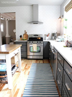
    stopping halfway like this looks unfinished, to me. would have looked sooooo much better going all the way up w/the tile. this actually cuts the height in half.


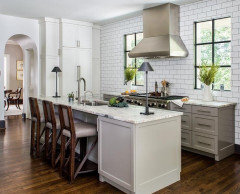
    this looks funky to me. it just does


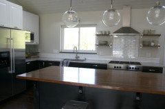
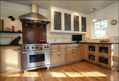
    also a no. I mean, ?? tile is cheap! this would have looked better just going w/the countertop material in the same location. with tile? no. just no.


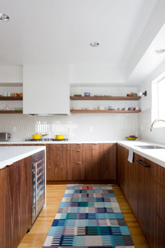
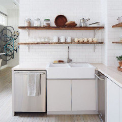
    you plan on doing any wood shelves like these? then stopping 3/4 of the way w/tile would look ok


    The other issue is, you're using plain old white subway. It's not like it's a show stopper as far as decor goes (and I'll show you why). doing the entire wall makes it look cleaner and more uniform


    now, if you had a more decorative type of tile, then doing an accent strip, or halfway, seems to look better than doing halfway w/white subway. (unless you plan on painting your wall black or something)


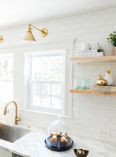
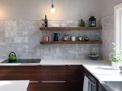
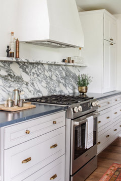
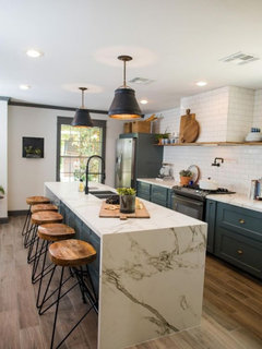
    however, I really like this look. find yourself a cool piece of slab marble and I'm all for this


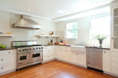
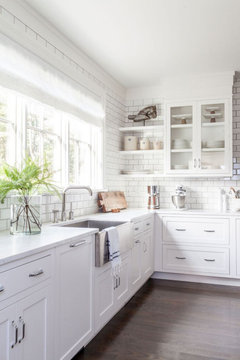
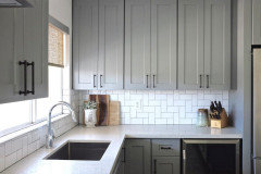
    as for tile layout, start in the center of the wall and work outward. you want to end with half cut tiles (not slivers) in the corners, around the window, and outer edges. do a dry layout. if you do get slivers, then adjust left or right until you get at least 1/3 piece of cut tile. look at pic 3. perfect cuts in the corners, along the tops, etc. no tiny cuts

    try to start w/a full tile on the bottom. what do you end up w/at the ceiling? if it's not a sliver cut, you're ok.

    you can tile that hood too


    Emily thanked Beth H. :
  • 6 years ago

    Hi @Beth H. : Thank you for your detailed response. I agree with you that it would look best tiled to the ceiling. I do like the slab marble look but it would be quite the switch-up at this point - may take me a while to wrap my head around doing that!


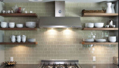
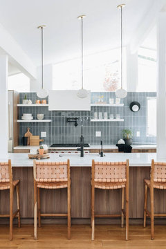
    The shelves we are planning will look similar to the ones below, but designed to suit our space optimally. They may be skinnier, or with supports to ceiling on just one side, etc. I will have them fabricated. We may add white oak to the base of the shelves, but we will have white oak window trim and the uppers beside the fridge will be white oak.


    Regarding the layout - we are good side to side. However, if I start with a full tile at the base, I will get a strip at the top (see the photo I posted above with the green backsplash - it would be like that). I could also trim my first base tile so that both the bottom tile and top tile are a little over half a tile. Can't see this done in any photos - seems like it's always a strip at the top.


  • 6 years ago

    As for the indent, that is exactly what mt tile guy did. It was a bout an inch or slightly less.

  • 6 years ago
    last modified: 6 years ago

    And you've taken into account your grout spacing? that still doesn't push it up?

    So I have many options to address your concern about the small strip at the top:.

    why not go w/a 1/16" grout line?

    or

    what if you picked a diff tile? a 3x9 or 3x12 should buy you that space.

    Layout. Try a diff one.

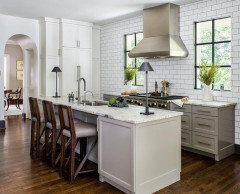
    instead of running bond, what if you did a vertical stack? I really like this layout. It's a bit more modern and goes w/the look of your kitchen (with the shelving) rather than a regular old subway layout.


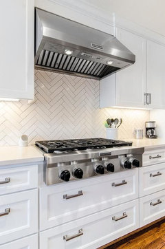
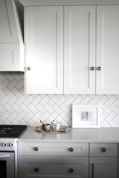
    Or, go for a herringbone layout The bottom course always gets cut anyway


    OR, you can trim off some of the bottom row (maybe a 1/3) in order to get you at least 1/3 at the top.


    see the top in this one? if you could somehow stretch it enough to end up w/that, it would be ok.


    and lastly, another option is to install a simple crown molding at the top to hide the small gap. (you wouldn't tile, just do the trim) Is that something you could do?

  • 6 years ago

    If the gap between the last full tile on the wall and the ceiling is small, how about adding a row of narrow matching pencil tile somewhere on the wall below as an accent running below a window or halfway up the wall. That way the top row could be a full tile. The alternative would be crown molding to cover any width gap, probably eliminating the top full-tile row as well so the molding would be substantial enough.