

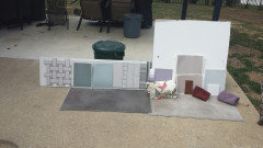
Grey paint for kitchen
6 years ago
last modified: 6 years ago
Featured Answer
Sort by:Oldest
Comments (11)
 6 years ago
 6 years ago
Related Professionals
Aurora Interior Designers & Decorators · Williamsport Interior Designers & Decorators · Daytona Beach Bathroom Remodelers · Vincennes Kitchen & Bathroom Designers · Indianapolis Interior Designers & Decorators · Murfreesboro Interior Designers & Decorators · Portland Interior Designers & Decorators · Lake Havasu City Interior Designers & Decorators · Danbury Kitchen & Bathroom Designers · North Adams Kitchen & Bathroom Designers · Washington Kitchen & Bathroom Designers · Virginia Beach Kitchen & Bathroom Designers · Spanish Fork Kitchen & Bathroom Designers · Owensboro Kitchen Remodelers · Santa Rosa Kitchen Remodelers 6 years ago
 PRO6 years ago
 6 years ago
- PRO6 years agolast modified: 6 years ago
 PRO6 years ago
- 6 years ago
 6 years ago
 PRO6 years ago


Related Stories
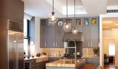
KITCHEN DESIGNObsessed With Gray in the Kitchen
See How to Use This Sexy Neutral to Heat Up Your Cookspace
Full Story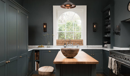
KITCHEN OF THE WEEKDark Gray Sophistication in a Shaker-Style Kitchen
Rich paint used throughout this compact London space helps create a kitchen that’s contemporary and inviting
Full Story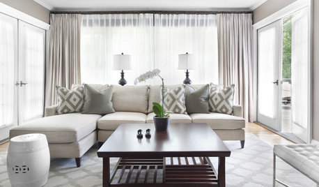
GRAYChoosing Paint: How To Pick the Right Gray
Which Version of Today's 'It' Neutral Is For You?
Full Story
KITCHEN DESIGNSubway Tile Picks Up Gray Grout
Heading into darker territory, subway tile offers a graphic new look for kitchens, bathrooms and more
Full Story
MOST POPULAR50 Shades of Gray
Gray is hotter than ever, thanks to a hit novel full of risks and dark secrets. Tell us: Which paint shade possesses you?
Full Story
COLORBathed in Color: When to Use Gray in the Bath
Go for elegance and sophistication without going overboard on coolness, using these gray bathroom paint picks and inspirational photos
Full Story
COLORCooking With Color: When to Use Gray in the Kitchen
Try out Trout or shake up some Martini Shaker gray for a neutral-based kitchen that whispers of sophistication
Full Story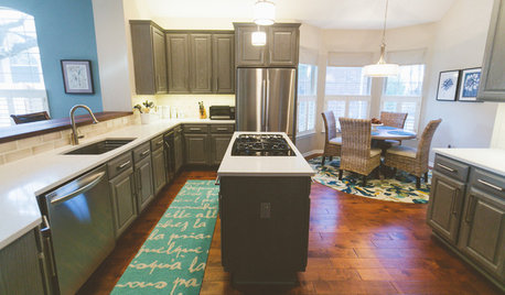
BEFORE AND AFTERSGray Cabinets Update a Texas Kitchen
Julie Shannon spent 3 years planning her kitchen update, choosing a gray palette and finding the materials for a transitional style
Full Story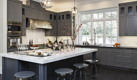
Shop Houzz: Elegant Gray Kitchen
Create a refined kitchen in elegant shades of gray with tile, furniture and lighting
Full Story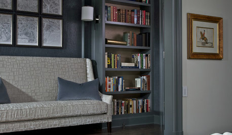
COLORHow to Layer Tones of Gray for Depth and Harmony
Use texture, pattern, contrast and more to create a subtle, sophisticated look with this popular color
Full Story
Sponsored
More Discussions


Beth H. :