

Navy in small kitchen?
We are renovating the galley kitchen of a 1957 colonial, and have settled on the layout and design of our custom cabinets but have NOT settled on paint colors for said cabinets. I absolutely LOVE Farrow and Ball's Hague Blue for the lowers, but am worried it's too dark of a shade for our kitchen. The room is roughly 18'x10' so it's not TINY, but it is small and isn't an open floor plan. The kitchen has windows on the south, west, and east side, and double doors into the dining room on the north side. There is an exterior door on the east side and an exterior door on the west side as well. It will get a lot of natural light throughout the day. Would Hague Blue be alright or would it make it feel even more closed in and small? We're thinking of doing Schoolhouse White or Wimborne White on the uppers, and the floor is a checkerboard of Marmoleum 10" tiles (in Stardust and Cornish Grey). Most of the counters are going to be Alberene soapstone, with one 6' stretch in edge grain maple butcher block as well. I was also looking at De Nimes if Hague Blue is too dark, but really love the drama of the navy. Help!
Comments (42)
 PRO6 years ago
I'm not a fan of two-toned cabinets and I've sick to death of navy ones. I would not do this.
 6 years ago
Scroll through these pictures below of a Bunny Williams' new apt in NYC to find her galley kitchen. It is smallish and has one window at the end. The cabinets are not blue, but a dark, petrol gray kind of moody color.
I am not a fan of two toned cabinets, especially in a smaller kitchen, especially in a galley. I like the feeling of being enveloped in a color. Design an appropriate lighting plan and go big with your Hague Blue.
Related Professionals
Cherry Hill Bathroom Remodelers · Manhattan Kitchen & Bathroom Designers · Aberdeen Kitchen & Bathroom Designers · Binghamton Interior Designers & Decorators · Syracuse Interior Designers & Decorators · Bronx Architects & Building Designers · Vidalia Kitchen & Bathroom Designers · Saginaw Kitchen & Bathroom Designers · Sierra Vista Kitchen & Bathroom Designers · Amherst Kitchen & Bathroom Designers · Denver Kitchen & Bathroom Designers · Riverton Kitchen & Bathroom Designers · Spring Kitchen Remodelers · Wheeling Kitchen Remodelers · Jamestown Custom Countertops PRO6 years ago
It sounds like you have lots of light in the space so that is good. If you LOVE the colour, don't be afraid simply cause it might make the room "feel" smaller...cause of course, it isn't ACTUALLY smaller. ;) Don't worry too much about the trends. Remember that those who do this all the time tend to move on faster than typical home owners do. If you feel like you'll love it for a long time, go for it. If you want that bit of wow/drama, and you are a little shocked for the first few days...it's probably perfect. :D
- 6 years ago
As for the trendiness factor, I would choose a different dark and moody color. Blue would still work, but something darker perhaps.
 6 years agolast modified: 6 years ago
Contrast can be so appealing. It draws the eye toward the switch from deep saturated hues to bright, unexpected light ones. I don’t love Hague Blue with soapstone, and if you ever get a chance to pair those samples together, you might not either. Would you consider Danby?
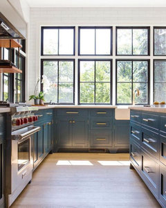
 6 years ago
You seem to get a lot of natural light so go for it! Do what you love, navy blue is classic.
 6 years ago
Better think about other furniture! it’s more important than painting itself. Think about where and what will be located in your house and conclude from this what color to paint. But, my advice, do not paint the sink like I did. The sink was very good, I bought on https://greatlivings.com/best-kitchen-sinks/. Now I'm watching the new best stainless steel kitchen sinks 2020 on the same site
hangejl0
Original Author6 years agoThanks, all. I was having a hard time convincing my husband to go bold, and after sharing this thread I think I've scared him off the concept completely, haha. We haven't made a final decision yet (they've just started building the cabinets), but he is a big fan of Farrow and Ball Pigeon on the lowers and Shaded White on the uppers. I have a feeling we might end up going that direction and I may be able to talk him into a more dramatic dining room.
And Bobby, I had no idea you could even repaint a sink! We're using the original enameled cast iron mammoth that was already in the kitchen and I couldn't imagine painting it!! PRO6 years ago
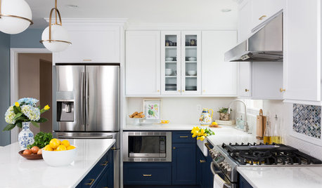
I love Navy Blue on bottom. I've seen it done with white on top, and gold hardware. I thought it was a great contrast especially in bright light. I"m not a fan of the lighter or pale blue. I think the dark color is eye. Ok so this image might be a terrible example because she was obviously the focus. BUT, the dark navy with the gold accents went really well in this house with gray walls etc.
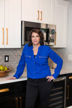
 6 years ago
I just did my uppers and lowers in Green Smoke and my kitchen is smaller than yours. As long as you balance it out by not going too dark with wall paint, counters, etc I think it looks great! I really love it and I'm glad I went dark.
- 6 years agolast modified: 6 years ago
I like navy or blue cabinets, and I just noticed this new Cambria solid surface color called Portrush from Cambria that would be gorgeous with navy cabinets.
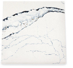
- 6 years agolast modified: 6 years ago
To hell with it, if you love it, do it. If it makes your heart sing, do it. You’ll look at this space every damn day and you better like it.
Nobody ever says “oh, such a nice beige kitchen.” No one would even remember what it looked like. But they’d remember a bold kitchen, done well. I love navy and combinIng it with white and either brass or gold is classic, think about the Navy uniforms! A deep green would also be striking.
Post updates, please.
And one more thing: my mother lives in NYC and has a galley kitchen with two small windows (one faces a brick wall). Her cabinets are white but her floors are black tile with black grout and she has black countertops. Kitchen does NOT feel small.And one MORE thing, we have Marmoleum and I LOVE how it feels on bare feet.
 6 years ago
My friend did navy uppers and lowers in her small kitchen. She has white marble counters and it's gorgeous. If you like navy, go for it.
 PRO6 years ago
Your space sounds like it gets plenty of light. You have a lot of different finishes going on in the space that are going to make it choppy and dark, the cabinets aren't one of them. . I would do the uppers and lowers the same color. Do the floors already exist? I think The Hague blue is a beautiful color and you shouldn't shy away from it due to it being dark. I wouldt not do it in a flat finish but consider a gloss for the sheen. I am not in love with the dark counters, checkered floor and butcher block all mixed in with it. I would opt for a light colored counter. That is what is going to keep the kitchen light and "fresh" looking. I have some confusion as to how this flooring plays into it all. That is where you've lost me. What is the flooring in the rest of your home? Is this the existing flooring? If so I would have budgeted new flooring into the Reno. What are you doing for back splash?
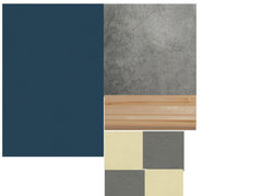 Bar stools · More Infohangejl0 thanked Design Interior South
hangejl0
Original Author6 years agolast modified: 6 years ago@Design Interior South Thank you. I have been having the hardest time settling on colors that I like, that also like each other. Currently, the floor has been stripped (of three layers of vinyl, plus all the asbestos gluing it down) to the original, 1957, brown linoleum tiles in the picture. We haven't purchased the new flooring yet. I do know that I absolutely want Marmoleum tiles, but have changed my mind on colors at least three times so far. We purchased the house from my grandparents, who built it in the 50's, and have maintained it perfectly but with zero upgrades since then. I spent a lot of my time as a child in the house and so I have a lot of nostalgia, and do want to keep the materials we used to the appropriate era for the house. I love the feel underfoot, but have been struggling with a limited color palette. The rest of the floors in the house are white oak, with the exception fo the two bathrooms (which were vinyl and are now being tiled).
Aside from choosing flooring colors, I've struggled with selecting countertops. I have fallen in LOVE with soapstone, and love that the Alberene soapstone is quarried just about 45 minutes from us. I originally wanted to do a portion in butcher block as well, and had planned on using it functionally as a prep surface but when you put all our finishes together I could see how it does come off as very choppy. I know navy may be boring to a lot of people. but all white and gray kitchens are soooo boring to me, and I was hoping a stretch of natural wood would warm it up a bit.
Your observations are pretty spot on, and definitely reflect a lot of the conflict I've been feeling so far! If you have any recommendations on Marmoleum colors and how to make the soapstone work with them, I'd love to hear. We do prefer to use the Modular tiles, but would also consider the MCT tiles as well (not interested in the click together tiles though).
The appliances have already been purchased. We have a 36" white Aga Elise, a white French door Cafe fridge, and the dish washer is panel ready so will just match whatever paint we ultimately choose for the cabinets.
Thanks again.
**edited to add** the backsplash is going to be a simple 2x2 white Daltile from counter to cabinet, and our cabinet makers are going to build a custom range hood cover.hangejl0
Original Author6 years agoMeant to attach these to my previous comment. This is the current “blank slate” we’re working with.
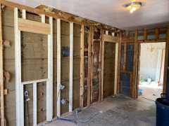
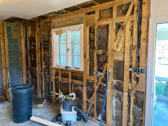
- 6 years agolast modified: 6 years ago
Everybody loves soapstone, but if that’s what you’re going to choose, go for lighter cabinets, or a dark charcoal that pairs better with the stone. Or consider Danby marble counters with your navy. In smaller spaces, multiple counter surfaces look choppy. I’d stick to one. You can warm up your space by choosing warmer colors to begin with, or warmer accents.
- 6 years ago
I love soapstone too, but once you choose an important element, like cabinet color, that becomes the boss. Conversely, you could choose soapstone first and have that choice drive the others. Danby is a great choice to work with blue. Lighter colored cabinets are a great choice with soapstone.
hangejl0
Original Author6 years ago@eam44 I like the look of marble but don't like the maintenance of it. I have two young kids, plus a baby coming this summer, and know myself well enough to know that I won't put in the time to keep it up as it should be. I also want the kitchen to be a much used, lived-in space so I don't need a lot of flash or to make it look like a showroom. One of the things I love about soapstone is how gracefully it shows its age.
- 6 years ago
Congratulations on your impending arrival!
No use discussing this further really. You’ll eventually see your choices together and like them or you won’t. Either way, I’m sure you’ll end up with something great. Good luck.
hangejl0
Original Author6 years ago@Zalco/bring back Sophie! Thanks for your comment. I am much more set on the soapstone than paint colors. Do you have any recommended colors that would look good with the soapstone? I don't want white but am open to lighter colors. Thanks!
- 6 years ago
Search navy with soapstone.. it's an amazing combo. We couldn't up our budget to do it but I am a huge fan of black and navy.
- PRO6 years ago
hangejl0 Congratulations. Now that I have a bit more info about the house , scratch the gloss cabinet idea I mentioned above. I love that this was a family home. Some more questions. Bear with me.1. what other colors are you carrying through out the home? Peaking into your dining room I see a older yellow toned wallpaper and 80's era chandelier. Will these be changed?
2. Where does your white Oak flooring run? Where is the cut off for the kitchen flooring wise?
3. Do you love yellow? I am asking simply because you chose the Stardust tile.
4. can we see pictures taken from the doorway into the dining room so we can capture the other end of the kitchen?
 6 years agolast modified: 6 years ago
I just finished repainting my kitchen walls and cabinets. It’s a small kitchen and I worried about two tone cabinets, so chickened out. After spending over 20 hours painting, I cried as it was not the look I wanted. So I repainted the lowers..almost a black but sometimes they take on a dark navy. The uppers are a slight grey blue and I am so happy! The walls are white and I think that makes a big difference in having the kitchen feel brighter as well.
I used Benjamin Moore‘s Black Ink and Metropolitan and combo is below.
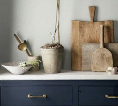
- 6 years agolast modified: 6 years ago
How about going darker and using a black like Maureen above or Bunny Williams did? That could look incredibly elegant. Otherwise, wood cabinets work, and some like yellow, cream or sage green, I even saw a bright green with soapstone, but that was a bit much for me.
- 6 years agolast modified: 6 years ago
Hangej, Did you see a kitchen with soapstone that you loved? If so, please post it. If not, look for pictures in Houzz. You can specify size, colors, etc. to narrow the choices down.
I agree on the marble. Not good for a kitchen as far as maintenance goes. I have marble floors in three bathrooms, and used to have marble floors in the kitchen. We removed them first. (Previous owners liked them I guess.)
To me, the checkerboard floor tiles are the problem. Stardust looks beige on my monitor. Checkerboard floors (or any patterned floor) says, "Look at me!" Then with the maple's patterns/grains it says, "Look at me!" Is the maple going to be a light color or a dark color?
If I had soapstone countertops, I would want them to be the eyecatcher along with the painted cabinets. I think the gray Marmoleum tile DOES work with the navy or even the Danby, but I do not like the beige tile with the gray. One color would be better.
Since you want to keep the feel of your 50s house, kitchens in the 50s never had a lot of light like the pictures with the white uppers and blue lower cabinets. Those pics might lead you wrong. Those windows are letting a huge amount of light in, so the white cabinets will look completely different in your house. The blazing, crisp, white look won't be the same with your windows. Plus, if you have window treatments you will have even less light. It looks like you have one (maybe 36") window and a patio door. Is there any other daylight coming through? The white uppers may be too trendy for your 50s look which usually had all one color painted cabinets.
Personally, I would hate white or off white cabinets. That is a lot of maintenance. I would always be cleaning them, and since you have kids, their hands would be all over them. You have enough to do to keep you busy. I love the dark gray soapstone and the blue cabinets even if they are both darker colors. That is why lights were invented! Maybe bright white LED undercabinet lights would help along with a bright white ceiling fixture. Maybe you could paint the uppers gray?
Try looking for kitchens with painted cabinets and NO wall of windows to get a better idea. hangejl0
Original Author6 years ago@Design Interior South Thanks! for your questions:
1. We are absolutely upgrading the dining room. This first phase of renovations is coming directly from our savings so we don't have to borrow anything, and we prioritized the projects we don't want to live through (kitchens, bathrooms, electrical) and once we move in, we plan on refinancing and using a HELOC to finish the cosmetic upgrades and other renovations later (finished basement, dining room, etc). Right now I've got some ideas for the dining room, but it's really still conceptual right now. I do want to lose the brass light and early 90s wall paper. There is wooden wainscoting on the lower half of the wall painted white, and I'd likely keep that. In my mind, I'd like to put some fun wallpaper in there, but it is going to be a tough sell to my husband. I love Josef Frank but not sure if it would work in that space. There is a wood paneled den that we are keeping as is because we love the cozy feel of it, and a very large living room that stretches the entire north end of the house. We're painting that Breakfast Room Green by Farrow and Ball.
2. The white oak begins once you cross the threshold from kitchen to dining, and runs throughout the entire downstairs (with the exception of the powder room, which will have a white spiral mosaic tile by Merola). I initially thought about carrying the white oak into the kitchen, but it wouldn't be a smooth transition thanks to the subfloor in the kitchen. The contractors we interviewed also all confirmed that modern white oak would not match the original floors anyway. My goal is for everything we do to the house to look like it's been there since it was built. I really don't like the look of mismatched wood floors. We are also having them widen the opening to the dining room so that it will have double doors instead of a single door.
3. It's funny you ask about yellow, because one of the first color schemes we picked was a pale yellow and cream checkerboard floor with a warm white on the cabinets. Then we both realized that we don't actually love yellow that much. The Stardust definitely looks beige-y in online pics, but we ordered samples from Forbo and it is the closest to a white marmoleum tile we could find. It does look less yellow in person, but it's also been one of those things that I haven't fallen in love with as much as I would like.
4. I don't have post-demo pictures of that aspect of the kitchen, but have attached one from before we started work. The original kitchen was Mamie Eisenhower pink cabinets and paint (even the doors, window trim, and CEILING), with pink formica, mint green cabinet interiors, some pink floral wallpaper, and beige painted backsplash.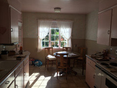
@Peke I have scoured Houzz, Pinterest, and done so many google image searches! I love most soapstone I've seen, but am a lot more partial to the dark greys and less so to the green-toned samples. One of my favorites pics lately you can find in the above thread in some pics that Design Interior South posted. We were planning on leaving the maple unstained so that we could use it functionally, but I do agree that there is a lot going on with it, and I'd rather lose that than the soapstone. As for the lighting, there is a large existing window over the sink, a Dutch door in the same wall, another large window on the south wall (pictured below), and in pictures of the demo you can see a 24" window that has been framed in, as well as an additional door (2 over 6 glass panels) framed in. These will be on the west side of the house. There are also 3 glass globes overhead that we are keeping, but are also having 6 recessed LED lights put in the ceiling, as well as under cabinet LEDs. I think it will be a very well lit room when we're done with it. And I have been going back and forth on two toned cabinets. I've seen some paint colors on our cabinets in Sketch Up and haven't really loved the look, but Sketch Up can be very misleading. I agree that I do not want all white cabinets. aside from the upkeep, I feel like it's a little too sterile of a look for me.- 6 years ago
I wasn't sure if that one window was coming or going. I think your lights will be wonderful even with your dark gray soapstone. From the original "pink" picture you can tell there wasn't much light in the kitchen. The new windows will help a lot.
It is very difficult to find kitchens that are NOT open floor plans now. I know not everyone has an enormous kitchen so I don't know where all those kitchen pics are. I guess the money is in extra large open kitchens now. I found a few though. A couple pics have pictures of blue and gray on the same cabinets. I don't know if "distressed" is the right word, but they are pretty with two toned on the same cabinets. And they have soapstone counters. The only thing I didn't like about the cabinets was having to clean under them.
I believe the caption said something about Scandinavian...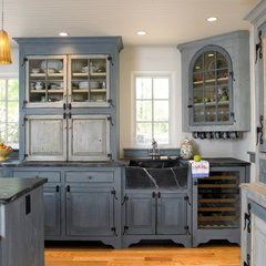 Swedish Inspired · More Info
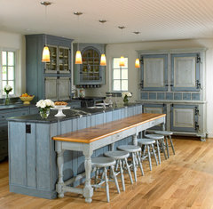 Swedish Inspired · More Info
different color blue green with soapstone and not a lot of light. I like the brushed nickel pulls better than gold.
I can see soapstone working with these cabinets, and I like the wood with the blue.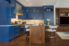 White Plains Penthouse · More Info
Blue green with gray?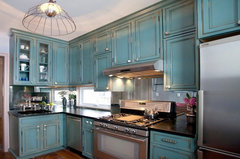 Alterman · More Info
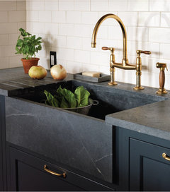 Designer’s Own Kitchen – Lower Manhattan · More Info
 Designer’s Own Kitchen – Lower Manhattan · More Info
Not a lot of light in this kitchen, and the white cabinets don't look as good.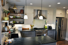 True Shaker style door from Scherr’s Cabinet & Doors. · More Info
Not much light even with two windows, but the blue looks great with the soapstone. Maybe a maple (or other wood) island top. Since you are adding plenty of light, I don't think your kitchen will be too dark with dark gray soapstone.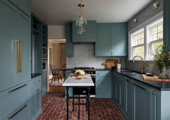 Kitchen-Living Portfolio · More Info
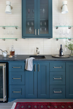 Ramsey Ave · More Info
Ha! I could never do shelves like these. I like the stained wood with the blue cabinets so maybe the maple top would work. Would Maple be about the same color or lighter?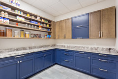 Modern Two Toned Kitchen · More Info
Honestly, I love your idea of soapstone with medium-dark blue cabinets in your kitchen. I don't think you need a lighter countertop. Fight for your soapstone! I wouldn't like gray cabinets with gray soapstone, so your blue is a great idea.hangejl0 thanked Peke hangejl0
Original Author6 years agolast modified: 6 years ago@Peke thanks for the pics! I agree that it is hard to find closed off kitchen pictures. I do like a lot of the pics you shared, and noticed that many of them have hardwood flooring. It's making me doubt my flooring choice all over again! Ugh. I do love the Marmoleum as a product, but the colors are so limited!
- 6 years ago
I like a lot of the examples of non navy blue and soapstone Peke posted.
As for the flooring, I do find wood is the easiest, most forgiving choice. White with some black in the Marmoleum should work, not a checkerboard per se though.
- 6 years ago
I have light white oak flooring in my open floor plan that is probably 30 years old or more. It needs refinished, but it will be last on my list as long as we are bringing in lumber, bathtubs, etc.
I think my oak planks are 2-3" wide. Not in fashion, but too much money to replace.
Hangej, you said there is a problem with level flooring from kitchen to dining room, I think...
I have the same problem. An old outdoor porch was turned into an inside room and the contractors did not measure carefully. It is now one giant living, dining room and kitchen. When I walk to the front door, there is about a 1" incline when I get to the porch area. Not really a step up, more like a ramp. Nothing I can do about it unless I want to rip all the wood out, then reduce all of the floor joists by 1". I also have a bedroom and bathroom that steps down about an inch.
And the idiots that poured the garage floor (bedrooms and bathroom above) did not know what they were doing. When I step out of my living room to go into the garage, there is a 4" or 5" step UP. The garage is to NEVER be a higher level than the interior. I am sure it is not to code, but there is nothing I can do about it unless we tear down the garage and half of the house. Inspectors here didn't do much except for flipping light switches when we bought the house, but when I sell the house, I will probably get the one inspector that will actually inspect.
Old houses!!! - PRO6 years agolast modified: 6 years ago
Thanks for more pictures and your information. I have done a couple boards and I want to talk you through them......this is for thought. Right now you have a lot of disjointed elements chosen for this home that don't necessarily relate to each other. I want you to really think about this. A green room here some yellow flooring here a gray here etc can really reek havoc on the flow of your home. You really need to have something that unifies the entire home so there is a relationship that continues from one room to another. I understand your floor dilemma but I would make sure that you REALLY don't want to carry that wood everywhere for continuation purposes. Sub floors can be leveled and wood can be sanded down and uniformly stained. Lets start with this design board that is using The Hague Blue you love. I purposely grabbed two photos of it in spaces off of the Farrow and Ball website. There is no arguing that it is a beautiful color. That said it has a definite deep teal undertone going on with it. I grabbed a Joseph Frank wallpaper for the dining room walls and fabric for the kitchen window (roman shades with some great trim) that could unify this space to the green you're planning on suing in your living room. On the floors if the Farbo is the way you want to go consider going more neutral with a medium tone gray and a light tones gray and an occasion blue tile mixed in. Lets talk backsplash.. A 2 x 2 tile is going to be BUSY. All that grout whew! I would bump it up to a 4 x 4" tile minimum. Less grout still in line with everything.

On this board I have moved away from that teal undertone The Hague Blue presents and Paired everything with Ben Moores Van Deusen Blue. I used all the same elements But mixed in a lighter blue on the floor. Your husband may not want wallpaper but you are going to need something to unify your color scheme. With this one if You are keeping the round kitchen set I would paint the chairs the color of the light blue floor tile or if you are going something different then I would go light and bring in the blue.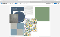
- 6 years agolast modified: 6 years ago
Design Interior, what is the largest glass tile you would use for a kitchen backsplash? I hate small tile and all that grout.
- PRO6 years ago
18-19" under cabinet to counter space. 6" is the max. You want to give tile enough space to repeat itself.
 6 years ago
how is your reno going and what colours did you end up choosing? would love to see some photos. :)




Design Interior South