Software
Houzz Logo Print
shannon_giebenrath

EEK my light grey-blue cabinets are changing on me

6 years ago
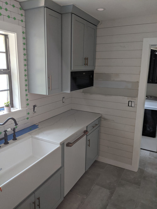
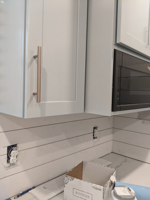
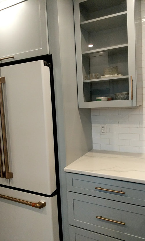
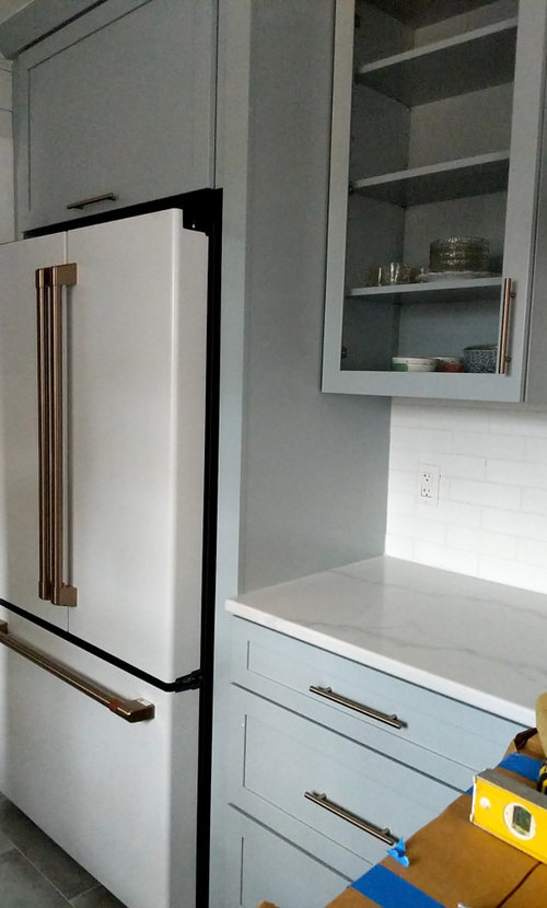
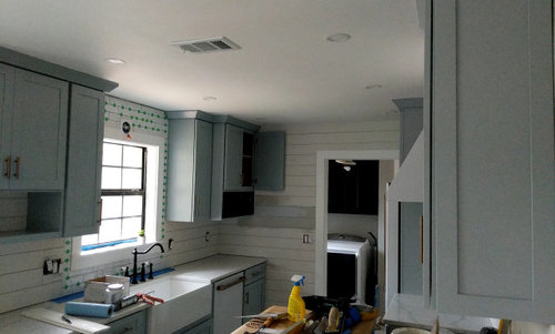
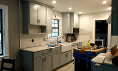
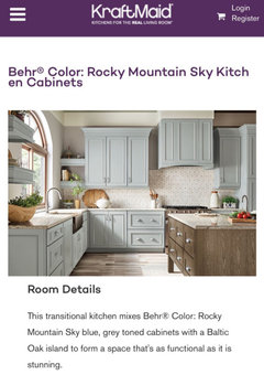
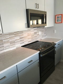
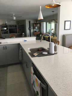
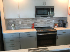
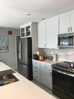
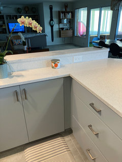
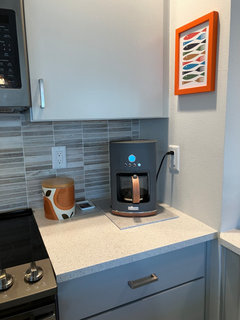
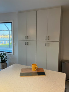
I'm open to any and ALL suggestions. Can anyone out there help me decide on a paint color that will bring the grey back to my cabinets and tone down the blue? For reference, they are Kraftmaid brand- Rocky Mountain Sky is the color. I knew going in that there was a blue undertone...but the further we get in the remodel, the more blue they seem to be getting!! I am hoping that painting a light subtle color on the shiplap will bring the grey back. What do you think?? PLEASE send paint color suggestions as fast as you can. Thank you, Thank you!!

Comments (40)

  • 6 years ago
    last modified: 6 years ago

    Hi Shannon. You’re not going to love my response. The way to make your cabinets look less blue is to make your walls a little more blue. My guess is that if you don’t like the blue in your cabinets, you’re unlikely to like it in your wall color.

    That said, there is very little wall/shiplap space in there to begin with. It looks like most of your cabinets don’t abut a wall space. You can also paint the ceiling.

    You will get advice on the temperature of your lighting. That can help when the lights are on, but you bought blue grey cabinets. It’s probably best to steer into the curve, as it were.

    If you want to try paint, you could consider a grey that has slightly more blue than red or green.


  • 6 years ago

    You are wonderful, thank you so incredibly much for responding, as I have been tasked with deciding on a paint color before my handyman comes back tomorrow morning.
    Sherwin Williams is where I shop, so I will definitely grab a sample can of your color suggestion.
    It's quite a mess in here, but I will send another picture showing that the shiplap wraps around and is being used as my backsplash. What do you think of Alabaster from Sherwin Williams?

  • 6 years ago
    last modified: 6 years ago

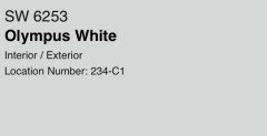
    One more thought. The Kraft Made/Behr collaboration on paint colors gives the following information on Behr 720E3 Rocky Mountain Sky: R: 181 G: 191 B: 189. It’s actually a green. There’s no way to know how the finish on the cabinets compares to the RGB values of the paint, but it is worth asking yourself if you are objecting to what you see as blue, or does it actually look green?


  • 6 years ago

    You’re welcome. I hope it’s helpful. Alabaster is fairly neutral, with almost equal values of red and green, and less blue. I would expect this to make the blue in your cabinets more prominent, not less so.

  • 6 years ago

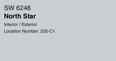
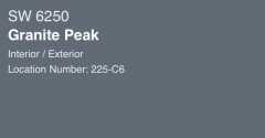
    You could also try


  • 6 years ago

    I just bought all 3 and I'm heading home to give them a try...wish me luck!!

  • 6 years ago

    And thank you again!

  • 6 years ago

    You’re welcome. Good Luck! Let us know how it goes.

  • PRO
    6 years ago

    I think the problem is the white appliances. Stainless would be a better choice and reinforce the grey tones.

  • 6 years ago

    To me part of the problem is the brass hardware. That orange color is the opposite of blue on the color wheel, so it will bring out the blue. Try replacing some of the hardware with stainless to see if this helps.

  • PRO
    6 years ago

    Agree with above, other cool tones will reduce how much blue the cabinets seem. You don't have to go to cool greys you can go with cool whites.

  • 6 years ago

    This kitchen is adorable. I like the color of your cabinets. I think it suits the space and gives a beachy vibe with the light off white paint color on the walls. I don't think you need to go dark on the walls. Your kitchen cabinets look grayer than the color of the paint chip I see when I google Behr Mountain Sky.

  • PRO
    6 years ago

    First before testing any colors make sure your lighting is right LEDs in 4000K for sure.

  • 6 years ago

    Did you sample your paints? What do you think?

  • 6 years ago

    Thank you everyone for your support and kind comments...there was only one I had to ignore, wink-wink. I will definitely try different hardware, that's an easy fix.
    I will send an updated photo this afternoon when it's complete and put back together. This was my first time putting something out on the web. Thanks for making it an endurable experience!

  • 6 years ago

    Not a Pro.

    Your kitchen is beautiful as is!


  • 6 years ago
    last modified: 6 years ago

    Good for you - it’s always better to love what you’ve got than to twist yourself inside out trying to change what it is. And the shiplap color really should have matched the tile color. What color did you finally use? It looks lovely.

  • 6 years ago

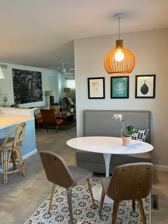
    The shiplap is Alabaster and where the dining area begins is light french grey. Perhaps sometime in the future I'll get back in there and try some different colors. For now though, I'm exhausted!

  • 6 years ago

    Funny I ran into the same problem with a very similar color by Benjamin Moore and almost cried after spending so much time painting. On the spur of the moment painted the lower cabinets black (have a black counter) and love the look. Glad it worked out for you as well.

  • PRO
    6 years ago

    I love your kitchen! I plan on painting my cabinets blue and Rocky Mountain sky is def an option. I also love your counter. It looks like a thinner profile. Can you tell me the brand and color? Thanks

  • 6 years ago

    Not only do I love you Blue cabinets but I love that you paired ot with white appliances and hood vent! It is so fresh and unexpected!

  • 6 years ago

    Love your kitchen!!!

  • 6 years ago

    Hi! I love your kitchen! I was just about to place my order for Kraftmaid in Rocky Mountain sky but found TONS of bad reviews for Kraftmaid recently. How is your experience? Where did you get them if I may ask?

  • 6 years ago

    I really like how it all worked out and the color of your cabinets. Much better than grey.

  • 5 years ago

    Can you advise which countertops you went with?

  • 5 years ago

    Sure, we purchased it from a local store. It's quartz and the name of the brand is Atlas. The color is called Coastal Allure.

    Good luck, I hope your project turns out beautiful!

  • 4 years ago

    Lol I found this after sesrching on google. I was worried it woukd look too bland, looking fir a muted bkue or green and now i think this is one of my top choices. Love the gold hardware and matching fridge. What is that fridge anyway? How mich $$$ if you dont mind me asking?


    I personally love how they look, but if you want to tone down the blue, make sure any undertone of your wall color is not helping that. like blue tone white walls wont make it stand out as much, vs a yellow indertone white…


    and the gold hardware is complimenting it, but the bkue will pribably stand out more as well.


    I oersonally would try embracing it and working with the colors you have now.


  • 4 years ago

    Lol ok i see you have embraced it- good job :-)

  • 4 years ago

    Shannon what wall color did you go with ?

  • 4 years ago

    I love it. Your kitchen is very fresh-looking. I just bought Kraftmaid cabinets - Rocky Mountain Sky lowers and Moonshine uppers and i am very pleased. I will post more once I have decided om backsplash.


  • 3 years ago

    Curious Traveler - I’m about to order cabinets and thinking Dove white perimeter with Rocky Mountain island - I didn’t consider moonshine. would you share photos of your kitchen?

  • 3 years ago

    Coming soon - thanks. i love moonshine with rocky mountain blue kitchen. i wanted a Nordic cool look since its always so hot in Florida. pictures coming tomorrow in day light

  • 3 years ago


  • 3 years ago


  • 3 years ago

  • 3 years ago

  • 3 years ago

  • 3 years ago

  • 3 years ago

    I think I’ll put this in a before and after story too because this kitchen was 1975 time warp before we moved in :)