Software
Houzz Logo Print
sambah006

Porch Ceiling Color

6 years ago
last modified: 2 years ago

Is this blue too much? Too crazy?


Comments (38)

  • 6 years ago

    Colors are hard to be sure of on a screen but I used a sky blue on my porch and no more wasp nests. Many call porch ceiling color haint blue which is a slightly greenish sky blue.

  • 6 years ago

    I like the bold color you picked but I would use a stain, not a solid color. Let the grain show thru and it will not be so loud???

  • 6 years ago

    Of course it should be Haint Blue! Every “Good Southerner” knows Haints fear water and these creatures will not enter a house with a blue porch ceiling because they will think the blue ceiling is water!!! It’s a tradition!

    Jane KR

  • 6 years ago

    Check Duron DCR069 St. Cecelia Blue. This is from the Historic Charleston (SC) Collection. A traditional blue used for southern porch ceilings. I have it on my porch ceiling in SC AND in my living room there! I believe that you might be able to find it through Sherwin Williams, too. Or color match it. It is less intense than your choice, above. Good luck with your project!

  • 6 years ago
    last modified: 6 years ago

    I think it's stunning, just a perfect compliment to the color of the wood. These other folks all mention "haint" blue for their southern porches where it's hot and humid. You live in a much different climate, I think a crisper color combo is a far better choice....just my opinion

  • 6 years ago

    When you see a haint blue ceiling, you notice the color and are calmed by it. In your particular area and house, you’ll feel at peace in a forest. Go with St Cecelia Blue. (BTW, I’d never paint my own ceiling blue; I’m a white ceiling proponent, but I enjoy colored ceilings in other people’s houses.)

  • 6 years ago

    I agree with the comments above in that a paler version of blue might be a better choice. “Jet stream” by Sherwin Williams might be a good choice. Good Luck with your beautiful house!

  • 6 years ago

    Too blue. It needs to be lighter. All the porch ceilings when I grew up were a blue but a light blue and I painted ours light blue as well but can't remember the color although I do think one of the paint companies has a blue color called H A I N T blue but can't remember which one -- google.

  • 6 years ago

    Haint blue is your friend, even if you want to feel warmer on your porch during the long cool seasons. The shade of blue in your sample will feel angry and unhappy to be around in short order, you can see it's already in conflict with your door trim in the photo. (That energy it's giving off is like a screaming roommate, it may be beautiful and fun at parties, but it's tiresome to live with much sooner than you expected.)

  • 6 years ago

    Get a larger piece of cardboard that will cover, say, the end of the porch ceiling, so you can stand back and really see the effect, and paint that and pin it up. Leave it up for awhile so you can live with it for a week or two and see what you think.


    My mother's kitchen countertops were this colour of blue for years (Formica in the 1980's), and many people who came into the house commented on them. When I added onto the kitchen after she died and replaced them, I missed them, but they were worn out by that time.


    I would suggest if you are going for the "I'm looking right up at the sky" effect, then it would look better a little toned down rather than brighter than the actual sky colour.


    If you have bold colours all over the house, don't be afraid to give it a good try! Which sounds like you are doing. :) Sounds like a fun project. :)

  • 6 years ago

    You only get to see the blue sky in July and August up there, so its OK if you forget what it looks like. That color is too saturated to mimic sky blue. Something a little whiter and a little less saturated may be what you are really wanting.

  • 6 years ago

    It’s too intense and will be magnified when covering the entire ceiling.

  • 6 years ago

    I'll tone it down.


  • 6 years ago

    Too bold with the browns. I would pick a softer blue.


  • 6 years ago

    I'm with some of the others: a nice robin's egg or sky blue would be more soothing and blend with the wood door; this is too turquoise for my taste. But, of course, it's your house :-)

  • 6 years ago

    I think your monitor needs adjusted or you should go in for your eyes to be checked if you think that looks like turquoise.

  • 6 years ago

    It looks fun! If it turns out that you don’t love it, just repaint it. It’s paint, so that’s not a huge commitment.

  • 6 years ago

    Sambah006 It looks like turquoise to me as well


  • 6 years ago

    Shoot. I guess that may be part of the confusion here. Because this color is certainly not turquoise.


  • 6 years ago

    I'm a fan of bold colors, but I agree with one of the posters above about thinning it out so you can still see some of the grain. It looks like you have a lovely wood grain, and that would give you both color and preserve some of the wood character. IMO, anyway. Good luck!

  • 6 years ago

    Agree that the blue should be paler in general. That said, in your part of the country, with the grey weather, the blue you chose might make a great statement and counteract the grey of the atmosphere. Do a test on large pieces of oaktag and tack them up to get an idea.

  • 6 years ago

    I love your blue color! It’s a matter of preference. Here’s how I chose the blue for my porches... just stand on your porch steps and look up on a cloudless day. I’d read, like others have previously stated, that a sky blue porch ceiling kept away wasps & in our case, barn swallows nesting. I can testify it woks 100%! I think any good blue color works, if that’s your goal. Otherwise, enjoy your pretty blue color. After all, it’s just paint. You can change it anytime!

  • 6 years ago

    It is pretty, I would like a sshade lighter, go with what makes you happy, trust your gut!

  • 6 years ago

    I went and did a bit of research. Via Southern Living article on haint blue, Farrow & Ball's Blue Ground was a recommendation. The Ben Moore version is called Tranquil Blue, it has a touch of green that will reconcile the reddish woodwork, it plays well with grey, and it seems to have the same intensity of current sample. Just an idea. https://www.benjaminmoore.com/en-us/color-overview/find-your-color/color/2051-50/tranquil-blue?color=2051-50


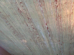
    I also enclose a photo of a local porch ceiling of an older house that had been painted and

    sanded to feature it's last coat of blue. It had a final coat of clear sealant and was without a doubt the most beautiful porch ceiling I've ever seen. Since you have a sanded wood to work with, you might be able to do something similar.


  • 6 years ago
    last modified: 6 years ago

    I have thought of doing something like that. If I were to, there are two or three boards I'd have to replace because of previous HOs who have put in porch lights on the ceiling (Even though there are already two on either side of the door).

    The color of the remaining paint is pretty close to BM Dolphin's Cove. The guys and gals at the Ben Moore store might be able to match a stain I could use on some new boards.


    I can take a look at tranquil blue. The siding has a lot of yellow in it and I noticed the dolphins cove pretty much turned green on the ceiling. I don't want a green porch ceiling.

  • 6 years ago

    Brown and blue are complimentary colors on the color wheel; with your wood tone being on the orangey side, however, I would go with a more green-blue, like a teal color. Craftsman style homes can take a bolder color than other styles. As someone else said, paint a larger sample...and it’s only paint, so it can be replaced! I do like the washed out look of what you have now. How about either thinning the blue or partially sanding some of it off afterwards to retain that look?

  • 6 years ago

    Maria Killam is a designer/color consultant who will do online color consultations for a fee. I have used her service twice and was very happy with her suggestions. The last time I used her was to choose a new color for my porch ceiling which I had painted a green that was too bright. The color brightens considerably outside, and then is magnified over the larger area. I'm afraid you are making my mistake.

  • 6 years ago

    Who cares what other people think! If you love it, then paint it. BTW, it does look awesome against the wood!

  • 6 years ago

    No turquoise look here on my monitor, It is a very pretty, brighter color blue. If you like it, give it a try. Remember it is only paint, if you decide its too bright, you can tone it down. If you dont like it at all, then, you cn repaint it. Good thing is, you will probably know after the first coat of paint, how you feel about it, and most likely, you will need at least two, coats. My own beadboard porch ceiling, took, 3 coats.

  • 6 years ago

    I think it’s too bright, but respectfully respect the OP’s taste and opinion. Like others have said, just paint it again if you don’t like it.

  • 6 years ago

    Since you asked, I think it is a little bit too intense, but please do paint a poster-board and try it out first. Why paint it twice (or more) if you do not have to?

  • 6 years ago

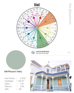
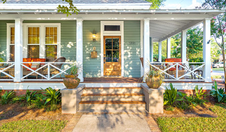
    Here’s classical colour harmony worked to great effect with the orange wood of the door.

    The walls have a slightly more gentle contrast.

    (See even more photos on this lovely Insta account.)


  • 6 years ago

    Yeah, it's too intense. I've come to my senses. Other projects going on right now that need wrapped up.

  • 6 years ago

    I love it! I painted my parch roof a vibrant chartreuse. You have to be happy after sitting on my porch. It’s a small area that you can smile at.

  • PRO
    6 years ago

    Try Birds Egg from Benjamin Moore

  • 6 years ago
    last modified: 6 years ago

    I had a darker grey house, the overhangs were painted the same color. When I repainted to a lighter than I had the overhangs done in white. My home became noticably brighter inside with the reflected light from the white overhangs.

    Painting your porch ceiling a darker color may reduce the amount of light inside your house.

  • 6 years ago
    last modified: 6 years ago

    No matter what color you choose, use semi-transparent Stain rather than paint. Stain will be much less maintenance than paint in years to come. Much less.

    In choosing your color, this application is definitely worth trying colors on a large mat board before staining the entire surface. Regardless of how a chosen color looks on a chip, everything changes once that color is put in place. See your color of choice in place before making a final selection.


    RE the notion (above) that a darker color may reduce the amount of light inside your house: Nonsense. Pick the color that pleases you, period.