Software
Houzz Logo Print
dannis639

YELLOW! I need color help!

6 years ago
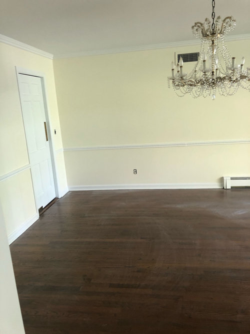
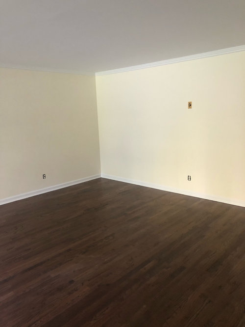
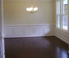
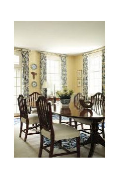
I recently bought a house and wanted a non gray, warm white so I went with Acadia White, it’s so YELLOW! I’m so upset! I didn’t see it until my painter was done ( rookie mistake), but I can’t live with this. Any advice on a warm not gray white? My painter is going to think I’m crazy. Thank you in advance for any advice!!!

Comments (47)

  • 6 years ago

    What color range are your light bulbs? Why did you not paint the walls the same color as the trim? What color is that?

  • 6 years ago

    That’s natural light 🙈. My painter recommended doing the trim white

  • 6 years ago
    last modified: 6 years ago

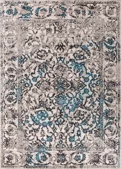
    Quite neutral and rug could do something -- and let's say you can 'take' blue with the paint color -- have blue in art for sure...?


    Well Woven Sydney Vintage Blue Area Rug, 2'3"x3'11" · More Info


  • 6 years ago

    some hope! Thank you!!

  • 6 years ago

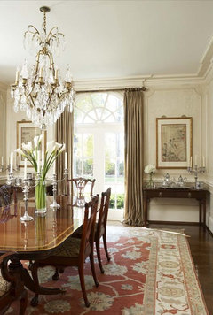
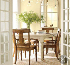
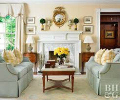
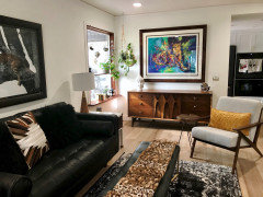
    I can delete these - would this look work?

    City: Kirkland Residence · More Info


  • 6 years ago

    I saved this picture! Thank you so much for your help and time!

  • 6 years ago
    last modified: 6 years ago

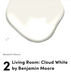
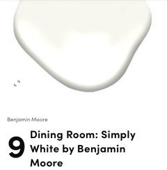
    If you decide to repaint, I thought it would help to compare Acadia White to some other warm whites. Acadia does have a strong yellow hue, while the other two feel creamy. I have used both of these colors in a number of rooms and love that they provide a soft neutral backdrop.


    dannis639 thanked Maureen
  • 6 years ago

    So sad story. same incident happen with me.

    dannis639 thanked Alice Mia
  • 6 years ago

    I’m so annoyed! What did you end up doing?

  • 6 years ago
    last modified: 6 years ago

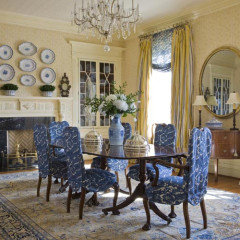
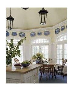
    I spent over 20 hours painting my kitchen cupboards and hated the look. I believe it’s best to bite the bullet rather than living with a room that I disliked and redid immediately. Maybe to help you decide take a look at yellow dining rooms on line (most are very traditional) and when furnished, art and drapery added you may get a sense of what your room could feel like. Another suggestion would be to add moulding and paint lower half white to soften and create more interest.


    dannis639 thanked Maureen
  • 6 years ago

    Thank you so much for the help! I’m going to look at cloud white. I know, I wanted to update this house and have it look fresh and ended up super formal🙈🙈

  • 6 years ago

    Glad you decided to tell you the truth.

    dannis639 thanked Maureen
  • 6 years ago

    Well, your chandelier is pretty formal.

    Just to offer consolation, you did not fail to update the room. Acadia White looks unexpectedly yellow in your room. I used it in a bedroom once and it remained a neutral warmish white. I was surprised at how yellow it looks in your photos.

    dannis639 thanked barncatz
  • 6 years ago

    once you're repainting, maybe consider removing the chair rail. It really doesn't add anything, other than a bit of a formal air

    dannis639 thanked drdeb1234
  • 6 years ago

    Thank you so much for all the help!! I was surprised too! Unfortunately because of Covid we’re in hard lockdown in NY and only one person is allowed in the house- hence not seeing it until he was done. I really appreciate the advice!!

  • 6 years ago

    Try SW Shoji White. It's warm without being yellow or gray. There are also some very good articles on choosing the right white under Houzz "decorating guides".

  • 6 years ago

    a chair rail is totally appropriate in a dining room, in fact it is the perfect room in which to have a chair rail! And here, it goes with the formal air of the chandelier.

    dannis639 thanked loobab
  • 6 years ago

    it's looks really yellow because you have it next to bright white trim and doors.

    But, I'd paint over it. If you want a neutral white, Oxford white, Simply White fit the bill.

    If you don't want yellow, then be very careful NOT to choose the yellow based warmer whites!

    dannis639 thanked Beth H. :
  • 6 years ago
    last modified: 6 years ago

    You know, I don't care for yellow myself, and look positively ill next to it, but a lot of people like it.

    Think about how you will decorate the room before you rush to spend a fortune to repaint it.

    I never thought I could ever like a room with any yellow walls at all until I saw a marvelous traditional room done in blue and yellow.

    It was just stunning.

    Think of the iris.


    dannis639 thanked loobab
  • 6 years ago

    Yellow is a very difficult color. Some are warm and inviting and some are just too citrus.

    dannis639 thanked houssaon
  • 6 years ago

    And some are positively bilious!

  • 6 years ago

    I am trying to figure out why Acadia white turned so yellow in your home.


    Acadia white is a yellow white and a bit cleaner than some of the other creamy whites, but in your pictures this is seriously yellow, not a touch of yellow.


    First question - Is the paint the right color? Was it actually Benjamin Moore Brand Paint? I know that sounds crazy, but often painters get Sherwin Williams paints and have it color matched to the Benjamin Moore color and the whites are never right.


    If it is the right color can you open some doors or windows and see if the color is different with natural daylight than daylight filtered through your windows. Some energy efficient windows can alter the colors on our walls (usually make them a bit green).


    The other thing that can happen is colors from outside can be reflected inside. (Walls go green when the trees get leaves or an awning color is reflected on the walls.)


    If your color is truly BM Acadia White and the walls are really look like pop secret movie theater butter popcorn, I may not try to paint another white and may move to a mid tone saturated color that can fight the yellow reflected light.


    Someone else recommended Cloud White - great choice, very neutral, with a tinge of warmth.

    Another excellent choice would be White Dove.

    If those are still too yellow try adding some depth to the color, Try Dove Wing or White Down.


    dannis639 thanked Jennifer Hogan
  • 6 years ago

    Haha so funny you say that be the other day I went back to check the paint cans!! I guess my natural light reads really yellow. I was afraid of a strong white looking too cold but I’m not worried about that anymore!!

  • 6 years ago

    SSwilliams website's colors give 2 other colors that will go ok - you might see your accent color with a white you'd consider.

    dannis639 thanked everdebz
  • 6 years ago
    last modified: 6 years ago

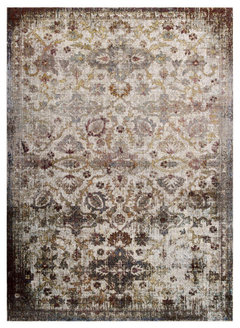
    With yellow-ish in this muted rug - wall color will make sense, and even be pretty...

    Modway Floral Moroccan Trellis 8' x 10' With Area Rug Multi-color R-1161A-810 · More Info


    https://www.houzz.com/products/modway-distressed-vintage-floral-moroccan-trellis-8x10-area-rug-r-1161a-810-prvw-vr~150009555

    dannis639 thanked everdebz
  • 6 years ago
    last modified: 6 years ago

    This neutral camel color could 'relate' with soft yellow - with pretty chandelier.

    Surya Topkapi TPK-2303 Camel/Taupe/Black Area Rug, 7'10" x 10'3" · More Info


    https://www.houzz.com/products/surya-topkapi-tpk-2303-7-10x10-3-camel-taupe-black-rug-prvw-vr~135192857

    dannis639 thanked everdebz
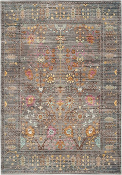
  • 6 years ago

    Some rugs would look more lively with soft yellow - this nice if ya like warms....

    Safavieh Valencia VAL108C 8'x10' Gray, Multi Rug · More Info

    https://www.houzz.com/products/safavieh-valencia-val108c-8-x10-gray-multi-rug-prvw-vr~61608095

    dannis639 thanked everdebz
  • 6 years ago

    Im going to take Maureen and Beth’s advice and paint over it. I’m leaning towards Simply White, any other recommendations? sho I do trim in Simply White gloss?

  • 6 years ago

    Whatever color you choose, test it first! Buy sample sized cans and test!!!! Colors look different depending on the lighting in the room and number of windows, and orientation of the room. Do not choose based on photos on a computer. A warm white that I like is Cotton Balls by BM.

    dannis639 thanked threers
  • 6 years ago

    Ya I think you can safely do all Simply, with glossy trim.

    A few years ago I had a dilemma here regarding choosing white paint. It was making me crazy. (“It’s white! How hard could it be?” Hahahaha).

    So just saying. I feel your pain.

    dannis639 thanked drdeb1234
  • 6 years ago

    I did Simply white in eggshell on my walls, and Simply White semi gloss on my trim if you want to see how it looks.


    dannis639 thanked Beth H. :
  • 6 years ago

    Beautiful!!

  • 6 years ago

    You have all been so wonderful! We’ve decided to paint over! Since I apparently have the wonder yellow wall we’re looking at whiter whites- sampling Simply White, Decorators White, Oxford White- any other recommendations that aren’t too gray are welcomed!

  • 6 years ago

    Chantilly lace.

  • 6 years ago

    Is that the white you ended up going with?

  • 6 years ago

    I am going to reiterate what you don't want to hear. If Acadia White went this yellow you may have issues with another light white. Simply white is less yellow than Acadia White, but still a very light, highly reflective white. If the light that is being reflected is yellow you will see yellow.


    Chantilly lace is about the most neutral white made. Test that first. If Chantilly Lace turns yellow in your space and you don't want to go gray you will need to move to something that is darker, less reflective than the light, bright whites.


  • 6 years ago

    Thank you!! I will definitely try Chantilly Lace!!

  • 6 years ago

    Chantilly definitely leans cool. Icy looking in some instances. So if you don't have yellow reflection, you're going to get a white w/a cool and icy appearance.

  • 6 years ago

    Which white was used for the trim? Test it in an eggshell or matt for your walls.

  • 6 years ago
    last modified: 6 years ago

    Just saw your question dannis.

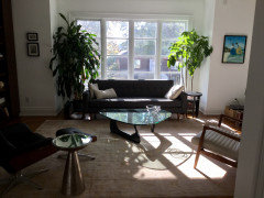
    No, I eventually in my desperation had a designer in to advise me about the white, and she recommended All White by Farrow and Ball (but it was actually Benjamin Moore tinted to match that). It’s very white, but looks great. In retrospect I’m sure several others would have been fine too. I think if you’re looking for a fresh white option, Oxford White is a great choice . Anyway here is my LR. I love having white walls again!

  • 6 years ago

    I love it! It’s so fresh!

  • 6 years ago

    Farrow and Ball All White is a bit lighter and cleaner than Chantilly Lace, but very similar.


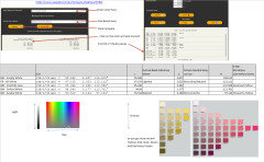
    There is a website that can help you compare colors Easy RGB


    It is not perfect, readings are from unopened Fan Decks and fan decks go through rigorous Quality control tests, but with color and paints there is no exact. 2 cans of the same paint mixed by the same person in the same store may not be exactly the same. If you roll paint or spray paint the color can be slightly different. If you paint on a hot day or a cool day the color can change. Not enough that most of us will ever notice, but paint color is not an exact science.


    It is probably the best data available and serves it's purpose.


  • 6 years ago

    Given this analysis - Chantilly Lace and FB All White are not too different - enough that you can see a difference if they are right next to each other, but close enough that if you painted 2 walls across the room from each other you probably won;t notice the difference.


  • 6 years ago

    Omg hours could be wasted on this. I’m so excited! Thank you Jennifer!

  • 6 years ago

    I’m impressed. You sound enthusiastic. I was panicky!!!

  • 6 years ago

    I have a love hate relationship with the numbers. I am a data analyst by trade, so I love numbers. I am an artist by hobby so I am more apt to use visualization to determine undertones.


    The numbers kind of drive me crazy because they are not perfect. You will often find the same color in 2 fan decks and even with highly sophisticated equipment and high levels of quality control in the print system, the numbers are different for the two samples in the system. Arrggghhh.


    Using the color muse I can get slightly different readings on the same sample or wall by moving the muse a fraction of an inch or by re-calibrating the device. The tools are not perfect - they give me a fairly reliable method of comparing colors.


    I have also not had time to really analyze the combination of chroma vs hue to determine the sweet spot where a neutral goes from being neutral to having a discernible undertone.


    And of course, we have to adjust our thinking when we add in the fact that lighting changes the appearance of our colors and the CIE LCH standard defines that the measurements are done with 6504 K lighting at a 2 degree angle. This rule allows uniformity (kind of like having all #10 nuts and screws in the world threaded with the same exact thread pattern so that brand x nuts work with brand y screws). The numbers don't reflect what I will see in my space.


    I would love to spend a year doing nothing but documenting, analyzing and comparing colors and their notations, but that will never happen, so I use the numbers strictly for comparative purposes and continue to use my eyes and testing to solve issues with my choice of paint colors.