Software
Houzz Logo Print
luke_warren24

Exterior Color Disaster!

6 years ago
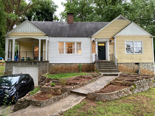
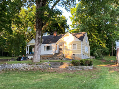
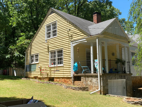
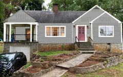
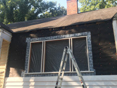
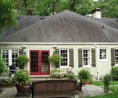
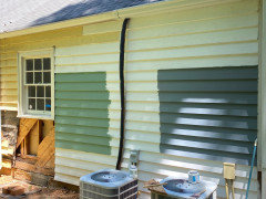
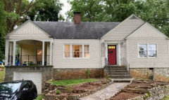
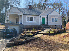
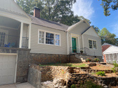
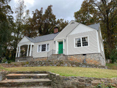
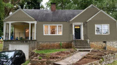
My wife and I have been slowly plugging away at our 1945 fixer upper. We're not quite sure of the style, we've been told its a mid-century, a colonial cape, others say cottage or something called minimal traditional. Whatever it is, we love it. We remodeled most of the inside, and with all the extra time on our hands we decided to tackle the outside. Before we knew it we cleared the garden beds, replaced half the rotted clapboards and pulled off the gutters to repair rot. Now we have a lot more structurally sounds house, but are stuck with a two tone paint/primer nightmare.


My wife and I weren't ready to paint, we wanted to update the gables first, but my gutter guy says sooner is better than later so we tried to dive in. We and are completely at odds with where to go with the color scheme though. She likes dark charcoal or a sage greens, and I want something bright like a salmon, butter cream, or a very traditional monochrome red/red like you'd see on an old colonial. Problem is, we don't know what the house needs. Suggestions welcome! By the way, we're in Atlanta, Ga.


Comments (31)

  • 6 years ago

    What a beautiful house you have! I love the dark door, the original windows, and the trim. I don’t like red.

  • 6 years ago
    last modified: 6 years ago

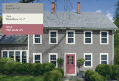
    I think a gray like Storm would enhance the beautiful stonework of your house. Salmon is too strong a color and even used as an accent not too many shades are formulated for the exterior. But I like a soft muted pink as an unusual front door color. I would paint the ceiling of the wonderful porch haint blue. Ling tern you might want to add screens to that room.


    Wash the soil off the stones and get the mold off the roof. (You might need a new roof in the not too distant future.)

    Good luck with your super charming Colonial cottage.

  • 6 years ago

    I would consider blue and a front door in the orange or yellow family.


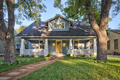
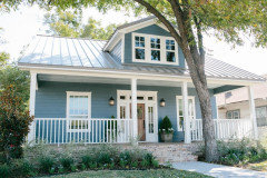
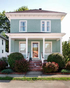
    Craftsman Cottage - Rosedale Ave · More Info


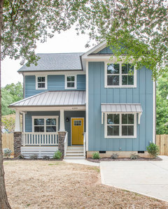
    New Construction - Cotswold, Charlotte NC · More Info


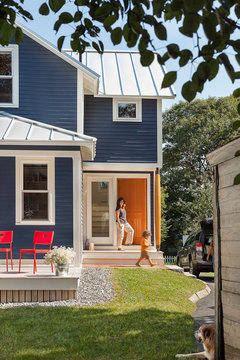
    Blue-Green Renovation · More Info


    Luke Warren thanked Elle
  • 6 years ago


    An alternative route would be to lift colours directly from the stone foundation, if you were after a softened look. You could judge by eye with paint chips next to the stone, or a more efficient way would be to ‘measure’ the colours in the stone with a small device.


    The device (Color Muse) links to an app on your phone and gives key colour attributes for the surface measured. Such as Lightness, (how light or dark it appears), Chroma (how colourful or neutral it is), Hue Angle° (Which plots the colour into its Hue Family) The process is akin to taking a photo and a screen shot but with different results.


    It’s then possible to use those Lch values to find close match or coordinating paint colours.

    Fun too and no guessing required.

    Luke Warren thanked Marylee H
  • 6 years ago

    I personally think your house has too much character for a kind of basic color like grey! I don’t like the mock up in the comments at all (no offense to the one who made it)- I think you can’t see the shape or style of the house. I really like the comment about the sage green with buttercream accents. It’s probably safer too, I would think looking at your house for so long and then changing it completely to a stark or dark color would take time to get used to! Your house reminds me of a doll house, with the different sidings and two paint colors I would keep it similar, just my two cents! Gorgeous cute house xo

  • 6 years ago

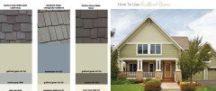
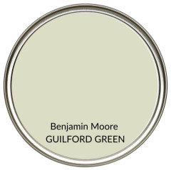
    I think the pale green of BM Gilford green or similar would look lovely

  • 6 years ago

    Wow! Thanks everyone for the help! My wife said red is bad too, makes sense, I never was the one with the style sense.

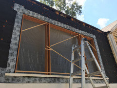
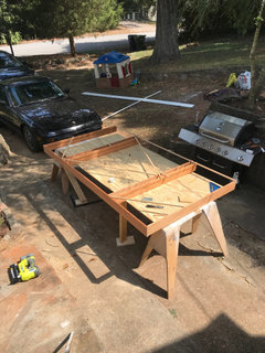
    We love our little house too, original features and all. We actually rebuilt the front 8’ bank of windows by hand, down to the sash and jambs! That was a project.

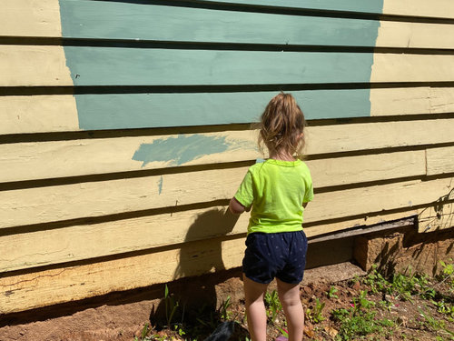
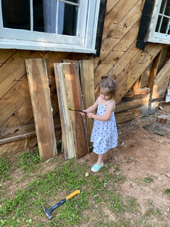
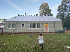
    Here is the kiddo working on it and the siding when we started! It’s been a family affair.

  • 6 years ago

    We have dark gray charcoal as our exterior color - and I agree it’s too modern for your beautiful home. We just built and went with a very modern + craftsman style in and out - I think dark gray would make it look like you’re going modern. I personally love the yellow with red door!!! Absolutely love it and think it would be stunning on your home. The other suggestions of sage green and blue would be beautiful as well!

  • 6 years ago
    last modified: 6 years ago

    I admire your love of color and red.

    Your house is beautiful. I really don’t see charcoal for this house. I think a color that is brighter, and more classic, would showcase the house much better.

    As far as sage green, I am not really in love with that idea, either - but a color scheme along these lines might be interesting.


    Other than that, I really don’t think your two toned disaster is so much of a disaster. The white + yellow actually looks good on your house. I don’t know which one I would choose for sure - but I am thinking maybe white with some of the yellow detail + a red door. With some red in landscaping, also.


  • 6 years ago

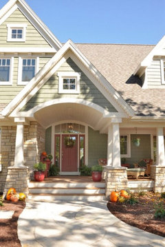
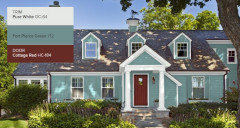
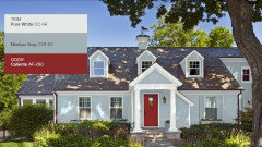
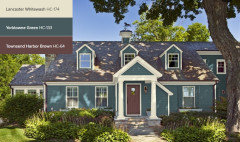
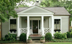
    A slate blue may be a nice color with a cream or soft white for the trim. I like the sage green with cream (my house colors) but if you're leaning toward something else, look at these for inspiration:


    I really like this one.

    Luke Warren thanked Anna (6B/7A in MD)
  • 6 years ago

    Our current yellow is so dingy we wanted to go drastically different, so we tried a grey and green from SW historic collection on some of our new clapboards. We’ll go lighter like everyone is suggesting, since these felt heavy. Could we do a light grey for the sashes? Or keep to white/ ivory trim across...

  • 6 years ago

    You posted a picture with some paint on the siding and a little girl standing there, up above. That is my favorite color for your house. Its a very cute house. Post a picture once its all painted.

    Luke Warren thanked cat_ky
  • 6 years ago

    Here are some other options.


  • 6 years ago

    Look at something like Saybrook Sage for the siding from Ben Moore.


  • PRO
    6 years ago
    last modified: 6 years ago

    What a charming house. Just make sure the roof gets washed before you begin to paint.

  • 6 years ago

    Thanks everyone! Looks like we’re ready to start trying sagey greens and yellows! Any recommendations on what to do with the gables? The scallops make it feel so dated. We were thinking of doing new vertical siding, or running the clapboards all the way up.

  • 6 years ago

    I love the soft yellow in deco's Urban Cottage photo.

  • 6 years ago

    What a lovely house. I agree with having the roof cleaned first. No sense putting money into painting if the roof isn't looking its best. A soft butter yellow or sage green would be perfect! Soft off white for the trim and a fun color for the front door. Please post after pics!

  • 6 years ago

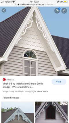
    Oh Luke! I love the scalloped look! It gives it kind of a Victorian feel!! But that’s just me :) can’t wait to see what you do!

  • 6 years ago

    Those gables are great and give the house a lot of character, without looking fussy. I think the very light sage color could work, but white would also look great on your house because you are surrounded by all the green trees, and a warm white would work well with your stone foundation. Once you get your landscaping in the house will be very charming!

  • 6 years ago

    The pale sage house with cream trim posted by Beverly is one of my all time favorites. I absolutely love your house and look forward to seeing your project as it evolves.

  • 6 years ago

    The scallop look is lovely, I hope you keep it, I like the more soft yellow, ivory look. I know you have a yellow look now but I think it’s nicer than sage

  • 6 years ago

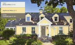
    Here is a pretty yellow. If you paint the scalloped portion the same as the lap siding it will almost disappear. I think it is part of the charm. I'd keep it.


  • 6 years ago

    Have you and your wife tried any of the paint visualizers? I used the one from Sherwin Williams. It is messy but gives you some idea. My preferred color for your house is white. A common practice when there is stone is to paint the house the color of one of the stones or the color of the grout. I tried to match the grout I think the but failed. The grout is more a true gray. So I tried to match the stone. It looks better than I had thought it would.


    Since you want a bright color perhaps you could compromise

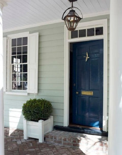
    with a bright door. Here is a green/gray.

  • 6 years ago

    Your house is lovely. Great job on the windows. What a team! I liked the yellows best, but wifey wins. As for your roof, Home Depot makes a roof paint that will make it look like new in various colors--like magic.

  • 6 years ago

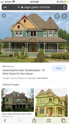
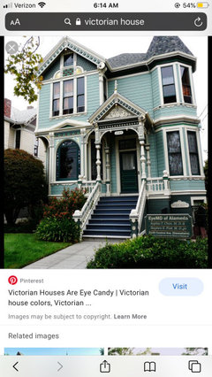
    I love how people are able to do the mock ups... I googled siding or paint mock ups once for our house... with the examples shown I really believe the trim and the scallops need to be a different color to pop (like how you have it now with the white and yellow) it’s too much detail and character to be lost!! I’m going to try and attach screenshots of houses I googled where you can see they use two paint colors....

  • 6 years ago


  • 5 years ago
    last modified: 5 years ago
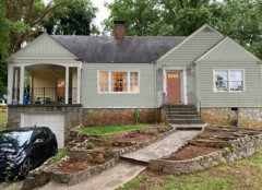
    We finally finished it! Thanks for all the help everyone!! I wanted to provide and update on how we got here.

    There was a lot more wood rot than we expected, which all needed to be fixed prior to painting. I replaced 1/3 of the total house siding with new clear yellow pine clapboards to match the originals. Trim was in bad shape, so I sourced new from the original millshop and replaced much of it. We kept the scallops :) We had the painters scrape for a week, then oil prime and use Peel Bond and wood fillers to make the alligatoring less harsh, and the transition from new to old clapboards more subtle.

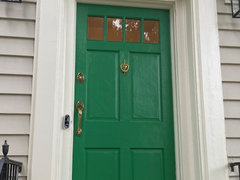
    We ended up going with BM Revere Pewter for the clapboards (color matched to SW Rejuvenation in low lusture) and SW Alabaster for the trim in a gloss. The front door is BM Once Upon a Time in gloss, and the back is SW Jazz Age in High Gloss. We're thinking of refinishing the front door and at that time using a less brilliant color. My wife hates the green, but I think it's feels like a hobbit door. We'll see. Painting was miserable, we had to fire our first paint crew. They painted in the rain, calked in the wrong places, and just make a mess. Turns out it's hard to find painters that know how to paint wood houses correctly in Atlanta. Second crew was great, it was worth the hard conversation.

    After painting a big storm came through which wrecked our roof. So, new roof as soon as the paint dried. That is IKO Cambridge Harvard Slate. We also went with new gutters, guards and downspouts. Those are all Tuxedo Grey. This is one choice we wish we had back, they feel too heavy. Maybe in the summer we'll paint them to match the trim.

    All in all, we're elated. A storm took down a 200 yr white oak in our front yard. Sad to see it go, but it gives us a new opportunity to landscape and finally tackle the terraces. Thats next!


  • 5 years ago
    Congratulation! A battle hard won! 🌈

  • 5 years ago
    It looks great, you must be thrilled. Very much appreciate it when the OP comes back with an update.