

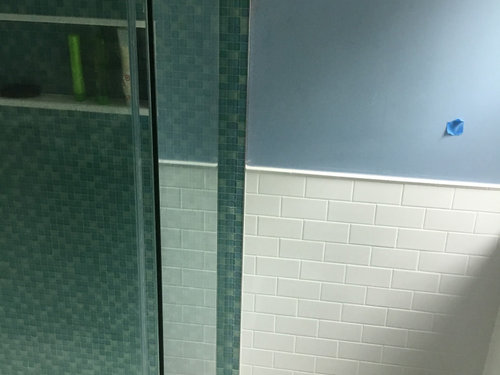
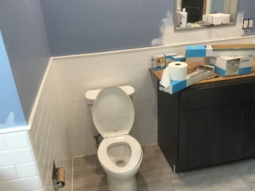
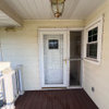
Picked the wrong color. Help!
6 years ago
Featured Answer
Sort by:Oldest
Comments (20)
 6 years ago
Related Professionals
Missoula Interior Designers & Decorators · Rochester Bathroom Remodelers · Sugar Land Kitchen & Bathroom Designers · Milwaukee Kitchen & Bathroom Designers · Indianapolis Interior Designers & Decorators · Portland Interior Designers & Decorators · Louisville Kitchen & Bathroom Designers · Santa Rosa Kitchen & Bathroom Designers · Mountain Home Furniture & Accessories · Longview Interior Designers & Decorators · Hartford Interior Designers & Decorators · Pullman Interior Designers & Decorators · Tacoma Interior Designers & Decorators · Austin Architects & Building Designers · Alpena Kitchen & Bathroom Designers 6 years ago
 6 years ago
 6 years ago
- 6 years ago
 PRO6 years ago
 6 years ago
- 6 years ago
- 6 years ago
- 6 years ago
- 6 years ago
- 6 years ago
- 6 years ago
- 6 years agolast modified: 6 years ago
- 6 years ago






Related Stories
COLORPick-a-Paint Help: How to Quit Procrastinating on Color Choice
If you're up to your ears in paint chips but no further to pinning down a hue, our new 3-part series is for you
Full Story
COLORPaint-Picking Help and Secrets From a Color Expert
Advice for wall and trim colors, what to always do before committing and the one paint feature you should completely ignore
Full Story
COLORPick-a-Paint Help: How to Create a Whole-House Color Palette
Don't be daunted. With these strategies, building a cohesive palette for your entire home is less difficult than it seems
Full Story
ARCHITECTUREHouse-Hunting Help: If You Could Pick Your Home Style ...
Love an open layout? Steer clear of Victorians. Hate stairs? Sidle up to a ranch. Whatever home you're looking for, this guide can help
Full Story
COLORColor Palette Extravaganza: Room-by-Room Help for Your Paint Picks
Take the guesswork out of choosing paint colors with these conveniently collected links to well-considered interior palettes
Full Story
PRODUCT PICKSGuest Picks: Help Your Home Blossom With Floral Decor
Sprinkle hints of spring around your rooms with fabrics, wall coverings and more that recall nature's charms
Full Story
COLORPick-a-Paint Help: 11 Ways to Mine Your World for Colors
Color, color everywhere. Discover the paint palettes that are there for the taking in nature, shops and anywhere else you roam
Full Story
GARDENING GUIDES6 Questions That Will Help You Pick the Best Plants for Your Site
Before you head to the nursery, learn more about your outdoor space
Full Story
PRODUCT PICKSGuest Picks: Hot Air Balloons Help Decor Soar
Flying onto wallpaper, pillows, lighting and more, hot air balloons lift rooms up, up and away
Full Story
PRODUCT PICKSGuest Picks: 20 Frameworthy Works to Help You Get Motivated
Conquer your goals and lift your spirits with encouraging art prints of inspirational quotes for your walls or shelves
Full Story


JudyG Designs