Software
Houzz Logo Print
butterflyjlv

Please help me decide between two kitchen designs!

6 years ago
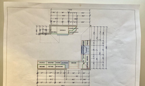
I am working with a new kitchen designer as I had to move on from the last company I was working with due to too many issues with their cabinets (they came in damaged, different color shades etc.). The new kitchen designer came up with a design that was a bit different than my original. I’m torn between aesthetics and functionality. Could you please help me choose between the two designs? I’m open to changes! Thank you!


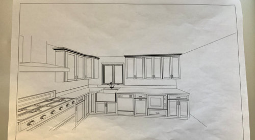
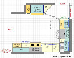
Pros of new design:

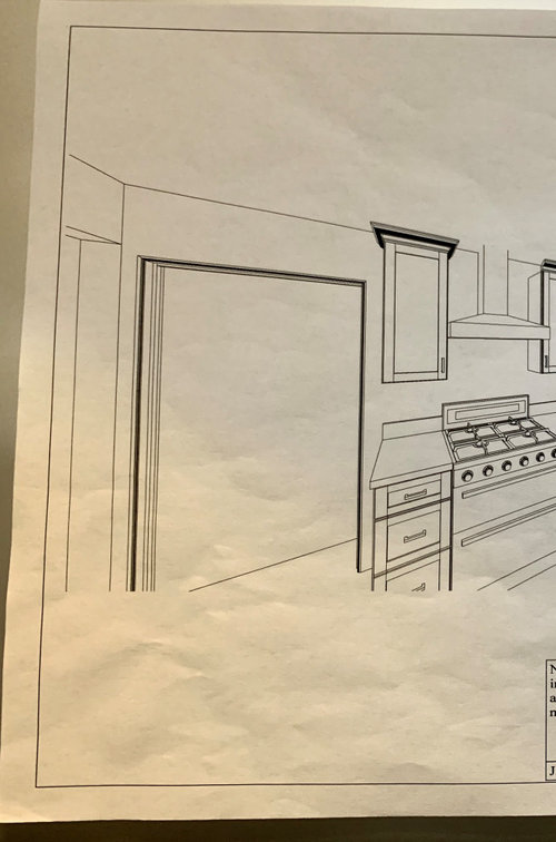
The cabinets extend all the way to my sliding glass doors

It has a larger base cabinet which can now fit a bigger sink.

Microwave drawer cabinet

Double trash barrels in cabinet


Cons:

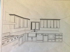
The two upper cabinets on the sides of the oven hood are different sizes

Oven is no longer centered on the wall (designer preferred more counter space on the right of the oven)


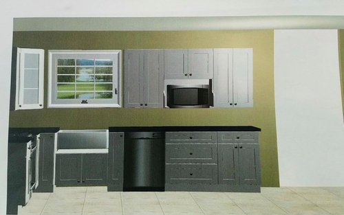
Old design pros:

All cabinets aligned

Oven centered


Cons:

Smaller sink

Cabinets did not go to sliding glass doors and had empty space

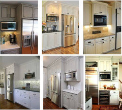
Upper microwave cabinet

9 inch spice racks for filler that I would not necessarily need


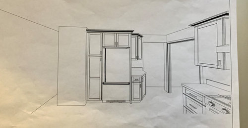
New design:


Old design:


Comments (10)

  • 6 years ago

    These are very different. Without knowing the relationship of the kitchen to the rest of the house, I think the new kitchen design is much better.

    butterflyjlv thanked anj_p
  • 6 years ago

    We need more information from you. We have a "Layout Help" FAQ that will be helpful. I'll summarize the main points here and link to the FAQ for further reading. We also have a set of Kitchen Design Best Practices/Guidelines that will help you understand the comments/questions you will be getting.

    We need a fully-measured layout of the spaces under consideration (in your case, Kitchen & Dining Room) and a sketch of the entire floor the Kitchen is on.

    Layout...While you did include the KD's 2D view, what's missing is the information telling us where the doors lead.

    Sketch...The sketch of the entire floor lets us see how the Kitchen relates to the rest of the home. It doesn't have to be to-scale, but it should accurately show how the rooms all relate to each other and should include all interior & exterior doors (or how to get to them if they're on a separate floor). In addition, it will help us see how traffic flows in, around, and through the Kitchen. Include the front entry and family entry, if different. The family entry is usually a garage or side entry, but it might not be. It's helpful to know which door you use to bring in groceries.


    Other questions...

    • Tell us about you and your family and how you plan to use your Kitchen. All-adults? Empty Nesters? Children (now or in the future)?
    • What appliances (& their sizes) do you plan to have?
    • Where are you flexible? Can walls/windows/doors/doorways change (move, change size, add, delete)?


    The above and more are discussed in the Layout Help FAQ.


    Also see...

  • 6 years ago

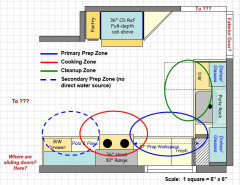
    In the meantime, I did work up another idea. It follows Kitchen workflow:

    Refrigerator ==> Sink ==> Prep Workspace ==> Range (or MW)

    Or, Ice.Water.Stone.Fire

    The most useful and most used workspace is between the range and sink (the prep workspace)...in both of your above layouts there is hardly any room b/w them. That's why I moved things around.

    That most used space is now also in front of the window. Work/time spend in the Kitchen:

    • 70% or more of the time spent and work done in the Kitchen is done in the Prep Zone
    • 20% or less is spent cleaning up; and that includes clearing and wiping down table & counters, sweeping up, loading/unloading the DW (you should no longer be rinsing dishes, just scrape and load into the DW)
    • 10% is spent cooking -- adding ingredients, stirring


    The range is on an exterior wall for ease of venting to the outside. (I don't know if the right wall is an exterior wall, there's no information on your layout).

    The sink counters and cabinets are all 3" deeper than standard. These extra 3" add quite a bit of storage and provides room behind the sink for the faucet, etc., as well as provides a bit more "face" room.

    • Counters are 28.5" deep
    • Base cabinets are 27" deep
    • Upper cabinets are 15" deep
    • The Plate Rack is raised higher than the other upper cabinets
    • If you cannot get deeper base cabinets, simply pull them out from the wall 3" when installing them. 15"D upper cabinets have become fairly common, so they shouldn't be a problem.

    The corner is voided out to give you more useful cabinet space.

    This layout also gives you space for more than one person working in the Kitchen. While I don't show it in the Work Zone picture, you could also have someone prepping to the left of the sink when the DW isn't running. (It's not pleasant working over a running DW.)

    Just a word of caution...don't crowd the doorways in the upper right. If that space is too tight, it can become an issue. I show a 45" wide aisle, I would not make it any narrower b/c there are two doorways in that corner. (Where do the lead?)


    Work Zones:


    butterflyjlv thanked Buehl
  • 6 years ago
    last modified: 6 years ago

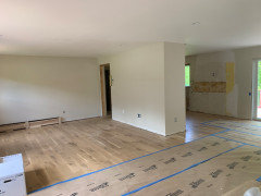
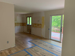
    Thank you so much Buehl! Unfortunately, the only measurements I have are from the first photos on the new design. They came out to measure the kitchen as we had many issues with measurements on old design. I can certainly try to take them myself! I will include photos of the kitchen. We are a family of four - two adults, two kids. The appliance specs are as follows.

    Stove:

    30 Inch

    Dishwasher:

    (rough cabinet opening)

    24 x 24 x 34.5 H

    Microwave:

    (Drawer Microwave for base)

    Depth 23.4

    Height 16

    Width 23.6

    * This microwave can also be purchased in a 30 inch. The microwave itself remains the same but comes with a trim kit.

    Refrigerator:

    Depth without door: 24

    Depth with handles: 30.75

    Depth excluding handles: 28.25

    Height to top of refrigerator: 70.25

    Width: 35.75

    Apron front Koehler farmhouse sink (I have a 30“ inch but would like to get a 33” which would fit in a 33” base)

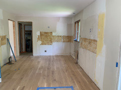
    View when you enter the home. Standing in living room area, looking into kitchen.


    Oven was placed on wall near the door, sink beneath the window (which we are open to moving, but prefer not to if possible. Hubby did say he would move it if need be lol)


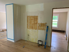
    Refrigerator placement


  • PRO
    6 years ago

    I don't think cabinet sales people are kitchen designers , they are limited to what can be done with their cabinets. I do agree symmetry is never my end game but function tops all else . IMO all lower cabinets should be drawers.

    butterflyjlv thanked Patricia Colwell Consulting
  • 6 years ago

    I agree, Patricia, but on the new design if I added drawers, I would not have a place for the trash bins, which are on the side of the dishwasher. She added another option if I wanted to add drawers to the right. I thought it looked a little funky that way.


  • 6 years ago
    last modified: 6 years ago

    Before I read the thread replies, or even looked at the old plan, I came up with the same plan as Buehl, except for the fridge wall. But I think it would be nice to keep the hood as a focal point from the dining area (I assume is off to the left). If the sink is not going to be under the window, it can go to the right of the window (as one faces it), to provide a nice wide prep area. You might need a small filler (1" or so) on each side of the range, to make it come out even with the upper cabinets. DW and sink are closer to the dining area, so helpers can gather dishes to set the table, without crossing the prep and cooing zones.

    I included an 18" trash pull-out and 39" wide drawers, with a narrow slot or pull-out, but the widths of those cabinets could all be adjusted to your specific needs or available cabinet sizes.

    The tall pantry was omitted and the fridge moved left, to provide wider cabinets to the right. The upper could include a MW (which I don't consider a con--from your list), or base could be MW drawer. You would lose cabinet space, but you'd have a nice landing space to pour a drink or make a sandwich.


    butterflyjlv thanked mama goose_gw zn6OH
  • 6 years ago

    " ...but on the new design if I added drawers, I would not have a place for the trash bins, which are on the side of the dishwasher. She added another option if I wanted to add drawers to the right. I thought it looked a little funky that way."

    First, it does not look "funky" -- it looks more functional.

    Second, it's not just the cabinets on the sink wall we're talking about, all the cabinets, except the trash pullout should be drawers. So, that means the cabinet next to the range as well.

    .

    I wish builders would stop putting windows so close to the corner in Kitchens! It makes it more difficult to get a functional layout if you're someone who absolutely must have the sink under a window, regardless of it's need today. (In the past, before dishwashers, much more time was spent in front of the sink (and cleaning up). However, today with DWs, that's no longer the case. In fact with today's DW detergents, you shouldn't even be rinsing dishes -- just scrape & load. Even less time than ever at the sink for cleanup! But the paradigm of "the sink must be under the window" persists today even though the original reason for it no longer exists.)

    butterflyjlv thanked Buehl
  • 6 years ago

    Thank you, Buehl! I have a meeting today for another layout with the kitchen window moved to the right. I just feel there’s not enough prep space and it should be moved. I am also removing the pantry, and angled cabinets, as well as requesting drawers. We’ll see how this new layout turns out!