Software
Houzz Logo Print
alexandra_mikhlinjones

I can't decide on tile backsplash! help

6 years ago
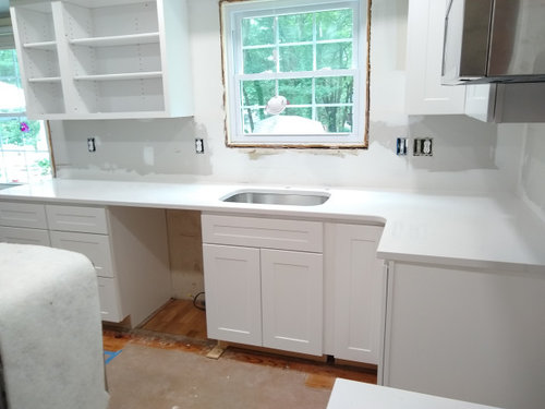
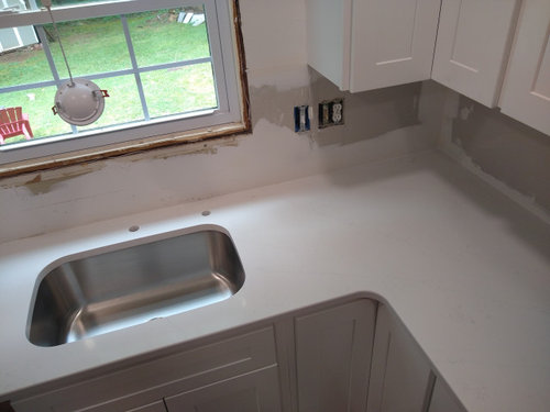
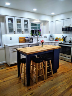
I need to decide on tile backsplash. we have white cabinets and countertops (see pics), medium dark oak floors, small navy island with medium dark butcher block. haven't decided on wall colors yet. I'm wondering if

  1. white tile would be too white in my pretty much white kitchen or would the navy island and wood floors warm it up enough?
  2. would subway 3×6 tile be too boring or just classy looking?
  3. is there a tile you can recommend to keep the tile look light in color, but not boring, with a different kind of tile than subway, that will not be too expensive?
    thanks in advance!

Comments (30)

  • 6 years ago

    What about a hexagon pattern tile or something similar? I hink It is fine for the perimeter to be monochromatic when you have a bold color choice on the island.

  • 6 years ago

    @amber playle I love the idea of hexagon tile. I was actually thinking of doing that in subway tile, but laid out in hexagon pattern. is hexagon look classic? or dated?

  • 6 years ago

    looks like from your ideabook you are drawn to subway tile in a herringbone pattern, love that look with longer subway tiles. also I like the beehive tile you show in your ideabook. I dont think it will be too much white by the way... love that look.

  • 6 years ago

    if you're feeling real strong about a white backsplash, but concerned about it being too white, you could change the grout color so that it visually breaks up the tile and the brightness of mostly white in the space

  • 6 years ago

    There are sooooooo many other options than white subway.
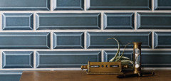
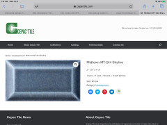
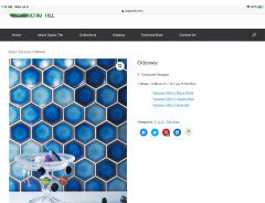
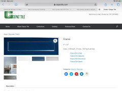
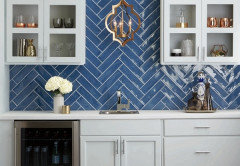
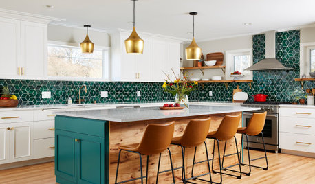
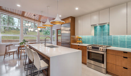
    I have Cepac midtown tile in Skyline. (I used two sizes) Cepac has lots of beautiful blue tile. These are just a few. I would absolutely incorporate the blue into your backsplash. Have fun. (And if these are too bold, there are many other options.)

  • 6 years ago

    I could look at blue backsplashes all day. I’ll stop after this one. (Not Cepac tile.)

  • 6 years ago

    @stumpydarby these blues are so pretty! would it clash with Navy blue island, though? or is it ok they might be slightly different blues?

  • 6 years ago

    I am all for slightly different blues as long as the undertone is the same in both blues.

  • 6 years ago

    You could do the same color backsplash as your island, but a few shades lighter. You could also do a complementary color if you’re super bold. Or choose a color harmony other than complementary. I’m not into a lot of white personally, but it’s up to your taste. Can we see the navy color on the island?

  • 6 years ago

    You absolutely could do lighter blue. A lot depends on lighting. Do you have under cabinet lighting?
    I never ever thought I would go with a beveled tile … but the blue tile almost looked like blue jeans. (I thought I wanted blue glass but I couldn’t find the right blue. Cepac didn’t have the Frame tile back then … that one is brand new.)
    There are so many fun colors and shapes … you can even do a backsplash with a mix of blues so it picks up lighter, medium, darker, etc.
    The backsplash doesn’t have to be a carbon copy match of your navy.
    I also would like to see a pic of your island. I know the pop of blue in the backsplash would tie everything together and look amazing.

  • 6 years ago

    Your ideabooks have a ton of herringbone so if that appeals to you the most definitely do it (but I’d keep it classic white to match counters and cabs with just a light pewter shade for grout so it pops slightly). However there are tons of inspiration pics with blue islands/butcher block tops - this is just one and notice the backsplash....

    https://www.houzz.com/photos/boerne-bentwood-farmhouse-kitchen-austin-phvw-vp~136461369

    What is the aesthetic of the rest of your home? That may help narrow down tile type/pattern if you explain more of the overall look and feel of your home.

  • 6 years ago

    A white or light colored glossy tile really helps reflect light onto the work surface, which may be needed in your kitchen.

  • 6 years ago

    Do white herringbone with a colored grout, something subtle. You put those pics in your idea book because you liked it. Go with what you're drawn to.

  • 6 years ago

    No white. I'd bring the blue over to your backsplash.

  • 6 years ago

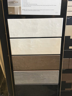
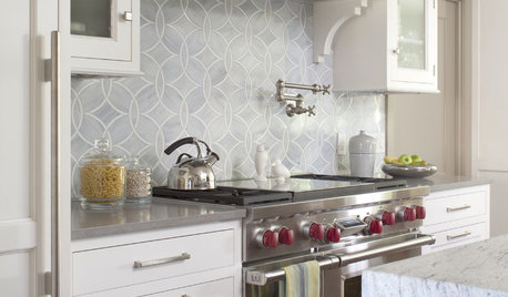
    I would do white with white grout and use blue and wood accents on the counter and in window treatment.. island color can change then what Do you do with blue backsplash? I used this it’s a wavy larger white subway.. the top one

  • 6 years ago

    I think hexagon is the new penny tile. It is going to be something that stays a classic as long as it is in neutral colors. Any color choice is a personal preference and there to stay. That said, this is your kitchen and you have already committed to a navy color elsewhere so I think it is up to you. A subway tile is a classic for a reason as well and can be used there with some flair in color. I would caution against a white tile and dark grout, it will show any imperfection in the installation. Low contrast will hide imperfections better.

  • 6 years ago

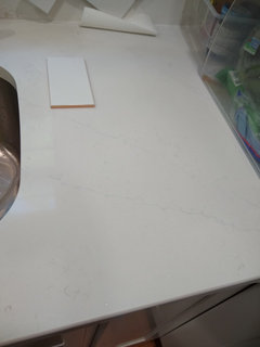
    i taped together the subway tiles and put it up in my kitchen. I do love the way the hexagon looks and I like the white. what color grout should I get? I kind of like the way it looks right now, I can see the lines. what about amber-color grout, is that a thing? here's a pic of the tile on my countertop, which has very light grey veining

  • 6 years ago

    thanks for helpful comments, everyone! I do love that herringbone in subway tile, so I'll go with that. I'm happy I've made a decision and I'll post when it's done.

  • 6 years ago

    OK good! Just don't go to colorful with the grout - you want it to be like a shadow color - just a hint of a tone - not a color color (Amber - no that will stick out in a bad way).

  • 6 years ago

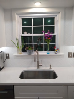
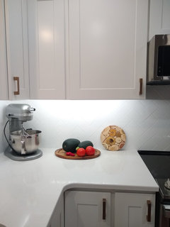
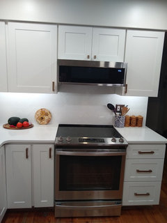
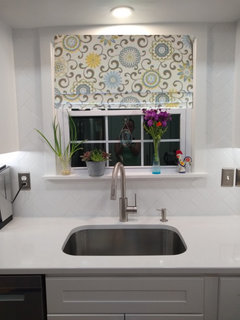
    we finally finished the kitchen (except the floor re-sand and finish), anf and I love my hexagon subway tile. backsplash! thanks for your advice, everyone!

  • 6 years ago

    @Alex M, You did such a great job! It’s beautiful. Enjoy your new kitchen in the best of health.

  • 6 years ago

    thank you!

  • 6 years ago
    last modified: 6 years ago

    alex, very nice job with your herringbone design. Did you do it yourself?

    looks nice, but man that's a lot of white. too bad you didn't use a gray grout so that you could actually see the pattern. the white grout really blends w/the tile.

    I love all your flower colors around the window. the purples and greens look amazing next to the white.

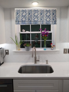
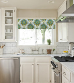
    have you thought about doing a colorful valance in that window to bring in some colors?

  • 6 years ago

    @Beth thank you. we didn't do that ourselves! it took a professional two days to do it, as it's a lot of cutting.
    yeah, I know what you mean about the grout... I agree that would have been better, to see the design.
    I haven't thought about a window treatment yet, but that's a good idea! can you share a picture of what you are thinking of?

  • 6 years ago
    last modified: 6 years ago

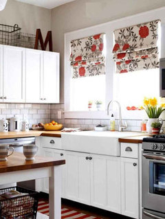
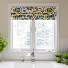
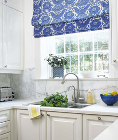
    alex, I posted a few pictures yesterday of window treatments. I guess it didn't take?? weird.

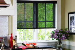
    these are just examples of how to bring in some color to all of that white


    this is a solar shade. they come in all colors and patterns


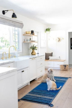
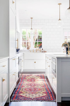
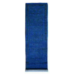
    you could also try a colorful runner in front of the sink


  • 6 years ago

    @Beth thank you, I love this idea! my island is navy blue with butcher block top, so I especially love the blue ones!

  • 6 years ago

    oh I love that island! yes, the blue or blues/greens would look perfect w/your wood


    and a cobalt runner . (it's an over dyed wood rug)


  • 6 years ago

    ooh where did you find this runner?

  • 6 years ago

    Your kitchen looks great. I love the blue island. Just go to Overstock and Wayfair and type in “blue runner “ and you’ll be there a while.

Sponsored
Wannemacher Interiors
Average rating: 5 out of 5 stars26 Reviews
Customized Award-Winning Interior Design Solutions in Franklin Cnty OH