Software
Houzz Logo Print
emma_lou2

Paint color suggestions

6 years ago
last modified: 5 years ago

.

Comments (76)

  • 6 years ago
    @Flo Mangan this is amazing - I was hoping you’d break it down a little for me. Crazy because I thought pale oak would be more gray/cooler than winds breath. based On the above pale oak sounds like what I’m looking for but I know in my space that could totally change. Stay tuned!

  • PRO
    6 years ago
    When colors are this close, it all boils down to lighting. The more LED lighting the cooler colors appear no matter how “warm” LED manufacturers advertise it. Your flooring also plays a big part. It throws off light reflection as well. I bet Pale Oak will look different in each of your spaces. It rides a line on the Color Wheel near the “warm/cool” line.

  • PRO
    6 years ago
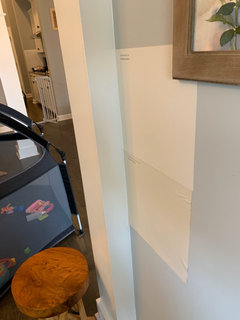
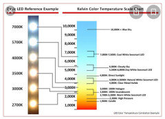
    Here is an LED lighting chart that might be helpful to you.

  • 6 years ago
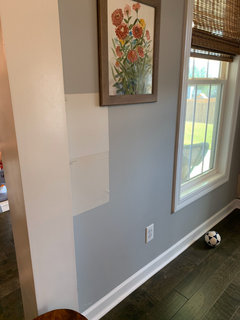
    Great information, Flo. Is there a website for those charts, or is it something Benjamin Moore provides?


  • 6 years ago
    last modified: 6 years ago
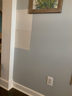
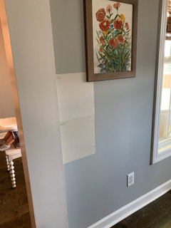
    I’ve posted some photos of my test samples twice and for some reason they won’t post. sorry If three lists appear with all the same photos . @Flo Mangan

  • 6 years ago
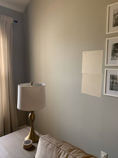
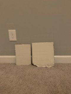
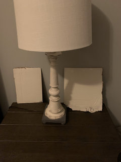
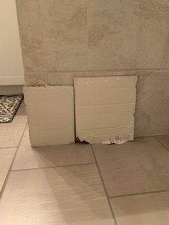
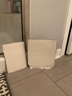
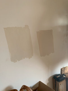
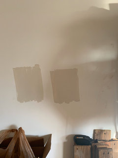
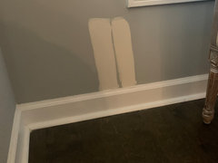
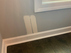
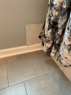
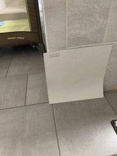
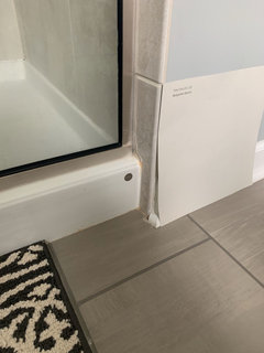
    This is all artificial lighting at night. Second coat isn’t quite dry so definitely preliminary. Pale oak is on the left and winds breath on the right. I have a favorite so far I think but interested in thoughts.

  • 6 years ago
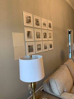
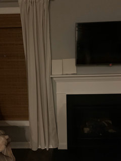
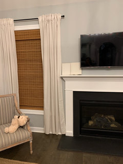
    A few more. In my great room - first is with the overhead light off and just my open kitchen light on (which is how I relax at night) and the second with the overhead light on (which is if we have company- this will soon be lit on a dimmer though).

  • 6 years ago
    last modified: 6 years ago
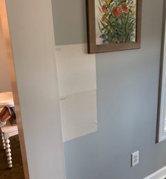
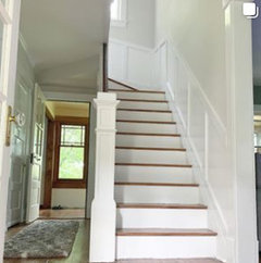
    I recently used SW-Lattice. It is a nice color, technically a "green" undertone grey but it is a bit of a chameleon. The mood of the color changes well with the house lighting conditions throughout the day. Here is a nice little photo of it that shows it simultaneously in 3 lighting conditions.

  • 6 years ago

    And one more with kitchen counters

  • PRO
    6 years ago

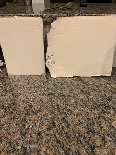
    Let’s just start with these are pretty crazy sample boards. The right one looks more yellow to me than left one? But I will wait for more pictures Tomorrow in real light.

  • 6 years ago

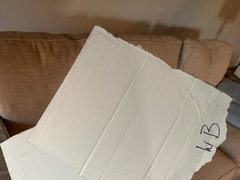
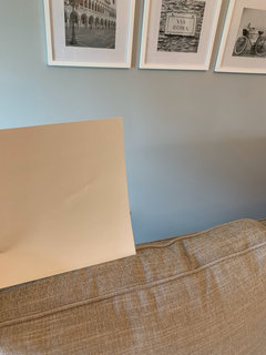
    @Flo Mangan i used white cardboard to paint two layers - did I make a mistake using that surface? here is one in this mornings dim natural light. Pale oak on left and winds breath on right. im not seeing any color at all in Pale Oak and more beige/yellow in WB. This has me afraid pale oak is too pale - but I love it in every picture I see but it just looks like white to me. 😆


  • 6 years ago

    A few more. First pictures are pale oak - In half artificial light with a little natural light, and then just natural light (dull morning light - we get afternoon sun through these windows. Last two pictures are winds breath in the same conditions.

  • 6 years ago

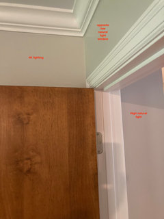
    Sorry for so many posts but wow those samples aren’t accurate at all - got it on the wall. In these pictures winds breath is on the left and pale oak on the right in my garage with natural light coming through. I’m even more confused now but I think Pale oak is promising!

  • PRO
    6 years ago

    I can assure you, Pale Oak will not look white. The reason I prefer samples from samplize.com is because they get the true color just perfect. So let’s wait to get that sample.

  • 6 years ago

    @Flo Mangan yeah i think I’ll feel better after seeing that. I did paint some in my great room. Do you think I should order winds breath too, or too yellow? I’m torn. Pale oak is on the left below and here - some with natural lighting and overhead or just natural


  • 6 years ago

    Love pale oak.

  • 6 years ago

    Apparently your painted woodwork is a creamy white instead of a bright white, which, to me does not provide enough contrast with the Pale Oak. JMHO.

  • PRO
    6 years ago

    Her trim looks very white on my monitor. I like .20 chroma difference between trim and wall color and you will have plenty with either color. Pale Oak will be beautiful with your trim. I fear Winds Breath might go too yellow which is not what you want. Right? Painting samples on wall not best practice. So get the Pale Oak sample please. When you get a whole wall you will see it has a good amount of color. Your trim will look really pretty with it. Bbl

  • 6 years ago

    I have Edgecomb Gray in most of my downstairs and I love it.

  • 6 years ago

    Another option that is less warm than Edgecomb Gray but still “greige” is Balboa Mist - I have that in my living room.

  • 6 years ago

    @Nancy Walton im not sure of my specific trim color but it’s definitely a bright white, a shadow form a chair may have just skewed those pictures. Still anxiously awaiting my Pale Oak peel and stick - it should arrive today!


    @Ephma i really do love edgecomb and maybe should still keep it in the running. Balboa mist went a little gray for me in the paint store when side by side with Pale oak, but if I’m not happy with Pale Oak it may enter the running! It does look really beautiful in that space. I do think from my sample so far I can see where Pale Oak would pull a little lavender.

  • 6 years ago

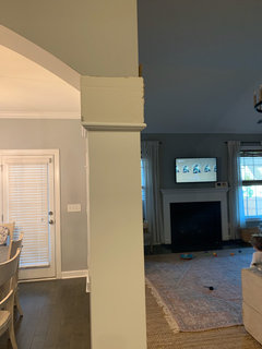
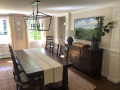
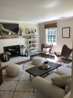
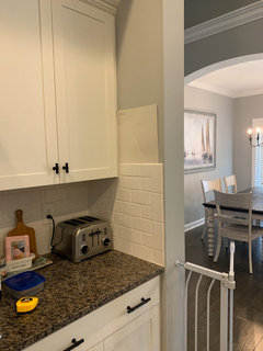
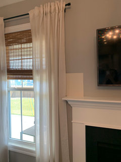
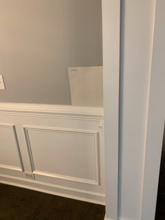
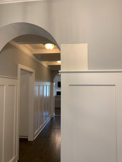
    Ok here is pale oak in many of my spaces of various lightings - daytime with some natural and artificial. The last photos are pale oak on top and edgecomb on bottom. Thoughts?

  • 6 years ago

    A few more

  • 6 years ago

    And a few more

  • 6 years ago

    @Flo Mangan updates with the pale okay sample above - would love your thoughts

  • 6 years ago

    Daytime with blinds down so filtered natural light

  • 6 years ago

    Filtered natural light

  • 6 years ago

    Filtered natural light filtered natural light plus overhead light

  • PRO
    6 years ago

    You can see what I mean about Pale Oak. It works in all your lighting at least from my views. Is that Winds Breathe below? I don’t think it is as successful. What do you think being there?

  • 6 years ago

    I prefer the Edgecomb, personally. The pale oak looks too much like a primer. But that's just mt preference. You are the one who has to live with it.


  • 6 years ago

    One more with my painting

  • 6 years ago
    last modified: 6 years ago

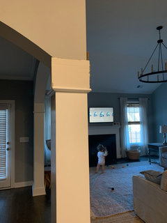
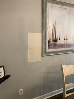
    @Flo Mangan @Nancy Walton I'm team Pale Oak and my husband is team Edgecomb (Flo, edgecomb is the other sample pictured)! I'm very torn though - I think you're right Flo - pale oak works really well in my light. I'm not seeing any weird undertones. Having them by the sailboat picture really made Pale Oak the clear favorite in that location especially. However, this angle is the one that scared me - it got really washed out here and just looks white. But, I see similar pictures online where it is washed out and think it looks beatiful, like the second picture here. Edgecomb is pulling too yellow for me.


  • PRO
    6 years ago

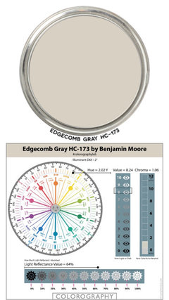
    The trend is to lighter so Pale Oak is winner but you have to love it. The DNA of Edgecomb is below.

  • PRO
    6 years ago

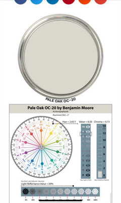
    Here is DNA Pale Oak. Pale Oak less Chroma so less graying. So up to you.

  • 6 years ago

    @Flo Mangan my husband, bless him, says the choice is all mine. I think once Pale Oak is on all the walls, we'll see the differences in the way the light hits so the room won't feel "white", and I think it's so much more neutral and flexible. But, you know - they're not going to start paiting in our huuuuge great room! They have a bedroom, hallway, office, etc to do first. I can live with either of these in those rooms, so, I say there's no harm in starting with Pale oak there and if we need to make a change for the main area, we will! I'll get a better feel for pale oak tonight when the sun's gone, but as of now I think that's what I'm going for. Once we start I will absolutely post pictures of the finished product - it's always nice with these kinds of posts when you get to see the resolution!

  • PRO
    6 years ago

    Fantastic- good plan. Grays are yesterday!! You are going to love your lighter, brighter world.

  • 6 years ago

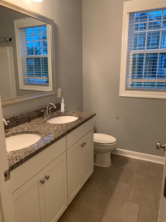
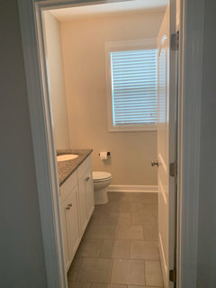
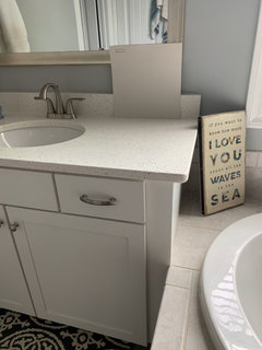
    A little before and after of the kids’ bathroom 😍

  • PRO
    6 years ago

    So much brighter and inviting. Love it.

  • PRO
    6 years ago

    Do you love it?

  • 6 years ago

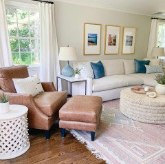
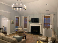
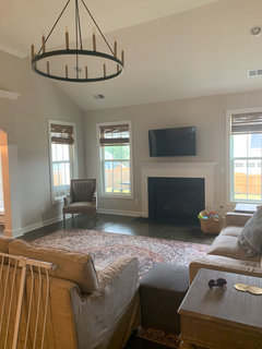
    And before and after of main area. It’s a gloomy day out so looking forward to seeing it with better natural lighting. Have to get my curtains hung back up - going with longer curtains at the right height this time though

  • 6 years ago

    @Flo Mangan I love it!!! So much. It looks different in every room so it isn’t boring having one color, but there isn’t a single room where I don’t like it. It truly is a chameleon. I am SO glad I didn’t go darker - I would have regretted it. The painters have even been going on and on about how beautiful the color is. I’ll post two final pictures when they’re done with the master bath and dining tomorrow. Amazing how much more I feel at home here now Just with A paint Change. Photos don’t do it justice.


    I can’t thank you enough for leading me to the color - I wouldn’t have ever found it without you and would have gone much darker and not accomplished what I had set out too. I am relieved to officially know for sure that I did not make another expensive mistake this time!


  • PRO
    6 years ago

    Gheesh! It is amazing. And it feels so much more inviting! You can do anything with this!

  • 6 years ago

    Very nice!

  • 6 years ago

    @Flo Mangan so there can be no perfect paint color in all lights... so far the only “flaw” I’ve seen with pale oak is that without natural light and with artificial light it’s turning gold - HOWEVER I believe that is a byproduct of my light temperature. In an attempt to warm things up with my other paint I went with 2700k. In my dining room, I have 3000k and I’m not seeing the gold (all though that room also faves a different direction. Is there a specific temperature you recommend? I’m going to move my 3000k bulbs in here tomorrow to see if it makes a difference but wondering if I should go even cooler.

  • PRO
    6 years ago

    If you want whiter and lighter, go 3500 to 4000. 2700-3000 is “warm LEDs”. See if that helps. I am quite sure it will.

  • 6 years ago

    @Flo Mangan do you happen to know a Sherwin Williams color that’s closest to Oale Oak? I have family that wants to stick with SW but wants a similar color and not paint matching.

  • PRO
    6 years ago

    I can do an analysis and see what I can recommend. Might not have time til late Sunday.

  • PRO
    6 years ago

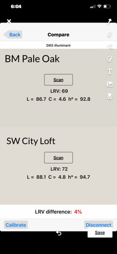
    ok. Sorry it took me so long. This was hard! But, I think I have good option from SW to test. It is City Loft. I put the two color DNA notations for each color. City Lift will appear a bit lighter because it’s LRV is 70/100 and Pale Oak is 68/100. 100 is lightest to the eye so the higher the LRV number the more reflective of light (lighter to most eyes) it will be. Pale Oak has a degree more Chroma (think graying) than City Loft and while it is in the Yellow Hue Family it falls in the warm segment. I think it is worth a sample to test in the room(s) intended. Of course, the natural light and artificial light in any given room will be determinate of how the color is perceived. Different eyeballs perceive differently too.

  • 6 years ago

    Following