Software
Houzz Logo Print
natalia_s

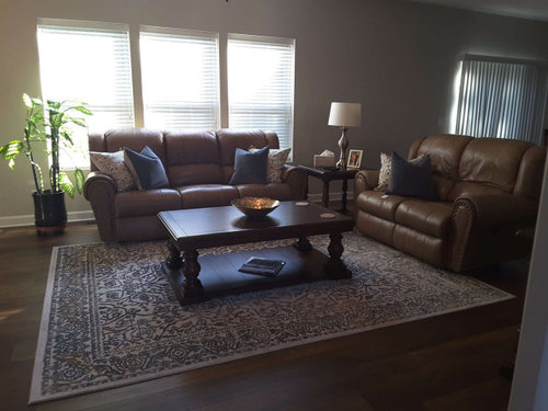
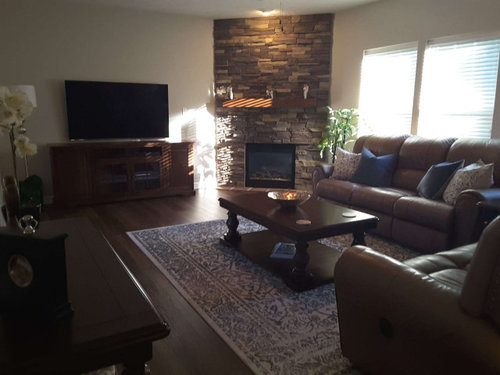
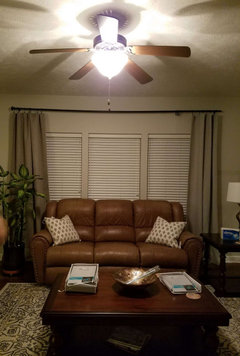
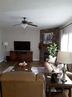
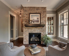
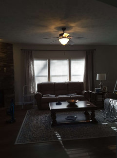
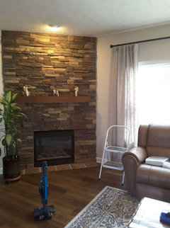
Need help styling my living room

6 years ago
last modified: 6 years ago
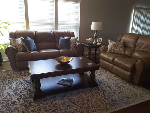
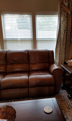
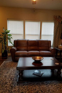
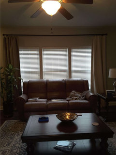
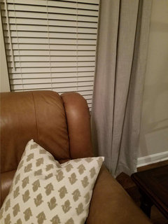
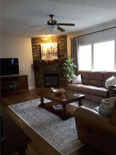
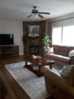
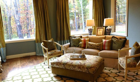
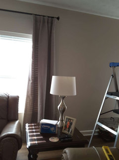
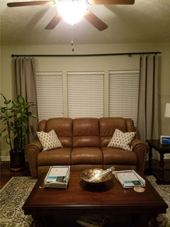
I am thinking about changing the light on the end table (ideas welcome!), but I also feel like I'm missing something, some other color splash or something. Your thoughts and comments are appreciated!


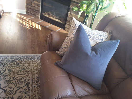
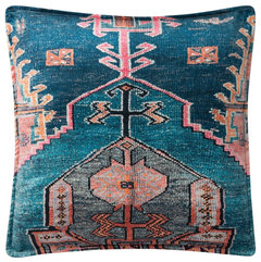
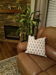
Here's a closeup of the pillow pair:


Comments (86)

  • 5 years ago
    last modified: 5 years ago
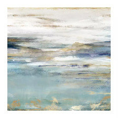
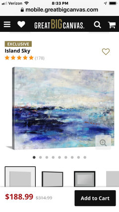
    everdebz, here are is couple that I like, but I haven't purchased anything yet.


    Art measures 30L x 1.25W x 30H in

  • 5 years ago

    @Deedee The mirror is 42 inches tall, and the space between the mantle and the ceiling is 49 inches. Would that make the mirror too tall for that space? Seems like it might just take over the fireplace completely.

  • 5 years ago

    I’d try it and see Don’t hang it just set it on the mantle If it seems like it’s just too much you might try leaning another piece of art or a photo in front of it if it seems like it’s just too much you might try leaning another piece of art or a photo in front of it If it doesn’t work take it down

    Liya thanked Deedee
  • 5 years ago


    Liya thanked Deedee
  • 5 years ago
    last modified: 5 years ago
    Curtains have arrived. Still deciding what I think about them...


  • 5 years ago
    last modified: 5 years ago
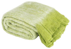
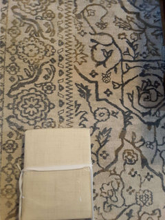
    At first thought, ok... and different enough than rug [beautiful btw]. If print is "perfect" machine- look, add something handmade, unique maybe near, on the sofa:


    Lonny Throw in Green · More Info


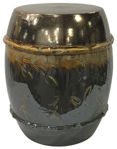
    Claybarn Patina Sienna Decorative Garden Stool · More Info


  • 5 years ago
    last modified: 5 years ago
    I forgot mirror - if finish is matte/ dull might be transitional with what you have... and not too perfectly contemporary,, idk... just talking..

    round seems to repeat arches.... could be frame without ridges too... show more house. :)

  • 5 years ago
    last modified: 5 years ago
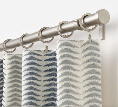
    Why not add shine in mirror with simple design... a little dressy for the table idk..... Home Goods carries these sometimes. Seems a natural color with camel tan.

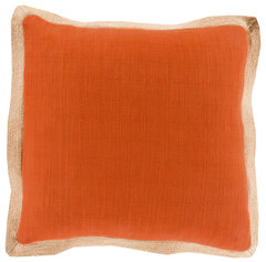
    Surya Jute Flange JF-004 20" x 20" Pillow Cover · More Info

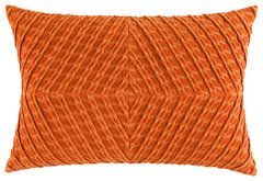
    Stunningly dimensional, of bias-cut ribbed cotton velvet, which is first pleated and then pieced into a lustrous chevron diamond pattern. Solid woven cotton backing with zipper opening. Down-feather insert. 14" x 20".

    Colors: Blue, Cilantro, Dijon, Paprika and Teal.


    Veronica Velvet Pillow, 14"x20", Paprika · More Info


  • 5 years ago

    A delicate dusty rose seems muted the same as rug's blue.... for a delicate look... is there a light colored chair....

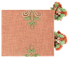
    Amie Throw Blanket, Burnt Orange/Mint/Khaki/Tan/Coral/Ivory · More Info


  • 5 years ago

    In other words, curtains ok, if you add unexpected something. Here's a good set of colors imo -

    Loloi P0824 Decorative Throw Pillow, Blue/Multi, 22"x22", Cover Only · More Info


  • 5 years ago
    last modified: 5 years ago
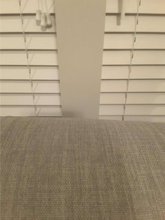
    The 2 you posted -- maybe add on another piece, with more visual ?

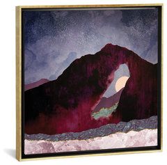
    Desert Perspective by SpaceFrog Designs Gold Framed Canvas Print, 37"x37"x0.75" · More Info


  • 5 years ago

    Love the Desert Perspective artwork, everdebz.

    Liya, I would probably choose a more subtle patterned curtain. West Elm has a nice variety...

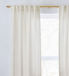
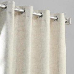
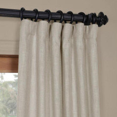
    Belgian flax natural linen:

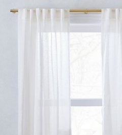
    Sheer ivory linen:

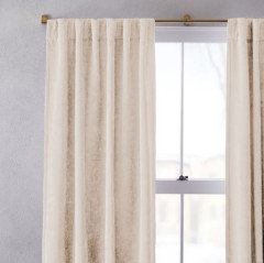
    Worn velvet with vintage vibe:

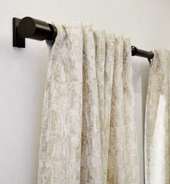
    Jacquard with shimmery threads running through:

    Here is another patterned one that I hope wouldn't be dizzying in real life. It's called Carmelo and is from Crate & Barrel.

    If you want more formal, you might consider a simple cream velvet or light blue dupioni silk.

    Liya thanked bluemarble
  • 5 years ago

    I have two more curtains, and I like both of them. I'm trying to decide between them.


    This one is Clay:


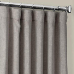
    This one is Ash Gray:


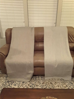
    Here they are side by side in a couple of photos (Clay on the left, Ash Gray on the right):


    I'm interested in hearing everyone's thoughts. In a couple of days I'll have another one, Natural Light Beige, and I'll post it then as well.

  • 5 years ago

    I prefer the contrast of the ash grey with the sofas. Looks me to that they make for a better transition from curtains to rug as they are of the same color value......to my eyes at least. Also seems to work better with your wall color, but I can’t discern because lighting is low.

    Liya thanked pat1250
  • 5 years ago

    I also like the lighter one. You're hanging them at the ceiling?


    Liya thanked Angel 18432
  • 5 years ago

    It's a 9 foot ceiling and an 8 foot curtain, and we'll be hanging them so that it hangs just off the floor, which will put it about a foot down from the ceiling.

  • 5 years ago

    In addition to drapery panels or actual drapes, you need some art. I would hang art on the empty walls and over the mantel. The tiny items on the mantel are too small for that location. If they are things you actually want to display, put them together on a table or cabinet top.

    Liya thanked felizlady
  • 5 years ago

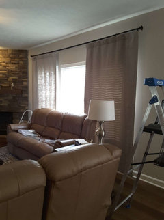
    We put up the curtain rod and I hung one panel of each color on the ends:


    Still trying to decide between them, and looking for everyone's thoughts...

  • 5 years ago

    I like the lighter ones.

    Liya thanked erinsean
  • 5 years ago

    I'm kind of holding out for the Natural Light Beige one. Has that arrived yet? What color is the paint on your walls? What colors are in your stone hearth?

    Liya thanked bluemarble
  • 5 years ago

    I also prefer the lighter one.

    Liya thanked Amanda Smith
  • 5 years ago

    I'm guessing these are from Home Depot. Here are the colors for reference...

    Natural Light Beige

    Ash Gray

    Clay


    Liya thanked bluemarble
  • 5 years ago

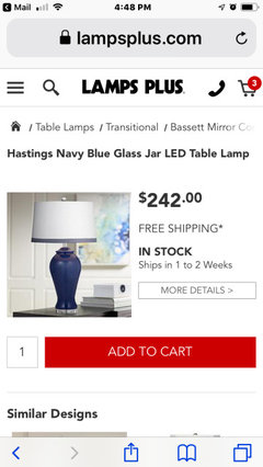
    I think a larger lamp would look better. Maybe blue to break up all the neutrals.


    Liya thanked Amanda Smith
  • PRO
    5 years ago

    some big blue vaces on fireplace could look good and your room seems so dark maybe it's not

    Liya thanked Carol Jean
  • 5 years ago

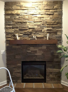
    @bluemarble - paint is Sherwin-Williams Pediment. Fireplace color is a stone mix. Here is a close up photo:


  • 5 years ago

    @bluemarble - the natural light beige has arrived. Here is a photo of it alongside the clay:


    Here is a photo of it contrasted with the rug. To my eye it looks a bit yellow against the rug:


    The photos that include the window are a bit dark. If I open the blinds, it washes everything out.

  • 5 years ago

    Which of the other two (Clay or Ash Gray) goes better with the stone? The Sherwin Williams website pairs Pediment with green, fyi.

    Liya thanked bluemarble
  • 5 years ago

    @bluemarble Difficult to say. My husband says the clay.


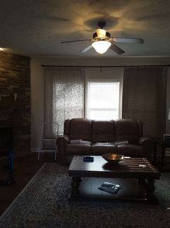
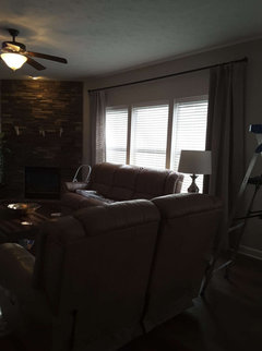
    Nighttime lighting of clay/ash gray:


    I also picked up a couple of pillows:


  • 5 years ago

    I like Clay better, too. It seems to tie all the colors together.

    Liya thanked bluemarble
  • 5 years ago

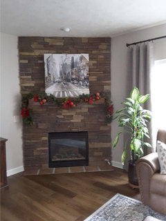
    The new art piece has arrived for the mantle:


    What does everyone thing?


    Personally, I don't like the colors and I think it's too big.

  • 5 years ago

    Oh, no, it’s not too big at all! That spot is a natural focal point. It needs something prominent. I like it.

    Liya thanked Amanda Smith
  • 5 years ago

    Personally, I would have chosen something “happier”....but that would be my preference for artwork.

    Liya thanked Amanda Smith
  • 5 years ago

    I think size is good. It's a neutral piece of art- was that your goal? If so, I think it is fine. I do think the spotlight above it is too yellow (maybe change that bulb to a higher kelvin).


    Liya thanked Gcubed
  • 5 years ago

    I suggest you work on the coffee table next. I needs to be layered for interest and warmth. Some greenery would be good here.


    Liya thanked Amanda Smith
  • 5 years ago

    A tray would be a good addition.

    Liya thanked Amanda Smith
  • PRO
    5 years ago
    last modified: 5 years ago
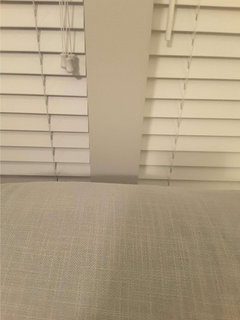
    I would move plant, look buzy in this corner. Instead I would go with double drapes on each side and from ceiling to floor. Replace dated fan with nice chandelier plus bamboo blinds.

    My vision


    Liya thanked Celery. Visualization, Rendering images
  • 5 years ago
    last modified: 5 years ago
    I've decided to return it and keep looking, taking all your excellent suggestions into account!

  • PRO
    5 years ago
    last modified: 5 years ago
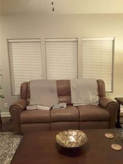
    Then get a couple of new ones.

    Liya thanked Celery. Visualization, Rendering images
  • 5 years ago

    How about something like this?


  • 5 years ago
    last modified: 5 years ago

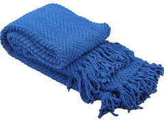
    Called Snorkel Blue -- but it's not a cottony-beach texture, so you might like this type with your new art....someone posted a blue lamp above .. bit darker...

    Tweed Knitted Throw Blanket, Snorkel Blue, 50"x60" · More Info


  • 5 years ago
    last modified: 5 years ago

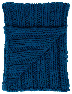
    Accent color on browns on leather.... make the throw large and textured. to make big impact.

    Chunky Knit Throw Blanket, Teal 50x60 · More Info


  • 5 years ago

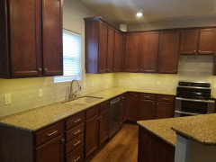
    Because the kitchen and breakfast area are in the same physical space/open floor plan as the living room, I'm wondering if I shouldn't try to tie them together. The kitchen has the cream colored backsplash tile and the cherry cabinets, and the living room has the gray curtains and slate blue/gray/beige rug. I have been thinking of blue for the accent color in the living room, but now I'm wondering if I shouldn't try to bring in some of the kitchen colors too. Thoughts?


  • 5 years ago
    last modified: 5 years ago
    And nice neutrals in it - do you use/like particular colors in entire house?... certainly some, chosen, would work in both areas.

  • 5 years ago
    last modified: 5 years ago
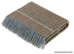
    I'm looking for casual like your fireplace in plaid-windowpane.... but soft look to blend with delicate-type rug pattern.... but there's always room for a touch of whimsy...


    Shetland Quality - Pure New Wool - Throw - Kingham - Eau de Nil - Rustic - Throws - by Bronte Moon (houzz.com)


  • 5 years ago
    last modified: 5 years ago
    The 2 water/misty/blue art pieces from Nov. 17 - and also did the cityscape seem too white... and not warm, not like kitchen cream?

  • 5 years ago
    last modified: 5 years ago
  • 5 years ago
    last modified: 5 years ago
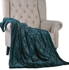
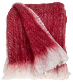
    As though we're looking through the magazines, together - what response to what I post? this might have a good quality "hand" - garnet / cranberry / deep red family:

    Humaira 100% Wool Throw - Mediterranean - Throws - by Sabira Collection (houzz.com)

  • 5 years ago
    Why not bring some of that blue into the kitchen?


    Liya thanked Amanda Smith
  • 5 years ago
    last modified: 5 years ago
    Amanda has a point about using what you like - surely you have something that thrills you for whatever reason... show or tell us? Yes, you want to connect some elements/colors of the open rooms - but they're really quite neutral, or am I missing it? Thanks..

    if you like the soft neutrals of cream, grey, medium browns, they are nice together, but your lamps' sheen is good to add, and textures, or it might be too plain... The fp alone has lots of texture... just to mention.

    Liya thanked everdebz
  • 5 years ago
    I feel the artwork needs to be less busy...
    everdebz, those are some beautiful blankets and pillows. Amanda, great idea to bring the blue into the kitchen.

    Liya, you could also consider a wreath above the mantle that could be switched out seasonally.

    Liya thanked bluemarble