Software
Houzz Logo Print
101newkitchen101

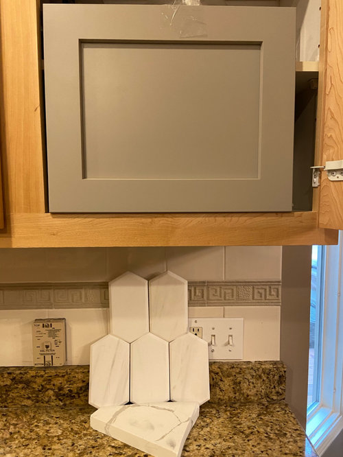
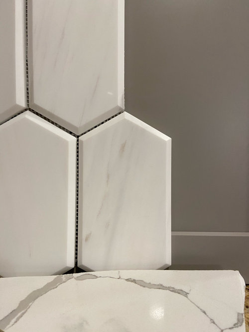
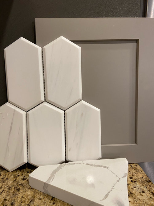
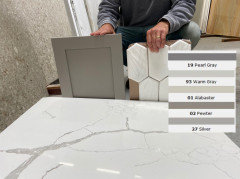
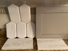
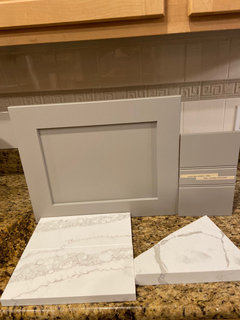
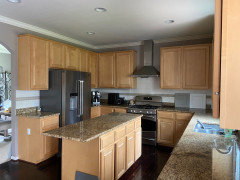
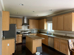
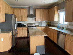
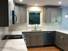
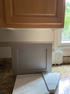
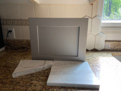
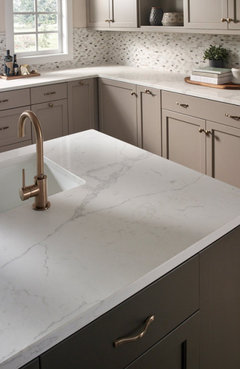
Does this counter and backsplash work with these cabinets.

6 years ago
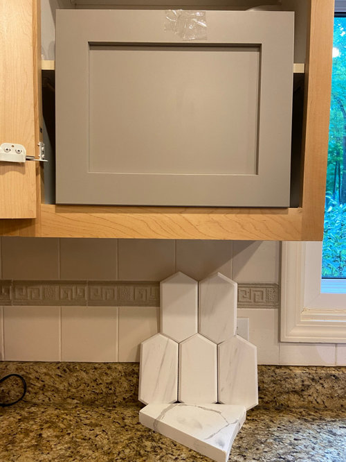
I am the worst at coordinating colors.

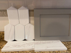
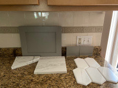
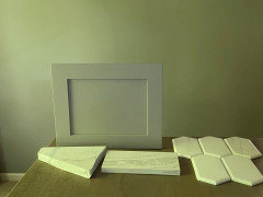
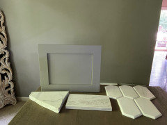
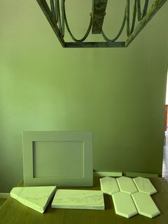
This is a starmark cabinet in portobella (greige).
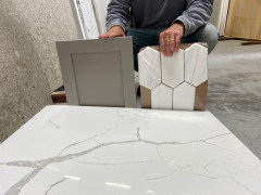
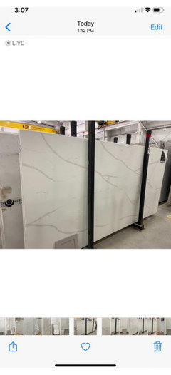
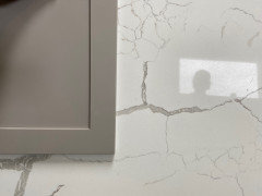
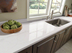
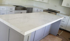
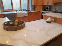
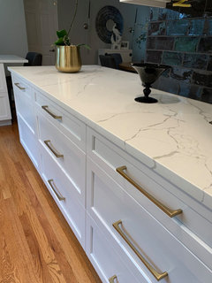
Calacatta Lazo quartz.
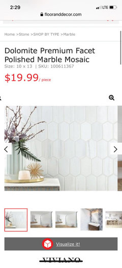
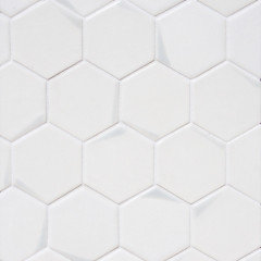
Viviano Dolomite Marble backsplash from Floor & Decor.

My kitchen is very dim usually, not much natural light.

I don’t like too much contrast. I was thinking the color would come from the cabinets, and then the counter and backsplash could lighten the space, while hopefully still looking cohesive.

I will definitely get the cabinets and counter installed prior to committing to the backsplash, but I want to at least have a solid possible option.

Thanks!

Comments (50)

  • 6 years ago
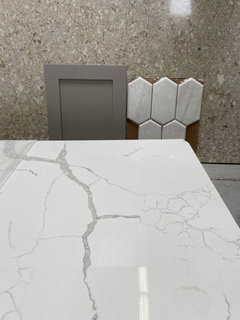
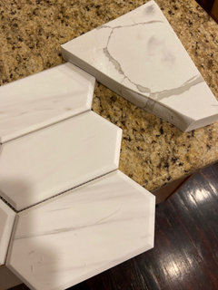
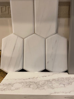
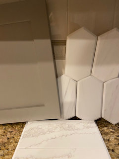
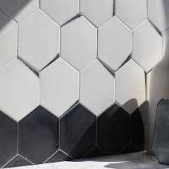
    This is the tile.

  • 6 years ago
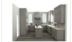
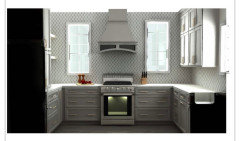
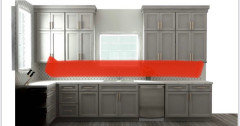
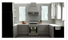
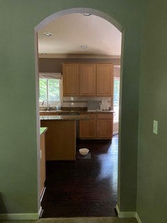
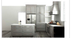
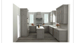
    This is my room. Cabinets will go to the ceiling, and I was thinking about taking the tile all the way up the window wall.

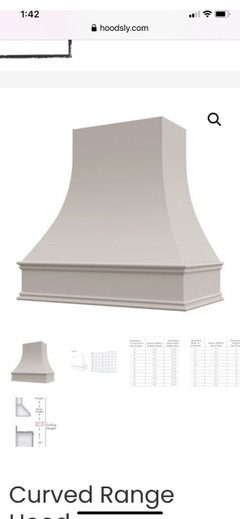
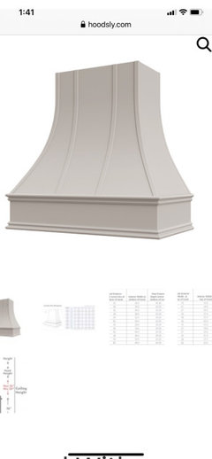
    The hood will match my cabinet color.

  • 6 years ago
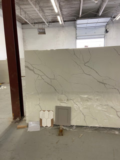
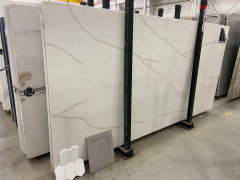
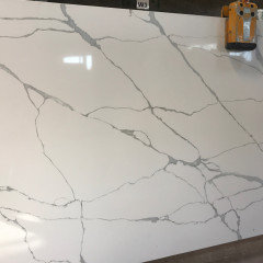
    Calacutta Lazo in the showroom.

  • 6 years ago
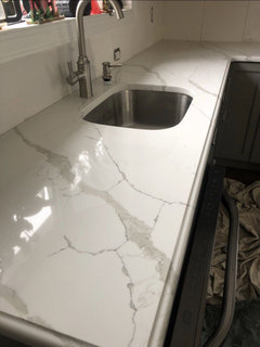
    last modified: 6 years ago
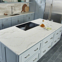
    Am I way off on this? Would taking the tile all the way around the whole room be overkill?

  • 6 years ago
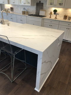
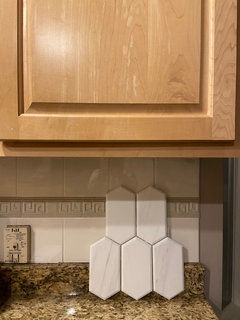
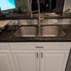
    Here’s a better pull back of under the counter:

  • 6 years ago
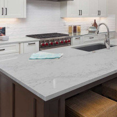
    last modified: 6 years ago
    @Beth H. :Yay!!! I'm glad it looks good because I had my heart set on the white/white sort of look!


    I don't know how it'll fit...that's actually a question I have. Do you have to center a row of the shapes to the middle? So it wouldn't sit right on the counter as shown above...it would be centered under the cabinet, right? This backsplash comes connected together with these 5 tiles. Does this mean I'd need two more pieces (one above, one in the middle, and one at the bottom touching the counter? So the top row would be cut and the bottom row would be cut? Does this end up wasting a TON of tile, or can you usually reuse those cut ones in another part of the backsplash puzzle? I've never actually had a backsplash!

  • 6 years ago
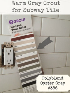
    Side question...how in the heck to people go about selecting their grout color? Seems like it would be hard to visualize without seeing it fully done!

  • 6 years ago
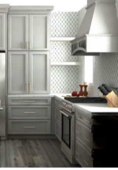
    Btw. I won’t be having this 3 inch piece of counter on the back. It’ll be tiled down to the counter.

  • 6 years ago
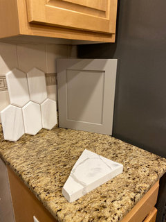
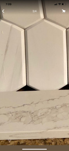
    It’s not really showing in the pics, but in some lights and angles you can see the counter is more of a dull white-Gray and the backsplash is a much whiter, brighter white. Hope this wouldn’t be an issue that makes the counter look drab.

    I’m going to look at it in the morning light.
  • 6 years ago
    last modified: 6 years ago

    so, the first row(bottom) would all be clipped so that it lays flat against the granite.

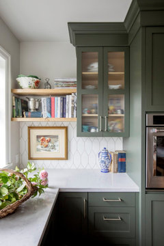
    basically, like shown here (the tile guy would need to make good measurements so that the bottom row isn't cut too short, and the very top row isn't too short or too long. it has to be balanced between the two)


    as for grout color, based on your color choices, I'd go w/Warm Gray from Mapei.


    I used it w/my tiles. it's not a blue gray, and it's not a brown gray. it's a nice neutral.


    or, if you want a tad darker, Oyster gray


    If you use a white, the shapes of the tile will be washed out.


    always do a little test sample w/left over tiles to be sure.

  • 6 years ago

    Thank you so much @BethH!!!

    I’m so glad you mentioned that about the grout...I was thinking white but you’re so right because you won’t see the shapes! I’m actually familiar with warm gray grout (we have it upstairs), and I think that would be a great match. Still subtle, but enough to show off the tiles!

  • 6 years ago

    @BethH...I see what you mean about the placement. What about this wall though? What if we ran the tile under the cabinets and then into and all the way up this wall?

    How do you make sure it’s centered under the cabinets but also under the range hood? Seems like it would be hard to be perfect with both?

  • 6 years ago

    I did switch my pick for the counter. I like the veins better in this one, but it’s not a white as the other.

    Is it bad to have a brighter shade of white for the backsplash than the counter? I don’t want the counter to look drab. Don’t know the design rules on that!

  • 6 years ago

    You can see the difference in white here:

  • 6 years ago

    Wait until countertop is in before choosing backsplash tile.....it looks different in the actual space than in the showroom!

  • 6 years ago

    I thought you're selections were very good with the 1st countertop selection and I think the 2nd choice is a mistake!The shade/color looks off next to the cabinet color and tile. And, yes! Run the tile from countertop to ceiling on the range wall. It will look phenomenal vs. looking like you decided to stop and save $. As someone else mentioned, make a final decision about the backsplash after the top is installed. It may look very different to you when you see a long piece of countertop. The artificial light - once installed - could change the appearance of the ctop and tile dramatically. One option would be to go with the same tile in a plain white/off white. You're going to have a beautiful kitchen. Please be sure to post pics!

  • 6 years ago

    Two more thoughts. Put everything against a pure white sheet(s) of paper. The existing cabinet and countertop colors are affecting the samples. I also like to look at things in broad daylight. If the undertones look good there, they'll typically look good together in artificial light. The other thought is to let the ctop or the tile be the star. I like your choices but it can be really challenging to pull off a perfect combo. Will you have artwork, sconces, window treatments, etc. on the range wall? I would lean towards a plain white or off-white tile and create interest and drama through those things. They're all changeable.

  • 6 years ago
    last modified: 6 years ago

    101, I kind of mentioned placement in my other comment. you want symmetrical under the cabs, and over around the stove wall.

    you better get a really good tile guy. he'll have to make a dry-run before starting to figure out how to start the layout to assure everything is symmetrical on the match ups.

    He may choose to start in the corner and work left and right, or, start in the middle of the stove wall, work out both ways, but once he hits that corner going over to the cabinets, he will have to see how the tile ends up there.

    I've already mentioned how to start the bottom row. clip the tiles. how much to clip depends on where the tile lands once it stops underneath the top cabinets.

    There has to be a dry layout. no way around it. If he doesn't, and just starts and one end and wings it, you're in trouble. Find a new tile guy.

  • 6 years ago

    Thank you @Grace Reed!!!

    You think the second counter option is bad for the paint color? Ugh...after seeing both slabs I kinda liked the softer veins of the second one better. The first one darker and more pronounced.

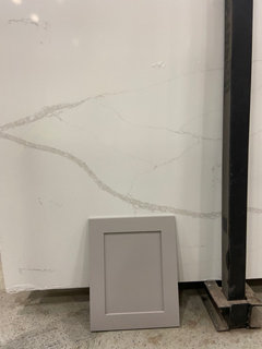
    First slab and second slab:

  • 6 years ago

    I’ll definitely decide after the counter and cabinets are in regarding the tile. But I’d like to have a good idea of choice, and then switch if it isn’t ideal. Doing it this way because it’s so hard for me to coordinate...I’m the worst!

  • 6 years ago

    I’ll make sure to get an expert installer! Seems complicated!

  • 6 years ago

    I like the first.

    don't forget, it's going to be cut. you'll only get 24" of that for your countertop.

    if you imagine 24" on the 2nd choice, you're barely going to get any of the veining.


  • 6 years ago

    I kinda see what you mean about the veins @Beth H. I only have a 24” island too.

    I really like the softer look of the second softer one, but don’t want to make a bad choice. I do want to see veins, but I don’t want it to be too busy.

    Do you agree that the second one isn’t a good match at all too? Beyond the veins issue?

    I do want to pick the better match. I’d pick a better match over the one I “think” I like.

  • 6 years ago

    101, now that I see the whole slabs against the cabinet color, I think either would work. I tend towards the 2nd one but Beth makes an important point about the veining. (For some reason the small samples of the 2nd look pinkish to me & that’s why I thought it didn’t work).

  • 6 years ago

    I still think a pure white background in natural light would help us a lot!

  • 6 years ago

    I’ll take another pic tomorrow. I barely get any natural light though. Super dark kitchen!

    Im adding two new windows onto the range wall, so that should help a little. But they’ll be north facing, so I’m never going to have bright natural lighting. I wish!

    @Grace Reed...the second one with the softer veins is definitely a softer white...a little more grayish and muted.

    I realized the cabinet was cut off in the slab pic. Here is the softer slab.

  • 6 years ago

    And the darker veinier slab, at the warehouse.

  • 6 years ago
    last modified: 6 years ago

    they both are nice. just depends the type of look you want.

    I think one like this looks cool.


    I still like the "crisper" look of the darker one. I like it w/your cab color. And since your backsplash tiles are so subtle and will appear mostly white, I think you can get away w/having sharper veining.

    you could use it for the backsplash and just use the tile over the stove wall


    when you see it cut, it really doesn't look overly 'veiny'


    you doing a waterfall?


    but really, you can't go wrong w/either. why don't you look at pictures w/both slabs in a finished kitchen and see which look you prefer?

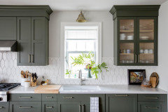
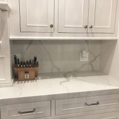
    here's one similar to your other pick.


    are you doing soft gold hardware? I think it would look great if you did


  • 6 years ago

    @BethH

    That’s an awesome idea about the tile on just the range wall and the quartz up the backsplash! I love that, and it would solve the issue of making sure the tiles are centered on both areas. As long as the price doesn’t get too high, I think that’s a great option!

    The dark veined quartz is MSI calacutta Laza and the lighter is MSI calacutta Verona. I think the lighting makes the veins look so different. Sometimes I like one and sometimes the other, haha! If those are all calacutta Laza in the photos you posted, I do like it there!

    I was definitely planning for gold hardware! So I’m glad you mentioned that!

    No waterfall on the island.

  • 6 years ago

    And because I’m digging the idea of the quartz along the cabinet run and the tile on the range wall, I have one more question while contemplating it.

    Would I also put the quartz here under the shelves? This area won’t be used a lot, it’s small (27 inches?) and is hid from all other angles by the fridge. Could you skip the quartz there to save money or would that look unfinished?

  • 6 years ago
    last modified: 6 years ago

    found some for the verona. either one is nice. I don't think there's a wrong choice.


    mitre edge


  • 6 years ago

    as for that corner spot, I see what you're saying.

    after looking again at the kitchen, I don't think i'd like the quartz up the back. If that L portion was disconnected, I'd say ok. But it's too close to the back wall. and the corner piece, I'd have to say continue w/the tile. doing the small quartz there might look weird.

    Now if the 'U' was fully visible from all angles, maybe the quartz on the sides, and tile on that back wall would be doable. but your kitchen layout isn't that symmetrical looking (as far as the backsplash) so I think just sticking w/the tile might work best in your situation.

    I'm trying to picture it in my head. as much as I'd like it to work, I don't think it would.

  • 6 years ago

    Thank you!!!! I’m going to look at as many photos as I can find. I keep flip flopping on which one I like.

    @BethH Just making sure I’m understanding right...skip the quartz up the wall there under the cabinets? I think that’s what you’re saying. I guess it’s such a tight U it would be asymmetrical and quartz heavy on that side.

    Thank you so much!!! This has seriously been so helpful to me! Can’t thank you enough!

  • 6 years ago

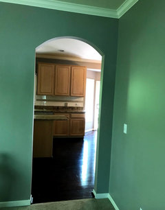
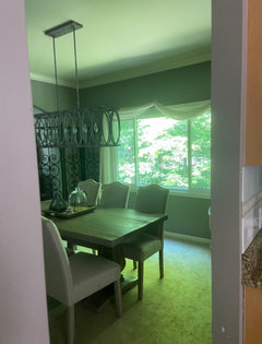
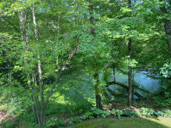
    I don’t know why I’m so overly worried about matching colors anyway! I had another post in here about adding the new windows because THIS is what is going to happen to my kitchen when I add the windows to the range wall. It’s north facing and heavily forested and look!!!$ Everything turns green from the color cast of the trees!!! My whites will be green anyway.

  • 6 years ago

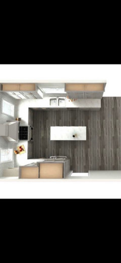
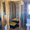
    Here’s the actual space...

  • 6 years ago
    last modified: 6 years ago

    oh wow. what a diff. what color are those walls. they look green!

    can't you get the star fire glass? (or sapphire glass?) forget what it's called. It eliminates the green cast.

    Are you raising the ceiling in the kitchen or does it look higher in the rendition?


    as for the backsplash, yes, I think it would off balance if you just did the quartz backsplash on that one side. and even doing the little corner shelf side wouldn't be enough to balance it out since it's not readily visible.

    wait until everything is installed and then finalize your backsplash. but keep looking!

    take a look at Encore Ceramics.

    http://encoreceramics.com/standard-field/

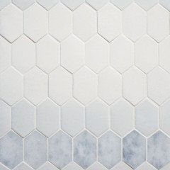
    They have a smaller size of that hex tile in some fabulous glaze options. (even similar whites and marble) I'm thinking the smaller size would be better to use under the cabinets and get a good layout.

    Look at the 6" 'Kiss' hex options!


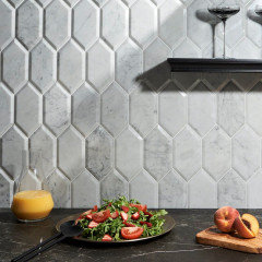
    here's the smaller size hex of theirs in the marble. but they also make it in any of the glaze options


    this back wall reminded me of yours


    Fireclay Tile would be another one.


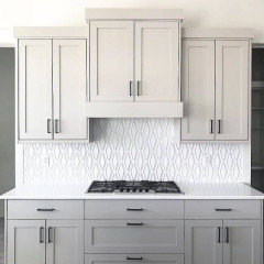
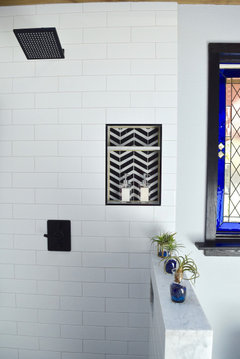
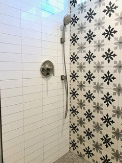
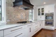
    different variation of the star and cross tile up close


  • 6 years ago
    last modified: 6 years ago

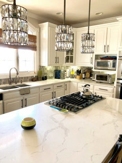
    Here is what we end up with - Calacatta Venice countertop and white porcelain backsplash. We picked slab with veins matching the hue of the cabinets, and white tile to keep it clean. Hope this helps.


  • 6 years ago

    Since either slab will work for your countertop and backsplash, just wait to decide the size of the tile when everything is installed. I like the shape of your tile choice but Beth makes an important point about the size. Carrying up it up the range wall will be beautiful. And yes, your tile person needs to be talented for these unusually shaped choices. Make sure you buy the right LED bulbs to help give the room good lighting.

  • 6 years ago

    101, I just want to chime in to say I think you’re much better at this than you give yourself credit for!

  • 6 years ago

    You guys are the best!!!

    Thank you @Grace Reed! I pick things and try really hard but I feel like some people can just read coordinated tones well and I just can’t ever tell.

  • 6 years ago

    Love these @Beth H! I’ll look at these options! Thank you! I hope it’ll be easier once it’s all installed!

  • 6 years ago

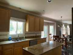
    Someone had asked about a natural light pic...it’s scarce. This is the brightest part of the day. We are heavily treed, and the trees are really close to the house. I get the slightest bit of morning sun and then it gets darker as the day goes on. We need lights on in the mid part of the day to even see.

    At one point we were going to make the sink window bigger, which would be a better light source, but we decided against that and instead the range windows.

  • 6 years ago
    last modified: 6 years ago

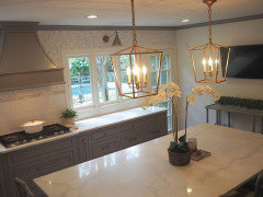
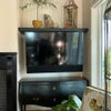
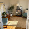
    But, with putting in the north facing range windows, we’ll be introducing CRAZY forest color casts. Here’s the counter and cabinet in the room that the new windows will face, so I’ll be getting similar lighting to this. I have a love hate relationship with the new window direction. I love the view on that side of the house, but hate the color cast!

    So my kitchen will be a mix of this light and the light I have now.


  • 6 years ago

    I’ll have shaker cabinets and square edged counters, but have curved doorways and an planning for a curved hood (can’t decide between striped vs plain), so my thought was that sort of shape for backsplash would be a nice way to soften the hard edges.

  • 6 years ago

    The trees really do complicate things don’t they? If interested, Maria Killam is a color consultant who’s excellent with undertones & dealing with trees turning paint green! She does virtual consultations.
    https://mariakillam.com/edesign-sales-page/

  • 6 years ago

    any chance of limbing or trimming the trees right outside the windows?

  • 6 years ago

    I’ll check her out @grace Reed. Thanks!! I did read a few things about picking peach or creamy whites to combat green.

  • 6 years ago

    Thanks @Beth H. The trees are pretty close to the house, but I was looking at a few branches that could be trimmed back. And that might help a little, hopefully.

  • 6 years ago

    beautiful! just trim a few that are close to the house, maybe let in a little more natural light