Software
Houzz Logo Print
stacey_schneider

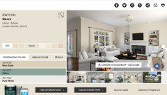
Neutral wall color to pair with Nacre trim.

5 years ago
last modified: 5 years ago
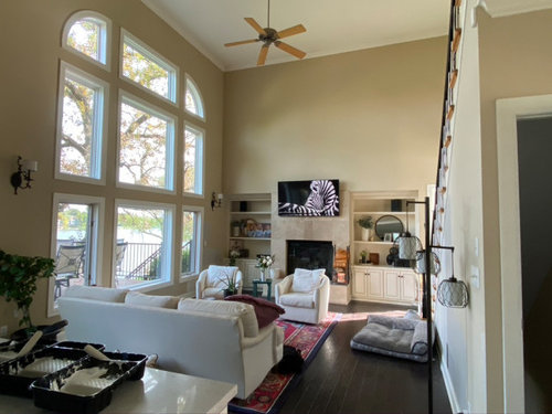
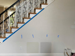
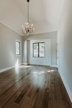
Am struggling with an all over paint color for this level. Kitchen cabinets are a glazed antique white (I'd like to remove the glaze, but that will be phase two) and I had the trim 'matched' at SW and they say the closest color match for reference is Nacre. I'd love the space to feel light, welcoming and neutral, but on the warm side. We are changing the stairs to white oak with black horizontal railings. Am thinking it will be easier to change rugs/furniture than to get scaffolding and repaint. I've tried Edgecomb Gray, White Duck, Colonnade Gray (regular and 25% lighter), Ballet White, Repose Gray, Steamed Milk. Any help with wall color that works with Nacre trim would be much appreciated!


Comments (41)

  • 5 years ago

    Are you able to say what you didn’t like about the colours you sampled?

    Too dark, too purple too grey etc?

  • 5 years ago


    Stacey Schneider thanked Marylee H
  • PRO
    5 years ago
    last modified: 5 years ago

    You can make any color you love a “neutral”. Everyone thinks it has to be beige or gray, but I disagree because all colors have undertones with which have influence.

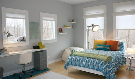
    I see this scheme for your light filled room: S W nacre with S W misty blue.


  • 5 years ago


  • 5 years ago

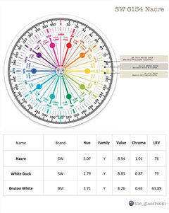
    Too dark or too cold. The White Duck I have up on a sample wall now, is so lovely, but it makes the Nacre look very yellow. Maybe something with a wink of green vs pink? I'll take a look at Bruton White!

  • 5 years ago

    JudyG - so just match the walls with the Nacre trim? I love the pic - that's a beautiful blue as well!


  • 5 years ago
    last modified: 5 years ago

    I’ll have a look at White Duck’s attributes,,,

  • 5 years ago

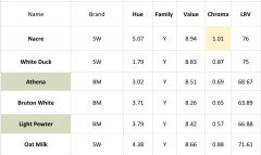
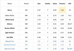
    It’s possible to objectively measure attributes of colours, so you can compare & contrast them in detail.

    Hue Family - to which does it belong + where within does it sit?

    Value - how light or dark does it appear?

    Chroma - how near to neutral/colourful is it?

    LRV - how much light does it reflect/absorb?


    Noting attributes you like and those you don’t, will help you move nearer to a colour you like best. Even if used just to rule some colours out before more samples -

    it’s way better than guessing.


    Note * Pairing white + off-whites? look for a minimum difference in Chroma of 0.2 so one doesn’t appear dirty next to the other


    🌈

  • 5 years ago

    Wow, that you Marylee H! Great to be able to see the colors by attributes. Where do you get that?

  • 5 years ago

    I found it, I'm going to be here all night. This is a rabbit hole of paint if I've ever gone down one. I understand to how to compare the colors using the ones I liked to narrow down the options, but what hue should be considered in trying to make the Nacre trim look more white? The White Duck is making the Nacre look very yellow, and White Duck is on the orange side of the family, so should colors on the Y/G side, with a Chroma differential higher than .20, be the place to look?

  • 5 years ago

    Using the numbers, I've narrowed it down to four more samples - SW Moderne White, BM Paper White and SW Frosty White - along with SW Nacre. Please feel free to let me know if I've picked a wrong path to go down with these colors!


    Thank you for your help!

  • 5 years ago

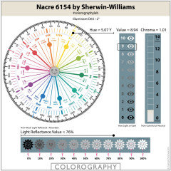
    Nacre, is a colourful off-white, to use for trim. (Chroma)

    For future reference for other rooms, it’s so much easier to find pairings for wall colours

    if the trim is much more neutral, i.e. less Chroma.


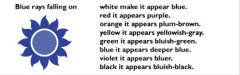
    The further you move away from the Yellow Hue Family, the greater the contrast in Hue, the more its ‘yellow-ishness‘ will be apparent.


    As you move anticlockwise towards Yellow-Red, away from Nacre, some near neutrals may demonstrate a suggestion of peachiness to their warmth and in some imbalanced light may be inclined to flash purple-ish.


    As you move clockwise towards Green-Yellow away from Nacre, some near neutrals may hint green and possibly in imbalanced light, may be inclined to blue-ishness.


    Obviously this is why it‘s important to sample your shortlist in the space, to view with your available light.


    Bruton White, although only a few degrees further away from White Duck, maybe enough of a move, to lessen the sense of peachiness. It is darker than White Duck and more greyed. Although still more neutral than the trim colour, you may like the difference.


    A higher Chroma, (more colourful) wall colour from the same Hue Family, will make Nacre more neutral by comparison, but it may not be the neutral surroundings you had quite envisaged.


    I will look at the others you sent.

    🌈

  • 5 years ago
    last modified: 5 years ago


    The other colours you mentioned sit into the Green-Yellow Hue Family.


    Near neutrals from this neighbourhood are often perceived by many as closer to a true neutral in appearance.


    As you see from their Chroma, Moderne White, Frosty White, Paper White are also factually more neutral than the other colours we have looked at.


    They would certainly show less peachy than White Duck, but there is no getting away from the fact that Nacre is more colourful than they.


    Natural Elements is likely to make Nacre appear the most neutral, as it contains more Chroma than Nacre. It doesn’t fit the 0.2 difference in contrast, but above 0.9 Chroma that is less important.


    Questions - do you prefer,,,

    • Walls darker or lighter than Nacre?
    • More colourful or more neutral than Nacre?
    • Nacre on trim AND walls?


    🌈

  • 5 years ago
    last modified: 5 years ago

    Marylee H's advice is always on point. I am going to throw in an option. SW has a new line called Emerald Designer Collection. The colors are beautiful but unfortunately only available in the more expensive emerald line. That said, you are in a pickle and quality paint is worth the investment. I have a large sample of these colors so I visually verified it.

    SW Oat Milk 9501. Its DNA is 4.42Y 8.66/0.79

    It is a little darker and greyer than your trim Nacre, but because they are so close on the color wheel, they don't influence each other to pull more yellow or peach. The combination, in my light, is very pleasing. In this case your walls will look more neutral than your trim, but that is often used as a beautiful combination in europe (at least in pictures, as I live in Canada)

  • 5 years ago

    Nice shout - I will tuck that combo away. 🌈

  • 5 years ago

    Thank you simple choices and MaryLee H! Would be much easier if repainting all of the trim was in the budget, but there is so much and we just can't swing that right now (thanks COVID) though with the amount of money I've spent on samples...


    To answer your questions MaryLee -

    • Walls darker or lighter than Nacre? Could be tad darker, lighter probably better as I want to keep an open airy feel that will hopefully be able to last awhile as we change styles, etc with other elements in the room besides wall paint.
    • More colourful or more neutral than Nacre? I'm concerned about any particular color being obvious as I would like as much flexibility as possible, so more neutral I guess. It's currently very yellow feeling in here, and I don't like it.
    • Nacre on trim AND walls? Possibly? I'm not against that, but the rest of my family really likes to see a contrast between the trim in wall color. Though I think I can get them past that if we have enough contrast with the built ins, wood accents (ceiling beams) and art/furnishings.

    I'm sorry I'm not better able to articulate, hopefully I answered your questions ok.


    I haven't called any samples in yet today, but after the latest feedback, I'm thinking to try Natural Elements, Bruton White, Nacre and Oat Milk.

  • 5 years ago


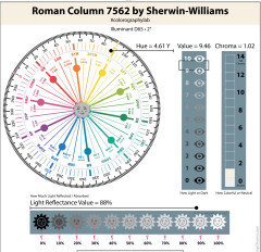
    Lighter + but same Chroma is Roman Column. (Matching Chroma above 0.9 = harmony.)

    It won’t make Nacre appear more yellow, but you still may find it too peachy/colourful

    for your wall.


    Lighter + less Chroma is SW Cotton. Will look more neutral next to Nacre, but Nacre will therefore appear more colourful.


    Darker + less Chroma - Oat Milk, Bruton White


    Darker + more Chroma - Natural Elements.

  • 5 years ago
    last modified: 5 years ago

    Here‘s where we are today -


    Nacre, Natural Elements, Bruton, Oat Milk

    The entire wall is painted in White Duck.


    Bruton was my fave on the sample board I started with, but maybe too dark on the wall. Going to watch them as the light changes today. These are on a north facing wall - facing a wall of windows. Which is why I’m guessing the Oat Milk is looking quite blue.


    As I mentioned, the stairs are being replaced with white oak banister/treads and black horizontal ’spindles’.

  • 5 years ago

    You have been busy!

    You may have found it a little easier on lining paper, so you could move them around the room. It is useful to see how they appear in different lighting. Let us know how things develop?

  • 5 years ago


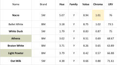
    I’ve highlighted a couple of alternatives to Bruton White if you still find it too dark. They are both a little lighter.


    Should you need further samples, why not ask at the store for a couple of larger decorator paint chips before investing in the sample pots? You would still be able to see if they read too dark for you, or shift under your inherent light.


    All lower Chroma colours are far more susceptible to changes in light than more colourful colours.


  • 5 years ago

    Thank you Marylee!


    I didn't realize decorator paint chips were an option, I'll have to do that; I'm running out of room to keep all the sample pots.


    In living with Bruton today, I'm not sure if it's the one or not. It's a chameleon that works well with the trim and lighting in 80% of the space. Will stick with it for a few days yet, while I add another one - Ballet White? Looking at it on Camp Chroma, it seems close to White Duck, but a tad closer to yellow with a higher Chroma that may help it retain its color better than Bruton White or Athena? Maybe the difference in numbers isn't significant enough to actually see on the wall.


  • 5 years ago

    Hi - The Decorator’s Chips are only about postcard size but can be big enough to discern colour shift. Alternatively there are larger Samplize wall decals of paint colours which you can order online. Very useful, little waste.


    Here’s the data for Ballet White. It’s pretty close to Nacre except a smidge darker. You might be hard pressed to tell the difference in the same space with changes in light?

    Nacre in two different sheens is an alternative, as the different finishes affect perception. The glossier of the two often appearing a touch darker.


    Stacey Schneider thanked Marylee H
  • 5 years ago
    last modified: 5 years ago


    I reread everything in the thread and Marylee is, IMO, giving you the only alternative. Paint the wall Nacre in a different sheen level.

    -We know based on what happened to Oat Milk that your light really shifts lower chromatic colors. So I don't think we can find you a lighter, low chromatic color. They are likely going to shift.

    -As Marylee said, and you have confirmed with White Duck, colors closer to the YR family, even low chromatic colors, make Nacre look more yellow, so that is not the way to go.

    -Higher YR colors chromatic colors start to look peach and make Nacre look more yellow.

    -As soon you raise the chroma, but keep a similar or lighter value, in the same region of the color wheel, you will be hard pressed to tell the difference between the two colors.

    -Darker, more chromatic colors look yellow, which is exactly what you were trying to get away from.

    So that leaves you with Nacre in a different sheen.

    Right now there is nothing on the walls, and there is no furniture. Once you start to fill the room and add art and soft elements, you will likely notice the yellowness of nacre less and less.

    Just to be completely thorough, I have one more thought for your space. Given your unbalanced light, you might benefit from a Full Spectrum Paint Color. By their nature, they are different than standard paint colors. Although they do change during the day. Perhaps you will be able to go lighter than Nacre, without getting that blue. I don't really want you to have to spend more on sample pots, but as you said, this is a long-term color because of ceiling heights, and it might be worth the extra $10-15.

    Full spectrum colors do not have black pigment in them. As Lori Sawaya of Camp Chroma puts it, "In addition to the nurturing benefits of living in the GLOW of balanced wall color, full spectrum paint enables you to create atmospheres that will gracefully morph and adapt – like a chameleon. Chameleon colors are an advantage because they offer flexibility – like when you are settling into a brand new home, or acquiring furnishes and decor as budget allows, or need the perfect *neutral* to sell your house.

    Take a look at

    BM CSP-245 Stoneware

    3.51Y 9.17/1.01

    It as the same chroma level as Nacre but is lighter.

    BM CSP-185 Plaster of Paris

    3.16Y 8.79/1.03

    Same chroma but darker than Nacre.

    But as said in the first part of this response, and by Marylee, if you are tired of spending money, and can live with it, use Nacre in different sheens. A flat sheen will look lighter that a glossier one.

    Stacey Schneider thanked simplechoices
  • 5 years ago
    last modified: 5 years ago

    Wow, thank you both! At this point you two are probably as eager for me to settle on a paint color as I am!

    Living with the colors this weekend, I don‘t think the one is there yet, but are getting closer. I believe SW’s Nacre sample is satin so will try an eggshell version and check out the BM Plaster of Paris - hard to find images of that one, but I love the ‘powdery’ description. I would definitely rather spend the additional 10-15 now to get this right as I can.

    Will let you know how it goes, thank you!

  • 5 years ago
    last modified: 5 years ago

    Another question on paint characteristics - what attribute (Chroma, LRV, Value, Hue) makes a paint color 'sit back' on a wall vs 'coming forward'? Like - I love white duck because, I think, of how it 'sits back' and invites me 'in' to the wall - I sound like a crazy person. Whereas Colonnade Gray and even Steamed Milk are more 'forward'. Maybe it's a 'softness'?

  • 5 years ago
    last modified: 5 years ago

    Apart from the obvious of bold colours advancing & more greyed, muted colours receding, what you describe is nuance - which is the consideration of both Value + Chroma at the same time.

    In your light, certain colours’ nuance suggest a ‘softness’ to you. Note that combo and you can see if it’s specific to that Hue Family location, or if similar nuanced colours in differing Hue Families offer you the same feel. 🌈

    Stacey Schneider thanked Marylee H
  • PRO
    5 years ago
    last modified: 5 years ago

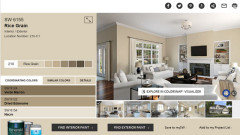
    SW painting site suggested Rice Grain as coordinating color for Nacre.


  • 5 years ago

    P.s. Plaster of Paris has almost the same Value + Chroma as Nacre, but sits a little more toward the Yellow-Red Hue Family. I don’t think you will find it conrasting enough to bring anything fresh to the room.


    Rice Grain sits a little nearer again toward the Yellow-Red Hue Family, is darker and more colouful than Nacre. It would certainly show greater contrast but it obviously depends what you are after.


    Stacey Schneider thanked Marylee H
  • 5 years ago
    last modified: 5 years ago

    I find SW's color visualizer rather random on it's accuracy to portray the color. When I hold Rice Grain and Nacre together, I see a greenness in Rice Grain, even though it is part of the Yellow Hue Family (but that is my light at the moment)

    SW Rice Grain: 2.68Y 8.32/1.67 (LRV 64)

    SW Nacre: 5.07Y 8.94/1.01

    Rice Grain is a little lighter than Bruton White but much more chromatic (colorful).

    As it is more chromatic than any other color your have tested, it will hold to it's true nature much better. It definately makes Nacre look like a neutral.

    I would call Rice Grain a medium sand color, but descriptions like that are not really helpful because we all see things different in our imagination.

    Rice Grain is a different direction than you have indicated, but it is not necessarily bad to change course.

    Personally I like the lighter vision.

    Stacey Schneider thanked simplechoices
  • PRO
    5 years ago
    last modified: 5 years ago

    No, I meant paint the walls S W Misty with Nacre trim. Misty can serve as your neutral.


    Stacey Schneider thanked JudyG Designs
  • 5 years ago

    Pretty. 🌈

  • 5 years ago

    Just an update - I've narrowed it down to two, ok, maybe three. BM Natural Cream, SW Natural Tan and SW Neutral Ground. Unfortunately SW NG sample is a satin which throws the color off a bit and I'm not sure I want to invest in a can of it so that really leaves BM NC and SW NT. I have found the attributes for BM NC but haven't been able to find them for SW Natural Tan - any suggestion where I can find the chroma, etc of Natural Tan? They are very close on the walls and I"m really just curious what the number differences are between the two.

  • 5 years ago

    Hi - hope this helps a little,,


    Stacey Schneider thanked Marylee H
  • 5 years ago

    Thank you Marylee, it helps a lot! Where do you find that info for colors that aren't on CampChroma? Maybe it's a trade secret, but I would look myself if I knew where to - and not bother you guys!


    I think, if I am interpreting correctly, that SWs Natural Tan is the one to go with; has the biggest difference in hue and chroma, giving my husband the contrast he needs, while giving me the neutrality and lightness.


    Marylee, simplechoices, JudyG and Celery - Thank you all so much for taking the time to share your expertise and recommendations. I hope we got to the right one!

  • 5 years ago

    Hi - certainly that difference in Chroma between Natural Tan and Nacre means Nacre IS more neutral by comparison. Also Natural Tan is a little darker to help with that contrast too.


    Due to its Hue Family location it may have a little peachiness to its warmth as it sits closer to the Yellow-Red Hue Family. Check you are happy with that.


    Also worth viewing on a sample board in the more shadowy areas of the room to ensure it doesn’t pull purple-ish either. It certainly doesn’t happen in every situation, but you want to be sure it won’t happen here either.


    I learned how to convert colour data values into Munsell Hue family notations via an amazing course at Camp Chroma via The Land of Color!


    Have a look at the YouTube videos by the the land of color, which will give you more insight into color measurements that you can explore and utilise yourself - now you clearly have your head around the benefit of comparing colours this way.


    Good Luck - keep us posted!

    🌈

  • 5 years ago

    Stacey, What did you decide on? Can I see photos? I have nacre trim, and am wanting to paint my walls white. Got samples and wow... the nacre now looks dingy and yellow!


    I am contemplating re-painting all trim. But wanted to see if you found the magic combo that will save the nacre trim!!!


  • 5 years ago

    This looks great! Thank you for the photos! I purchased samples of white whites, and the nacre was ugly and yellow at that point! I was thinking of trying Nacre on the walls, but need some contrast. I'll try a sample of natural tan for sure!


  • 5 years ago

    Stacey,

    Is your ceiling painted in Natural Tan?

    So trim is Nacre, and walls/ceilings both Natural Tan?

  • 5 years ago

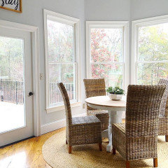
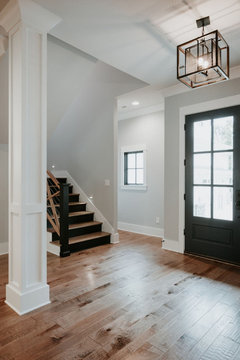
    All of the walls are SW Natural Tan. Ceilings were not touched, they're the original knock-down whatever the previous owners did. The trim is a SW matched Nacre, not sure what the homeowners actually did, but Nacre is what SW said the match was when I brought trim samples in.

  • PRO
    5 years ago

    Amazing result considering the tricky color of the trim.

Sponsored
NME Builders LLC
Average rating: 5 out of 5 stars2 Reviews
Remodeling Company in New Albany, Ohio