Software
Houzz Logo Print
emma_lou2

Awkward kitchen Ceiling

5 years ago
last modified: 5 years ago

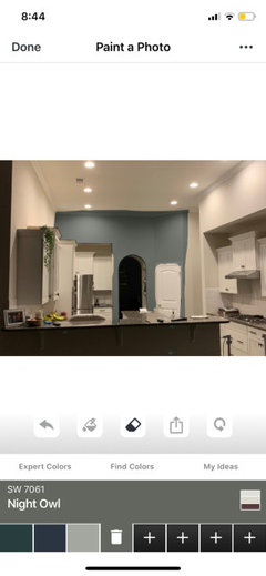
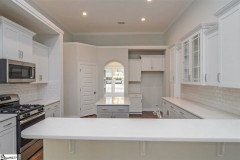
Part of me loves my kitchen - it’s a perfect square in the center of the home that makes for wonderful entertaining. BUT... the ceilings are awkwardly tall and all I see when I look in from the family room Is those blank walls! What can I do to fill up the space or make it feel cozier and take the attention off the high ceilings? My great room has the same height ceilings and I’ve found it a bit easier to draw the eye down with decor, but I’m at a loss here!

I hate my high ceilings so much that I’m really considering something architectural that I know would cost a fortune or just moving... but neither of those are really good options. I keep changing decor etc and just don’t feel like this house “fits” me... but I’m trying hard to feel comfortable in it And you all have been an immense help already on the journey!


Comments (48)

  • 5 years ago

    A darker shade of ceiling paint would appear to bring it down.

  • 5 years ago

    This site has some useful ideas:

    http://www.housepaintingtutorials.com/painting-ceilings.html

    I'd paint the ceiling darker, and even bring the darker color down the walls a foot or two and add additional molding.

  • 5 years ago

    Light wood ceiling treatment. Remove bulkheads if possible. More crown molding. Cabinets to the ceiling. Any or all ideas would work.

  • 5 years ago

    Was this a new build or a remodel? I don't understand the tucked in cabinets, but maybe it was a remodel & this had to be done? I am not a professional & I wouldn't know what to do to make the ceiling seem less tall. Maybe the angle of the camera exaggerates the situation? The cream walls & white cabinets make it seem a bit sterile, so maybe some color will liven it up & make it more homey. What about wallpaper or some sort of texture on the walls. A hanging light fixture? A house becomes a home by the people & good times within it. It is a nice kitchen, it just needs a lil something. I am sure the pros will have much better advice.


  • 5 years ago

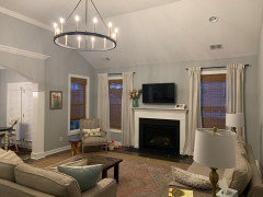
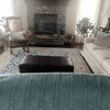
    @che11e yep that’s me, thank you 😆 I did incorporate a lot of things from that post - it helped a ton! The kitchen just felt like a totally different challenge - no windows for curtains, not as much wall space for decor, etc. Here is an updated pic of the great room to see the results - this is connected To the kitchen as one big open area. Since this picture I’ve also changed quite a few things - painted my Whole house in Pale Oak by BM, replaced with true white curtains (waiting for the rod to come in for that side window, it will have curtains too) and found a rug with more contrast - also that’s just a temporary coffee table from outside until I find one I like. Amazing the difference decor can make compared to the before in that post. I’ll get an after with my recent changes once I have everything back together from painting!


  • 5 years ago

    Also @che11e this was new build but spec build by a mass builder. I got to pick the floor plan and finishes. They do have floor plans that actually have only 9 ft ceilings which I love, but those are the bigger houses with second stories that were just wayyyy Too much space for us. I love my ranch floor plan - but The ceilings weren’t well planned out that’s for sure. My chandelier in the great room is soooo off center that I can’t even line it up with my coffee table like would be ideal. May offset it later.

  • 5 years ago

    May be expensive to do, but I think lighting the interior of those recesses would help. The dark shadows really draw the eye to a negative. All your lighting is coming from the high ceiling. If the lighting is lowered (recesses and under upper cabs) the focus will be brought down.

  • 5 years ago

    I am stumped why anyone would hate high ceilings.

  • 5 years ago

    Oh wow, such a pretty home. So serene. I looked at the other link more closely to see your other rooms & views. The ceiling height is fine and gives it character. The picture you posted here does not give that kitchen justice. It looks much larger in the other photos. I am hoping the pros can offer some decor tips to liven up the kitchen walls.


  • 5 years ago

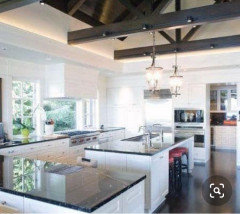
    I would add decorative ceiling beams (not white) to give your eye somewhere to focus.

  • 5 years ago

    pendants lighting would completely change that. Oversized pendants or something that fits your style and makes a statement

  • 5 years ago

    I think the kitchen is beautiful. What about tiling the entire wall surrounding the stove- either continuing the white subway tile or some other tile?

  • 5 years ago

    Your kitchen is beautiful.

    i have read the comments from all the viewers but would like to suggest a few other ideas to help the eye rotate around the room.

    My suggestions:

    Paint a contrasting color on the walls and display a collection of artwork .

    The paint color of walls should be a color you see in the artwork.

    Two pieces of Artwork above the pantry door and the Cabinets to the left.

    This will add texture with a focal point as well.

    Lighting:

    Hightop lighting is only one source of lighting. You may want to tilt the ceiling eyeball lights toward the artwork.

    A large pendant in the middle of room.

    The lighting will reflect on the ceiling and floor

    Two smaller task pendent lights over the peninsula.

    Under Cabinet lighting will bring another source of task lighting.

    Paint Color, Artwork and Lighting will

    help your eye focus around the room.

    I love the high ceiling !

    Simple tricks that will not cost too much to help you feel more comfortable in the space.. The most important thing of all.

    MA Good


  • 5 years ago

    A collection of fabulous decorative plates or trays along the one bulkhead would certainly help. Personally, I am not fond of peninsulas as they really separate the spaces and make the narrow entrance a problem for flow when entertaining. Is there enough room to use a central island, either built in or moveable. You could warm up the space by doing that in wood and then use the wood as bead board on the ceiling. The whole kitchen needs warmth and that is created by adding color and/or wood.

  • 5 years ago

    I solved a similar problem in my house (with a very limited budget) by making pegged crown like strips around the top of the wall. I hung my collection of antique kitchen tools and collectibles on it. I had plans to do a shelf around the top of another room to put breakable collectibles on, but we moved before I got it done. Paint or stain so that it stops the eye to see what is there and you will forget about how high it is. The higher the ceiling, the larger items you can hang. I have even seen toys and fishing/hunting gear hung this way.

  • 5 years ago

    I would add 3 beams across the ceiling, the same colour as the peninsula and change the cove molding to the largest you can afford { between the beams}.Also, a few big crocks or blue and white big urns on top of the cabinets, will bing the eye down.

  • PRO
    5 years ago
    last modified: 5 years ago

    IMO some color woulld be a good start and a darker color on the ceiling would work I hate kitchens with no windows but that is me. Make sure all that lighting is LED in 4000K before choosing the ceiiiling color for sure and get a real vent to the outside for that range and IMO that raised bar makes this space feel very tall and closed in like a tunnel IMO that is why the ceiling seems so high. A couple of pendants over the island would aslo be a nice look and take your eye down. BTW adding stuuf on top will take your eye up.

  • 5 years ago

    In my opinion you need some wood to warm up your space. Wrapping your hood vent in wood, hanging a large wood sign(this kitchen is for dancing is cute) or wood architectural piece on that far wall, wood backed barstools, and then bring in a touch of your light blue from your living room. To me a white room needs wood and greenery to warm it up. Your blinds add so much in your living room. Have fun decorating!!


  • 5 years ago

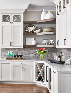
    I'd get rid of the cabinets in the cooktop nook and put in some stained wood open shelves. that will do more to draw the eye to that area, rather than the ceiling.

  • 5 years ago

    Then get some color on the walls.

  • PRO
    5 years ago

    To me, the two things that really seem to make this kitchen a dilemma are:

    (1) Placement of upper cabinets. If they were taller to fill the alcoves, it would cut down on all of those shadows. The proportion just seems really off making the ceiling feel taller than it really is. Adding 'stuff' to cabinet tops just increases cleaning chores and clutter (that's just me).

    (2) The door to the right of arched opening feels like a hobbit door and is mismatched to cabinets. Maybe cut opening for taller door or add a transom with backlighting, or make the arched opening into a rectangle to match the alcoves.


    I agree that some of the lighting needs to be replaced with dropped lighting. All of those cans just pull the eye up to the ceiling.


    I am sure you will do what works best for you and your budget, and look forward to seeing your decisions in a photo!


  • 5 years ago

    Seems like a kitchen remodel is in your future! Probably not what you want to hear, but it will ultimately make you happier. Moving would be way more expensive! But I do agree that your kitchen could look and function better. We also have a tall ceiling that we're looking into options and I am considering wall paper on the ceiling, or a contemporary wood beam addition. Good luck with this.

  • 5 years ago

    I normally like crown molding but in this instance it draws my eye up, which you don't want. Either remove the crown which is highlighting the ceiling height or paint the walls a little deeper color to make the crown disappear more. The alcove cabinets need to be extended up; remove the crown molding from those cabinets and extend the top of the cabinet up with flat wood panels the color of the cabinets and then add the crown back against the ceiling of the alcove. A few pieces of color on the counters will also bring you eye down.


  • 5 years ago

    It's the proportions that are wrong. A high ceiling in a larger area would be fine, but in your case are too tall for the size of the room. I agree that the ceiling and 18-20" of the upper wall should be painted a darker color.

  • 5 years ago

    You can always higher an interior designer to help you draw up a plan that you can implement as you have money and time. Someone in the space can look at how the rooms flow and give you a good idea for how paint, molding, lighting, etc would help the whole space flow. A one time visit with maybe a follow up later wouldn't be exorbitant.

    That said, the comments on painting the ceiling and the top bits of the walls darker, adding molding, hanging things, changing and adding lighting are all good. I'd just want to make sure it works well as you have an open plan space that can be seen from multiple areas.

  • 5 years ago

    very Wide molding with decorative molding IMO. Small space so I would not darken the ceiling.. It will make it look squaty.

  • 5 years ago

    Your kitchen is very pretty. It looks well lit too. Pendant lighting as others mention is a nice idea to draw the eye down but you probably don’t “need” more lights. Would you consider painting the back wall a deeper neutral? Here’s a sample. Not this color but a deeper neutral might look nice

  • 5 years ago

    I've used 1x6 chair rail in kitchens that worked out nicely. Paint above, new tile countertops and wall paper below. If you have access to a hobby person with a small mill your options are limited by how much you want to put into it. Or access to fallen trees oak, hickory, some pines, mahogany, teak, same thing, limited by budget and what you want. Mahogany that was used to edge new tile with a darkish stain and continued around kitchen.

  • 5 years ago

    This ceiling looks high--they doubled down on the crown moulding. https://www.houzz.com/hznb/photos/luxury-kitchen-remodel-modern-atlanta-phvw-vp~156673353

    Luxury Kitchen Remodel · More Info


  • 5 years ago

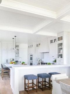
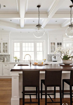
    Coffered ceiling, wider crown moldIng and lighting over peninsula to break up the space visually


  • 5 years ago

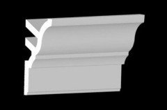
    Big molding

    I like maureen ideas

    Built ins to the ceiling

    you could hang some big copper pots or a long foody painting above the cupboards on the right side

    i wouldnt change the ceiling colour

    Glass cabinetry with light to the ceiling ... putting some special items in

  • 5 years ago

    We had a century home that had high ceilings (10 1/2 to 11 feet) throughout the main floor. However our kitchen was a very small footprint with 5 doorways and 2 lower windows than the rest of the house. So we dropped the ceiling in the kitchen to 8' so it wouldn't feel like we were in the bottom of a very skinny box. Made a world of difference.

  • 5 years ago
    last modified: 5 years ago

    @Chris H good idea to just lower the kitchen!! I’d love the whole area to be lowered but that’d be a mess, but the two story version of our house actually does have a lower ceiling! Picture here. Somehow with the trim and alcoves they still managed to make it look incredibly awkward (this flipped the opposite direction of mine)


  • 5 years ago

    I think you need a wider crown molding. The upper cabinets need to be taller. The alcôve with the stove looks awkward. I would either remove the cabinets there and use open wood shelving or have the cabinets go to the ceiling. You also need a bigger hood for the stove that is more of a statement piece. The wall in the back with the refrigerator needs to have the cabinets to the ceiling or maybe a pantry type cabinet. The door in the rear needs to be taller. It should be at least as tall as the arched opening. You need more lighting- at least pendant lighting over the peninsula and under counter lighting. The room also needs more color. There is no contrast between your cabinet, walls and backsplash. It may be the angle of the photo, but it seems that the peninsula doesn’t allow much space to enter the kitchen. It might be worth the investment to work with an interior or kitchen designer. Good luck and please show us photos when you complete the project .

  • 5 years ago

    I just looked at the photo you posted of the one with the lower ceiling. It seems awkward to me that they have those areas with à drop ceiling and open space- seems like a giant dust collector. Also I noticed in the alcove with the fridge the cabinet are different heights. Those cabinets should definitely be the same height and go to the ceiling of the alcove.

  • 5 years ago

    I also like Maureen's statement and the inspiration pictures with coffered ceiling. That would visually lower the ceiling.

  • 5 years ago

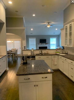
    @pianomuse it actually is a central island - wow, just realized how bad of an angle my picture was. I was focused so much on capturing the ceilings I didn't get a picture that was representative of the whole space. Here is one looking out from the kitchen into the great room instead for a better visual! I've since changed my wall color - this was Argos by SW but now all of my walls are Benjamin Moore pale oak as pictured in my main post. Loving that change!


  • 5 years ago

    @nolanirvana my main picture was misleading, it's a center island, not a peninsula. Posted a better one above! Love the idea of more of a statement hood. The door to the right of the arch is my pantry - I never noticed how awkward that door size was until someone called it a hobbit door and now that's all I see when I look at it! Raising that and maybe having the door be an accent color would make a big difference.

  • 5 years ago

    @Maureen love these ideas. I just posted a better picture two comments above, it's actually a center island not a peninsula. With that considered, would you add lighting above the island, just above the bar, or both?

  • 5 years ago

    @Martin Seebach do you have any pictures of what you described?

  • 5 years ago
    last modified: 5 years ago

    I think just over the island. Being in middle of kitchen, it will visually break up the expanse of space and draw the eye down. Adding to both areas could be too much.


    .

  • 5 years ago

    Your cabinets need to to go up to the ceiling, they are to short.

  • 5 years ago

    Those alcoves are a bigger issue. Recessed cupboards...who thought of that? ugggg

  • 5 years ago

    I love the look of the arch to the dining area. Could that be used to separate the kitchen and living area? It would define the space and hopefully reduce the glare from the kitchen ceiling lights into the living room.

  • 5 years ago

    Melissa, i would definitely add a light fixture over the island

  • PRO
    5 years ago

    Darken the ceiling to bring it down / make it cozy. Light fixture over the island will unite the top with bottom as well.