Software
Houzz Logo Print
susan_murin

Would you add to this sitting area?

5 years ago

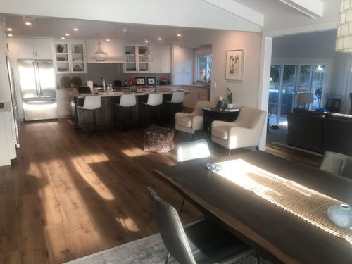
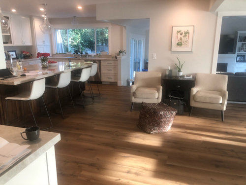
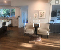
I have a very open-plan home (by design) with a large kitchen and dining area. I put a little sitting area between and it’s where I love to sit and have my morning coffee, read, etc. I am debating whether to add additional seating to this area- either 2 more chairs or a small loveseat. Would you leave it as is or add more seating?

Comments (26)

  • 5 years ago

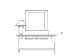
    I like Sabrina's suggestion. A console table with art above would be very nice. Don't hang the art too high since it needs to "connect" to the table.

  • 5 years ago

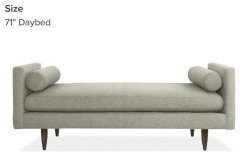
    I like the above ideas. However if you are adamant about a sitting area, then a small settee or bench instead of the chairs against the wall with a nice mirror or picture above would function and not break up the space so much.

  • PRO
    5 years ago

    I'd honestly remove the chairs.. they look awkwardly out of place.. but just my 2 cents. Beautiful space!

  • 5 years ago

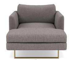
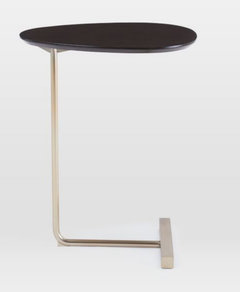
    I think it looks a bit odd, but if you love it, keep something there! A house should be all about what YOU love! Instead of more chairs, I'd make it look intentional = seating for one. Add a great chaise, with a small c-table and art above...


  • 5 years ago

    Absolutely add something....a nice patterned, striped or Oriental rug that is large enough to hold your chairs and the small chest. If you often have more than one other person for coffee, you could add a third chair or just pull one from the dining area.

  • 5 years ago

    Susana, on another question, what size is your dining rug? Your table looks same size as mine.

  • 5 years ago

    You could try rotating the set into the middle so the backs of the chairs are facing the kitchen. I'm not great at visualizing, so not sure if the size would fit, but it seems like a good option. Easy to try anyway!

  • 5 years ago

    @nuppal, the rug is 10’6 x 7’6. The table is 86”.

  • 5 years ago

    Thanks all for your input! I do like having a little seating area for 2...we are just 2 most of the time and it’s way more comfy and intimate feeling to sit there and have coffee or a glass of wine than to sit side by side at counter or at our large dining table or on sectional in FR. I think the scale of the table (which is an end table I repurposed) is off, and plan to get a more narrow one so the chairs can be angled toward one another and don’t extend beyond the edges of the wall. If anyone has thoughts about a new table, do share.

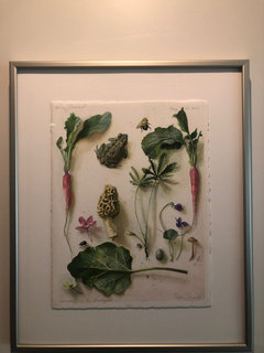
    The picture is an original watercolor by Katie Musolff that I LOVE! I had focused lighting installed to highlight it. Your comments have made me realize it may be too small for that space...not sure where else it can go so I may explore having it re-matted/framed a bit larger.

    Again, thanks to all for your insights!

  • 5 years ago

    I would angle the chairs a bit more and add a zebra hide rug. I think the shape of a hide rug would lend itself better to the space more than a rectangular rug. Good luck!

  • 5 years ago

    If the 2 chairs work for your lifestyle, then a smaller table, the pretty art lowered to a more intimate level, and play with the position of the chairs-- maybe pull one out a bit and angle them more. I'm thinking this grouping needs to claim the space between kitchen and dining more and have less overlap of the doorway to living room?

  • 5 years ago

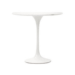
    Might consider a white tulip side table and lower your art as it is way too high. Lowering it will make it look like it is more part of your intimate space than hanging way above it and may take care of the size being too small. And whether you change the frame size of not, I do believe that if you take it to a professional framer they can lead you to a better frame and matt that will showcase your painting whereas right now it doesn't show off it's true beauty.


    tulip side table - Google Search · More Info


  • 5 years ago

    If you have another place to put those two chairs, compare that option with these options and choose the one that suits your lifestyle best.


    You might consider adding a desk w/chair there and, if height appropriate, you could use one of these chairs for the desk and set the other chair beside it facing the opposite direction -- executive and visitor style -- and center your desk grouping on a rectangle rug.


    You could add a round pedestal game table grouping on a round rug using both chairs facing each other. A table with a thin pedestal table would leave more leg room a clunky table or table with four legs.


    A square table grouping could be arranged on a rectangle rug.


    You might need to cut off the height of the pedestal height or wood table legs or wood desk legs or add gliders or wheels to the desk or table to make the desk or table a suitable height..


    https://www.decorsouth.com/listing/nassau-game-table-brown/?gclid=EAIaIQobChMI5Nr2tb2U7AIVA4eGCh2CAwofEAQYBSABEgLacPD_BwE

  • 5 years ago

    I think to angle the chairs more, as mentioned above, is the key! Lower your picture to connect more with table. Remove the pouf. Then add a little low table in between the two chairs to set your coffee or wine, or whatever on, an voila .. it's done!

  • 5 years ago

    Think about the view you're facing when the two of you sit there. Can you come up with an arrangement that gives you something pretty or more interesting to look at?

  • 5 years ago

    It be great for entertaining!

  • 5 years ago

    The view is of my wine fridge which is great by me!😉

  • 5 years ago
    last modified: 5 years ago

    My parents' home has a small settee in the kitchen that "shouldn't" be there but is everyone's favourite seat. I disagree with those who say this should be moved or replaced with something purely decorative, or less comfortable seating. If you enjoy sitting there, sit there. Homes are for living.

    I agree with a smaller table in between. A round table instead of a square or rectangle will make it look more natural for the chairs to angle towards each other, and still leave enough room for your glass or cup, and maybe even a light for easier reading. Be sure to get the height of the table and lamp correct - for example. Do you use the pouff as a footstool? If so maybe a wider one to share. For some reason DH and I love to share a footstool LOL. I think this is area sized for 2 and wouldn't add more.

    As far as the picture, I'd add a narrow lower shelf, and prop the picture along with another picture or another decor item. If you pull the seating away from the doorways and more into the room (maybe by a foot?) I think it will look better. Less stuck to the wall but still close to it.

    Make yourself at home.

  • 5 years ago

    I think the reason the chairs look awkward is that they overhang the wall they're pushed up against on both sides. If you are small people, you could look into swapping them out for narrower chairs or a chair and a half sized loveseat. How wide is each chair? A narrower table would help too, possibly more oval shaped than round to help bring the chairs closer together.

  • PRO
    5 years ago

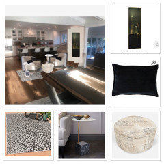
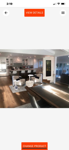
    Have you tried floating the chairs to face each other in center of the space and add a couple small drink tables large enough to also hold a book. Then couple your water color with a couple more pieces and stack one above and one below. Possible dark coloring and then add dark green velvet lumbar pillows to your chairs. Put pouff between the chairs. Creates more of a conversation area and other chairs could be added when entertaining. Here is little mock up for you. Need taller darker picture for the wall where current art is and find a better spot for that piece. I put mood board with pieces for you to see together. .

  • 5 years ago

    I would define the space by adding a rug. The result would be a floating room within a room. You can either use the chairs or a settee. Add a small table or place to set a cup or dish and a magazine. It's a comfortable place to flop, talk to the cook or have a cup of coffee.

  • 5 years ago

    Keep the chairs since you love them but really consider Flo Mangan’s advice - it’s what I was going to suggest. The chairs look awkward against the wall but I think they’d look great floating in the middle of that big space between your kitchen & dining area. It’s a beautiful room BTW!

  • 5 years ago

    I would agree that angling the seating toward the kitchen a little so the chairs dont jut out into the walkway as much....the right rug to connect it better as a grouping......then try any other table options you may have ..to see which size and shape works best for your needs..something smaller and lower for better function...the little ones that slide under the chairs are really convenient...if you like that ....a plant could ground the area as a grouping instead of a centered table

  • 5 years ago

    This would leave a little floor space for a basket or magazine holder for news papers or a book...in front of the planter between the chairs

  • 5 years ago

    Thanks so much all, for the advice and compliments on the space. Flo, I love your mockup and will give it a try!