Software
Houzz Logo Print
mandy_redworth

Paint...nothing looks right!

6 years ago
last modified: 6 years ago
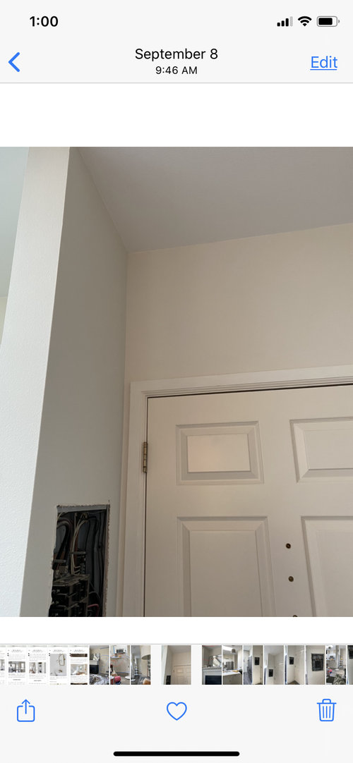
Yeah I know, everyone has this problem. I’ve read the forums on here and tried some of the suggested colors. I’ve spent so much time and money and have made zero progress. I’m only working with Benjamin Moore and I’m wondering if I should try Sherman Williams. Love Ben Moore bc it’s easy to use and blends well.

i have three large east facing windows, open concept with skylights. Here is what I tried and the outcome. Any advice?

Edgecomb - looked purple

Dove Wing - blue (painted most my house)

Dune White - blue (ditto, was told no blue undertone)

Ballet White - orange

White Dove - yellow

My ceiling and trim is Chantilly Lace. I don’t understand what is going on. Nothing looks like the swatch on my walls and I can’t really tell until it’s actually painted largely on my walls.

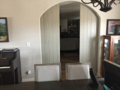
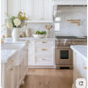
Here is a pic of Dune White which is said to be a no fail neutral which failed me

big time!!


Comments (19)

  • 6 years ago

    Have you had a nice chat with the BM store sales person in your area? Give them a call and explain your situation. Ask if they have a long time employee who has experience with color. Ask your question. If they can't help, call a different BM store.

    mandy_redworth thanked Elaine Doremus Resumes Written
  • 6 years ago

    The paint brand isn’t the problem but I wonder what you want to see when you look at your walls. I’m glad you said about the violet cast you can see in Edgecomb grey, at times I see it also! That said it doesn’t bother me because mostly it’s just a warm grey that I love and have in every room and light exposure in our house.


    If you painted your walls chantilly lace as well as your trim it would solve your seeing undertones in your paint but I think you might be better off if you can pick a color you wouldn’t mind seeing and pick your paint color with that in mind.


    We have some cabinets in Revere pewter and they definitely go to the grey/green side but i like green so I’m good with that. Hope you can find a color you can live with because sterile white walls don’t sound fun to me!


    mandy_redworth thanked mojavemaria
  • 6 years ago

    Hi Elaine - thank you so much for your response. I have tried to talk to the BM stores in my area - they added contrasting color to the Dune and Dove Wing and it was very orange. I didn’t ask for a senior associate though but will today as that is a good idea.

  • 6 years ago

    Hi Mohavemaria - ah...your Edgewood wall looks beautiful and exactly what I want. Your post made me feel a lot better. I definitely think you are right about accepting an undertone I can live with. It is now painted a lovely color that I tried to match for a very long time with tons of tweaking and we couldn’t get it right. It’s sort of a lovely putty-ish color that looks light beige sometimes and other times blaring yellow. I am trying to get rid of the yellow but you know, I think I like yellow over blue undertones - I don’t think I’d mind green either. Thank you so much for your advice.

  • 6 years ago

    It sounds like you've got some good suggestions. Also, look outside your windows to see if there are trees or shrubs overhanging the windows. THey can both block the light and cast green light into the rooms. Other large surfaces in the room such as brightly colored rugs will reflect their colors back into the room.

    mandy_redworth thanked apple_pie_order
  • PRO
    6 years ago

    How about not being so neutral? I see threads all the time of folks struggling with all these shades of off white. How about a nice sage green or pale yellow?

    Just a thought

    mandy_redworth thanked Debbi Washburn
  • 6 years ago

    I convinced my husband spending a few hundred dollars on samples was cheaper than spending thousands painting and then finding out we hate the color. I hope my “investment” in paint samples will help you out.


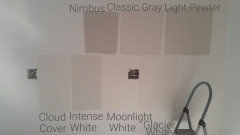
    This is my order of the samples I tired, starting with the colours with the strongest red/purple undertones to no undertones.


    Balboa Mist – this is not in picture but it’s close to Edgecomb Gray

    Nimbus – I saw flashes of purple depending on the time of day

    Light Pewter - a touch pink

    Classic Gray

    Glacier White

    Cloud Cover – it looked washed out

    Intense White – it looks better in pictures

    Moonlight White - a simple cream. The formula is yellow with a shot of black


    I painted my east facing living room with lots of trees outside Classic Gray. I think Glacier White would have looked nice too. They are warm but don't shift red/purple or green/blue.

    mandy_redworth thanked Cherie
  • 6 years ago

    i also like yellow better than blue, for living with. when we first moved into my house, it was painted some sort of tan side of white, and we repainted it all with something white that leaned orange. it reads like white everywhere (different shades in different light, of course), but the effect was like the sun had come out from behind a cloud -- that's the yellow, and it just makes you happy to live with.

    mandy_redworth thanked acm
  • 6 years ago
    last modified: 6 years ago

    Thank you Apple Pie & Debbi. The place it’s the most blue looking is in a corner. I realized the door color (some weird shiny tan almost rose color they painted) was skewing the color. Next to the Chantilly Lace trim, it looks really good and not blue at all.

  • 6 years ago

    Hi Cheri - ha! Your wall looks like mine but much neater. Thank you for reminding me to be patient with the samples!! I really like Classic Gray. I also found out that Glacier White is the new name for the color I have now, Dune White. I don’t know why the same color has two names. However, that’s the one I’m seeing so much blue in but you’re right, it doesn’t have weird undertones, the blue I see has to be a reflection or lighting. I appreciate you sharing your suffering, I mean trials. :)

  • 6 years ago

    Mandy, try exploring this link. Kylie has many articles on paints.


    i think she even has a topic on windows w/diff directions, and what colors look best.

    Here:

    https://www.kylieminteriors.ca/north-east-south-west-which-paint-colour-is-the-best/


    these are actual paint colors:

    https://www.kylieminteriors.ca/category/the-best-paint-colours/neutral-gray-greige-cream-and-white/


    https://www.kylieminteriors.ca/category/the-best-paint-colours/paint-colour-reviews/

  • 6 years ago

    ACM - agree. I like my original color but in the sun it is a harsh yellow. Now that I’ve learned there is no perfect all the time color, I may go back to it. I spent soooo much time looking at the yellow and hating it but now, I realize it wasn’t that bad. Can you tell I am a first time home owner?! I definitely want warm - when I look at the blue, it makes me feel cold!

  • 6 years ago

    Beth - Wow! This is extremely valuable info! Thank you!!!

  • 6 years ago

    Hi - Out of the colours you have sampled, which did you like the most?

  • PRO
    6 years ago

    I agree with JuneKnow. If you can't find a color that works, after sampling over and over, try something different. A professional color consultant works with these colors all day long, and knows the properties better than someone who paints their rooms once every few years. You'll save time and money, and a lot of angst.

  • PRO
    6 years ago

    Here is a pic of Dune White which is said to be a no fail neutral which failed me

    big time!!


    There's no such thing as "no fail neutrals". The internet lies. :)

  • PRO
    6 years ago

    ^ that's exactly what needed to be done. Map out where you've been with samples so you can stop repeating what didn't work and know where to pivot to find what DOES work. Great job, JB!