Software
Houzz Logo Print
ryan_castle36

Beige Paint Looks Pink on Wall!

5 years ago
last modified: 5 years ago
Hello, all.

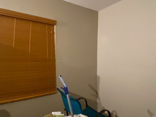
I purchased two different colored paints from my local Lowes, one is Balanced Beige and the other Accessible Beige. The problem is that, for some reason, the paint looks completely pink on the walls!

I tried to take a picture to show what I mean, but, surprisingly enough, the phone camera captured the true color of the paint. (Photo attached). Yet, to the eye, it is distinctly pink.

The light source in this room is provided by hardwired LED lights, the LED being a slightly warm white.

My big question is: how do I make the paint look less pink to the eye? Should I replace the lighting? If so, what luminosity should I use? Help pleaseee.


Comments (11)

  • PRO
    5 years ago

    Do the orange blinds have to stay?

  • 5 years ago
    last modified: 5 years ago

    @Lori A. Sawaya Not necessarily, but kind of a "if it ain't broke" guy haha

  • 5 years ago

    You don't show your floor in the photo, but i had the same issue with Edgecombe gray. showed pink on my walls. I think the culprit was the flooring. i wasn't about to change my floors so I had to paint the walls back to what they were. your blinds might be part of the issue.

  • 5 years ago

    Ryan-Lori is a color expert. I’m sure she’ll be back to give you some color ideas.

  • 5 years ago

    My gut is telling me that your flooring has yellow undertones and this is why your choices are pulling pink.


    Notice how pink Accessible Beige looks with yellow compared to orange.

    (Yes - our brains automatically perform comparisons between colors)


    This is not uncommon for neutrals to shift based on what is around them, along with lighting.


    I had a similar issue with a gray blue green a few months back. It was pulling powder blue.

    I had to look at several samples to correct the color and get the result I wanted.


    Original Color Was Beach Glass

    If I just increased changed the Hue - going greener, but keeping the Chroma the same it turned dead gray. (Iced Marble) (12 degrees greener)


    So I knew I had to increase Chroma.

    I tried 2 more colors -

    Quietude (5 degrees greener, 2 points more chromatic) and

    Silvermist (15 degrees greener and 1 point more chromatic).


    Quietude seemed a bit too bright - needed to be less chromatic, more neutral

    Silvermist added just enough green color to fix the powder blue and make it the blue/green/gray I wanted.


    I don't know how much you need to change color to eradicate the pink, but this is where I started. I looked for some colors that seem to be less pink but were relatively closeto the general color you want.


    I pulled the LCH Values and RGB Values so I could display the colors (Note Grecian Ivory and Canvas tan are also lighter than either of your two starting samples)


    Then I created the same interior exterior boxes with the colors I would try in order of what I believe will yield the least pink to the most pink. I stuck some yellow in their so you could evaluate pinkness next to yellow.


    Sorry I can't be more specific without actually seeing the space.


  • 5 years ago

    UGH...I'm looking at beiges, off whites to repaint and that is my biggest fear is what color it will end up looking on the walls...Not easy picking paint colors is it!!

  • 5 years ago

    It can be - as long as you don't want neutrals, but most of us don't want to live in a circus tent.

  • 5 years ago

    Always1step, I once wanted to use the same paint color in my bedroom that I used in my downstairs TV room. Down there it's a beige with a yellow undertone. Two flights up, it turned pink. Like magic, I took a paint stick downstairs and watch it appear beige! Lighting is everything.

    The one tan that seems to work everywhere is BM Manchester Tan. I don't have it here but used it for both my DD's co-op apartments. My husband liked it so much it used it for two rental apartments. It looks good during the day or night and it doesn't seem to matter what exposure you are facing.

    I have BM Shaker beige in my foyer and hallway. Not much light in the hallway. This color too seems to stay true.

  • 5 years ago
    last modified: 5 years ago

    Your blinds/flooring could be the culprit.

    I used edgecomb gray in my kitchen/family room. The rooms are open to each other and the paint looks different in each room. In the family room, the paint leans greige, which was the intended look. In the kitchen however, it takes on a pinkish hue at certain times of the day. I think it's a reflection of my cherry kitchen cabinets. Sometimes it's hard to believe it's the same paint color.

  • 5 years ago

    @always1stepbehind - There are a lot of talented color experts on Houzz. We don't always agree on semantics, but generally come up with similar answers on what colors will work.


    Working with pictures on the internet is a whole other challenge - they don't always depict colors as expected.


    If you can post pictures of your space and current wall colors it helps.


    I always like to test colors outside at about 2:00 in the afternoon on a clear day - it is an artist trick to seeing hidden undertones in colors.


    Here is a pic of my dog helping me look at colors. I took samples of my flooring, planned paint colors the small piece of teak is my furniture color - had a larger piece in some of my photos, brought the white counter top (only size sample I have, proposed wall tile going in the bathroom and bedding chair and linens colors.


    Since these colors all worked outside we stood a good chance that they will also work indoors.


    In this picture you can see second neutral that I was considering. Taking it outside and looking at it with the flooring I could immediately see that it had too much pink/purple next to my flooring (smaller sample behind Willow). Inside these looked very similar, but outside the pink reared its head and screamed. That is what would have happened if I painted a whole wall.