Software
Houzz Logo Print
stegonwheels

Paint color help please

5 years ago
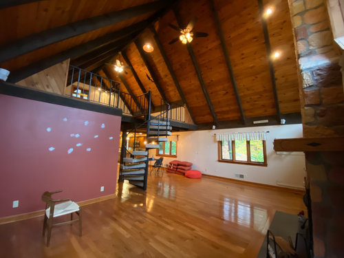
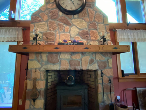
Hi All: we just bought this lake house and I want to update the paint colors. I‘m not a fan of the pinkish accent wall color, although I understand why the prior owner chose it - to bring out that color in the fireplace. Any other ideas for me? I was actually thinking of going dark grey. For the far wall, the color is a warm white/cream. I’d like to keep it in the white family - and warmer shades seem to be the way to go because of all the wood. I tend cooler colors though and love bright white, but I don’t think that would work here. Any help is appreciated!


Comments (23)

  • 5 years ago
    Pick a lighter color from the stone. That color pink doesnt go with the stone either, so not sure why they chose it. You could go with the cream that is on your other wall, since you seem to like it. It looks a bit busy in there and painting the same color cream, just might make it a bit more cohesive. Very pretty room. Love the ceilings.

    stegonwheels thanked cat_ky
  • 5 years ago
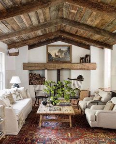

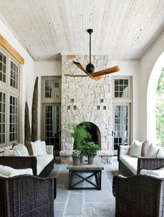
    Old Meets New · More Info


  • 5 years ago
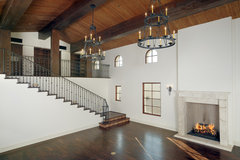
    last modified: 5 years ago

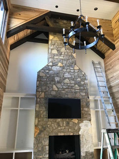
    And I hope the previous owners took the big fireplace clock with them along with the little fringy curtains. In a vacation house, who wants to be reminded by a clock what time it is? A beautiful skyscape on that tall fireplace would look amazing, or nothing at all on that stunning stone.

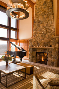
    Rustic Family Room · More Info


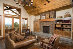
    Desert Ranch · More Info


    stegonwheels thanked housegal200
  • 5 years ago
    last modified: 5 years ago

    @housegal200 haha! They took that clock, but left those curtains! I have to take them all down. The plan is to replace the mantle with some reclaimed wood and just leave the fireplace stone plain and simple.

    the white on the far wall is actually a cream and not a stark white. Here is a close up from the prior owner


  • 5 years ago

    Hmm, the white looks chalky and cool on my screen. Might be worth getting some small samples from Benjamin Moore to try next to the wood and the stone. Get some large posterboard and put it up at different times of day--natural and artificial light.

  • 5 years ago

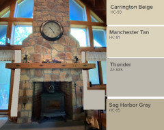
    I would paint all the walls a darker color. Anyone of these Benjamin Moore colors would work. Thunder picks up on the grout color and is a good compliment to the wood trim.

    I think the current mantel is a bit kitschy - I would keep it!


    stegonwheels thanked houssaon
  • 5 years ago

    @houssaon thanks. That’s a great idea on Thunder. I like it. I just need to see if it’s too dark for the adjoining room - dining room- with lower ceilings. And the kitschy is all going away. the love, life, lake signs would all be tossed in the lake if it wasn’t bad for the lake 😂

  • 5 years ago

    It seems they used an eggshell finish. I would use matte.

  • 5 years ago
    last modified: 5 years ago

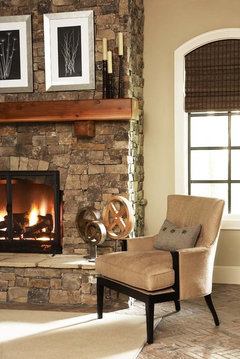
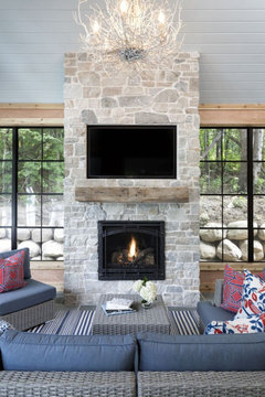
    Here's a Houzz photo with SW Windsor Greige if you're wanting to go in a golden tan direction. It seems to go well with stone fireplace shown and wood mantel. Again, try out samples on posterboard before committing.

    P.S. I'm still for Gentle Cream Benj. Moore because you do have the handsome wood ceiling which makes the room a bit darker. A tan, plus wood ceiling, and wood floor may need more contrast on the walls.

  • 5 years ago

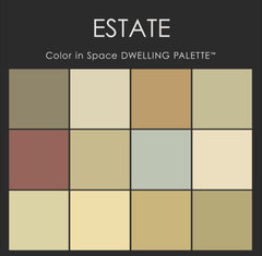
    Coincidentally, this set of colors includes what seems their paint color... if you like BMoore paints:

    Color in Space Estate Paint Color Palette™ · More Info


  • 5 years ago

    @housegal200 the tan is too much for me. I’m leaning a cream or maybe greige. I’m a big fan of grey and bright white trim, so this is hard for me, but that’s not the aesthetic here.

  • 5 years ago

    @houssaon why matte? we have flat in our apt and I’m regretting it daily with all the scuffs from dog, baby and the adults too.

  • 5 years ago

    I did add a PS about the tan. You might want to consider getting a one-time color consultant. You have a beautiful house with amazing features. A pro might be able to help you toggle between your preferences and the unique house you have. I would think carefully about gray unless it's very, very pale because you're then mixing warm and cool, not always a good combo. Also where are you located? In the north and northwest, gray indoors and out in wintertime can be a downer.

  • 5 years ago

    Wall BMoore Cream Silk and trim is Mayonnaise, the color of heavy cream: crisp white without being cold. Built ins are regarded as trim work 90% of the time, and as such, are painted, or stained the same.
    LORRAINE G VALE

    Urban Townhome Living Room · More Info


  • 5 years ago

    Benjamin Moore’s Swiss Coffee is a warm white without the CREAMY FEEL / not too yellow, or almond ? a great color to mediate between warmer and cooler materials and natural and artificial lighting.

  • 5 years ago
    last modified: 5 years ago

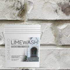
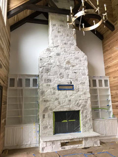
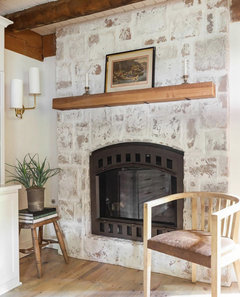
    sorry, but that fireplace stone (it almost looks like manufactured stone) is a no for me. I'd lime wash it with Romabio. Then your room would take on othis type of look. see below for others


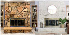
    you could do it in a white so that it looks like this stone (which is the same as yours) and solid coverage:


    or, pick a softer color and do a light wash so that those colors all meld into a similar shade (that pink has to go)


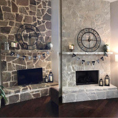
    Romabio Cristallo White lime wash: before


    after


    You see how the stone on either of these are washed so that the tone is almost the same? Do it w/yours.


    there are a ton of tutorials. just search, "Romabio limewash stone fireplace"


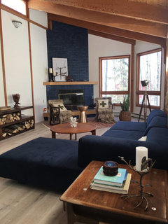
    Then just get a nice beam like they've done w/this one. (BTW, they painted this brick a rick navy blue. )


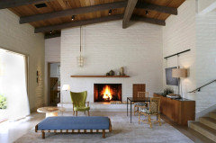
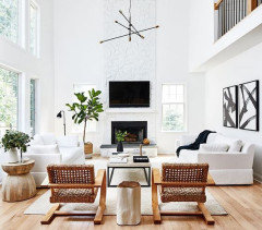
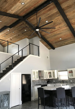
    once you do that, then you can pick a color for the walls. these are all similar style rooms w/the wood ceiling and beams
    Love this one. (you'd prob have to paint out all of the honey oak if you want to use this gray shade)


    I think a swiss coffee color would look nice on the walls


  • 5 years ago
    last modified: 5 years ago


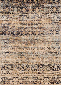
    Blue Beige Anastasia Area Rug by Loloi, 12'x15' · More Info

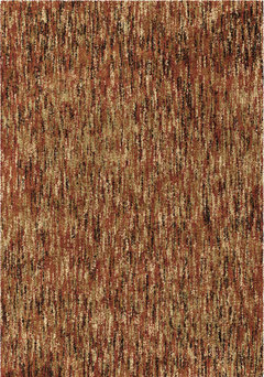
    Palmetto Living by Orian Next Generation Solid Area Rug, Red, 7'10"x10'10" · More Info


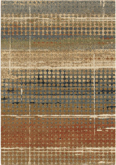
    Palmetto Living by Orian Next Generation Delgado Area Rug, Multi, 7'10"x10'10" · More Info

  • PRO
    5 years ago


    I find the darker colors even darker during the winter month.

  • 5 years ago

    Idk if this has been on your mind, or posted here. A copy from Maria Killam's web page, and there's more there... you have to keep reading, and she's on houzz.com.

    "[As] white became the new grey, I understood why. It was just too soon to go back to beige (we’d been doing beige for 30 years leading up to the Tuscan trend) and white seemed the newest and freshest choice...

    When I say ‘greige’, I’m basically referring to warm greyed whites; they are the palest colours in the green grey, violet grey and taupe categories -- TOO COOL in many contexts [though versatile, and softer than starker whites] ...

    What is a Complex Cream?

    warmer, and still light and bright ... when you want a fresher look in a room that has earthy beige, brown and gold finishes.

    And how do you get a cream that looks richer and more complex (meaning there’s more varied pigment in the colour)? Well you choose the very palest of beiges...

    Fast forward to today. Since we’re now specifying the palest of beiges and beige has 5 undertones (see the wheel below) I now have 4 complex creams in my system...

    I anticipate that the complex creams will continue to grow in popularity as the colour trends warm up again. Because I’ve noticed that even though the colours are warming up, the overriding look is still FRESH and LIGHT...."

    https://mariakillam.com/complex-creams-and-why-you-need-to-understand-them/

  • 5 years ago

    Dunn Edwards- Swiss Coffee is light.


    Mediterranean Living Room · More Info


  • 5 years ago

    @everdebz - this looks lovely.

  • 5 years ago

    Sherwin-Williams Accessible Beige would look great with the color of your wood and stone.