Software
Houzz Logo Print
athenaantal

Trapped in white paint decision hell

5 years ago

I’m de-Tuscaning my early 2000s McMansion. Painting all trim and interior walls to start fresh. I’d like to choose the same white but different sheens. I could choose 1 white for the north side and 1 white for the south side. North side gets good, consistent, cool light. South side is highly variable. It gets pummeled with sun from like 11am-4pm. I want a neutral white (or for it to read neutral in my spaces). I will be changing out all hard finishes in the kitchen within the next 6 months. Counters will be soapstone.

White dove was highly recommended. On every wall downstairs I have painted it, and on my white test board, someone else’s “depth” to me looks like someone smoked a lifetime of cigarettes in a room that used to be white. My master bedroom and another bedroom in my home were painted white dove when we moved in. They get only artificial light, very little natural light, and they look ok. But in my sun filled southern great room, WD looks yellow beige to me.

Chantilly lace is a top contender, but it also feels jarringly white. I also love super white, I used it in my previous home, and to my eyes it seems slightly cooler than chantilly lace. Simply white is too yellow. Someone else’s “warm” is my yellow!

White dove cut to 50% is almost what I am looking for. It seems to brighten it up and remove lots of the yellow/grey undertone. But the “color people” I’ve seen weigh in on other threads recommend to not cut a color, but instead find a paint color close to what you want to make. What color is like White Dove cut 50%? Like in the high 80s LRV? And is there any truth to super white being similar to a toned down Chantilly lace?

Any insight appreciated. I can also share photos of the spaces if it would be helpful.

Comments (28)

  • PRO
    5 years ago
    last modified: 5 years ago

    First correct your lighting that is what is giving the yellow glow to the paint. Maybe the issue is you should not be choosing whites at all.They are actually difficult to work with use a white you like for the trim in semiglass get all that done chnage the lighting to every bulb LED 4000K then get poster board and test colors. I happen to like a soft gray/ green for a wonderful neutral just think nature. As for pictures they always are a good idea. BTW the blazing sun can easily be handled with solar shades that control heat and UV rays , give you daytime privacy and allow you to keep the view , I usually pair them with drapes if you need nightime privacy.

    Serenity N thanked Patricia Colwell Consulting
  • 5 years ago

    This is a good point. I bet every light in the house is 2500k. Our electrician is coming next week to retrofit our kitchen lights with adjustable hue LED trim kits. I can ask him to do the rest of the first floor also.

  • 5 years ago

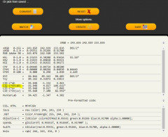
    There is a website that can be used to assist with refining your selection of whites.


    The website is https://www.easyrgb.com


    If you select a color you can see other colors that are similar -


    and you can compare the color to another color by using the LCH values.

    Click on the color and select Convert

    LCH is found on the CIE-L*Ch(ab) line and describes the level of Light, Chroma (How gray or colorful the color is) and Hue (where the color falls on the color wheel.


  • 5 years ago

    PPG Delicate White

  • 5 years ago

    If you have had White Dove cut by 50% and like the color there is no reason not to use the color. The issue people have with cutting formulas is that sometimes the result is not really just a lighter shade of the same color. The base has some color and sometimes the formula includes titanium white, which is whiter than the base - if you cut the titanium white in 1/2 you may end up with a darker color. I often play with a couple of paint colors that are close to what I want and figure out the formula for exactly what I want.


  • 5 years ago

    I remember hearing of this PPG delicate white - I’ve never heard of the brand. can it be matched or is it best if it’s that brand? My painter was going to use Bm advance semigloss as well as Fine paints of Europe eco satin

  • 5 years ago

    Kylie M Interiors has a great write up on the top BM White colors

    https://www.kylieminteriors.ca/the-8-best-benjamin-moore-white-paint-colours-undertones-and-more/

    and a separate write up on the top SW top 4 whites.

    https://www.kylieminteriors.ca/the-4-best-white-paint-colours-sherwin-williams/


    These two articles may help you more than researching LCH.


    Seldom have I had a situation where one of these 12 white colors didn't work out perfectly.


  • 5 years ago

    One other piece of advice - don't compare one white to the next. Only one will be on your walls. I can't count the number of times people have said Simply White was too yellow and ended up picking Simply White when they stopped looking at it next to cooler whites. It does have a yellow undertone, so I am not saying it isn't too yellow for you, just that it looks way more yellow next to Chantilly Lace than when it is painted on a wall and not compared to Chantilly Lace.


    I have also seen people go down the rabbit hole on whites and pick out 43 different whites. Don't do it. No one will know that you picked from 12 whites and not every shade of white produced by BM and SW.

  • 5 years ago

    Here are the LCH values for some of the colors you have tried.


  • 5 years ago

    Thank you. That’s exactly what is happening! When they are next to each other everything has an undertone compared to CL! My old house was basically one big room, a modern ranch, windows on all sides and it was bathed in sun all day, and it was decorator’s white that looked truly “white” in that house. Did super white trim, it all looked awesome. DW looks blue where I’ve painted it here.

    I’m going to have our painter come paint the bedrooms that are already WD with WD trim in semigloss, and ask her if she can hit some walls with primer for me. All my walls are brown - a color called BM wheeling neutral, I found the can in the basement - so all the white paint samples I have whether on the walls or on poster board I think are reflecting all that brown.

  • 5 years ago

    Decorators white reads blue also in my house, I get a northern light in my kitchen. Simply white reads completely White because it is not next to a pure or a cooler White.

  • 5 years ago


  • 5 years ago

    You got it! The brown is going to throw off your color selection.


    I help people pick colors for their homes all the time, but have struggled with my own living room. I bought a fixer and the LR has gold metallic wall paper from the late 1960s. As good as I am at isolating colors, this stuff is throwing me off. It glitters and glows and is gold! The carpet is also a light gold. I am changing the flooring to a light taupe LVT and have a cream sofa.


    Decided my final color selection has to wait for me to remove the carpet and wall paper. Then I will test my selections next to my sofa and flooring and on both walls.


    Best of luck! Let us know what you decide - share pictures if you can!


  • 5 years ago

    PPG is Pittsburgh Paints

  • 5 years ago

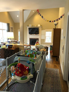
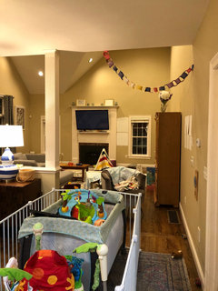
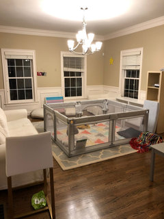
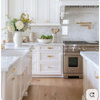
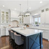
    Pictures of my house. Ok. It’s a mess but I have 3 little boys! It is only letting me post 4 photos. You’ll see our south facing office with white dove walls in daylight. OG peach window trim. The crown molding there is primed, unpainted. I put the sample of Chantilly lace next to it to show how close the color is to primer. Then the great room during the day and at night with artificial light. And the library, at night. Less yellow light there. Same wall color!

  • 5 years ago
    last modified: 5 years ago

    @Serenity N,

    I can't help you at all with color, but I do have a couple of paint suggestions. If you're planning to use FPE and/or BM Advance, you may want to consider BM's Scuff X paint, instead.

    It's from their commercial line, but it is a great product. I first read about it on Paint Talk (a pro painter site).

    We have since tested it for trim and painted about 6 gallons on our walls.

    I normally like eggshell, but in the Scuff X, I used matte. It looks great, & once it cures, it is an extremely "hard" finish. Not at all easy to scuff or knick, even for 3 little boys!

    The matte has a little "shine" to it that actually lessens as it cures.

    The biggest advantage over Advance for trim is the turn around/dry time. Cost is also a factor - I think Scuff x is about $62 vs. Advance at $80 per gallon?

    Benjamin Moore has not listed Scuff X as a cabinet paint, but a lot of the pros say it works great.

    https://www.painttalk.com/threads/scuff-x.94441/#post-1658953

  • 5 years ago

    I am a huge fan of Ben Moores Advance for cabinets. I used a no nap baby roller and the finished product looks really good. Almost a sprayed on finish.

    my favorite white for my house which is open plan with soaring ceilings is called Roman Plaster. It is a behr color but you can match it to other vendors i believe.

    this white is especially good with dark wood tones. i painted the ceilings white. Very open and airy atmosphere.

    my style is to use woods, rugs and fabrics to add color. I have never been happy with big color on walls.

  • 5 years ago

    I will check it out!

  • 5 years ago

    I also see you have white columns. I actually satined mine with gel stain in a dark mahogany to match my front door and floors. Just a thought.

  • 5 years ago

    I chose alabaster white for my walls. It took me FOREVER to find it but maybe that will help!

  • 5 years ago

    I had the same problem. I painted the colors on foam board so I could move it around and look at the color in different rooms and lighting. I chose BM Navajo White and for our space, it is perfect.

  • 5 years ago

    @Jennifer Hogan I'm doing the same strategy with the back of the house - I think I'm going to wait until the new countertops and backsplash are in my kitchen before choosing a white for the back of the house. As of now I'm trying to avoid painting the cabinets because they're beautiful, in pristine condition and I think the unfortunate wall color is making the wood look sadder than it is.


  • 5 years ago

    Your cabinets are lovely. They should look 100 times better with better colors around them. The muddy tan does nothing for the rich wood.


    I just saw that you are getting adjustable hue lights installed in the kitchen. I have not owned these, but did some research while looking at lighting. Negatives are that the CRI (color rendering index) is not very good on most of the ones that I had looked at and I saw a lot of complaints that they worked for a while and then the hues started not adjusting so well.


    I am really specific on my lighting needs and use only Fiet or Cree brand 5000 K daylight bulbs in all of my lights. I do not have any integrated light fixtures, only fixtures that accommodate bulbs.

  • 5 years ago

    I agree! If it’s easy for me to get up on a ladder and swap the bulbs out (and it is), it may not be worth the cost to replace them with the adjustable kind, especially if it then limits what I can do with them. I would however like them on dimmers. That’s one thing that none of the lights in the kitchen have that I would like.

  • 5 years ago

    I too am trying to traverse the rabbit warren of white paint hell. :-)


    I’m sticking with BM because I am sold on Scuff-X.


    I picked up a sample of PPG Delicate White from Home Depot and I *loved* it! All of my samples are painted on 15 x 24” foam core boards.


    So far, I have failed to match the Delicate White in BM paint.


    For whatever reason, Simply White is the closet match according to my Color Muse and my eyes. On paper, this does not make sense, and I cannot explain it... Perhaps the Home Depot PPG is not accurate? The sample from HD is in PPG base 1. 🤷‍♀️


    The lights in the office where I test/compare are all 4000k & 90+ cri.


  • 5 years ago

    @jeri are you enjoying being burned by the fires from hell or do you want relief?


    If you want to escape hell you need to understand that the two colors are not going to look exactly the same when you have them right next to each other, but unless you plan on painting alternating stripes on your wall no one will see the difference.


    If you want proof have a friend or family member take your two samples and a piece of cardboard with a hole that is slightly smaller than either of your samples or use a dark colored picture mat.


    Go outside when the sun is shining and have this person hold up one sample behind the cardboard, turn your back and have them place the other sample behind the cardboard/mat.


    Guess which one was which. Have them switch the samples back and forth in different patterns sometimes showing you the same one two or three times sometimes switching them one at a time, but always turning your back away between looks.


    My bet is you won't be able to accurately pick one sample from the other.


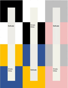
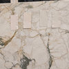
    Here is an illustration using the RGB Values for Delicate and Simply White


    Which blocks are Delicate and which blocks are Simply White?


    Can you guess these two?


  • 5 years ago

    These two colors are very close - same hue, Delicate is a bit darker and grayer than Simply White.


    The gloss level you use will alter the appearance, making the paint look lighter or darker. The other colors in the home will alter the appearance. The direction of the light will alter the appearance. The color of the light will alter the appearance. Your mood will alter the appearance. If you have the color sprayed vs rolled will alter the appearance, and the temperature and humidity will alter dry time, which alters the appearance.


    When you purchase multiple gallons of the same color they advise you to mix the gallons together so you don't get a demarcation line when you open a new can because even with the exact same formula one may be slightly off compared to another can,