Software
Houzz Logo Print
michele_davis5

Interior paint colors - getting out of control? or keep going?

5 years ago
last modified: 5 years ago
Hi Everyone... I just discovered Houzz a few weeks ago and I SO wish I had known to start here for advice BEFORE I started this whole house project. I'm VERY much in over my head - so - I hope I don't sound like I'm rambling, but I'll try to condense my concerns and be as clear as I can.

Two months ago, a grand (3800 sq/ft), beautiful house strolled into our lives and, ignoring that it was over the $$ I wanted to spend, we bought it. I am in LOVE with the house - the land - the street - the whole package.

We are not in a rush to move in and the house needed some light reno and painting so we started right away. We hired a contractor to finish the basement and my hubby is tackling the interior painting himself. This is not our first house renovation and (until now) I've been confident about my decisions for paints and decor style (woods, traditional, Earthy-tones).

Bottom line - I have been making many decisions in a short period of time and they are starting to backfire. I've learned HUGE lessons in lighting (this house brings out undertones) and the upstairs hallway and 4 bedrooms are actually 4 different colors that look VERY close to each other. They flow great.

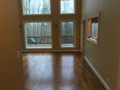
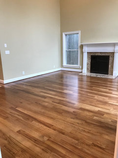
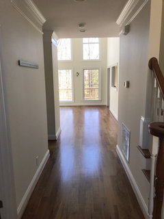
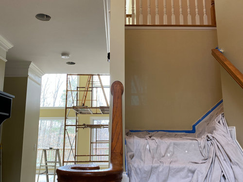
Now... the main floor is a different thing, as I am up to 8 paint colors total - not all flowing together. Each room looks BEAUTIFUL on it's own, but when you stand back - your eyes catch IMO way too many colors that don't match each other, Ugh.

Have a look a the pics, please, and some of these pics are 'in progress pics' because that's all I have taken in some rooms.

This house is a blank slate and (because my hubby is the painter), I don't want to ask him to keep repainting rooms (especially the green, great room which is 22 ft).

Any suggestions for decor/paint/rugs/curtains/furniture are appreciated. I am out of my league and cracking a little, but I'm hoping that furniture and decor will help bind the colors.

Colors:

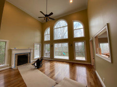
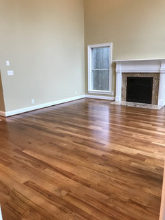
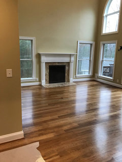
Main hallway/great room - FINAL STRAW (Behr)

Powder Room - REVERE PEWTER (shows gray)

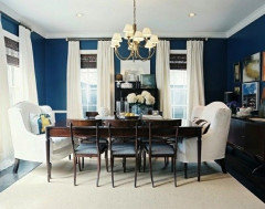
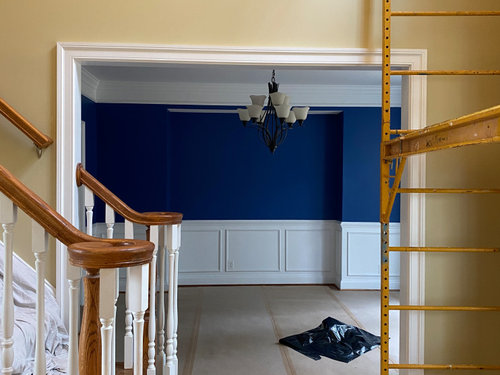
Dining room - SAPPHIRE BLUE (?)

Study - REVERE PEWTER (shows beige)

Kitchen - KILIM BEIGE

Laundry room - PALE OAK

Bedroom off kitchen - RAINWASHED - bathroom - CLASSIC SILVER

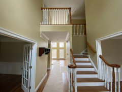
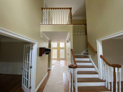
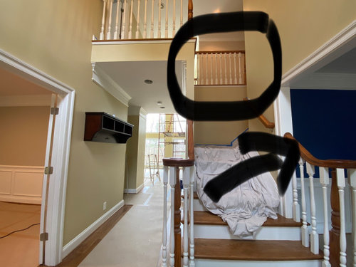
The view from the foyer/front door. (hall - Behr -FINAL STRAW). Upstairs Hallway - Cedar Key (BM)


Kitchen eat in area - Killim Beige


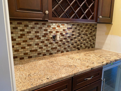
the butler pantry (only area that has the new backsplash) Existing granite is GOLD tone.


looking right from the foyer - to dining room. It's original to house - we liked the blue.


the left side room is a study - REVERE PEWTER - hallway upstairs is CEDAR KEY


I have a few more pics that the site isn't allowing me to upload (even as a comment)

Comments (46)

  • PRO
    5 years ago

    What's with all the yellow and gold? The public areas should have been one color with the exception of perhaps the dining room.


    IMO selecting a soft white and then adding the color to the room with furnishings and accessories makes a cohesive solution.


  • 5 years ago

    Your blue and white are cool and your warm wood and gold are warm. I prefer all warm colors or all cool colors in one area (for unity). Paint companies can use any color name they want, but the bottom line is some colors are warm and some cool.

  • 5 years ago

    With all your wonderful trim, crown, wainscot, I would suggest this palette believed to be Navajo White walls and White Dove trim. This throughout, and then the dining room can still carry the blue if you love it, but remember, blue stifles the appetite; not always desirable in a kitchen or dining area unless your family are all dieting.

    Horse Country Home · More Info


  • 5 years ago

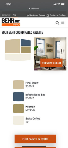
    Sounds like you want to keep the colour in the great room? The dining room does really clash. This is the palette on Behr’s website. Maybe start with toning down the blue and then re-assess? I would lighten up the kitchen and hallway too if you’re willing to have your husband re-paint those areas something like the Swiss Coffee pictured? But you said you love all of the colours individually... what’s the overall look you’re going for? Do you have any inspiration pics?

  • 5 years ago

    I think swiss coffee is a better selection for the down stairs. or the BM sea salt.

    bring in the straw colored elements w/rugs/accessories

  • 5 years ago

    Thank you, everyone for chiming in and it does mean much to have other eyes looking at it.
    The house, when we bought it, was one color (egg yolk yellow) throughout the main floor. Early in the paint selection, the main room was difficult to pick because almost all grays and Greige turned pink, blue or purple so we delayed the choice for that room until later and went about painting the bedrooms and upstairs hallway - basically painting the smaller rooms first to finish what we could. HUGE mistake because the main floor final color ended up being a yellowish / brownish /green that doesn’t really match well - but I will say -it looks great on it’s own.

    I need to coordinate (repaint) the adjoining rooms to match bc the cost of painting was $15k(ballpark). I KNOW my hubby will just tell me to live with it.

    The kitchen backsplash has all the green/peach/brown in it. Minus the blue dining room, the colors do blend with that.

    As far as furnishings— we have none for the room. We ordered Crate/Barrel couches (cement) and they were overdue for a month now. Tables, lamps, rugs haven’t been purchased yet. I was hoping to tie in the green/yellow/peachy colors through a rug, art for over the FP and linen wall coverings.

    The dining room HAS to be repainted, no doubt, I will look at the palette given. Probably Swiss coffee is my best best. It’s a dim room so needs lighter paint.

    Thank you again -

  • 5 years ago

    Are the couches final sale? Crate and Barrel does have free e-design and can help you choose a fabric to go with your wall colours. Cement sounds like a steely grey. Not sure it will work. Or maybe choose a rug first. There are hundreds of fabric colours to choose a couch.

  • 5 years ago

    The Cement-Taft material is actually a beige-linen that is very neutral - it’s a stock fabric for them. Covid has delayed everything and I’m actually glad I went with it bc Id need to change the order had o picked out a gray-steel fabric. Purchased In sept, with a nov delivery for an ‘in-stock’ item - guess not. Anything custom was looking at a April-May delivery
    I’m very hopeful that there is a rug out there that will bring it all in.

  • 5 years ago

    Ok that sounds good. If you have a photo of the fabric list it and then you can get some help with rugs.

  • 5 years ago

    This is the couch. I have 2 ordered.

  • 5 years ago

    This is the living room - complete with the Final Straw color paint. I posted it on another board to ask about where to hang curtains so I know what length to order.

  • 5 years ago

    Love the couches. That room does look like a lot of work to repaint. What about doing the hallway upstairs Swiss Coffee too? Might help if the surrounding spaces are muted and the great room stands out.

  • 5 years ago
    last modified: 5 years ago
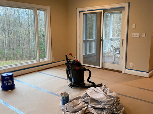
    this one isn't bad, the coloring. I mean, I think there are better colors, but in this shot it doesn't look as sickly as the other photo.


    maybe once you get art on the wall, some rugs, furniture, it will be alright. I know what a pain it is to paint those two story rooms. (didn't you start w/the lower room first to make sure you liked it? lol

  • 5 years ago

    Yeah I totally agree Beth. It looks workable with the lighting in that particular pic.

  • 5 years ago

    @beth - this WHOLE thing started with the kitchen granite because the original owners used the granite on the FP and it’s Venetian Gold(?). It has been really hard to match bc it is very rust-colored and definitely did not match (m)any grays. My goal was to mute the yellow of the previous paint and this color did it.
    Unfortunately I started on the perimeter rooms and saved this room until last.

    Swiss coffee from Behr is on the palatte so then it should just blend? I’m afraid of the two other colors on the behr palette. (The dusky blue and dark green)

    I’m done with green.

  • 5 years ago

    The green-color totally muted the orange in the FP (which is a plus for me).
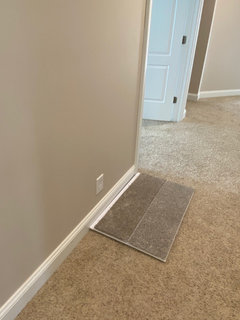
    This hallway is what I’m afraid of.
    If I paint the hallway Swiss coffee - the vanilla color would sill be visible from the foyer. Wouldn’t be the same greenish hue.

    Still leaves the dining room up for grabs

  • 5 years ago

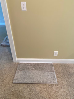
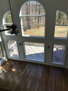
    This camel-colored carpet is going to be changed out to one that better matches the walls

    We were going to keep the carpet but these colors make it look dingy.

  • 5 years ago
    last modified: 5 years ago
    yeah, sorry. i'm just not into that color. I couldn't look at it everyday. too yellow/green. any color carpet is going to look like that, unless you do a golden shag from 1995!

    try the Swiss coffee, or even the BM Sea Salt.

  • 5 years ago

    The lighting in each room is making the job harder. I understand trying to “tone down” the granite on the fireplace but that would have been easier to change. A neutral color throughout, consistent and warm, would have done it. SW Creamy is a good warm white. I used Antique white in my whole house because I have so much wood trim and detail that anything else would have been oppressive. And I have high ceilings too so I understand the frustration of not getting the colors right.

  • 5 years ago

    @beth - I have to laugh because I feel the same way. I call it poopy-diaper green, but everyone that comes over to see progress raves about it and how they love it, so I kept going. I have to somehow make it work for a while. He will not repaint it - he’s been painting for 2 months - and the $$$ is too much.

    I need to step back and take a breath with it

  • 5 years ago

    I should have known it was an issue when I couldn’t find it anywhere on the internet. Lol. Now I know why.
    I’ll figure out a why to get it to work

  • PRO
    5 years ago

    Some potential artwork that may help to tie in some of the greenish/yellow color you were talking about could potentially be this work by Avaulte artist Bronle Crosby. It is titled 'Still Waters' and is 36'x26.5' and the grayish blue and bits of golden beige may help to tie in the room color.

    This work title 'Pink Hug' by Avaulte artist Qais Al-Sindy may also work. It is 24'x18'. I'm not sure exactly what size you're looking for, this may be a bit small, but I think the colors could work well along with the greenish/yellow wall color.

    Let me know what you think and good luck with your home makeover, I think you can definitely make this wall color work, and I hope these suggestions help you!

  • PRO
    5 years ago
    last modified: 5 years ago
    Okay, you have painted…done deal.

    The one thing that the rooms have in common is the trim paint…white. Make it your primary color and use the color of the walls to dictate accent colors.

    What if your upholstery were white? I know, I know, but a fabric like Crypton will work.


    Don’t repaint…walls are just a backdrop. Your constant should be white.

  • 5 years ago

    well try and choose a nice neutral carpet color that will kind of work, but be fine w/a new color down the road. (and you can always paint in a few months. just do a wall a week or something )

    bring in some blues to work w/those yellow tones for now, in art or other decor.


  • 5 years ago

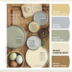
    Beth just posted this on another thread and I thought of you. Not for wall colours - but all the other decor.

    Florigina thanked Trem Wills
  • 5 years ago

    Following

  • 5 years ago
    last modified: 5 years ago
    @Trem Wills I like the soft colors in that page - very much. And... I do still need to paint the dining room away from the sapphire blue color, so, I'm open to them, too.


  • 5 years ago

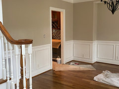
    Wanted to share a quick update - we repainted the dining room (on the right) away from the Sapphire Blue and had matched it with the Revere Pewter in the study on the left. And the top floor hallway is now the same color as the main room. It is MUCH better to the eye. Now, I just need to get furniture in there to see about how to smooth this color out.


    It feels much lighter.

    Had the electrician put in dimmers on most lights so I'll be able to soon see how the light affects the paint colors. It's working - that makes me happy.


  • 5 years ago
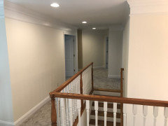
    that looks nice! (but I really did like that blue!)

  • 5 years ago

    That all looks so much more harmonious! Now you can get more colours in with rugs, furniture, art etc.

  • 5 years ago
    The changes look good. I too liked the blue, but not for a dining room.


    I have been thinking about using SW Naval for my study that is just inside the front entrance off the foyer. I have orange and cream print love seats. Now I am second guessing the blue. :( The dining room is very open across the hall from the study. I real wanted a bold color in there, as well. Was thinking a color like the study and guest room in the SL Idea home in Asheville, NC. SW 9530 Momentum Saw it in person and so pretty. And our foyer also opens to the great room which I want neutral because it opens to the kitchen that will have off white cabinets. UGH...I am overwhelmed thinking about the colors. So tough to pick out paint colors. I feel for you!!!


    Anyway, can anyone recommend a SW color that is similar to BM Sea Salt?

  • 5 years ago
    Florigina-

    Although it is awful to paint with furnishings in the house, I suggest you acquire some - furniture, art, area rugs (if you like those) etc and get an idea of what your style in this house will be as well as your color palette .

    If you don't actually bring the things into your house, I would make the world's largest and most detailed scrapbook before you and/or your husband even think about going near a paint bush or even a fan deck of colors.

    And congratulations on your new home!

  • 5 years ago

    Much better. It looks more cohesive.

  • 5 years ago

    Hey Hey - everyone - hope you all are having a quiet, restful new year weekend.

    I still have an entire basement to paint and was watching paint reviews on-line and the Paint People-guy has a quick show of suggested Foyer color and LOOK at what he picked!! (comparing the the video shot and our main color - they are pretty-darn-close, aren't they?)


    Now - I know it isn't the color for everyone - or - everyone's main house color, but I was just thrilled to see it on someone's else's walls.


  • 5 years ago

    Florigina.... so glad you found that video. Colors are very similar. Your house will look great. At the end as long as your eyes love it all that matter. Enjoy your home.

  • 5 years ago

    I wanted to give one more update on the main color of our house. It’s been a long month of soul searching but...
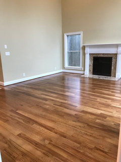
    I finally threw in the towel and re-painted with BM Swiss Coffee. Enjoying this much more than the green (which was a yellow-y green)
    Very happy so far.
    Thank you everyone for the support and advice.
    Means much

  • 5 years ago

    Oh so much better! I'm so happy for you that you finally were able to end up with something you like!

  • 5 years ago

    oh my! what a diff that wall color makes!! I love it! How are you liking it now?


  • 5 years ago

    @Beth H. : Honestly - it is a dreamy color and I cannot believe how much more reflective the light is in the rooms. Added bonus - it lightened the carpet color in the upstairs hallway! I'm very happy about that bc I was concerned it was looking too dark. It's a win-win. TY


  • 5 years ago

    it made quite a diff (but I still liked your blue dining wall!)


    do you have a shot w/this angle?


  • 5 years ago

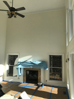
    @beth - this is the only shot I have of that angle - it was in-progress on Sunday. (Rainy day)
    I’ll be taking a lot of pics tomorrow.

  • 5 years ago

    nice! did your husband do it? again? lol

  • 5 years ago

    @beth - Negative. He is not allowed to play painter again.

    He had me cutting trim with a 2 inch brush for days - professional showed up with a 6 inch brush and was cutting a window frame in 15 min. He finished the whole thing in 4 days. #worthit


  • 5 years ago

    It looks very fresh and clean. Great color!

  • 5 years ago

    @Florigina. I know the soul searching you were going through. I have been going through the same paint decisions for months. You chose well and it looks bright and beautiful. Enjoy your home!😊