

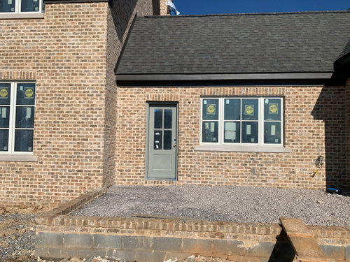
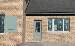
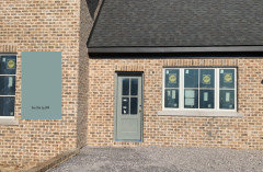
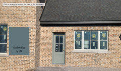
Front Door Color
5 years ago
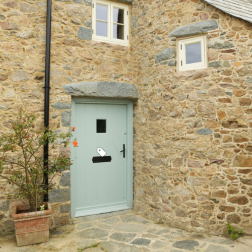
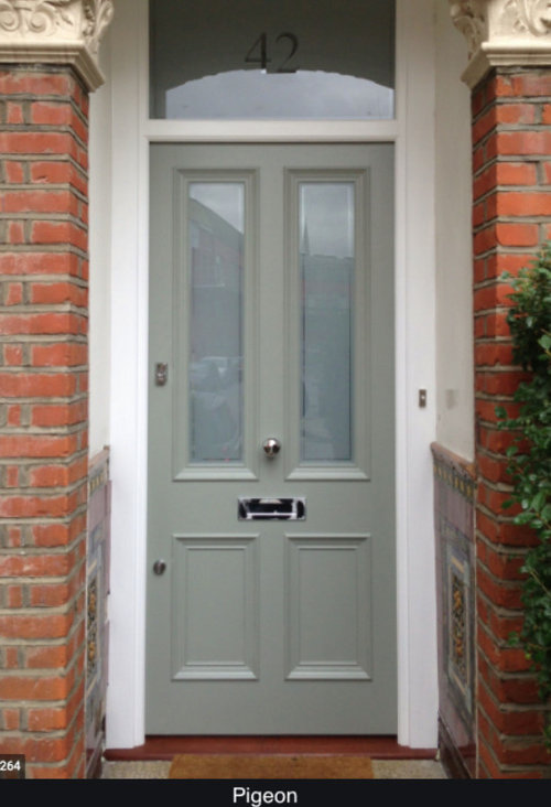
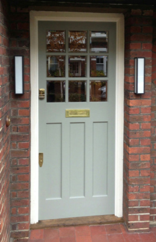
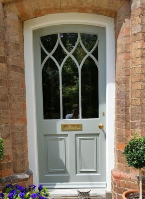
Featured Answer
Sort by:Oldest
Comments (14)
 5 years ago
Related Professionals
Raleigh Kitchen & Bathroom Designers · Youngstown Kitchen & Bathroom Designers · Little Rock Interior Designers & Decorators · Carbondale Interior Designers & Decorators · Hackettstown Interior Designers & Decorators · Huron Architects & Building Designers · Madison Architects & Building Designers · Gillette Architects & Building Designers · Waterloo Design-Build Firms · Bakersfield Design-Build Firms · Spartanburg General Contractors · Elgin General Contractors · Carson City General Contractors · Jamestown Flooring Contractors · Cornwall Flooring Contractors- 5 years ago
- 5 years ago
- 5 years agolast modified: 5 years ago
- 5 years ago
- 5 years ago




Related Stories
FUN HOUZZHouzz Quiz: What Color Should Your Front Door Be?
Think you’re hip enough for orange? Or optimistic enough for yellow? Take our front-door personality quiz and find out
Full Story
CURB APPEAL5 Bright Palettes for Front Doors
Splash bold green, blue, orange or red on your front door, then balance it with a more restrained hue on the rest of the house
Full Story
CURB APPEAL9 Daring Colors for Your Front Door
Stand out from the neighbors with a touch of neon green or a punch of hot pink
Full Story
MOST POPULARHow to Choose a Front Door Color
If choosing a door paint isn't an open-and-shut case for you, here's help
Full Story
CURB APPEAL77 Front Doors to Welcome You Home
Crossing the threshold is an event with these doors in a gamut of styles
Full Story
FRONT DOOR COLORSFront and Center Color: When to Paint Your Door Black
Love the idea of a black front door? Here are 8 exterior palettes to make it work
Full Story
CURB APPEALDIY Painting Project: A Colorful Front Door
Give your entrance a notice-me new hue to make it inviting and energizing for fall
Full Story
COLORFront and Center Color: When to Paint Your Door Purple
From grapelicious to lavender, a front door cloaked in the color of royalty might just reign supreme in the neighborhood
Full Story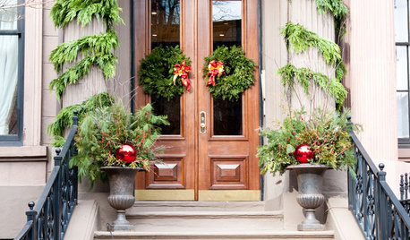
HOLIDAYSShow Us Your Decorated Front Door
Nothing says, ‘Come on in’ like a front door decorated for the holidays. Share pictures of your decorated door in the Comments
Full Story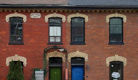
FRONT DOOR COLORSFront and Center Color: When to Paint Your Door Blue
Who knew having the blues could be so fun? These 8 exterior color palettes celebrate sunny-day skies to electric nights
Full StorySponsored

Innovative & Creative Custom Closet Designer Servicing Franklin County

littlebug zone 5 Missouri