Software
Houzz Logo Print
arabella_blackwood

Paint Colour Recommendations for Library?

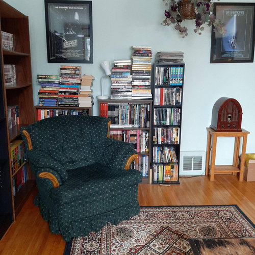
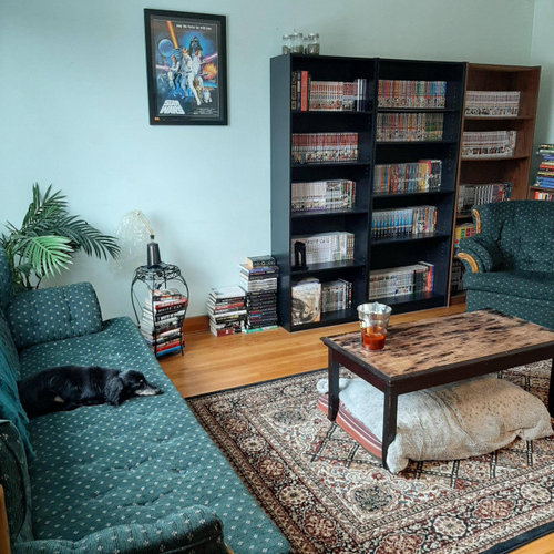
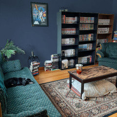
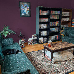
I'm cool with dark, bold colours. The room gets a tonne of sunlight, I use blackout curtains most of the time. I've been considering dark teal, navy, burgundy, a warm gray or brown.. Any suggestions are appreciated : )


"I'm cool with dark, bold colours. The room gets a tonne of sunlight, I use blackout curtains most of the time. I've been considering dark teal, navy, burgundy, a warm gray or brown.. Any suggestions are appreciated : ) "

Comments (56)

  • 5 years ago
    @Angie K Thank you : )
    I have been considering an accent wall or two, but am not sure which walls I would paint which colours - the longest wall walking in is going to be lined completely with shelves and books. Hmm.. I wish I had more painting experience, lol.

  • 5 years ago
    Super fun project. I think a deep teal with a bit more blue in it would be a great backdrop for your sofa and chair. I like when the furniture and walls are similar in color. Then you can add a punch with white or another color, reflection with metallics, and warmth through wood tones. You have lovely floors.

    You might consider buying samples of your favorite colors ($4 or $5 each) and painting sample boards that are at least 12" square. You can use poster board or mat board. Or cut up a giant cardboard box! Just make sure you put enough coats of the color to keep the board color from distorting your color. You can also buy peel and stick samples of Ben Moore and Sherwin Williams colors ($6 each). I would recommend looking at them throughout the day and evening, because lighting will alter how it looks.

    https://samplize.com/


    Arabella Blackwood thanked bluemarble
  • 5 years ago
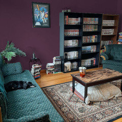
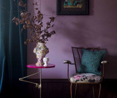
    Any of these eggplant tones would look super with your furnishings. https://www.pinterest.com/pin/395753885976878222/

    Arabella Blackwood thanked Yayagal
  • 5 years ago
    last modified: 5 years ago

    @Bluemarble I was in the middle of trying to respond to you when my phone died earlier. Thank you so much for going out of your way to help me, I really, really appreciate it! You're awesome. These are all beautiful examples.. I'll have to pick up a bunch of samples and try them like how you mentioned. I love the deep eggplant, which I hadn't considered at all. I've been leaning towards your original suggestion that you made of "Dark Night" by SW, but I'm always going back-and-forth between choices. It's so hard to choose just one when you love colour - of course I'll be able to implement more colours in with little details and items afterwards, but choosing a base to start with still seems so hard to me.

  • 5 years ago

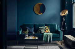
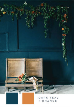
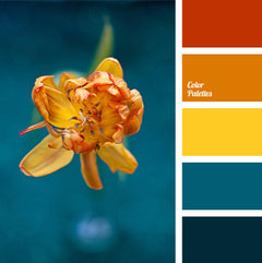
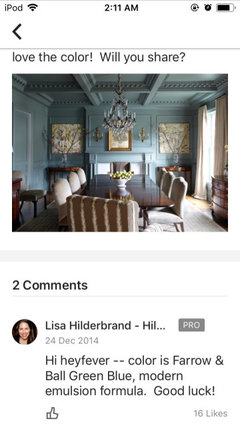
    I suspect with all the natural light you get, Dark Night will look more colorful during the day while still giving a cozy vibe. You can tame the light with curtains, or wait until the evening when it provides drama in your vignettes (corner pedestal table with lamp and decor?). You can experiment with various shades of yellow, orange and pink, and it looks wonderful with earth tones. I also like the color in this photo with your furniture and floors. It is a touch brighter than Dark Night.

    Fun palette...

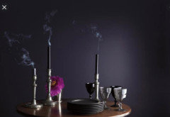
    Maybe deep purple in another room...

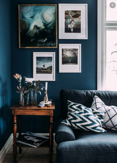
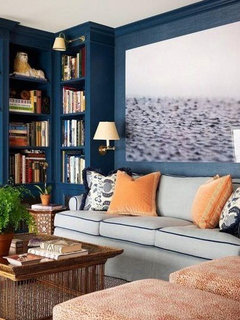
    Have you considered painting the bookshelves the color of the walls? I like this apricot accent color...


  • 5 years ago
    On the subject of indecision...I totally agree with you that it's hard to choose when you love so many colors. The good news is you will like whichever one you go with especially knowing you have another room waiting for one of your other faves. I painted several sample boards of different black and navy colors for an accent wall in my bedroom. After going back and forth over them, I chose SW Jasper without even sampling it. It's a super dark green that looks almost black in the darkest corners. And I love it. You can make any of them work, because you love color and won't mind mixing it up. Samples will help you decide which teals work and don't work (if you go with teal). They will also help if you can't decide between teal, navy, eggplant, etc. You can do a process of elimination easier that way.

  • 5 years ago
    What about this one?

  • 5 years ago


  • 5 years ago
    @bluemarble I bet your room looks amazing! Jasper looks like a stunning colour. Sometimes it's best to go with the colours we're most drawn to I guess.
    I agree, I was thinking of using the eggplant purple in a different room. I still have the front walk-area, hallways, and two other bedrooms (one I've turned in to be used as a closet) - so lots more colours to choose in the future. I think that the dark blue-green would be nicer for a library/study room, itd go well with the wood colour, and I love the idea of it with the green furniture like you've pointed out.

    Thank you again for lending your wonderful ideas to me. I hadn't thought about painting all of shelves the same colour as the wall. I think that it could look really good. It will definitely be something to ponder. I don't mind going an extra mile or doing extra leg work, the shelves look sort of cheap in the first place so maybe painting them all would help take that away a bit.

    I was going through lots of paint colours online to try and find colours in the same ballpark as Dark Night for sampling, and have narrowed it down to a few - SW 6230 Rainstorm, *SW 6237 Dark Night, and SW 7620 Seaworthy - with dark night front and foremost. For Aubergine colours I ended up noting - Jester, *Autumn Purple, and Dark Purple by Benjamin Moore. I'm really excited to get the ball rolling and try out some samples!

  • 5 years ago
    last modified: 5 years ago

    Marylee, that brown is really nice. I tried to find a dark, dark one like that. Maybe I'm missing a whole group of colors if I don't search specifically for Williamsburg Collection?

    Arabella, your house is going to be so cool. Your friends and family will start referring to the different spaces as the green room, the blue room, etc. I love all the colors you're considering. When you pick up the samples, ask if you can get them in a flat or matte finish which gives the best depth of color. Dark paint in a flat finish is marred easily when touched, so when you buy the actual full gallons after making your decision, you might consider a scuff-proof paint. Otherwise, if your stack of books falls against the wall, it will leave a mark!

    As to the bookcases, obviously you can determine whether or not to paint them after the walls are painted. Maybe you'll like the collected look of them, maybe you'll want them to blend in with the walls and let the books be the star, or maybe you'll be in teal overload and decide to paint them an eye-popping jewel tone. Can't wait!

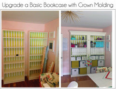
    If you're handy and have the tools (or have handy friends with tools), you can add molding to the bookcases prior to painting. This is what happens on houzz...ideas snowball. ; )


  • 5 years ago

    Another Houzzer with an inspired eye introduced me to Bucktrout Brown recently. I love it.


    Arabella Blackwood thanked Marylee H
  • 5 years ago

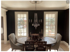
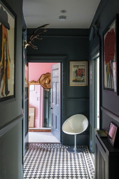
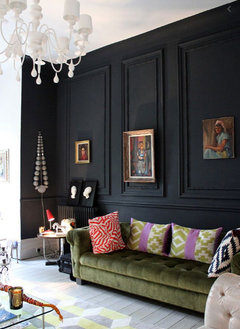
    Beautiful backdrop for you lovely chandelier. What color for the adjacent room?

  • 5 years ago

    I wish it were mine! But ‘tisn’t. 🌈

  • 5 years ago

    Ohhhh...I thought it was your house. Well, thank you for sharing. 😁

  • 5 years ago

    I was helping with accompanying trim colour dilemma! 🌈

  • 5 years ago

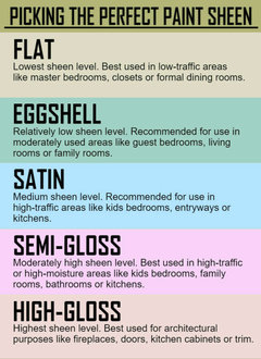
    @bluemarble Thanks! I plan to line the entire wall with shelves and was considering adding molding to them! However lumber is pretty expensive at the moment, so maybe down the line unless I can salvage some from somewhere, it would be an absolute dream : ) I usually ask for my paints to have an eggshell finish (which I think is flat?), What would you personally recommend as a paint finish if you were to choose it?


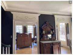
    @Marylee H It is a beautiful house and colour though! I love the gothic victorian vibe going on in it.

  • PRO
    5 years ago

    Egg shell is not flat. Here is paint sheen chart


    Arabella Blackwood thanked Celery. Visualization, Rendering images
  • 5 years ago

    I see someone above mentioned a Farrow and Ball colour and I think their colours are just so gorgeous and saturated.

    Here are some options you could think about:

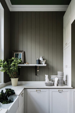
    A lovely dark olive green. Neutral enough to go with a lot of colours

    Treron · More Info


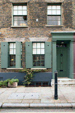
    Gorgeous green, would look fantastic.

    Green Smoke · More Info

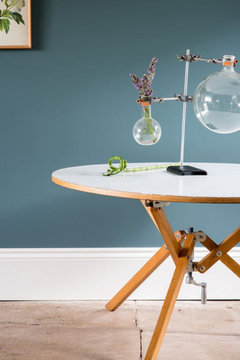
    A little more blue green - your couch would look good with this I think

    Inchyra Blue · More Info


    This one is a dark grey - very dramatic.

    Down Pipe · More Info


    Arabella Blackwood thanked mvcanada
  • PRO
    Arabella Blackwood thanked Celery. Visualization, Rendering images
  • PRO
    Arabella Blackwood thanked Celery. Visualization, Rendering images
  • 5 years ago

    @mvcanada I love F&B's catalogue of colour, they are really beautiful! Unfortunately, they aren't easily accessible where I live - I'd have to travel a couple of hours to Toronto (I live in Canada) or have a friend bring them to me, and with Covid-19 right now it's just not feasible as Toronto is a hotspot. I looked into colour matching as well, but apparently when you try to colour match with F&B, the colour doesn't turn out the same 99% of the time.

  • 5 years ago


    These are closely related from the same Blue-Green Hue Family neighbourhood.

    Pleasant Valley is just a tiny touch darker + less colourful.

    Arabella Blackwood thanked Marylee H
  • 5 years ago

    @celerygirl, Wow!! Those look amazing. Thank you for going out of your way to render those for me. I love them both.

  • 5 years ago

    Oh...I hear you about their colours not being easily available. I know that Tubs here in Etobicoke carries their colours, but I don't know if I've ever seen any other stores that carry them. And I've read that too about colour matching for FB paint.

    You can't go wrong with Benjamin Moore paints IMO. And easily available too.


    Arabella Blackwood thanked mvcanada
  • 5 years ago

    Nice renderings, Celery. The eggplant color is divine. It will be interesting to see how Arabella responds when the sample boards are in use.

    Arabella, paint sheen is probably more about preference. Obviously, the higher the sheen, the easier to clean. I used SW Infinity Flat for my family room before I knew about the scuffing. If I had it to do over again, I would have used what I used in my bedroom...Behr Ultra Scuff Defense Flat (even though it's a SW color). If someone wants to convince me that SW Infinity Eggshell would be a better choice, I could be persuaded haha. I just didn't want any reflective value to the walls - but, I also don't want all the scuff marks! You have a lot of light coming into the room, right? If you like a soft shimmer, then go for it. Whichever you choose, if you decide to paint the bookshelves the same color, opt for a higher sheen like satin.

  • 5 years ago

    @bluemarble The purple does look divine, doesn't it? I'll need to search for a few more aubergine and purple paints to sample after seeing it rendered out. Also yes, the whole wall behind the couch is almost entirely a window which faces the sun - on a sunny day the light level is intense and blinding. I definitely have a lot to consider and think about now. Thank you for being so helpful, I couldn't have come up with any of this alone : )

  • 5 years ago

    I’m curious... what is the first thing that comes to mind when designing this space? Are you picturing contrasting colors throughout the room, a monochromatic look with small bits of color, a dark room at night with mood lighting, a bright room during the day with intense color, an eclectic vibe or something more formal...?

    Also wanted to clarify when I suggested a satin finish, I meant for the bookshelves.

  • 5 years ago
    last modified: 5 years ago

    @bluemarble Can you read minds? Thank you for clarifying about the finish, I wanted to ask you but didn't know how to word the question. So you'd recommend a satin finish for the shelves, but the walls should/could be a different finish - perhaps one with less sheen than satin has?

    A dark room at night with mood lighting would be nice. I have colour changing bulbs throughout the entire home. I can appreciate everything and am pretty open minded, but definitely think I lean towards liking more vintage, victorian-esque and an eclectic styles (although not full-on eclectic), I also like gothic but again not full-on. Up until now I've just kind of played around with things in the rooms I furnish and decorate until I find them aesthetically pleasing and balanced.

    Here are some albums that might give you some more insight into my style, I've also posted some photos to my "ideas" here on hauzz:

    Previous apartment bedroom: https://imgur.com/a/jIEJiHO

    Current Kitchen (scroll down, its a B&A album) I used "Tumeric" and "Calligraphy" by Behr for the wall paint:
    https://imgur.com/a/J6xav4H

    Current bathroom after renovating it (Contemporary, I wanted a cleaner spa-like place to bathe and relax, the previous retro bathroom was rotting): https://imgur.com/a/3XMVTz7

    Also my Instagram handle is @thesapphiresea if you're able to get even more of an idea of my style from something like that : )

    I also really like all of the previous pictures you've shared to show me paint colours, I wouldn't mind aiming for something along those lines.

  • 5 years ago

    Yes, painting wood trim (if not keeping in a wood tone) a higher sheen than the wall allows it to stand apart from the wall while still being cohesive.

    Thank you so much for giving us a glimpse into your design leanings. Victorian with a hint of Star Wars. Got it 😉. Love the dress form in your old bedroom, and it’s evident you have put much thought into your personal spaces.

    Great instinct on using the blue wall color in the kitchen to attempt a seemless transition to the backsplash.

    Couldn’t believe when I saw Turmeric in your link. I was strongly considering that color for a linen duvet cover recently. Mine was a little more orange, though.

    What a shame the checkered floor had to go in the retro bathroom. So fun, but I totally understand the need to replace it. Very impressive what you are tackling head on, and I know it is rewarding.

    Enjoyed scrolling through some of the memes you have highlighted. Very entertaining! OMG, the Bernie ones. 💕 I might have to buy the sweatshirt.

  • 5 years ago

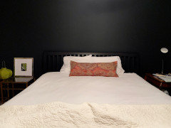
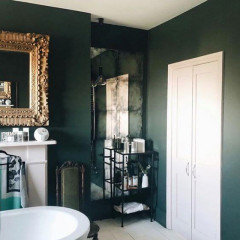
    Wanted to share the Jasper wall at night and my inspiration photo - which is a bathroom haha. The room is still in progress and the tapestry pillow ended up in another room, but I like the idea of bright pink and/or chartreuse accent colors. Instead of replacing our 30 year old black sleigh bed, I decided to paint an accent wall behind it to sort of disguise it. Making it a dark green allows the bed to not completely disappear while adding some drama. I thought about putting antique mirror glass above the nightstands, but mirrors are for reflecting beautiful things. From certain areas of the room, they would've reflected doors. Not very exciting. So, I may hang art in mirrored frames instead. I want to get a linen duvet cover, but haven't decided what color yet. Anyway, Jasper is beautifully deep green by day and awesomely dark by night.


    Arabella Blackwood thanked bluemarble
  • 5 years ago
    last modified: 5 years ago

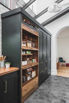
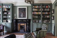
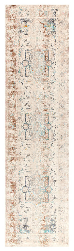
    Personally I think i would go with a very dark green, and get abigger rug and table (and new dog bed)


    Industrial Dark Green Kitchen with a Vintage Twist · More Info


    Highbury Hill · More Info


    Surya Traditional Dublin Polypropylene 5'3" x 7'3" Area Rugs DUB2307-5710 · More Info


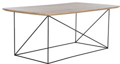
    Rylee Rectangle Coffee Table - Taupe Brown Pine, Black · More Info


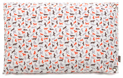
    Dog bed


    Scout & About, Outdoor Bed, Vanilla, L · More Info


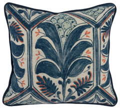
    Chair pillow


    Kosas Home Castillo 100% Cotton 18� Throw Pillow, Blue · More Info


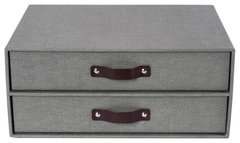
    I would put some boxes like these or upright ones on top of the bookcase


    Birger 2 Drawer Chest, Canvas, Canvas Grey C64 · More Info

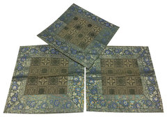
    Sofa cushion


    Vintage Silk Cushion Cover Indian Sari Border Green Decorative Pillow Cases · More Info


  • 5 years ago

    following...

  • 5 years ago

    Arabella...patiently waiting for an update. ; )

    In the meantime, I noticed you might like nature photography. Here is a photo I took a few years ago of a gorgeous fungus growing on a fallen tree...


    Arabella Blackwood thanked bluemarble
  • 5 years ago
    last modified: 5 years ago

    @bluemarble I'm sorry for taking so long to respond! One of my cats injured their tail (they're okay now for the most part), then I got sidetracked for a while with some other things. I will absolutely post of photo when I'm finished painting! I have chosen a colour (I'm going with purple in the end), I am going to purchase the paint next weekend, Im waiting for lockdown to lift in my area since I'm unable to purchase the paint until then. You're room looks amazing btw and your nature photography skills are amazing, I love it.. That's such a beautiful photo. Feel free to share more with me, I'd love to see them. If you have social media where you post them to I'd also love to follow it as well : )

  • 5 years ago

    How nice to hear from you! Thought maybe you were off painting the whole house haha. Can't wait to see the purple walls.

    So sorry your cat was injured. Hope there won't be any long-term complications.

    I do not have social media accounts for posting photos, but your kindness makes me think I should look into it just for something fun to do. In the meantime, I appreciate all here to humor me/allow me to post this one for Arabella...

    Well, I'm not able to post it for some reason, so I'll try in a separate comment.

  • 5 years ago


  • 5 years ago

    Does that look familiar? I figure since you said you live a couple of hours from Toronto that maybe you've been to Bruce Peninsula. Lake Huron and Lake Superior are breathtaking.

  • 5 years ago

    Yes! It makes me wish it was summer so I could go camping : ) I chose Autumn Purple by Benjamin Moore,i Hace y ubhave yestt to pick up a full cab, n but plan to this weekebd.Im uit OIm pretty slow at doing things aroubf yhe house since my schedulI work shift work and fue to covid lockdowns bht iI will make dure to post progress puvtures or and pictures obupob vompletiob :),canada is beautiful so -I +s,


  • 5 years ago

    My cat is alright, I thought I commented back originally but I guess it didn't send! If you end up setting up an account for your photos somewhere definitely share it with me.

  • 5 years ago

    Autumn Purple is a very pretty color. Sorry I didn't mention this before, and maybe you already know this...look at your sample throughout the day to make sure you like the color as much when it's blasted with all that warm natural light coming in as you do during the evening hours. Hold the sample against the wall (with a larger white paper between it and the wall) not just against the furniture for comparison. Rooms that get warm morning light will have a beautiful glow, but that orange or golden glow might very well alter your chosen color. I purchased a dusty rose duvet that looked very muddied in an east-facing bedroom, and a royal blue wall went completely electric LOL. Autumn Purple may become brighter and more saturated if your room faces south. Just things to thing about. : )

  • 5 years ago

    If you haven't purchased the paint yet, get matte for the walls. Satin for the trim.

  • 5 years ago
    last modified: 5 years ago

    Is that really the message I sent? It looked fine when I wrote it out earlier.. lol. That's what I get for using my phone to respond. I meant to write something like "Canada is so beautiful, It makes me wish it were summer so I could camp again. I have yet to pick up a full can of paint, but plan to this weekend - I'm running errands tomorrow. I'm pretty slow at doing things around the house due to lockdown and shift work but will make sure to post progress photos and photos upon completion :)" Just in case you didn't understand it at all. It's between "Autumn Purple" and "Dark Purple", both by Benjamin Moore, Shadow by Benjamin Moore has also been a consideration - I am having a really hard time picking between them.. Autumn purple seems to have more red tone in it and you're right, it may show up as a more burgundy tone during the day more since the sun shines right in, I'm not sure If I'd mind that.. I'm still sort of contemplating. In the end I think I'll be happy with whichever one I end up going with.


    @Houssaon I will definitely go for a matte finish. Everyone on here has been so helpful, I'm really appreciative of all of the feedback and helpful advice I've received, thank you : )

  • 5 years ago
    last modified: 5 years ago

    I feel as though Autumn Purple will look like this in full (the original visualization posted above by Celery):


    and Shadow might look something like this in full?:


    Dark Purple I think would be between the two,


    The samples I painted have helped a little but it's been hard to visualize the entire room a specific paint colour even with having them. I like them all, and they're all sort of similar... I think I am just the worst at making choices when it comes to choosing colours for rooms.

  • 5 years ago

    Shadow is more muted/greyed than the other two colors, which may work better with your green sofa.

  • 5 years ago

    Arabella, I'm cracking up over that wacky text and your realization of it haha. We got the gist.

    I wouldn't say you are the worst at choosing the room color. Have you browsed the dilemmas on houzz? LOL. It often times takes an army of experienced homeowners and more than one Pro to help someone choose the perfect shade of white. I know everyone says paint is the easiest and cheapest solution to transform a room, but committing to a color is a big deal. No pressure from us, but we are happy to help you explore more colors if you want. Hope I didn't shake your confidence in Autumn Purple. Can we see your samples? Maybe next to your sofa and flooring. Can't remember if your rug is staying. If it is, can we see a close-up? Also, can we see the window wall?

  • 5 years ago

    You could always paint one wall as a test, since the samples aren't quite giving you what you need. Eventually, there will be bookshelves and art covering much of it. : ) How do your samples look with the color of your floors? Fun room with dark teal velvet curtains...


  • 5 years ago

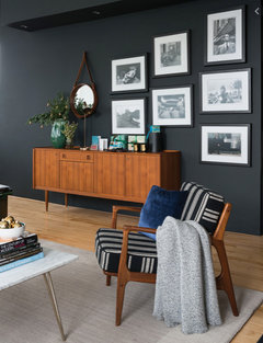
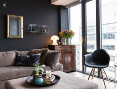
    Just throwing this out there...black or near black. mvcanada mentioned dark gray upthread which would look nice with your floors and rug. The darker the better IMO.

    There are many beautiful photos of black rooms, but these show them in well-lit spaces. Black is a great backdrop for all colors, and will often times have an undertone of blue, green or purple.


  • 5 years ago

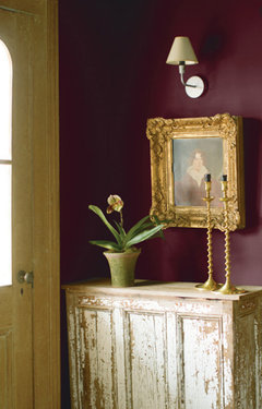
    SW Burgundy


  • 5 years ago

    Arabella, thought of you this week and wondered if you took the plunge regarding your library transformation. Hope you are doing well.

Sponsored
Hope Restoration & General Contracting
Average rating: 4.7 out of 5 stars35 Reviews
Columbus Design-Build, Kitchen & Bath Remodeling, Historic Renovations