Software
Houzz Logo Print
susan_grant4226

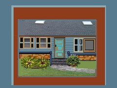
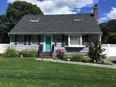
Front of house!

13 years ago
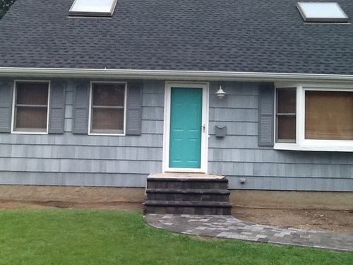
Does anyone like the door color I picked out!!

Comments (163)

  • 12 years ago
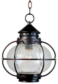
    I am looking into changing the light, and trying to decide on railings charcoal or white vinyl...
  • 12 years ago
    i think a white railing would convey the beach look better. can't wait to see it with some greenery and colourful perennials!
  • 12 years ago
    last modified: 12 years ago
    Just fooling around again. Hope I see the finished results of your house. It's really lookimg good!
  • 12 years ago
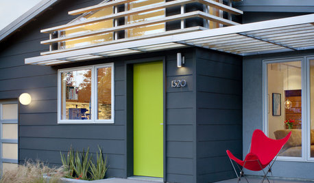
    Front door ideas..
  • 12 years ago
    Sorry, but I really hate the look of that white vinyl fencing, gate, etc. stuff.
  • 12 years ago
    I do too! I am leaning towards a black satin finish alum.
  • 12 years ago
    You could do bench on the side with the bay window, bark and some larger rocks with large potted plants or a water feature/bird bath or bird feeder planter to the left, and smaller group of potted plants to the right by the door. Choices in pots are endless, including misc. items like old washtubs, wheelbarrows, wagons, etc....they can be laid on their side or at angles instead of straight up too...a rain chain that drips into a barell that has a faucet at the bottom to attach a hose to for watering. I personally love hanging chimes and mobiles too.
    Susan Grant thanked gypsyrose17
  • 12 years ago
    I don't like the color
    Susan Grant thanked Mike Thompson
  • 12 years ago
    I love it. It's my happy color...my beach house door is the same shade of blue!
    Susan Grant thanked beachhouseforme
  • 12 years ago
    the color pops and there is this "wow" factor. work that door people! I love it.
  • 12 years ago
    maybe some wide slat shutters for the windows. I think on a budget, so widening the entry maybe something later on so, I would darken the entry steps, maybe install a railing for the steps in maybe a stained wood or in white metal, or something like that. some shrubs, flowers and some landscape lighting, because you have that "wow factor " door, it is a focal point, that I love. it is a cottage type home. okay maybe a change in the mailbox, and change the front light fixture in maybe a bronze like color. Where I live a house had this beautiful color in gray it was by "Fraizer" paints, (for the spelling) it's called "tin man" take a look. So, these are just inexpensive things. But, you need windows just plain, no grids, if you choose shutters. My house is always evolving every year, so will yours.
  • 12 years ago
    last modified: 12 years ago
    Depending on what you're looking at, and if it would work with the bay window, it might look nice, if someday you extended the porch across the front of the house.

    If it's a beach house, you may already have a deck in the back, but there's something about "settin" on the front porch...................

    My in-laws lived on a block where everyone had been there at least 40 years, and a couple of kids had bought their parent's houses. Every summer we would have a block party, a garage sale, and wander back and forth sitting on each others porches for a visit.

    It was very funny, because EVERYBODY had an exercycle for sale! My FIL saw one, and said, "Gee, maybe I should look at that........." I told him, "Emilo!" "You sold THEM that LAST year!
  • 12 years ago
    Great color, but needs plants for curbside appeal and to feel more like someone lives there. Lavender in assorted styled pots would look lovely with a few scattered geraniums. Yes, darker shutters for contrast.
  • PRO
    12 years ago
    The door is the focal point of your home. The door loses that title if you add more turquoise somewhere else besides the door. I think that since turquoise is a bold strong color, you could use accents in midtone to dark vivid colors. Accent colors that are too light will not have a contrast to the house color. White is a great color for the beach style freshness.

    I think the darker gray shutters are still not enough contrast to the gray on the house. I would like white. Black is an option that I liked before, but taking the beach into consideration, white seems to be a better balance for your home.

    White railing not black or charcoal, it will get lost. Repetition is needed for good design. White on all your trim and fascia. If you use gray or black for fascia, it will blend too much with the gray and not accent the roof line which is an architectural feature of any home. If you choose any more strong bright colors for accents, I think it will start to look like a cartoon playhouse.
  • 12 years ago
    I agree with Nanette's comments. The shutters need to pop a little more and would look better to match more closely to the color of roof shingles. I like it very much. Can't wait to see it with some beautiful landscaping.
  • 12 years ago
    last modified: 12 years ago
    Cartoon playhouse?! Where do I sign?! Friends say my decorating style is," Pee-Wee's Playhouse"!

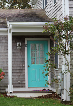
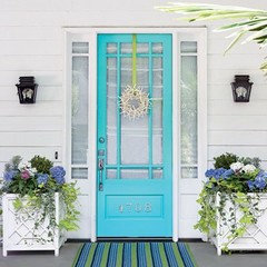
    LB: I agree that using a lot more turquoise in a design with all cool colors, could diminish the door as a focal point somewhat. But it's hard to tell, since the front door is centered, the porch is not completed, and we don't know what accessories, (flower pots, flag) or plantings Susan will add. As photos in the thread show, often just the architectural design makes the front door special, and identifiable as the entrance to the home.

    Also, could you give examples of "dark vivid" colors (recommended) and "strong bright" colors (not recommended) ?

    If you are referring to my drawings, they are meant to be "cartoony", I guess. I was going more for "whimsical", but I'll take it. And actually, they are more editorial, and meant to inspire, not necessarily literally translated. Although, it is also highly acceptable for those with superior taste, nonetheless! :)

    I don't think Susan needs any more turquoise. I like the dark shutters, but I think all white, with that great door would be very nice, and just the ticket.

    Susan! Don't you love me talking about you, on your thread, like you have no say?!! :) :)

    Susan: "Well I'd like.................................
    SM: "Please, Susan, I'm speaking!" :) :)
  • 12 years ago
    LOVE the door color with white and gray. Some dark pink or red flowering plants would look great!
  • PRO
    12 years ago
    last modified: 12 years ago
    'smdrovetto'. I'm referring only to this particular home and this houzzer's tastes. People can do anything that is suggested by any of us. It is only our personal opinions that the houzzer needs to weigh. There are definite reasons for design balance, needs and how colors affect us all similarly. There is not much variation in how color affects us.

    The structure of a home is the primary canvas here. Accessories (plants and landscaping, pots, stones, walkways) can add great dimension and color. But many times that is not long lived. They add interest to the stationary structure of the home. The home is a constant and is somewhat separate from the landscape and accessories to compliment it.

    I'm not referring to your drawings at all. I'm referring to how color affects all of us in a similar way.
  • PRO
    12 years ago
    last modified: 12 years ago
    There are definite reasons why color is used and placed in the overall canvas of whatever is the issue. Color theory. Color speaks to us in very similar tried and true ways and reasonings. To achieve the desired affects for any canvas is a balance of how these colors will affect us. What, Where, How. What the color is placed on. Where the color is used on the canvas. How much of the color is used. This all plays a huge part in the feeling one wants from the canvas.
  • PRO
    12 years ago
    I wouldn't go with that color whatsoever
  • PRO
    12 years ago
    last modified: 12 years ago
    Dark vivid colors for a stronger contrast can be either dark or vivid or high striking contrast to the gray, if you are not changing it. Colors close in value to the gray will get lost. I believe that all architectural features on a home should have contrast. That's what makes it interesting and noticed. That is why architects and most of us love homes that have detail.

    White will be high bright contrast to the gray. Black and navy would be vivid dark high contrast to the gray. For me, turquoise door is a decision already made. If the door is to be focal, it needs to be the only color used on one element. Then other colors need to work with that to get the final picture. The gray is not a soft light gray. It is midtone. I feel that accent colors with this gray color need to be vividly stronger to get a contrast. If the accent colors are too close in saturation and value, those elements will get lost visually in the adjacent elements they are near.

    There are many colors that work with gray. This is the exterior of the home. Not a fun room in the home. Of course you can choose any other color on any palette if you like it and is comfortable for you. Maybe you have a consideration of what the surrounding exteriors of the homes are in your locale. You are the only one that can make that decision. We are only here to give you the many options for choices.
  • PRO
    12 years ago
    last modified: 12 years ago
    Regarding having to match the roof... I feel that many times the roof color needs consideration. For me, on this home, the roof has a very high pitch with a lot of gray color that is visibly predominate in this overall canvas.

    The reason I suggested black for the shutters is that the gray roof and home's exterior is a form of black mixed with some white (called gray). The black is a stronger sharp vivid contrast to this exterior. Therefore, I chose the black to work with the grays.

    The reason I liked white for the shutters was to keep it more fresh and beachy.

    I think the structure below the roof should be the focal of the home and not the roof. I feel that if darker gray is on the shutters, the roof and the gray shutters blend more and is visibly heavy with the entire home. That's a lot of gray. The shutter color does not direct the eye to the lower section of the home to be as much noticed. MO :))
  • 12 years ago
    when I refer to Shutters, I am so sorry, I meant interior shutters not exterior window shutters.
  • PRO
    12 years ago
    last modified: 12 years ago
    Here is a helpful article to understand color theory.
    http://www.sitepoint.com/color-theory-101-2/

    A patial excerpt taken from this article....

    Understanding the principles of color combinations will help you to choose combinations that work well together, set the right mood, and create the right amount of contrast within your design work.
  • 12 years ago
    An interesting knocker makes the door pop.
  • 12 years ago
    last modified: 12 years ago
    Thank you, LB. I appreciate all your information. I think I understand what you are saying. The use of color can be very complex. I actually worked on a paper, researching how light and color affect the retina, and visual imagery. It is quite impressive. Reading just the first sentence works better than Ambien!
  • PRO
    12 years ago
    You're welcome smdrovetto!
  • 12 years ago
    Personally, if your going to paint the front door Turquoise then the shutters should match. I disagree that the shutters should be darker. I would also add thicker trim on the other windows and paint them a High Gloss white. Add some bright red Geraniums inside wooden boxes and you've got yourself a fun cottage.
  • 12 years ago
    I have been reading all the hints, suggestions and it seems to me you should tear your house down and start over!!! (Just kidding)
  • 12 years ago
    I love this house, I believe the interior window treatment throws the whole thing off. Again I think Shutters will give the windows that look which would tie in the white. I like the gray, t say freshen the shingles, with a creamy gray, change the light fixture, but with that beautiful door, the front exterior landing is screaming for an update. This is a cottage home, I would update and not remodel, or freshen up to clean simple lines and soft colors. It's just me, simple clean elegance with tasteful "pops" of color. My door is red for now, with a simple white wreath. This adorable simple home with the door, say's welcome. again, simple classic elegant look.
  • 12 years ago
    Just had the driveway, stoop and sidewalk done! Railings getting installed in Sept. we went with a black railing. Interior window treatments are going. Just found a great anchor door knocker in a cute little antique shop in Montauk.
  • 12 years ago
    I kind of agree with catscats; I think the plethora of suggestions on a simple question has really kind of gone over the top on this discussion.Enough already!
  • 12 years ago
    I like the door; the mailbox and the porch light are lost. Paint them a dark black accent or silver grey maybe. Turquoise if you dare. Good luck
  • 12 years ago
    Hi Susan!
    It is so fun to be able to participate and follow a project where you also see the results! You are moving!
    Can't wait to see everything!
  • 12 years ago
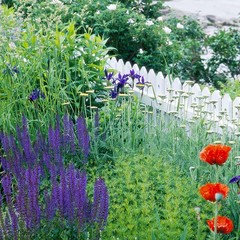
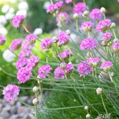
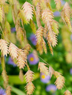
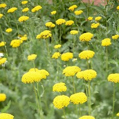
    Jumping ahead- some hardy plants that will withstand the strong winds and the salt spray. If you wait to finish the whole house inside and out before you start planting, then it's going to be a long wait for plants to come up unless, you are going to buy them all ready made all set to flower with landscaping people joining in. I enjoy gardening and like it a little wild too. Not very well kept if you know what I mean. A nature lover's garden. Even if this is not to your taste Susan, thank you for giving me a chance for letting me have my say.
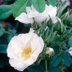
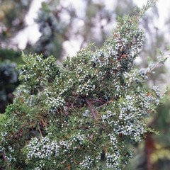
    Since I am in the tropics, I am not very familiar with what you see - Sea oats, Sea pink and Yarrow. Lavender I know. More suggested are Juniper, Rosa Rugosa and Geranium. Lantana which I am familiar with, is also suggested for butterflies but the leaves are very scratchy. Hydrangea has been suggested by many already.
    Whether you have the time for a garden at the moment with all the paint work is another matter! But, thanks again. I enjoyed telling.
    Susan Grant thanked sellaginella
  • 12 years ago
    Hardy plant pictures...........
  • 12 years ago
    excellent choice, good job vavilla. right on the money
  • 12 years ago
    Thanks jenhome. You've made my day. Susan takes it all in such good spirit, you want to help in any way you can.
  • PRO
    11 years ago

    Hi
    The problem is you have a statement door colour and as you say the shutters just fade into the background.
    Why don't you paint the shutters the same colour as the door and make a statement of them as well.
    If you do remove the shutters you would need to remove all of them or it will look odd.

    I agree that the entrance, e.g. steps could do with re modelling and seems to be crying out for a porchway to create a nice frame to the front of the house with some lovely green foliage/climber to soften it and the door could do with some door furniture.

    The stairs at the front look very slabby . Have you thought of softening with decking either side of the steps , (in a sympathetic grey/blue wood stain with a lovely designer bench under the two single windows and on the other side some designer pots and tubs etc?

  • 11 years ago

    Art Decor - did you notice this is an old post. August 2013.

  • PRO
    11 years ago

    Obviously not Angel


  • PRO
    11 years ago

    What an incredibly long feed. Every one was charmed with your house. The gray shutters look great but I still would paint the wide white casings around the bay window the gray of the shutters. This will look great with or without the bay window shutters. If you add planter boxes under the 2 smaller windows be sure you plant them with a mix of evergreen and annuals and are committed to maintaining them in all seasons. I would add foundation evergreen and perennial plantings under the bay window rather than another window box. Large round box wood on each side of the steps would be attractive year round.

  • 11 years ago

    Susan, what did you end up doing?

  • 11 years ago

  • 11 years ago

    Oh and everyone -- I just love it and have gotten many compliments!!

  • 11 years ago

    Does look lovely and the landscaping has filled in nicely.

  • PRO
    11 years ago

    Congrats. That's beautiful.

  • PRO
    11 years ago
    last modified: 11 years ago

    Are shutters darker gray than original? I like the contrast color.

  • 11 years ago

    Yes they are much darker