Software
Houzz Logo Print
artsfan

Help! How to pull off aqua with red accents

5 years ago
last modified: 5 years ago
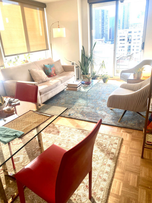
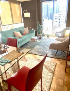
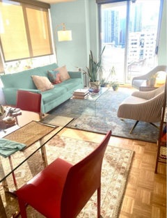
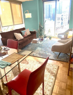
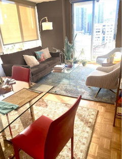
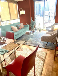
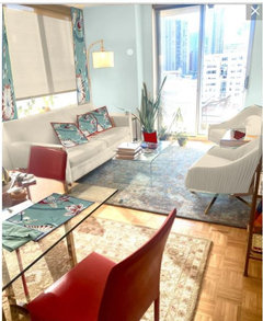
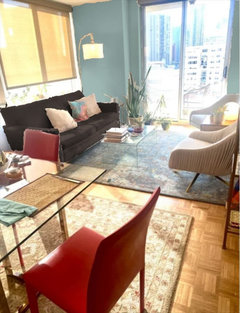
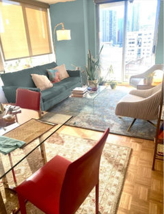
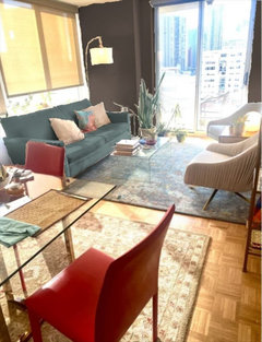
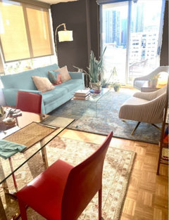
So in a relatively small living/dining space with an open kitchen, I am trying to change color schemes without getting rid of my red dining chairs or beige rug. Right now my space doesn’t know what color it is! The light is great, east and south.

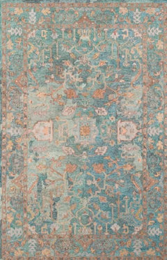
The new kitchen (at left off camera) will be a soft aqua. The red chairs are at a glass table with a gold/ivory/beige/deep red rug. My questions are about the living area: I have an aqua rug with some brown, gold, and slate blue accents. There are two ivory upholstered chairs.

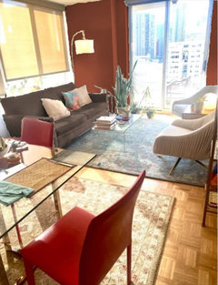
I want to replace the couch. Should the new couch be a deep aqua or a dark brown? The latter pops against the rug and ties in with the dining area But I worry brown will further confuse things.

There is also a wall to the right behind the two upholstered chair and I want to put up faux or real grass cloth. Aqua or brown?

I do have various antique prints that incorporate both colors. Not on the walls yet.

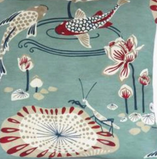
I’m attaching a closeup of throw pillow fabric to give the idea of what I’m going for.

Advice, please!


Deep aqua couch and aqua accent wall
Brown couch and brown accent wall
Brown couch and aqua accent wall
Aqua couch and brown accent wall
Something else

Comments (43)

  • 5 years ago

    Help, got a message thatthere are 3 votes but I can’t see them...

  • 5 years ago

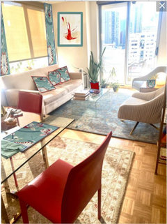
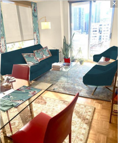
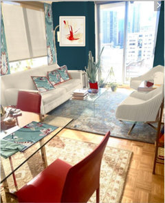
    There are browns and there are browns (and aquas and aquas)

    . Here are some mockups.


  • 5 years ago

    I did some with a much redder brown (arguably a brownish red).


    artsfan thanked cawaps
  • 5 years ago

    The biggest issue I see is that the rugs are clashing in style. One is very traditional, the other modern. I think the rugs need to unify the space since they are so close together.

  • 5 years ago
    last modified: 5 years ago
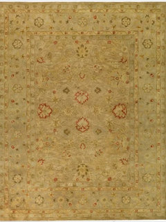
    These are the rugs. Safavieh calls them both traditional.


  • 5 years ago
    last modified: 5 years ago

    @cawaps I have been unable to find a couch fabric that’s as aqua as that. Every company I check sends me samples that are more like a teal. Your Non-red brown couches are appealing. I feel like the brown couch brings a warmth to that part of the room that connects it to the red chairs. Thanks for doing these!

  • 5 years ago

    If you can share pics of specific colors, or links to photos, I can dial in the mockups. Everything is set up now, so doing more color combos is no bother.

    artsfan thanked cawaps
  • 5 years ago

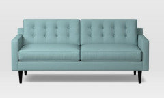
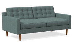
    @cawaps if you still have time, it would be amazing to see these fabrics in your mock-up. Here is Eucalyptus Heathered Weave from West Elm; Crypton Sarsparilla in the same style (website pic and my close-up swatch photo); and Bluestone Basket Slub from West Elm. (I think we’re going to forget the accent wall for now because I have antique prints coming out of my ears and they can cover that wall across from the couch.)


    from West Elm:


  • 5 years ago

    I agree that your space would look more unified if you change the gold toned rug. It does have a traditional style, but IMO the color does not play well with the other rug, and is too similar to your floor tones. Have fun with your update!

    artsfan thanked L.D. Johnson
  • PRO
    5 years ago

    I say that cool aqua/teal couch from west elm, and a deep dark aqua wall in the same tone. LOVE the aqua rug in the living room! But I dont think you need a rug under the dining table—at least, not that rug. It seems too traditional for the look you’re going for. Also, too close to the e other one imo—it just takes away from the awesomeness of the other one. Also— red chairs are so cool but not really right on that rug. I think you don’t need one—but if you really want one, maybe a round one in a solid-ish neutral color. Sisal maybe? Or a pale pale aqua.

    artsfan thanked Kim Moulder, Art and Design
  • 5 years ago

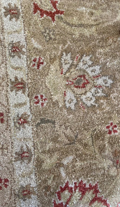
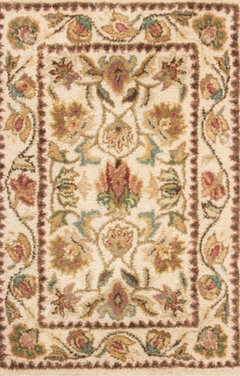
    @L.D.Johnson thanks; here is a more accurate pic of the rug. It is beige, not gold.


  • 5 years ago

    @Kim Moulder, Art and Design all very interesting ideas. Agree that a round rug would break things up but I don’t think I have room for one that all chairs would fit on. This rug and I (see color correction above) go way back haha but I get what you’re saying. On the side away from the living space we are installing an aqua kitchen, so I am not sure about an aqua rug there; could be a lot of aqua.


    The no rug idea is certainly intriguing. It won’t look too bare? Is the no-rug look a thing?

  • 5 years ago
    last modified: 5 years ago

    @Mogul Interior that’s a wow!

  • PRO
    5 years ago

    I opted for no rug under my dining table a long time ago. Partially because it was easier to clean up with kids. I loved my hardwoods too—and didn’t want to cover them up. Is there another home for that rug in your apartment? It’s pretty, and from another angle maybe it’s better there... what if you angled it? May not be room...lol and it might be breaking some rules. (I’m a rule breaker though...) Your apartment is ahhhmahzing!!! 😍😍😍 Those windows and that view. wow.

    artsfan thanked Kim Moulder, Art and Design
  • 5 years ago

    Thank you @Kim Moulder, Art and Design! If I remove the rug we will see more parquet, which no one on Houzz loves! This floor does go with the MCM sofa though...

  • 5 years ago

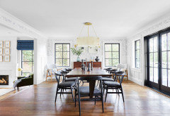
    Adding my vote to find a new home for the dining table rug. Here are pictures of

    some dining rooms without any rugs. Just as beautiful and easier to clean!


  • 5 years ago
    last modified: 5 years ago

    Adding my vote to find a new home for the dining table rug. Here are pictures of some dining rooms without any rugs. Just as beautiful and easier to clean!


    artsfan thanked Renee Tatge
  • PRO
    5 years ago

    I feel that the dining rug is a bit large. I would def pull out some of the color in that rug, but be careful not to overkill. Some window treatments could really elevate the space. Layer your texture and pillows. Your decor makes me think a bit of a Mediterranean vibe.


  • 5 years ago

    Are the rugs the same size? I wonder if the beige was under the seating area you could have an aqua couch and then having the aqua rug under the dining table might bring the spaces together. Just an idea. Love the aqua rug. Very pretty.

    artsfan thanked pricklypearcactus
  • 5 years ago

    @Patricia Justice thanks, I love pillows and know they will help bring the space together. Re window treatments this is a compact space and nobody closes draperies here so if I do anything it will probably be sheers left off to the side. Good point about avoiding overkill. Will be keeping that in mind...

  • PRO
    5 years ago

    I think the parquet looks great with the MCM! When you have your new couch they will be lovely!! I love those chairs in the living room too! White Sheers off to the left would soften those vertical
    Lines and set off that wall if you do a color there. . .

    artsfan thanked Kim Moulder, Art and Design
  • 5 years ago
    last modified: 5 years ago

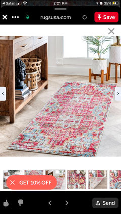
    This is the runner I ordered for the open hallway to the right of the dining area, bridging the aqua kitchen and the dining space. A mistake? Way too traditional? Picked it because it appears to have touches of teal. Already have sisal at the entry so don’t think another sisal would work. Open to suggestions! You are all super helpful!


  • PRO
    5 years ago

    Hmmmm... it might be. (But if it can be returned or canceled—not a mistake! ;). what if you did one with that eclectic faded look like the living room one... maybe...? And bring more of a red/orange/pink vibe. And a little the teal/aqua. This might be my personal preferences coming out, but I think if you’re going for more MCM or eclectic look—I say go for it. Something with these colors would make me so happy when I walked in everyday. :) And then you turn the corner to that gorgeous teal couch and that view and you’re knocked out!

    artsfan thanked Kim Moulder, Art and Design
  • 5 years ago

    Yes returnable! Ooh nice idea. Everything is coming into focus. I’ve been straddling traditionland and modernland, which is why it’s not working. The boho touches work with modern but the traditional ones really don’t.

  • 5 years ago

    Here are some ideas with your accents added.


    I would use one shade of red, one cream and two tones of aqua. I would not bring any other colors in with such a strong combination.


    In this case, less may be more. I would seriously consider cream for the walls and sofa/chairs and just do accents and art in both colors.

    artsfan thanked Jennifer Hogan
  • PRO
    5 years ago

    You know what, artfan? You should get your sofa and get the right runner rug and try your special traditional rug in another room. Once you’ve got that—and if you like it, all the other things will be easier to figure out. (And those are also easier to change out).

    artsfan thanked Kim Moulder, Art and Design
  • PRO
    5 years ago

    Not sure I would spend all this money and effort for this color combination. Might be less expensive to change out the chairs.


    artsfan thanked BeverlyFLADeziner
  • 5 years ago
    last modified: 5 years ago

    @Jennifer Hogan great idea to have two aqua tones, one red, and cream. I have too many reds going and they just throw everything off.

    @Kim Moulder, Art and Design I think the traditional rug will need to go to a family member or to Craigslist because I have rugs that actually work well in my other rooms.

    @BeverlyFLADeziner I get what you’re saying about changing the chairs. I used to have everything red and gold and found myself feeling as though I was on fire. So I decided to introduce the aqua because I do think aqua and red can work together well, especially with the MCM stuff. I love the rugs you’ve posted. Thank you!

  • 5 years ago
    last modified: 5 years ago

    I agree with Beverly. all of the best suggestions here involve getting new living room furniture, rugs, etc, which would be so expensive. even after all those changes, I still don't like the red in there. unless you absolutely love the dining chairs and have some kind of sentimental connection to them, I say get rid of those and decorate with the colors you really want.

    artsfan thanked User
  • 5 years ago

    @User I am getting a new couch in the living room, and I’m ready to ditch the dining room rug. I do have a big connection to the red chairs and as we talk I’m grasping the idea that this living space basically needs to be aqua with red accents. (I also have quite a bit of red in my antique prints.).


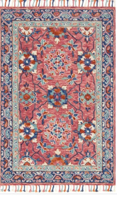
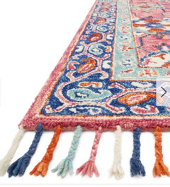
    Any thoughts on this wool runner for the entry? It contains rose, orange,and aqua but no red. @BeverlyFLADeziner I also like the second one you posted if you can source it for me?


  • PRO
    5 years ago

    I LOVE that rug artsfan! I think the rose works fine and you don’t need the exact red in the runner. The rose and orange together do the trick. (I love those colors together—dynamic!) That’s really pretty.

    artsfan thanked Kim Moulder, Art and Design
  • 5 years ago

    Ordered it! I think this color scheme will take courage, without which it will continue to fall flat. To be continued!

  • PRO
    5 years ago

    Yay! I agree!! Sometimes you gotta just go for it. :)) You’ll be glad you did!

    artsfan thanked Kim Moulder, Art and Design
  • 5 years ago

    I tried to dial in the colors a bit closer to what you posted. Not sure I succeeded (the brown upholstery was hard), and I can't match the texture of the fabric at all because I'm just colorizing the old sofa with unsophisticated graphics tools.

    FWIW, I like orange-reds with green-blues. If it were me, I'd keep the palette tight and leave brown out of the mix. There's enough going on color-wise already.

    artsfan thanked cawaps
  • 5 years ago

    @cawaps these are good representations, thank you. I think you’re right about not adding the brown. The deeper aqua works for me. TBD re an accent wall!

  • 5 years ago

    I have never found a color combination in nature that doesn't work.


    artsfan thanked Jennifer Hogan
  • PRO
    4 years ago

    Hi artsfan! Wondering how your room turned out? 😊

  • 4 years ago

    I would not spend $$ on a Safavieh or any fakey rug.

    Get yourself a proper handmade rug, either a knotted or woven, in the colors that coordinate with the teal and burnt red (or whatever that color red is called.)

    I would not have the sofa be a bright teal of the same intensity as the red of the chairs. This isn't a Crayola box or a kindergarten.

    I also wouldn't have the sofa and chairs be a stark white for the same reason.

    Subtlety always wins the day.

    As beautiful as that print is, you can't use it everywhere, in curtains, all the pillows, on placemats, etc. It is boring.

    I would use additional fabrics for pillows such as a teal weave, or a small teal print, or a small burnt red print, and a solid velvet on the backs and a piping on the edge of a couple and a fringe on another couple.

    I think the room is too small for a grasscloth on that wall and art on top of it.

    Less is more.

    If your art is really not that interesting, you can go for a strie effect, but unless you are very talented and plan to do it yourself, that is rather expensive, and you are better off getting better art and/or objets.

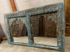
    Mogul Interior's arch is lovely and you don't need to put a mirror or anything else behind it either. Or you could. The decorator Phoebe Howard uses an unpainted one on the cover of one of her books.

    What I would do, since I collect objects from nature would be to mount a bracket or two and have a rotating display of the things I collect- corals, large shells, butterflies, interesting driftwood, fossils, etc.

    I really like the contrast with human beings need to fancify things and nature's ability to do it.

    Anyhoo, back to you.

    I am crazy for your print, and would love to see a large swath of it somewhere, but I think given that your living room is small, it might be too much on the sofa, and your chairs are really not the style for it.

    Have you thought about getting a pouf made for in front of the sliding glass door covered in the fabric?

    (You need to get rid of those fiddly small plants there anyway.)

    Or, if you change out the chairs, you can cover those with that marvelous fabric.

    Cause there really isn't enough room for a poof.

    And I do like the acrylic table, it takes up less visual space.

    I suggest you keep your eyes open at Goodwill or a tag sale for two well constructed but not large upholstered chairs such as club chairs (nothing large like a wing chair) or something of wood and upholstery like a spool chair or a bergere, but ones that are scaled down in size that would fit your apartment.

    I think to use that marvelous print in curtains would be wasting it because the curtains will be kept open all the time.

    You could use a photoediting program and test out some wall color such as a lighter tint of the background teal or leave them a soft off white.

    I favor the soft off-white so as not to distract from your art and objets.

    Also, I think one has to be careful with too much light blue, a room can start looking too ethereal, and bedroom-ish unless it is grounded by wood, or black, and you don't have that in there.

    And this way, you can have a light tint of the teal in your curtains with an inner curtain of s sheer or patterned voile or something like that just to cut down on the glare.

    I agree with everyone else to get rid of the yellow rug in the dining room.

    The color is just not different enough from the wood color.

    The is a sample room in the traditional rooms that is not in your colorway, it is orange and turquoise, I can't find it now, I just looked, (Murphy's Law!) but it is similar enough you can get some great inspiration if you can find it. The designer was listed as "User."

    Good Luck!


  • PRO
    4 years ago

    oops— @loobab, I was actually just curious and asking about what @artsfan ended up doing—as her post was 10 months ago. She has likely already done whatever she was going to do... 😬

    artsfan thanked Kim Moulder, Art and Design
  • 4 years ago

    Oh- I didn’t realize that !

  • 4 years ago
    last modified: 4 years ago

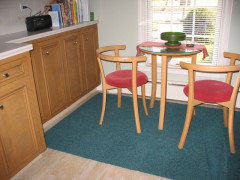
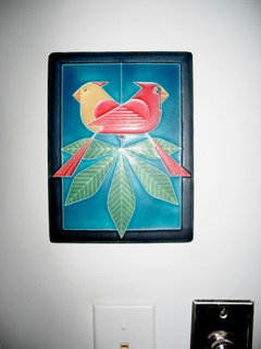
    This is how I used this color scheme in my kitchen. The plaque is a Charlie Harper. It is on the wall just as one enters the kitchen. The walls are very light sage green.