

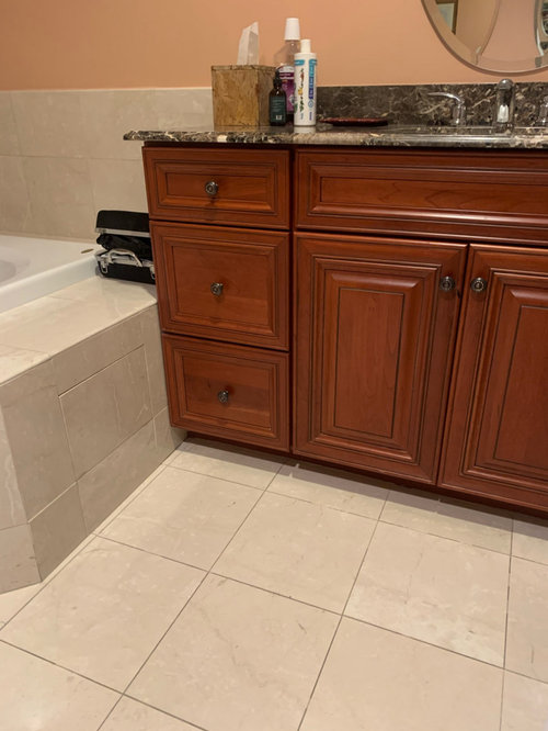
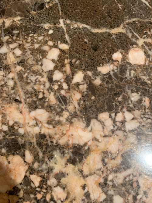
color theory question
5 years ago
Sort by:Oldest
Comments (8)
Related Stories
DECLUTTERINGCan’t Figure Out What ‘Sparks Joy’? Try This Question Instead
If you can’t decide whether to keep something or let it go, shift your perspective to find the answer
Full Story
WORKING WITH PROS12 Questions Your Interior Designer Should Ask You
The best decorators aren’t dictators — and they’re not mind readers either. To understand your tastes, they need this essential info
Full Story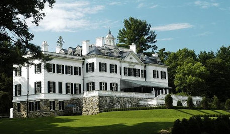
HOUZZ TOURSHouzz Tours: Edith Wharton's The Mount
New Restoration Shows How the Famed Author Put Her Decorating Theories Into Practice
Full Story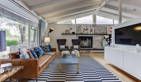
MOST POPULARHow High Should You Mount Your TV?
Today we look at an important question to consider when locating your television: How high should you set it?
Full Story
DECLUTTERINGClutter vs. Keepers: A Guide to New Year's Purging
Simple questions to get in touch with your clutter comfort level — and figure out what needs to go
Full Story
PRITZKER PRIZE WINNERSJapan’s Arata Isozaki Wins the 2019 Pritzker Architecture Prize
The field’s highest honor goes to a prolific architect whose designs bridge theories and cultures around the world
Full Story
REMODELING GUIDES10 Things to Ask Your Contractor Before You Start Your Project
Ask these questions before signing with a contractor for better communication and fewer surprises
Full Story
FLOORSIs Radiant Heating or Cooling Right for You?
Questions to ask before you go for one of these temperature systems in your floors or walls (yes, walls)
Full Story
MORE ROOMSDesign Ideas for a Teen Boy's Room
Make room for your teen to shine with a space that reflects his personal style
Full Story
PETSSo You Want to Get a Cat
If you're a cat lover, the joys outweigh any other issue. If you haven't lived with one yet, here are a few things to know
Full Story

K R
gyk1Original Author
Related Professionals
Dallas Interior Designers & Decorators · Chillicothe Interior Designers & Decorators · North Adams Interior Designers & Decorators · Denver Interior Designers & Decorators · Roswell Interior Designers & Decorators · Evanston Interior Designers & Decorators · Charlotte Bathroom Remodelers · Lawrence Bathroom Remodelers · Merced Bathroom Remodelers · Sacramento Bathroom Remodelers · Starkville Kitchen & Bathroom Designers · Rocky Mount Kitchen & Bathroom Designers · Sierra Vista Kitchen & Bathroom Designers · Pullman Kitchen & Bathroom Designers · Cowansville Kitchen & Bathroom DesignersMarylee H
gyk1Original Author
Marylee H
sdnick
gyk1Original Author
gyk1Original Author